Candlestick
What is a Candlestick Chart?
A Candlestick Chart (or Candle Chart) is a type of financial chart that describes the price changes of a security, derivative, or currency. Candlestick graphs and charts usually represent data as numerical values in vertical axes and compare the price movements across time, visualizing the open, high, low, and close values.
In this Candlestick Chart Guide, we will go through the data-formats for Candlestick charts. You will be able to how to create a basic Candlestick Chart with some example code and will explore different options to how to customize it further.
Candlestick Data Format
The data format for candlestick is slightly different than other charts. ApexCharts assumes that your data is in the OHLC format as given in the below example.
Two dimensional Array (Paired)
The multi-dimensional array format accepts [[Timestamp], [O, H, L, C]]
series: [{ data: [ [1538856000000, [6593.34, 6600, 6582.63, 6600]], [1538856900000, [6595.16, 6604.76, 6590.73, 6593.86]] ] }]
Single Array
The single array format accepts [Timestamp, O, H, L, C]
series: [{ data: [ [1538856000000, 6593.34, 6600, 6582.63, 6600], [1538856900000, 6595.16, 6604.76, 6590.73, 6593.86] ] }]
xy Format
The xy format accepts [{ x: date, y: [O,H,L,C] }].
You can also pass timestamp in the x property instead of a date String
series: [{ data: [{ x: new Date(2016, 01, 01), y: [51.98, 56.29, 51.59, 53.85] }, { x: new Date(2016, 02, 01), y: [53.66, 54.99, 51.35, 52.95] }, . . . { x: new Date(2016, 08, 01), y: [52.76, 57.35, 52.15, 57.03] }] }]
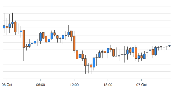
Customizing the colors of candle
Candle Body Color
By default, the upward candle has a green color and the downward candle has a red color in Candlestick charts. You can change these colors by setting the below options
plotOptions: { candlestick: { colors: { upward: '#3C90EB', downward: '#DF7D46' } } }
The above color setting will produce the following result
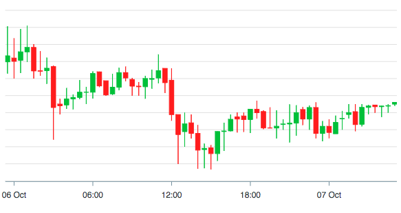
Candle Wick Color
The wick which indicates the high and low of a candle uses the same color as the body color. If you turn this option to FALSE, the wick uses options.stroke.colors property as a fallback color.
plotOptions: { candlestick: { wick: { useFillColor: true, } } }
Keeping the useFillColor option as TRUE will produce the following result
When to Use Candlestick Chart?
- For financial scenarios and stock movement analysis.
- When trading as Candlestick Charts show four price points- open, high, low, and close on a particular day.
- To enable easier predictions of stock prices
- To represent the size of price movements of an asset.
- To display the relationship between variables or the overall direction in which the information is going.
- When you have to display numerical values using vertical axes.
Bar Chart vs Candlestick Charts and Graphs
Candle charts are better at highlighting the difference between the open and the close value and can very easily show OHLC information. With bar charts, it is a bit more challenging to see these dynamic price changes and anomalies.