Funnel Chart
What is a funnel chart?
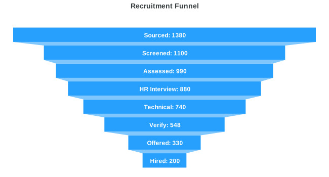
A funnel chart is a data visualization tool that represents the progressive reduction of data as it moves through different stages of a process. Funnel charts assist with recognizing possible bottlenecks in the conversion process, highlight areas for improvement, and provide insights into the effectiveness of marketing or sales efforts at each stage.
Each stage is drawn as a horizontal band, and the bands narrow as values fall, so the shape itself carries the message: where the process loses the most volume.
What is a funnel chart used for?
The defining requirement is that each stage is a subset of the stage above it. Everyone who signed up also visited; everyone who purchased also signed up. That nesting is what makes the narrowing shape meaningful rather than decorative.
Common uses:
- Sales and marketing conversion, from impressions through to closed deals
- Signup and onboarding flows, to find the step where users abandon
- Recruitment pipelines, from applications through to offers accepted
- Order fulfilment, from carts created through to deliveries completed
- Support ticket resolution, from opened through to closed
When should you use a funnel chart?
| Use a funnel when | Use something else when |
|---|---|
| Stages are sequential and each nests inside the previous one | Categories are independent, so a bar chart compares them honestly |
| The drop-off between consecutive stages is the thing you want read | You need precise magnitude comparison, where a bar chart's common baseline is easier to judge |
| There are roughly three to seven stages | There are many stages, since the lower bands get too thin to label |
| Values decrease at every step | Values rise anywhere in the sequence, which a funnel's shape will misrepresent |
That last row is worth spelling out, because ApexCharts will not warn you. Items render in the order they appear in the series array, so a series whose values are not monotonically decreasing still draws in a funnel shape. The chart will look like a funnel and describe something that is not one. Sort descending, and if the data genuinely rises somewhere, that is a sign the stages are not nested and a bar chart is the right chart.
One practical note: a funnel in ApexCharts is a horizontal bar chart with isFunnel: true, so anything that works on a horizontal bar (data labels, colour ranges, formatters, annotations) works here too.
Funnel vs pyramid
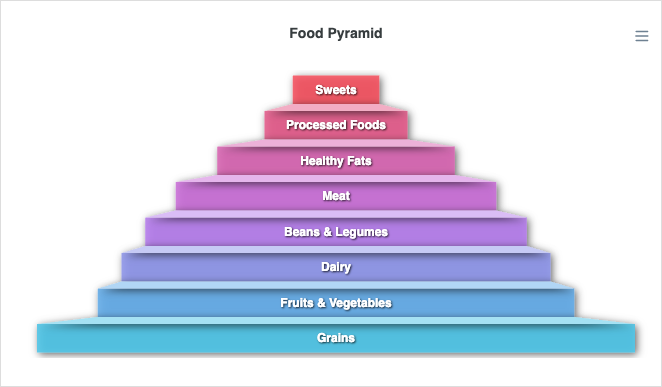
A funnel narrows from top to bottom, implying a process where volume decreases at each stage (website visits, signups, purchases). A pyramid widens from top to bottom, implying a hierarchy where the base is the largest group.
In ApexCharts, set chart.type to select between the two:
// Funnel
chart: {
  type: 'bar',
},
plotOptions: {
  bar: {
    horizontal: true,
    isFunnel: true,    // narrows top-to-bottom
  },
}

// Pyramid
chart: {
  type: 'pyramid',
},
Sort your data descending (largest first) for a funnel, ascending (smallest first) for a pyramid, since ApexCharts renders items in the order they appear in the series array.
Chart Configuration
You need to set certain options under plotOptions to make a funnel/pyramid chart.
chart: {
  type: 'bar',
},
plotOptions: {
  bar: {
    horizontal: true,
    isFunnel: true,
  },
},
Data Format
The data format for a funnel chart is the same as for the other XY charts. You need to provide your data in the series array in chart options. Please note that you will have to manually sort the series array either in ascending or descending order based on whether you want to plot a funnel or a pyramid chart.
Basic Funnel Chart
Creating a funnel chart is no different than creating a horizontal bar chart. As stated above, you only need to tweak a few configurations, rest everything stays same. Please
chart: {
  type: 'bar',
  height: 350,
},
plotOptions: {
  bar: {
    horizontal: true,
    isFunnel: true,
  },
},
series: [
  {
    name: "Funnel Series",
    data: [
      {
        x: "Sourced",
        y: 138
      },
      {
        x: "Assessed",
        y: 99
      },
      {
        x: "Technical",
        y: 75
      },
      {
        x: "Offered",
        y: 30
      },
    ],
  },
]
Pyramid Chart
A pyramid is an inverted funnel. Set chart.type to 'pyramid' and list the stages from the narrow top to the wide base (ascending values).
chart: {
  type: 'pyramid',
  height: 350,
},
plotOptions: {
  bar: {
    distributed: true,
  },
},
series: [
  {
    name: '',
    data: [200, 330, 548, 740, 880, 990, 1100, 1380],
  },
]
Each stage occupies a vertical share proportional to its value, and the stages render as trapezoids stacked inside a single continuous triangle, so the silhouette stays a clean triangle with no gaps between segments.