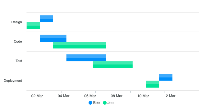
Range Bar Chart
ApexCharts range bar charts plot a start and end value for each category, making them well suited for Gantt-style timelines, event duration comparisons, and any visualization where each item has a distinct beginning and end.
To render a range bar chart, set chart.type: 'rangeBar' in the configuration.
Data Format
Each data point uses the { x, y } format where y is a two-element array: [start, end].
Numeric range
series: [{
  name: 'Performance',
  data: [
    { x: 'Team A', y: [65, 96] },
    { x: 'Team B', y: [55, 78] },
    { x: 'Team C', y: [72, 130] },
    { x: 'Team D', y: [95, 186] }
  ]
}]
Timestamp range
Pass Unix timestamps (milliseconds) in the y array and set xaxis.type: 'datetime' so ApexCharts formats the axis labels as dates.
series: [{
  name: 'Project Timeline',
  data: [
    { x: 'Task A', y: [new Date('2024-01-06').getTime(), new Date('2024-01-20').getTime()] },
    { x: 'Task B', y: [new Date('2024-01-15').getTime(), new Date('2024-02-05').getTime()] }
  ]
}]
Complete example: project timeline (Gantt-style)
The example below creates a horizontal timeline with four tasks. Each bar spans from a start date to an end date on the x-axis.
<div id="chart"></div>

<script>
var options = {
  series: [{
    data: [
      {
        x: 'Design',
        y: [
          new Date('2024-01-06').getTime(),
          new Date('2024-01-15').getTime()
        ]
      },
      {
        x: 'Code',
        y: [
          new Date('2024-01-12').getTime(),
          new Date('2024-02-05').getTime()
        ]
      },
      {
        x: 'Test',
        y: [
          new Date('2024-01-25').getTime(),
          new Date('2024-02-15').getTime()
        ]
      },
      {
        x: 'Deploy',
        y: [
          new Date('2024-02-10').getTime(),
          new Date('2024-02-20').getTime()
        ]
      }
    ]
  }],
  chart: {
    type: 'rangeBar',
    height: 300
  },
  plotOptions: {
    bar: {
      horizontal: true
    }
  },
  xaxis: {
    type: 'datetime'
  }
};

var chart = new ApexCharts(document.querySelector('#chart'), options);
chart.render();
</script>
Horizontal vs vertical
By default, rangeBar renders horizontal bars, which is the natural orientation for timelines. Setting plotOptions.bar.horizontal: false switches to vertical range columns, where each bar stands upright between a lower and upper value on the y-axis.
plotOptions: {
  bar: {
    horizontal: false   // vertical range columns
  }
}
Data labels
Data labels are off by default on a range bar. Turn them on with dataLabels.enabled: true and each bar is labelled with its length, end - start. A custom dataLabels.formatter receives the range itself as [start, end], on horizontal bars and vertical range columns alike, so it can print both ends:
dataLabels: {
  enabled: true,
  formatter: function(val) {
    return val[0] + ' to ' + val[1]
  }
}
On a datetime axis both values are timestamps in milliseconds, so format them as dates before returning them.
Grouped range bars
When you provide multiple series with the same x category values, ApexCharts renders them as grouped bars side by side, one bar per series for each category. This is useful for comparing ranges across groups at the same x position.
series: [
  {
    name: 'Actual',
    data: [
      { x: 'Design', y: [new Date('2024-01-06').getTime(), new Date('2024-01-15').getTime()] },
      { x: 'Code',   y: [new Date('2024-01-12').getTime(), new Date('2024-02-05').getTime()] }
    ]
  },
  {
    name: 'Planned',
    data: [
      { x: 'Design', y: [new Date('2024-01-04').getTime(), new Date('2024-01-14').getTime()] },
      { x: 'Code',   y: [new Date('2024-01-10').getTime(), new Date('2024-02-01').getTime()] }
    ]
  }
]
Live demos
See the full collection of range bar chart examples in the Range Bar Chart demos.