Synchronized charts
When you have multiple charts with a common x-axis and significant difference in y values, it's a prevalent way to visualize it through synched charts.
In this Synchronized chart guide, we will go through the required setup to create such charts.
Setting Global Options
Multiple charts that share the same styles can use the global Apex variable to set the common options which are applied to all charts on the page.
window.Apex = {
  chart: {
    height: 160,
  },
  dataLabels: {
    enabled: false
  }
}
This will set the height of all the charts to 160px and turn off the data labels.
Setup individual charts
Each individual chart will have it's own element.
<div id="synced-charts">
  <div id="chart-line"></div>
  <div id="chart-area"></div>
</div>
Setting up the options for each chart.
There are some properties that are mandatory to correctly build the synced charts.
chart.idshould be a unique identifier.chart.groupshould be same for the charts which needs to be synced.yaxis.labels.minWidthshould also be same for all the charts. Different widthyaxisin different charts will produce incorrect results when hovering or interacting.
var optionsLine = {
  series: [{
    data: [...]
  }],
  colors: ['#00E396'],
  chart: {
    id: 'line-1',
    group: 'social',
    type: 'line',
  },
  yaxis: {
    labels: {
      minWidth: 40
    }
  }
};
var chart = new ApexCharts(el, optionsLine)
chart.render()

var optionsArea = {
  series: [{
    data: [...]
  }],
  colors: ['#008FFB'],
  chart: {
    id: 'area-1',
    group: 'social',
    type: 'area',
  },
  yaxis: {
    labels: {
      minWidth: 40
    }
  }
};
var chart = new ApexCharts(el, optionsArea)
chart.render()
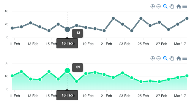
That's it! Once you're done, you'll see 2 charts (a line and an area) and when you hover over them or zoom in/out in one of the charts, you will see the other one follows.
Complete two-chart example
The following self-contained example creates two synchronized line charts. Both charts share group: 'social', so hovering or zooming one automatically updates the other.
<div id="chart1"></div>
<div id="chart2"></div>

<script>
window.Apex = {
  dataLabels: { enabled: false },
  markers: { size: 0 }
};

var data1 = [31, 40, 28, 51, 42, 109, 100, 81, 55, 49, 62, 69];
var data2 = [11, 32, 45, 32, 34,  52,  41, 31, 40, 28, 51, 42];
var months = ['Jan','Feb','Mar','Apr','May','Jun','Jul','Aug','Sep','Oct','Nov','Dec'];

var optionsLine = {
  series: [{ name: 'Pageviews', data: data1 }],
  chart: {
    id: 'chart1',
    group: 'social',
    type: 'line',
    height: 160
  },
  colors: ['#008FFB'],
  xaxis: { categories: months },
  yaxis: { labels: { minWidth: 40 } }
};

var optionsLine2 = {
  series: [{ name: 'Sessions', data: data2 }],
  chart: {
    id: 'chart2',
    group: 'social',
    type: 'line',
    height: 160
  },
  colors: ['#546E7A'],
  xaxis: { categories: months },
  yaxis: { labels: { minWidth: 40 } }
};

var chart1 = new ApexCharts(document.querySelector('#chart1'), optionsLine);
var chart2 = new ApexCharts(document.querySelector('#chart2'), optionsLine2);

chart1.render();
chart2.render();
</script>
How chart.group works
When two or more charts share the same chart.group string, ApexCharts links them together at runtime. Hovering over any chart in the group fires the tooltip on all other charts in the group at the same x position, so the crosshair tracks across all panels simultaneously. Zooming or panning one chart also zooms and pans every other chart in the same group.
Charts in different groups, or charts without a group, are unaffected by interactions on grouped charts.
Aligning y-axis widths with yaxis.labels.minWidth
When the y-axis labels on different charts have different widths (for example, one chart has values like 100 and another has 1,000,000), the plot areas will not align horizontally. The chart areas start at different x offsets because each y-axis takes up a different amount of space.
Set yaxis.labels.minWidth to the same value on every chart in the group to guarantee the plot areas line up:
// Apply to every chart in the group
yaxis: {
  labels: {
    minWidth: 40
  }
}
Choose a value wide enough to fit your largest label without clipping.
Brush chart: linked overview and detail
A brush chart is a specialized synchronized pair where a small overview chart lets the user drag a selection window, and a larger detail chart displays only the selected range. This is useful for exploring dense time series data.
The setup requires two charts:
- The overview chart has
chart.selection.enabled: true. The user drags a selection box on this chart. - The detail chart has
chart.brush.enabled: trueandchart.brush.targetset to theidof the overview chart. It automatically zooms to match the selected range.
// Detail chart - shows the selected range
var detailOptions = {
  chart: {
    id: 'chart-detail',
    type: 'line',
    height: 300,
    brush: {
      enabled: true,
      target: 'chart-overview'   // id of the overview chart below
    },
    selection: {
      enabled: true
    }
  },
  series: [{ data: fullDataset }],
  xaxis: { type: 'datetime' }
};

// Overview chart - the small navigator at the bottom
var overviewOptions = {
  chart: {
    id: 'chart-overview',
    type: 'area',
    height: 130,
    brush: {
      enabled: false
    },
    selection: {
      enabled: true,
      xaxis: {
        min: rangeStart,
        max: rangeEnd
      }
    }
  },
  series: [{ data: fullDataset }],
  xaxis: { type: 'datetime' }
};
See live examples in the Syncing Charts demo.
Checkout the full example on Syncing Charts demo.