Treemap Chart
What is a Treemap Chart?
A Treemap chart (or Treemap graph) is a data visualization method that displays hierarchical (tree-structured) data as a set of nested figures - rectangles. These figures are presented through variations of coloring and size, allowing you to more easily identify patterns and trends between categories or data values. Because Treemap charts are linear, they provide a quick-to-read visual summary of information, making complex data comprehensible.
How to Use a Treemap Chart?
In this JavaScript Treemap chart guide, we will show you how to use and configure Treemaps and will go through all the available options for plotting different Treemap graphs available in ApexCharts.
Data Format
The data format for a treemap chart is expected to be in the XY format as shown below.
options = { chart: { height: 350, type: "treemap", }, series: [ { data: [ { x: "New Delhi", y: 218, }, { x: "Kolkata", y: 149, }, { x: "Mumbai", y: 184, }, { x: "Ahmedabad", y: 55, }, { x: "Bangaluru", y: 84, }, { x: "Pune", y: 31, }, { x: "Chennai", y: 70, } ], }, ] }
As seen in the code above, you just have to set the chart.type as treemap and passing the series will get you a basic treemap chart. 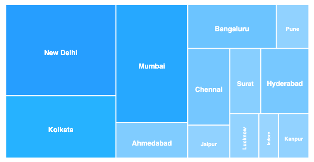
A complete example of a basic JavaScript treemap chart can be accessed at this page
Color Range
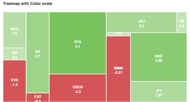
The cells of the Treemap are filled with the colors of the default color palette. Each color in the cell of the treemap corresponds to the value in that series.
By specifying the color range, you can override the default behavior and make each cell respond to a different color based on cell value. Below is an example of how to specify a color range.
options = { plotOptions: { treemap: { colorScale: { ranges: [ { from: -6, to: 0, color: '#CD363A' }, { from: 0.001, to: 6, color: '#52B12C' } ] } } } }
In the code above, note the ranges array. It consists of 3 properties.
- from: Upper limit of the range
- to: Lower limit of the range
- color: Color for cells falling between this range
The code above produces this output.
Click here to see a complete example on how to use a color range in treemap charts.
Enable/Disable Shades
You can toggle the color-shades behavior of the treemap by this option. If you turn off this option, the color of the rectangles will not be affected by the cell value.
plotOptions: { treemap: { enableShades: false } }
Difference in the colors when enableShades option is changed. 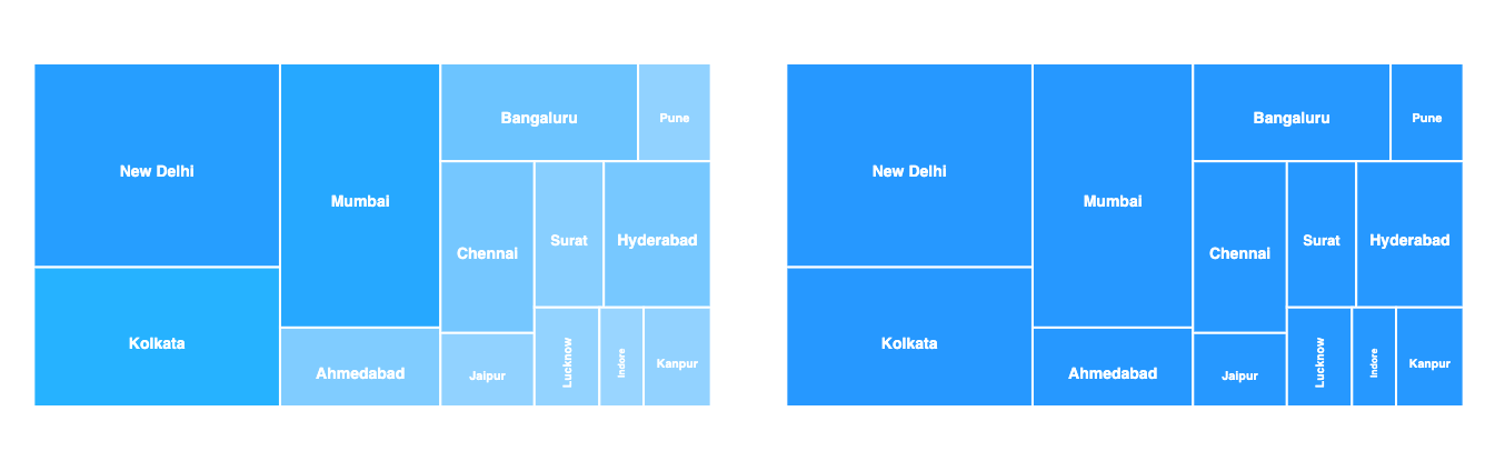
Additional Options
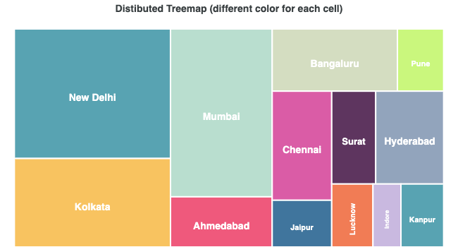
Distributed / Different color for each cell
The default behavior of the cell color uses the same color for each cell and shades it by value. If you want to change this behavior, you can do this
options = { plotOptions: { treemap: { distributed: true } } }
What is a Treemap Chart Used For?
There are several common scenarios, suitable for when to use Treemaps.
- To handle drill-down scenarios.
- To illustrate category-wise sales figures.
- To handle and show large hierarchical data sets, while tackling space constraints.
- To summarize comparative values between one or more categories (branches) and subcategories (sub-branches) in a quick and easy to understand way.
- To make space-efficient data visualizations.
- To provide at-a-glance data analysis without precise values.
- To sow thousands of items on the screen at the same time.
Treemap vs Pie Chart
The pie chart is usually divided into many widgets which makes the information more difficult to be processed. Whereas Treemaps are more effective than pie charts as they can better classify data points and present the relative differences of the values in a space-efficient way.
More configuration specific to JavaScript Treemap chart can be access at this page.