Unit Chart
What is a Unit Chart?
A unit chart draws one discrete mark for every unit of value instead of a single bar or slice, so "37 of 200 seats" or "% of goal" reads as a countable quantity. It is a non-axis chart type (no grid or scale by default, dispatched like a pie or treemap) that covers a whole family of count-based visuals: dot clusters, pictograms (isotype charts), waffles, and beeswarms, all from one chart.type: 'unit'.
The signature behaviour is motion. On an update each mark tweens from its old position to its new one, so re-grouping, filtering, or a changing count re-forms the marks rather than redrawing from scratch.
When to Use a Unit Chart?
Use a unit chart when the count is the message and you want the quantity to feel tangible:
- Part-to-whole where the whole is a countable population ("18 of 200 delegates abstained").
- Pictograms that put a recognisable icon behind each unit (people, houses, cars).
- A waffle or percentage grid as a friendlier alternative to a pie.
- A beeswarm that shows every observation on a value axis without the dots overlapping.
When to avoid:
- Very large counts where individual marks are no longer distinguishable. Use
unitValueto let one mark stand for many, or reach for a bar chart. - Precise value comparison. Reading an exact number off a cluster of dots is slower than off an axis.
Quick Start
Flat counts with matching labels are the simplest input. Each value becomes that many marks, grouped into a cluster per category.
const chart = new ApexCharts(el, {
  chart: { type: 'unit' },
  series: [276, 266, 3],
  labels: ['For', 'Against', 'Abstain'],
  plotOptions: { unit: { layout: 'grouped' } },
})
chart.render()
The Layouts
plotOptions.unit.layout chooses how the marks are placed. One engine, seven built-in arrangements, plus a seam for your own.
Grouped and packed
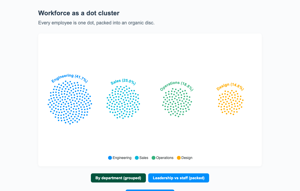
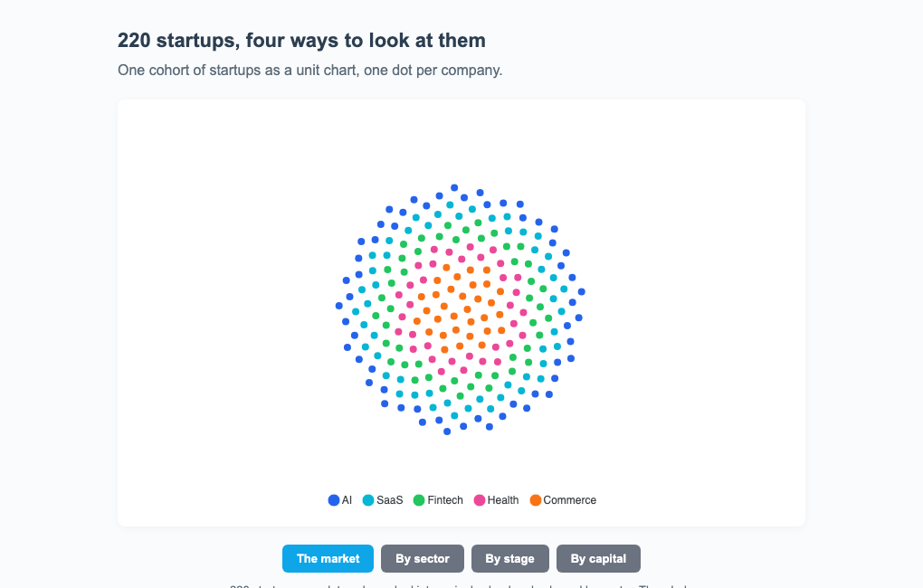
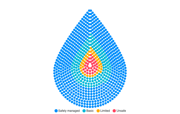
'grouped' (the default) gives each category its own phyllotaxis blob, laid out in a row. 'packed' merges everything into one blob coloured by group, with sortByGroup nesting the minority in the centre, useful for a population with a highlighted subgroup.
plotOptions: {
  unit: {
    layout: 'grouped', // or 'packed'
  }
}
Columns
'columns' builds each category into a vertical bar of stacked dots, a unit column whose height encodes the count.
Grid (waffle)
'grid' fills one lattice of cells in category order, a part-to-whole square "pie". chart.type: 'waffle' presets this layout with square cells; see the waffle chart guide for grid.total percentage waffles and grid.split small multiples.
Scatter (beeswarm and 2D bubbles)
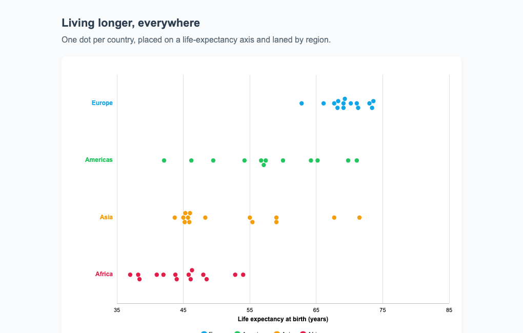
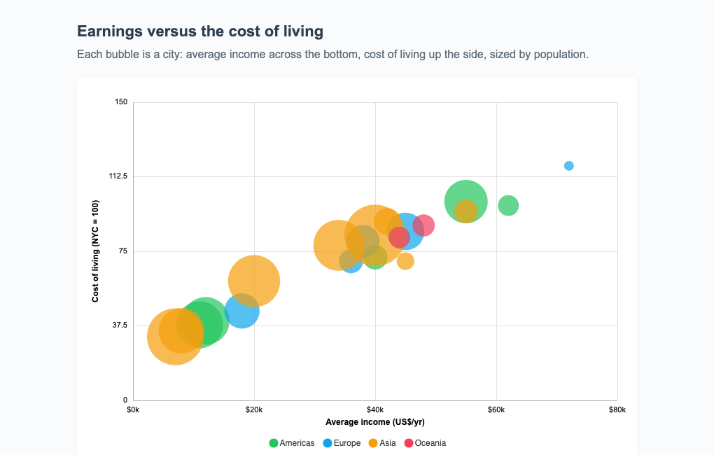
'scatter' places marks on real value axes. scatter.y: 'lanes' (the default) is a beeswarm: a value axis with one category lane per series, packing equal values off the lane centre so nothing overlaps. scatter.orientation picks which axis carries the value: 'horizontal' (the default) puts it on X with lanes stacked on Y, 'vertical' puts it on Y with lanes as columns across X. scatter.y: 'value' switches to a 2D value-value plot, and scatter.sizeRange turns the marks into area-scaled bubbles.
plotOptions: {
  unit: {
    layout: 'scatter',
    scatter: {
      y: 'value',          // 'lanes' (beeswarm) | 'value' (2D)
      sizeRange: [6, 44],  // area-scaled bubbles from datum.z
      xTitle: 'Income',
      yTitle: 'Cost of living',
    },
  },
}
Arc (parliament / hemicycle)
Added in ApexCharts 6.7, 'arc' arranges the marks as seats in concentric arced rows across an annulus, filled in category order so each category is a contiguous wedge. It is the classic parliament or hemicycle, the natural shape for seat counts and any part-to-whole where a semicircle reads better than a grid. Angles use the radialBar convention (0 at the top, clockwise); the default sweep is a top semicircle, and a full circle is startAngle: 0, endAngle: 360.
plotOptions: {
  unit: {
    layout: 'arc',
    arc: {
      startAngle: -90,       // top semicircle by default
      endAngle: 90,
      innerRadiusRatio: 0.4, // donut hole (inner / outer radius)
      rows: 'auto',          // seat rows, or a fixed number
    },
  },
}
Like the packed layout, the legend carries the category names (there are no per-wedge labels).
Custom (your own arrangement)
Every built-in arrangement is a closed set, so an arrangement none of them expresses used to need a change to the library. layout: 'custom' opens it:
plotOptions: {
  unit: {
    layout: 'custom',
    positions: (objects, rect) => objects.map((o, i) => ({
      id: o.id,
      x: rect.x + (i % 20) * 14,
      y: rect.y + Math.floor(i / 20) * 14
    }))
  }
}
A layout is objects in, positions out: it takes (objects, rect) and returns [{ id, x, y, r? }]. It knows nothing about animation, because the engine already tweens position, radius and colour and already keeps a mark's identity across a relayout. That is the whole point of the seam, a new arrangement needs no new transition code.
objects carries identity and data per mark rather than just an index, so you can place a specific unit rather than a positional slot. Marks whose ids you omit animate out; ids matching no mark are ignored.
Register a layout by name to reuse it across charts:
ApexCharts.registerUnitLayout('silhouette', (objects, rect) => [...])

// then
plotOptions: { unit: { layout: 'custom', positions: 'silhouette' } }
Tuning the Gather Animation
Every layout share the same gather tween that moves marks into place on an update. Since 6.7 it is tunable through plotOptions.unit.gather. easing picks the travel curve, 'outCubic' (the default) decelerates to a stop, 'inOutCubic' accelerates gently out of rest, and 'outBack' overshoots each mark past its slot and springs back for a per-mark settle. enter sets where a fresh or appearing mark animates from: 'burst' (fly out from the cluster centre), 'fade' (materialise in place), or 'rise' (fade in while drifting up into the slot).
plotOptions: {
  unit: {
    gather: {
      easing: 'outBack',  // 'outCubic' | 'inOutCubic' | 'outBack'
      enter: 'rise',      // 'burst' | 'fade' | 'rise'
    },
  },
}
Data Format
Two input shapes.
Flat counts (above) are the quick path: a number per category plus labels.
The object form gives every mark its own datum, so a mark can carry its own colour, position, size, and tooltip content. This is what the scatter layout and the identity transition need.
series: [{
  name: 'Cities',
  data: [
    { name: 'Zurich', x: 72000, y: 118, z: 1.4 },
    { name: 'Tokyo',  x: 40000, y: 83,  z: 37.4 },
    // one object = one mark
  ],
}]
| Datum field | Used by | Meaning |
|---|---|---|
value / y | all layouts | the mark's numeric value (count weight, or the Y position in scatter) |
x | scatter 2D | the mark's X position on the value axis |
z | bubbles | the size value when scatter.sizeRange is set (key configurable via scatter.sizeField) |
name / label | tooltip | the mark's own label |
fillColor | all layouts | per-mark colour, overriding the category colour |
id | identity tween | stable key so a specific mark persists across a regroup |
Transitions
plotOptions.unit.transition decides which previous mark each new mark tweens from on an update.
'group'(default) keeps each mark in its category; category-level enters and exits fade in and out.'flow'keys marks by global draw order, so the anonymous crowd migrates and recolours across a regroup, the circles-to-bars effect.'identity'keys by each datum'sid/name, so a specific mark persists across any regroup or relayout, keeping its colour and size (needs the object form with unique ids).
Marks that leave fade out in place. The whole thing is a pure eased tween, with no physics simulation.
Pictograms (Isotype)
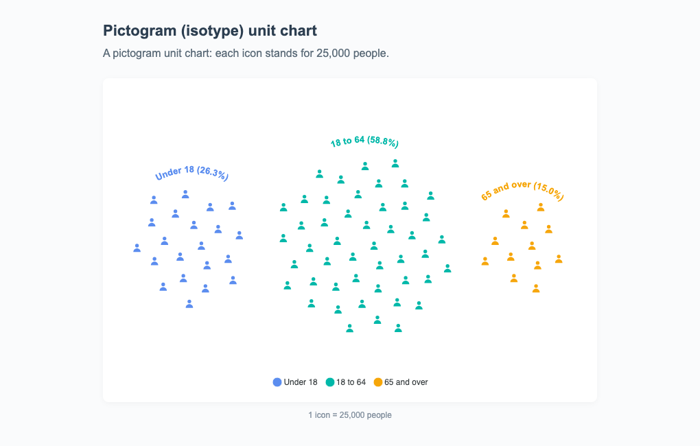
Set shape: 'image' to render an icon per unit. image.tint recolours a monochrome icon to the category colour so the pictogram matches the legend.
plotOptions: {
  unit: {
    shape: 'image',
    image: {
      src: '/icons/person.svg',
      width: 18,
      height: 18,
      tint: true,
    },
  },
}
Bubble Sizing and Cluster Labels
sizeByValue scales each dot's radius by its per-unit value (circle shape, object-form data), with the lattice spaced for the largest bubble so nothing overlaps. clusterLabels adds a per-cluster label, a curved arc above a blob or a straight label above / below a bar.
plotOptions: {
  unit: {
    sizeByValue: { enabled: true, scale: 'area' },
    clusterLabels: { show: true, curved: true },
  },
}
Scaling and Safety
For large counts, unitValue lets one mark stand for many (e.g. unitValue: 1000 draws one dot per thousand), and maxUnits (default 5000) caps the total, scaling counts down proportionally above it.
Licensing
The unit chart is the first Premium chart type. Without a license it renders in trial mode with an APEXCHARTS watermark; a valid license key removes it. Every other chart type stays free. See the pricing page for the current terms.
Tree-Shaking
Unit is a tree-shakeable chart type. When you import ApexCharts via its module entry, pull in only the unit renderer, which also serves the waffle alias:
import ApexCharts from 'apexcharts/core'
import 'apexcharts/unit' // dot / pictogram / waffle / beeswarm
The full list of unit-specific settings is documented under plotOptions.unit.