Waffle Chart
What is a Waffle Chart?
A waffle chart is a part-to-whole grid: a lattice of equal cells, filled in category order, where the share of coloured cells shows each category's proportion of the whole. It reads as a friendlier, more countable alternative to a pie, and it makes "roughly two thirds" easy to see at a glance.
In ApexCharts, chart.type: 'waffle' is a preset of the unit chart: it selects the grid layout with square cells. Everything on plotOptions.unit applies; this page focuses on the grid-specific options.
Quick Start
const chart = new ApexCharts(el, {
  chart: { type: 'waffle' },
  series: [38, 27, 21, 14],
  labels: ['Coal', 'Gas', 'Hydro', 'Other'],
  plotOptions: {
    unit: {
      grid: { total: 100 }, // a 100-cell percentage waffle
    },
  },
})
chart.render()
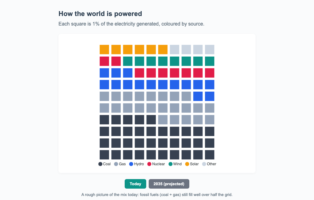
Percentage Waffles
Set grid.total to a fixed cell budget (100 is the classic percentage waffle). A largest-remainder rule allocates the cells to categories so they always sum exactly to the budget, no rounding drift. Leave grid.total undefined to draw one cell per unit instead (respecting unitValue and maxUnits).
grid.columns sets the cells per row (default 10, giving the familiar 10x10 square), and grid.fillFrom chooses whether the fill starts at the 'bottom' (default) or 'top'.
plotOptions: {
  unit: {
    grid: {
      total: 100,
      columns: 10,
      fillFrom: 'bottom',
    },
  },
}
Small Multiples
grid.split: true renders one mini-waffle per category in a trellis instead of a single shared lattice, a wall of comparable gauges. Each tile has total cells (default 100) and fills value / max of them; the rest show as a faint trackColor backdrop, and each tile carries its own label.
plotOptions: {
  unit: {
    grid: {
      split: true,
      max: 100,          // "of 100" percentage tiles
      tileColumns: 4,    // tiles per row (default: auto)
      trackColor: '#eceef5',
    },
  },
}
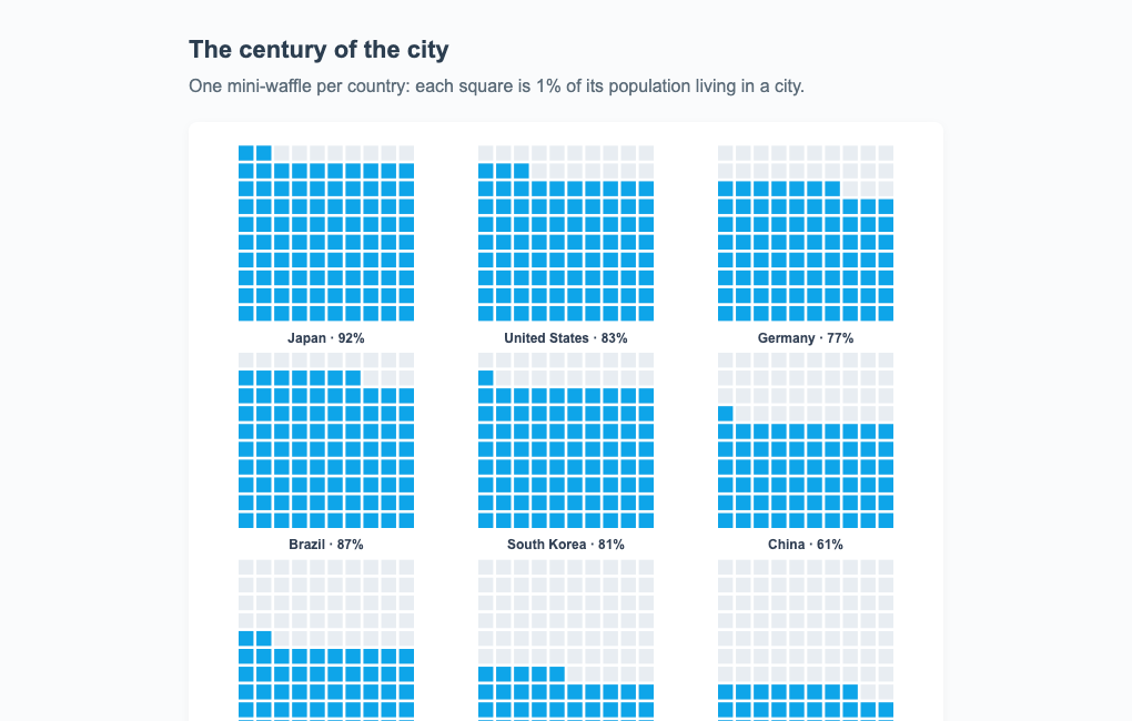
Squares, Not Circles
Because the waffle preset uses square cells, borderRadius rounds the cell corners, and size (or 'auto') controls the cell size. To switch a unit chart to a waffle without changing chart.type, set layout: 'grid' and shape: 'square' yourself.
Licensing
The waffle chart shares the unit engine, so it is a Premium chart type: without a license it renders in trial mode with an APEXCHARTS watermark, which a valid license key removes. See the pricing page for the current terms.
Tree-Shaking
The waffle alias is served by the same tree-shakeable module as the unit chart, so one import covers both:
import ApexCharts from 'apexcharts/core'
import 'apexcharts/unit' // serves both 'unit' and 'waffle'
The full option set is documented under plotOptions.unit, and the layout family is covered in the unit chart guide.