pie
Configuration Structure
pie: {}plotOptions
startAngle
0A custom angle from which the pie/donut slices should start.
endAngle
360A custom angle to which the pie/donut slices should end.
expandOnClick
trueWhen a pie/donut slice is clicked, slide it outward along its own mid-angle to distinguish it.
Selecting used to darken the slice and redraw it at a larger radius. Growing the radius inflates the quantity the slice encodes, so the visual said something the data did not; the slice now moves instead. Legend clicks toggle a slice in and out through the same path.
More than the arc moves: the slice's data labels, any external label group and the hover outline band all slide with it. Since 7.6.0 each of them carries the apexcharts-slice-mover class, so a stylesheet can address the whole moving set at once rather than naming each part and leaving whichever one it missed behind mid-slide.
expandOffset
10How far a selected slice slides out, in pixels.
hoverOutline
A translucent band traced just outside the rim of the hovered slice, so the slice keeps its own colour instead of being lightened.
This takes the place of the states.hover filter for pie, donut and polarArea, and is skipped entirely when states.hover.filter.type is 'none', which stays the way to turn all hover feedback off.
show
trueAvailable Options:
- true (default)
- false
size
8Band thickness in pixels.
gap
0Extra clearance between the slice rim and the band, in pixels, on top of the slice stroke: the band always starts at the outer edge of the stroke, never under it.
Defaults to 0 because a stroke is normally present (stroke.width defaults to 2) and already reads as the separation. Any gap beyond that and the band stops belonging to its slice and starts reading as a ring of its own.
opacity
0.3Band opacity, over the slice colour.
color
undefinedBand colour. Defaults to the hovered slice's own colour.
borderRadius
0Rounds the corners of each slice (in px). Applies to pie, donut, and polarArea. Defaults to 0 (sharp corners). The value is clamped per slice so corner fillets never cross on thin or narrow slices. Added in 6.7.
spacing
0Gap between adjacent slices (in px). Applies to pie, donut, and polarArea. Defaults to 0 (slices touch). Each slice is inset symmetrically, so its mid-angle (data label and hit region) is kept. Added in 6.7.
offsetX
0Sets the left offset of the whole pie area
offsetY
16Sets the top offset of the whole pie area
customScale
1Transform the scale of whole pie/donut overriding the default calculations. Try variations like 0.5 and 1.5 to see how it scales based on the default width/height of the pie
dataLabels
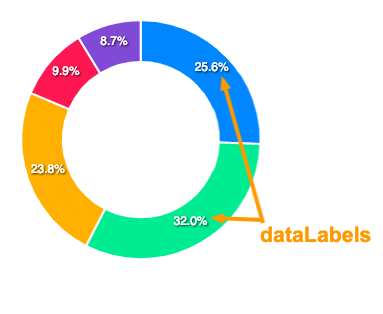
offset
Offset by which labels will move outside / inside of the donut area
minAngleToShowLabel
Minimum angle to allow data-labels to show. If the slice angle is less than this number, the label would not show to prevent overlapping issues.
All additional formatting/styling settings for dataLabels has to be done in [dataLabels](/docs/options/datalabels/) configuration.
external
Render each slice's name outside the pie, joined to the slice by a leader line, so the chart reads without cross-referencing the legend. The percentage keeps rendering inside the slice. Applies to pie and donut only (ignored for polarArea, where the radial length already encodes the value).
plotOptions: {
  pie: {
    dataLabels: {
      external: {
        show: true,
        connector: {
          show: true,
          length: 16
        }
      }
    }
  }
}
show
falseTurn the external labels on. Off by default, so existing pie/donut charts keep their inside labels.
offsetX
0Horizontal shift applied to every external label.
offsetY
0Vertical shift applied to every external label.
fontSize
Font size of the external label. Falls back to dataLabels.style.fontSize when unset.
fontFamily
Font family of the external label. Falls back to dataLabels.style.fontFamily when unset.
fontWeight
Font weight of the external label. Falls back to dataLabels.style.fontWeight when unset.
color
Text colour of the external label. Defaults to chart.foreColor so the label stays readable against the page background.
formatter
Build the label text. Receives the slice name and an options object { seriesIndex, percent, value, w }. Return a string for a single line, or an array of strings to stack multiple lines, for example [name, percent + '%'].
connector
The leader line drawn from the slice edge to the external label.
show
trueDraw the leader line. When off, labels sit outside the slice with no connecting line.
width
1Stroke width of the leader line, in pixels.
color
Colour of the leader line. Defaults to the slice colour.
length
16Length of the horizontal run of the leader line after the radial elbow, in pixels.
gap
6Gap between the slice edge and the start of the leader line, in pixels.
size
Donut / ring size in percentage relative to the total pie area.
background
The background color of the pie
labels
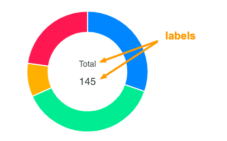
show
Whether to display inner labels or not.
name
show
Show the name of the respective bar associated with it's value
fontSize
FontSize of the name in donut's label
fontFamily
FontFamily of the name in donut's label
fontWeight
Font-weight of the name in dataLabel
color
Color of the name in the donut's label
offsetY
Sets the top offset for name
formatter
A custom formatter function to apply on the name text in dataLabel
value
show
Show the value label associated with the name label
fontSize
FontSize of the value label
fontFamily
FontFamily of the value label
fontWeight
Font weight of the value label in dataLabel
color
Color of the value label in dataLabel
offsetY
Sets the top offset for value label
formatter
A custom formatter function to apply on the value label in dataLabel
total
show
Show the total of all the series in the inner area of radialBar
showAlways
Always show the total label and do not remove it even when user clicks/hovers over the slices.
label
Label for "total". Defaults to "Total"
fontSize
FontSize of the total label
fontFamily
FontFamily of the total label
fontWeight
font-weight of the total label in dataLabel
color
Color of the total label
formatter
A custom formatter function to apply on the total value. It accepts one parameter w which contains the chart's config and global objects.
Defaults to a total of all series percentage divided by the length of series.