Gauge Chart
A gauge chart displays a single value against a defined range. It is well suited for KPIs, completion percentages, speedometers, and any scenario where the position of one value within a min/max bracket needs to be communicated at a glance. The gauge chart type is built on the same engine as radialBar but exposes additional configuration for partial arcs, threshold bands, tick marks, and needle indicators.
Gauge chart vs radialBar
ApexCharts has two related chart types for single-value indicators: gauge and radialBar. They share the same rendering engine but have different defaults and configuration surface.
Gauge (chart.type: 'gauge') | RadialBar (chart.type: 'radialBar') | |
|---|---|---|
| Primary use | Single KPI with a defined min/max range | Progress percentage or multi-ring comparison |
| Default input | Numeric value within a min/max range | Percentage (0-100) |
| Needle support | Yes (via plotOptions.radialBar.shape: 'needle') | No |
| Threshold bands | Yes | No |
| Multiple series | Not typical | Yes, each series is one ring |
Use gauge for speedometer-style KPIs with a min/max range, threshold bands, and optional needle. Use radialBar for progress rings and multi-series radial comparisons.
Chart Configuration
Set the chart type to gauge and pass a single value in series.
chart: {
type: 'gauge',
height: 350,
},
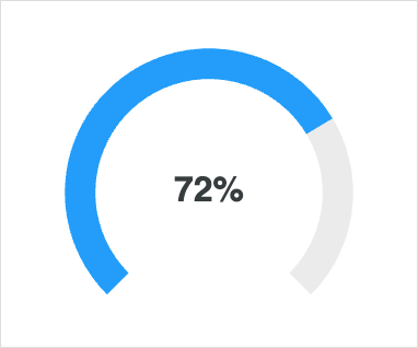
series: [72],
labels: ['Progress'],
Data Format
Gauge charts accept a single numeric value in the series array. The value is interpreted against plotOptions.radialBar.min and plotOptions.radialBar.max (default 0 and 100). The corresponding entry in labels is rendered as the metric name beneath the value.
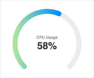
Basic Gauge
The default gauge uses a circular arc with the value rendered in the centre.
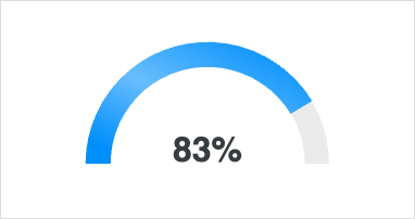
Semi-Circle Gauge
Constrain the arc to a half-circle with startAngle and endAngle. The chart auto-centres within the available canvas.
plotOptions: {
  radialBar: {
    startAngle: -90,
    endAngle: 90,
  },
},
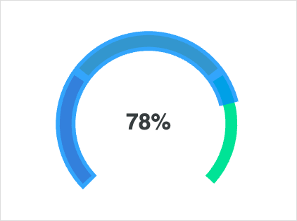
Threshold Bands
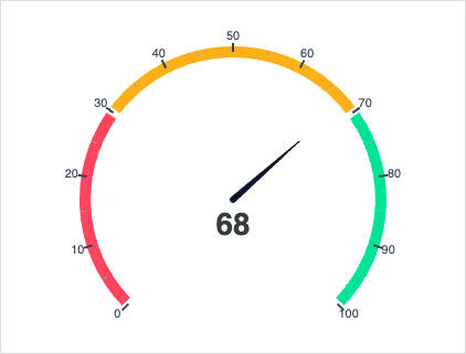
Use bands to colour-code value ranges along the arc, useful for indicating safe / warning / critical zones.
plotOptions: {
  radialBar: {
    bands: [
      { from: 0,  to: 30,  color: '#FF4560' },
      { from: 30, to: 70,  color: '#FEB019' },
      { from: 70, to: 100, color: '#00E396' },
    ],
  },
},
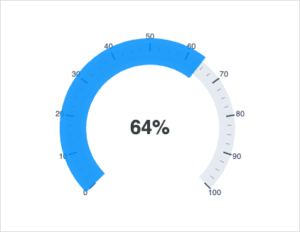
Tick Marks
Render major and minor ticks along the arc to make the scale readable.
plotOptions: {
  radialBar: {
    ticks: {
      show: true,
      major: { count: 11, length: 12 },
      minor: { count: 4,  length: 6  },
    },
  },
},
Needle Indicator
Switch the gauge to a needle by setting shape: 'needle'. The needle tweens between values on updateSeries calls, which makes it suitable for realtime / dashboard scenarios.
plotOptions: {
  radialBar: {
    shape: 'needle',
    startAngle: -135,
    endAngle: 135,
    needle: {
      showValueArc: true,
      offsetY: 0,
    },
    hollow: {
      stroke: '#e0e0e0',
      strokeWidth: 1,
    },
  },
},
For a live-updating needle, see Live Needle Gauge.
Custom Value Label
Format the value label and add custom prose with dataLabels.name.formatter and dataLabels.value.
Related
- RadialBar / Circular Gauge: multi-value radial charts and the underlying engine.
- See
plotOptions.radialBarfor the full set of gauge configuration options.