Histogram Chart
What is a Histogram Chart?
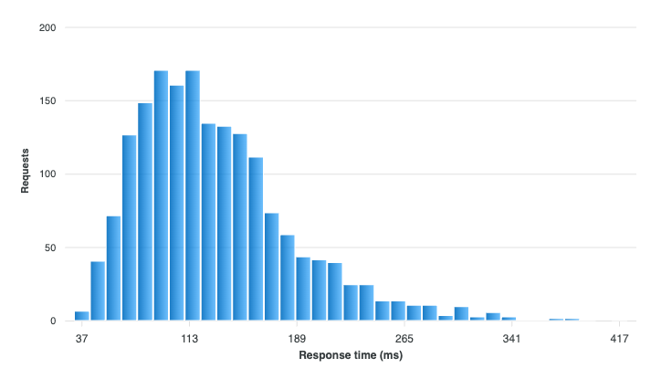
A histogram shows the distribution of a single numeric variable. The values are sorted into consecutive intervals, called bins, and each bin is drawn as a column whose height is the number of observations that fell into it. The result is the shape of your data: where it clusters, how far it spreads, whether it is skewed, and whether it has more than one peak.
Every other chart type in ApexCharts expects values that have already been aggregated. A histogram is the one that does the aggregating for you.
When to Use a Histogram Chart?
- Understanding one variable in depth: response times, order values, ages, measurement error.
- Checking a distribution's shape before choosing a summary statistic. A mean is misleading on a skewed or two-peaked distribution, and a histogram is what reveals that.
- Comparing two or three samples measured the same way, for example latency before and after a change.
When to avoid:
- For comparing many groups at once. Five overlaid distributions become unreadable; use a box plot or violin chart instead, which reduce each group to one shape.
- For categorical data. A histogram bins a continuous number line; counting categories is a bar chart.
- For very small samples. With a dozen observations the bin choice dominates the picture, and the shape you see is mostly an artifact of the binning rule.
Data Format
The series carries raw observations: one number per event, unaggregated. It can be a flat array of numbers, or objects with a y.
chart: {
  type: 'histogram'
},
series: [
  {
    name: 'Requests',
    data: [102, 87, 143, 91, 118, 96, 134, 88, 205, 97]
  }
]
You do not supply x values. The chart derives the bin edges from the data's own extent and counts the observations itself.
A complete example is on this page.
Choosing the Bins
plotOptions.histogram.bins takes either the name of a binning rule or a fixed bin count.
plotOptions: {
  histogram: {
    bins: 'auto'
  }
}
| Value | Rule |
|---|---|
'auto' | The narrower of Freedman-Diaconis and Sturges. Falls back to Sturges when the IQR is 0. |
'fd' | Freedman-Diaconis. Uses the IQR, so it resists outliers. |
'sturges' | Sturges. Assumes roughly normal data, and under-bins large samples. |
'scott' | Scott. Uses the standard deviation. |
'rice' | Rice. A simple cube-root rule. |
'sqrt' | Square root of the observation count. |
| a number | That many bins, regardless of the data. |
The bin choice is a real editorial decision, not a formatting detail: too few bins hide a second peak, too many turn the distribution into noise. 'auto' is a reasonable default, but it is worth stepping through a few widths on your own data before publishing one.
Fixed Boundaries
When the boundaries carry meaning of their own, decades, 5-minute buckets, price bands, pin them with binWidth instead. It takes a width in value units and wins over bins.
plotOptions: {
  histogram: {
    binWidth: 25
  }
}
range: [min, max] bins over an interval you choose rather than the data's own extent, which is what keeps two charts on one scale when their samples do not span the same values.
What the Y Axis Counts
normalize changes the units of the bar heights.
| Value | Bar height |
|---|---|
'count' (default) | Observations in the bin. |
'relative' | Percent of that series' total. |
'density' | count / (n * binWidth), so the total area is 1. |
'relative' is what makes two samples of different sizes comparable: 400 requests and 40,000 requests produce the same shape rather than one dwarfing the other. 'density' matters when bins have different widths, and it is also the scale a violin chart draws on, so it is the one to use if you plan to show both.
Set cumulative: true for a running total across the bins, which turns the chart into a CDF and answers "what share landed under this value" directly.
plotOptions: {
  histogram: {
    normalize: 'relative',
    cumulative: true
  }
}
Comparing Two Distributions
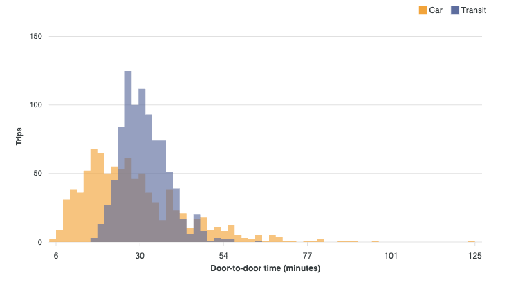
All series share one set of bin edges, derived from their combined extent. Two samples therefore always put their bars in the same places, which is the only way the comparison means anything.
By default the series overlay: each one is drawn across the full width of the bin, with a softened fill and no bin separator, so the region where they overlap reads.
plotOptions: {
  histogram: {
    overlap: true
  }
}
Set overlap: false to divide each bin between the series and get side-by-side columns instead. That arrangement is easy to misread as a clustered bar chart, so the overlay is the default. A single series is unaffected either way.
Opening a Bin Into Its Observations
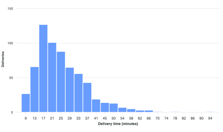
A bin stands for the rows it counted, and rowSeries() hands those rows back. Because it returns a series, the summary and the observations are two views of one dataset, and you can switch between them in place:
chart.updateOptions({
  chart: { type: 'unit' },
  series: chart.rowSeries()
})
The morph engine cuts each bar into exactly as many marks as it counted and flies them out, so the columns visibly come apart into the observations behind them rather than crossfading into a new chart.
Tree-Shaking
Histogram renders through the bar pathway, so bins get stacking, zoom, export and animation from code that already handles them. The binning itself lives in the optional stats feature.
import ApexCharts from 'apexcharts/histogram'
Or, alongside an existing bar import:
import 'apexcharts/bar'
import 'apexcharts/features/stats'
The default apexcharts bundle already includes it. Without the stats feature the chart warns and draws nothing, rather than silently rendering one bar per observation.
See tree-shaking for the full picture.
The complete list of histogram settings is documented under plotOptions.histogram.