Violin Chart
What is a Violin Chart?
A violin chart shows the full distribution of a numeric variable across categories. Each category is drawn as a mirrored density curve, wide where values are common, narrow where they are rare, so the shape reads like a smoothed, symmetric histogram. Individual observations can be scattered on top as jitter dots to expose the raw sample behind the curve.
When to Use a Violin Chart?
Use a violin chart when the shape of a distribution matters, not just its summary statistics. Common cases:
- Comparing distributions across groups (latency per service, scores per cohort, measurements per batch).
- Revealing multi-modal data: two or more clusters that a box plot would hide behind a single median.
- Showing both the smoothed density and the underlying observations together.
When to avoid:
- When your audience is not familiar with density plots. A boxplot is universally understood; a violin requires explanation.
- When sample sizes are very small (fewer than ~30 points per group). The density estimate will be unreliable and the curve shape will be misleading.
- When you need to compare more than 6-8 groups. Violins on many categories become unreadably narrow.
Violin Chart vs BoxPlot
A box plot reduces each group to a five-number summary, so two very differently shaped distributions can produce an identical box. A violin keeps the whole density, making skew, gaps, and multiple peaks visible. Both types take the same input, either a precomputed summary or the raw observations, so you can move between them without reshaping your data. A box plot even unfolds into its violin and folds back if you switch type on a live chart, once the page has loaded the violin type.
Data Format
A violin point carries an object on its y value with a precomputed density profile and, optionally, the raw observations:
import ApexCharts from 'apexcharts'
import 'apexcharts/violin'
var options = {
chart: {
type: 'violin'
},
series: [
{
name: 'Measurement',
data: [
{
x: 'Group A',
y: {
// [value, weight] pairs: the kernel-density profile
density: [[42, 0.01], [46, 0.06], [50, 0.13], [54, 0.06], [58, 0.01]],
// optional raw observations, drawn as jitter dots
points: [48.2, 51.7, 49.9, 53.1, 50.4]
}
},
{
x: 'Group B',
y: {
density: [[55, 0.02], [60, 0.10], [62, 0.18], [64, 0.10], [69, 0.02]],
points: [61.2, 63.4, 60.1, 62.8]
}
}
]
}
]
}
var chart = new ApexCharts(document.querySelector('#chart'), options)
chart.render()
When you supply density, ApexCharts draws that curve exactly as given. It is an array of [value, weight] pairs, where weight is any non-negative number (a relative height), and the chart normalizes the widths for you.
Raw Observations
You do not have to compute the density yourself. Supply the observations and the library estimates it, either as a flat number array on y or in points:
series: [{
data: [
{ x: 'Group A', points: [48.2, 51.7, 49.9, 53.1, 50.4, 47.6, 52.2] },
{ x: 'Group B', points: [61.2, 63.4, 60.1, 62.8, 64.5, 59.7] }
]
}]
plotOptions.violin.kde tunes the estimate: bandwidth is the kernel width in value units (unset uses Silverman's rule of thumb), and resolution is the number of density samples per violin, 64 by default. Note that bandwidth is the statistical parameter, whereas bandwidthScale only scales the drawn width.
Deriving the density takes the stats feature. The default apexcharts bundle includes it, so the two imports in the Data Format example are enough. On the lean core (apexcharts/core) add import 'apexcharts/features/stats' as well (dist/features/stats.js by script tag). Without it, 8.0 warns in the console and a violin of raw observations draws nothing until the feature loads, while a precomputed density draws as usual. See Tree-Shaking below.
Because points is the same field the jitter overlay reads, the sample lives in exactly one place whether the library estimates the curve or you do.
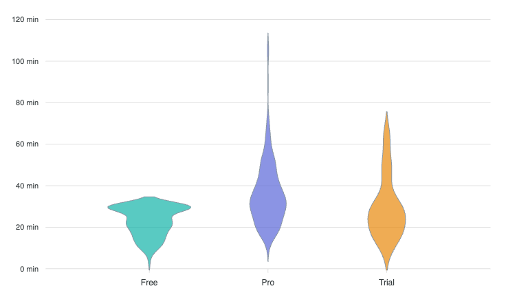
A complete basic example is on this page.
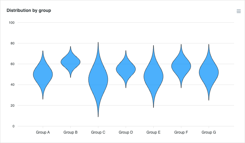
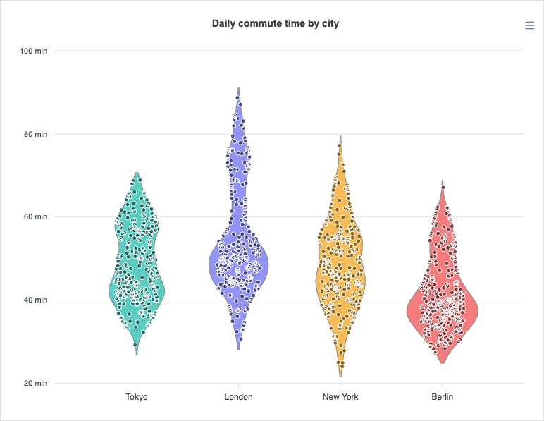
Overlaying Observations (Jitter)
Set plotOptions.violin.points.show to scatter the raw points on top of each curve. jitter controls how widely the dots spread inside the curve (a fraction of the half-width), and constrainToViolin keeps them within the density outline at each value.
plotOptions: {
violin: {
points: {
show: true,
size: 3,
jitter: 0.6
}
}
}
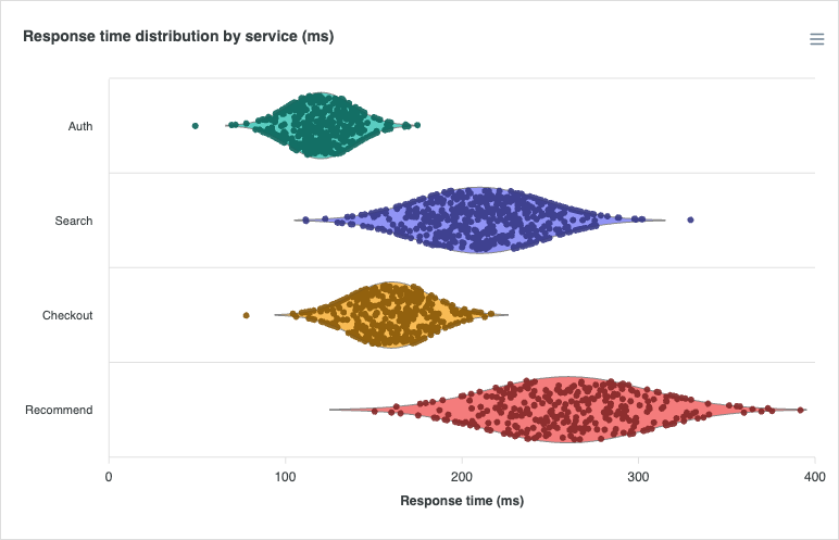
Horizontal Violin
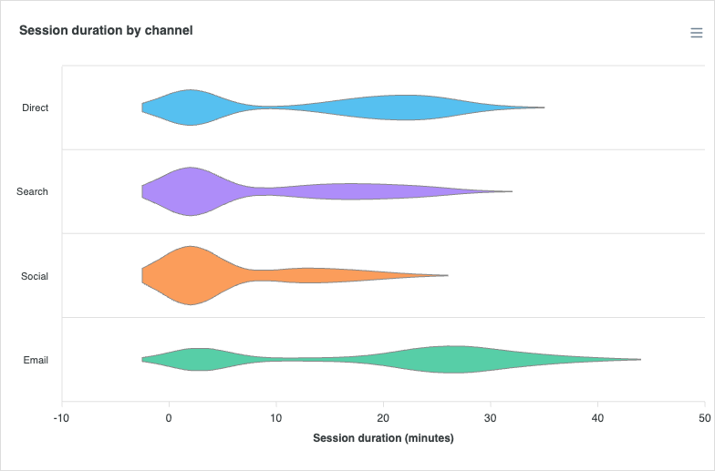
The violin can be laid out horizontally by flipping the underlying bar orientation, the same switch used by bar and box-plot charts. distributed: true gives each category its own colour.
plotOptions: {
bar: {
horizontal: true,
distributed: true
}
}
Normalization
By default (normalize: 'individual') every violin is scaled to its own peak, so all of them fill the category slot regardless of sample size. Set normalize: 'group' to share one scale across the series, keeping widths proportional to density between categories, useful when the relative spread of each group carries meaning. The example below uses grouped normalization to keep the twin-humped (bimodal) shapes comparable.
plotOptions: {
violin: {
normalize: 'group'
}
}
Colouring Observations by Value
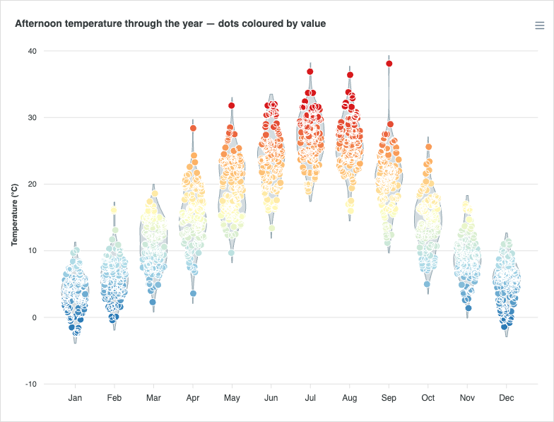
The jitter dots can be coloured along a ramp by their value with points.colorScale, turning a single violin into a value-graded scatter that reinforces where each observation sits in the distribution.
plotOptions: {
violin: {
points: {
show: true,
colorScale: {
colors: ['#2c7bb6', '#abd9e9', '#ffffbf', '#fdae61', '#d7191c'],
min: 0,
max: 32
}
}
}
}
Tree-Shaking
Violin is a tree-shakeable chart type, and since 8.0 it is not in the default bundle. Next to the default bundle it is one import:
import ApexCharts from 'apexcharts'
import 'apexcharts/violin'
Without a bundler, load dist/violin.js next to the main script:
<script src="https://cdn.jsdelivr.net/npm/apexcharts"></script>
<script src="https://cdn.jsdelivr.net/npm/apexcharts/dist/violin.js"></script>
On the lean core, violin draws through the bar renderer, so import apexcharts/bar as well. A violin built from raw observations also needs the stats feature, which the default bundle has and the lean core does not; 8.0 warns in the console when it is missing:
import ApexCharts from 'apexcharts/core'
import 'apexcharts/bar'
import 'apexcharts/violin'
import 'apexcharts/features/stats' // only for raw observations (`points`, or a flat number array as `y`)
apexcharts/full (apexcharts.full.min.js by script tag) has violin along with every other chart type and feature. If the violin type is missing, the console names the line to add and the chart draws nothing.
The full list of violin-specific settings is documented under plotOptions.violin.