Line Chart
What is a Line Chart?
A Line Chart, or a Line Graph, is a basic type of charts that depicts trends and behaviors over time. It displays information as a series of data points also known as “markers” connected with a line. A unique feature of Line Charts is the possibility to incorporate large data into a single chart without any difficulty in viewing or understanding the information being presented.
In this Line Chart guide, we will go through the configuration of Line Graphs, will give you common use cases scenarios, and will show you how to plot different Line Chart types.
When to use a line chart
Use a line chart when:
- Your x-axis is ordered: time, sequential steps, ranked categories.
- You care about the slope (rate of change) between points, not just the individual values.
- You have multiple series to compare on the same scale.
Avoid a line chart when categories are unordered (use a bar chart instead) or when you want to emphasize the total area under the curve (use an area chart).
Line chart vs area chart
A line chart and an area chart encode identical data. The difference is that an area chart fills the region between the line and the x-axis baseline with color. Choose a line chart when:
- You have three or more overlapping series — filled areas stack visually and obscure each other.
- The trend (the shape of the line) is more important than the magnitude.
Choose an area chart when:
- You have one or two series and want to emphasize volume or cumulative quantity.
- You are showing a range with upper and lower bounds.
In ApexCharts, switching between them is one property: chart.type: 'line' vs chart.type: 'area'.
Data Format & How to Make a Line Chart?
The data format for the line chart is the same as for the other XY charts. You will need to provide your data in the series array in chart options. To create this type of chart, set the chart.type property to Line. More information about how to build the series can be found at Working with data page.
Line Charts Types
Currently, the Line Chart control by ApexCharts gives you the option to configure three Line Chart types which connect the data-values in different ways. The three variants of Line Charts include:
- Spline Line Chart
- Straight Line Chart
- Stepline Line Chart
In the following sections, we will show you how to plot the three different variants quickly and easily.
Spline Line Chart
In a Spline chart, the data-points are connected using smooth curves. To draw such a smooth curve, you have to set the following option

stroke: {
  curve: 'smooth',
}
Straight Line Chart
Connect the data-points in a straight line and not apply any curve to the line.
stroke: {
  curve: 'straight',
}
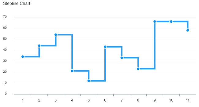
Stepline Chart
In a step-line chart, points are connected by horizontal and vertical line segments, looking like steps of a staircase.
stroke: {
  curve: 'stepline',
}
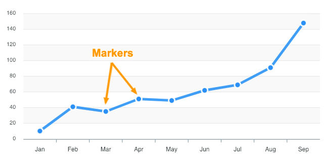
Controlling markers/points on the lines
Markers are used to represent a particular data-point on the chart. Any size greater than 0 will enable the markers.
To hide the markers, you can set the size to 0 as illustrated in the below code.
markers: {
    size: 0,
}
More information how to customize the markers can be found at markers documentation.
Using line in a combo chart
With ApexCharts, you can plot a line with other chart types. The below examples give an idea of how a line can be combined with other chart types to create a mixed/combo chart.
You have to specify the type in the series array when building a combo chart like this.
series: [{ type: 'line', data: [...] }, { type: 'column', data: [...] }]

You can check out the code for the above example on the combo chart demo.
Multi-axis line chart
When you have a significant difference in value ranges, multi-axis charts allow you to plot multiple data sets with different types of units.
In a multi-axis chart, multiple y-axes can be rendered along the left and right sides of the chart. You'll get a clear idea by running the below example with 2 y-axis scales.
Plotting a time-series
A time-series graph is a data viz tool that plots data values at progressive intervals of time. With ApexCharts, a time-series is created if you provide timestamp values in the series as shown below and set xaxis.type to 'datetime'.
series: [{
  data: [{
    x: new Date('2018-02-12').getTime(),
    y: 76
  }, {
    x: new Date('2018-02-12').getTime(),
    y: 76
  }]
}],
xaxis: {
  type: 'datetime'
}
 View the full demo at Zoomable Line chart demo.
When plotting a time-series chart with a large number of data-points, zooming and panning help to get a clear view by providing a closer look into the graph. Hence, you will see all the zooming tools if you provide xaxis.type: 'datetime' property.
Styling Line Charts
With ApexCharts, you can give your desired look to your line graphs and enhance the look of your dashboard design. We will go through options like setting colors of the lines, changing the width of the stroke as well as using different filling methods to fill the SVG paths.
Dashed lines
Dashed lines are useful in showing a certain type of data. For eg., when there is incomplete data available or when you want to compare with previous data in a multi-series line graph, a dashed line is helpful in such cases.
stroke: {
  dashArray: 2
}
The above code creates dashes in the borders of the SVG path. A higher number creates more space between dashes in the border.

View the full example on Dashed Line Chart
Changing colors of the lines
To change the color of the lines in your graphs, you just have to modify the [colors](/docs/options/colors) property in the configuration. If you want to use predefined theme palettes, you can use the [](/docs/options/theme/#palette)palette option of the themes.
colors: ['#2E93fA', '#66DA26', '#546E7A', '#E91E63', '#FF9800'];
Line width
Changing the width of the line is easy.
stroke: {
  width: 2
}
Fill types
Configure the SVG paths by specifying whether to fill the paths with solid colors or gradient or pattern.
fill: {
  type: 'gradient' / 'solid' / 'pattern' / 'image'
}

More information on how to configure the path filling can be found at [fill](/docs/options/fill/#filltype) options.
When to Use a Line Chart?
There are several common scenarios for which a Line Chart or Graph is the best option:
- In case you want to compare different trends on a timeline.
- If you have to show the difference between 2 or more data series.
- Need to graphically represent time-series data in a detailed way.
- When you have to visualize large, high-volume data sets and you want to integrate interactions like Panning, Zooming and Drill-down.
Related Chart Types
Check out the related chart types guide to learn more about integrating different types of graphs available in ApexCharts.
[

Area Chart Guide
](/docs/chart-types/area-chart-guide/)[

Candlestick Guide
](/docs/chart-types/candlestick/)[

Combo Chart Guide
](/docs/chart-types/multiple-yaxis-scales/)