markers
Configuration Structure
markers: {}size
0Size of the marker point.
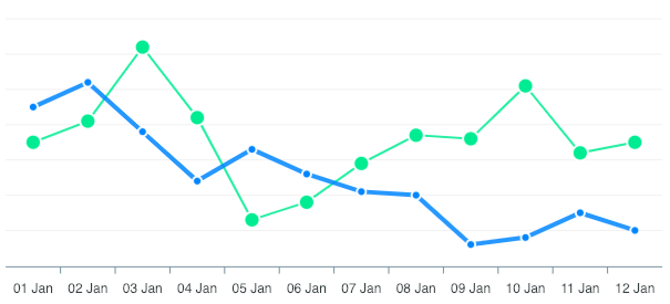
In a multi-series chart, you can provide an array of numbers to display different size of markers on different series
markers: {
  size: [4, 7]
}
colors
undefinedSets the fill color(s) of the marker point.
strokeColors
'#fff'Stroke Color of the marker. Accepts a single color or an array of colors in a multi-series chart.
strokeWidth
2Stroke Size of the marker.
strokeOpacity
0.9Opacity of the border around marker.
strokeDashArray
0Dashes in the border around marker. Higher number creates more space between dashes in the border.
fillOpacity
1Opacity of the marker fill color.
discrete
[]Allows you to target individual data-points and style particular marker differently
markers: {
  discrete: [{
    seriesIndex: 0,
    dataPointIndex: 7,
    fillColor: '#e3e3e3',
    strokeColor: '#fff',
    size: 5,
    shape: "circle"
  }, {
    seriesIndex: 2,
    dataPointIndex: 11,
    fillColor: '#f7f4f3',
    strokeColor: '#eee',
    size: 4,
    shape: "circle"
  }]
}
shape
'circle'Shape of the marker.
Available Options for shape
- circle
- square
- line
- plus
- cross
- star
- sparkle
- diamond
- triangle
offsetX
0Sets the left offset of the marker
offsetY
0Sets the top offset of the marker
onClick
undefinedWhen a marker is clicked, markers.onClick is called.
markers: {
  onClick: function(e) {
    // do something on marker click
  }
}
Note: This event will not work for a shared and non-intersecting tooltip. You will have to modify your tooltip to the following code to catch the events.
tooltip: {
  shared: false,
  intersect: true
}
onDblClick
undefinedWhen a marker is double clicked, markers.onDblClick is called.
markers: {
  onDblClick: function(e) {
    // do something on marker double click
  }
}
Note: This event will not work for a shared and non-intersecting tooltip. You will have to modify your tooltip to the following code to catch the events.
tooltip: {
  shared: false,
  intersect: true
}
showNullDataPoints
trueWhether to show markers for null values in a line/area chart. If disabled, any null values present in line/area charts will not be visible.
hover
size
undefinedFixed size of the marker when it is active
sizeOffset
3Unlike the fixed size, this option takes the original markers.size and increases/decreases the value based on it.
So, if markers.size: 6, markers.hover.sizeOffset: 3 will make the marker's size 9 when hovered.
largeDatasetThreshold
0Above this many points in a series, draw that series' markers as one path element per marker size (a subpath per point) instead of one element per point. 0 (the default) leaves it off.
Each per-point element costs a DOM node, about 16 attribute writes and an appendChild, which is why markers dominate a large render rather than anything about the data. At 2000 points, markers take 15ms of an 18ms render; batched, they take about 1ms.
markers: {
  largeDatasetThreshold: 1000
}
It also covers the markers showNullDataPoints adds implicitly, which is what makes a null-heavy series slow even at size: 0: every point beside a null is isolated and gets its own dot, so a 2000-point series with half its values null built about 1000 elements. Those dots are a different size from the configured ones, hence one path per size rather than one per series.
It is opt-in because it is not pixel-identical where markers overlap, and above roughly 1000 points in a normal-width chart they always do. One path is rasterized as a single region: all the fills paint, then all the strokes, so the seams between neighbours disappear and dense clusters read flatter. Measured at 1% to 9% of pixels, scaling with density. Markers sparse enough not to touch are unaffected.
It applies only where markers are already non-interactive and uniform: a plain line or area chart with the default sweep tooltip, no discrete markers, no per-point colours, no marker click handlers and no dataPointSelection handler. A batched series has no .apexcharts-marker nodes, so the hover dot is served by the tooltip's own marker (the same one size: 0 charts use), the keyboard focus ring lands on that marker, and the per-marker reveal is replaced by a series-level fade.
Rather than take the numbers above on trust, measure your own case: the render cost lab sweeps point count, null density and marker size with batching on and off, and reports the render time for each combination.
seriesIndex
Which series the point belongs to. Required, since discrete targets one point by position.
dataPointIndex
Index of the point within that series.
size
Size of this one marker, overriding markers.size.
shape
Shape of this one marker, overriding markers.shape.
fillColor
Fill colour of this one marker.
strokeColor
Stroke colour of this one marker.