Pie / Donut
What is a Pie/Donut Chart?
Pie Charts and Donut Charts are instrumental visualization tools useful in expressing data and information in terms of percentages, ratios. A pie chart is most effective when dealing with a small collection of data. It is constructed by clustering all the required data into a circular shaped frame wherein the data are depicted in slices. In ApexCharts, the pie/donut slices can be crafted by patterns/gradients/images for increasing the visual appeal.
All the options and configuration described below will work for pie and donut charts both unless stated otherwise.
When to use pie and donut charts
Pie and donut charts work well when:
- You have 2-5 distinct categories that together form a meaningful whole (100%).
- The largest slice is roughly 3-10x the smallest, enough contrast to read the differences.
- The exact percentages are less important than the general "biggest vs smallest" picture.
They break down when:
- You have more than 5-6 slices. Small slices become unreadable and comparison is impossible.
- Categories do not add to a meaningful 100% total.
- Readers need to compare specific values precisely. A bar chart is easier to read for exact comparison.
Pie vs donut
A pie chart is a filled circle. A donut chart is a pie with the center hollow. Both encode identical data. Choose a donut when you want to display a summary statistic (total, percentage, label) in the center of the chart, the hollow provides space for it. In ApexCharts, switch between them with chart.type: 'pie' vs chart.type: 'donut'.
Data Format
The data format for the pie/donut series is a single-dimensional array of numeric values as described below. The names of the values have to be provided in the labels array separately.
options = {
  series: [44, 55, 13, 33],
  labels: ['Apple', 'Mango', 'Orange', 'Watermelon']
}
The above syntax is for core apexcharts library. If you are using Vue/React, you need to pass labels in chartOptions
series: [44, 55, 41, 17, 15],
chartOptions: {
  labels: ['Apple', 'Mango', 'Orange', 'Watermelon']
}
Donut
Donut Charts are similar to pie charts whereby the center of the chart is left blank. The pie chart can be transformed into a donut chart by modifying a single property.
options = {
  chart: {
    type: 'donut'
  }
}
Customizing Data Labels
Data-Labels in pie/donut charts are the percentage values that are displayed in slices. 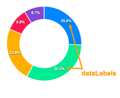
The configuration for these data labels has to be done in the following way.
options = {
  dataLabels: {
    enabled: true,
    formatter: function (val) {
      return val + "%"
    },
    dropShadow: {
      ...
    }
  }
}
Full documentation for dataLabels can be accessed here
External (outer) data labels
By default the slice names live in the legend and only the percentages sit inside the slices. When names are long, or there are enough slices that mapping legend colours back to slices gets tedious, you can render each name outside the pie, joined to its slice by a leader line. The percentage keeps rendering inside the slice, so both pieces of information stay visible at a glance. External labels apply to pie and donut charts.
Enable them under plotOptions.pie.dataLabels.external:
options = {
  chart: {
    type: 'donut'
  },
  plotOptions: {
    pie: {
      dataLabels: {
        external: {
          show: true,
          connector: {
            show: true,
            length: 16
          }
        }
      }
    }
  }
}
To control the label text, pass a formatter. Return a single string for one line, or an array of strings to stack multiple lines, for example the name above the percentage:
external: {
  show: true,
  formatter: function (name, opts) {
    return [name, opts.percent.toFixed(0) + '%']
  }
}
The full option list, including connector width, length, gap, and label styling, is in the plotOptions.pie reference.
Changing the size of the pie
If the default size calculation of the pie doesn't work great for you, you have some options to control the size of the pie/donut chart.
1. Set the scaling of the pie
This is similar to CSS transform: scale() property where you can resize the pie/donut by providing a numeric value and it increases or decreases the size based on the value you provide.
options = {
  plotOptions: {
    pie: {
      customScale: 0.8
    }
  }
}
2. Set a fixed size
You can also set a fixed size for the pie/donut. Note that the size which you set there won't be responsive and will be fixed regardless the available width around it.
options = {
  plotOptions: {
    pie: {
      size: 200
    }
  }
}
Changing the size of the donut
The inner donut radius can be controlled with plotOptions.pie.donut.size property. The value has to be a percentage value that will increase/decrease the spacing inside the donut based on the percentage you provide.
options = {
  plotOptions: {
    pie: {
      donut: {
        size: '65%'
      }
    }
  }
}
Donut Labels
Apart from the dataLabels (percentages inside slices), you can also show donut labels when user hovers over a slice.
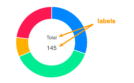
The donut labels configuration has to be done as follows.
options = {
  plotOptions: {
    pie: {
      donut: {
        labels: {
          show: true,
          name: {
            ...
          },
          value: {
            ...
          }
        }
      }
    }
  }
}
Full configuration for donut labels can be access here
Disable slice expansion
When you click on the pie/donut slice, it expands it's size on selection.
You can turn off this default behaviour by setting
options = {
  plotOptions: {
    pie: {
      expandOnClick: false
    }
  }
}