Radar
What is a Radar Chart?
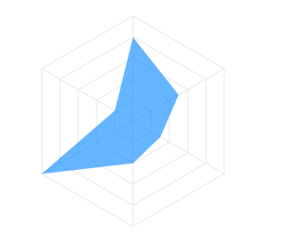
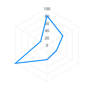
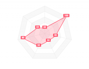
The radar chart, also known as spider chart or web chart is equivalent to a parallel coordinates plot in polar coordinates. It is a web-shaped diagram used to indicate the relative influence of different numerical parameters. The values are plotted on scales that radiate out of a point and are then connected to each other.
When to use a radar chart
Use a radar chart when:
- You are comparing multiple entities across the same set of 4-8 categories (skill profiles, product ratings, athlete benchmarks).
- The categories are qualitative and non-ordered. A radar's symmetrical layout treats all axes equally.
- Readers will recognize the shape as a visual "fingerprint" of an entity.
Avoid a radar chart when:
- You have more than 8-10 categories. The axes become dense and the polygon meaningless.
- Categories have a natural order or time sequence (use a line chart).
- You need readers to compare exact values (a grouped bar chart is more precise).
Radar chart vs polar area chart
Both use a circular layout with category axes radiating from the center. The difference is in how values are encoded:
| Radar | Polar area | |
|---|---|---|
| Encoding | Distance from center along each axis | Sector radius (all sectors same angle) |
| Multiple series | Connected polygon per series | Not typical |
| Shape readability | Profile comparison (overlapping polygons) | Magnitude per category (isolated sectors) |
Use radar when comparing multiple entities across the same attributes. Use polar area when showing the magnitude of independent categories for a single subject.
Data Format
The data format for the radar chart is the same as used on other axis-based charts (line/bar). The below example shows the accepted data format for a radar series. Labels for the dataPoints has to be provided in the labels array separately.
options = {
  series: [
    {
      name: "Radar Series 1",
      data: [45, 52, 38, 24, 33, 10]
    },
    {
      name: "Radar Series 2",
      data: [26, 21, 20, 6, 8, 15]
    }
  ],
  labels: ['April', 'May', 'June', 'July', 'August', 'September']
}
Fill
You can fill the area inside radar as well as apply opacity to the filled area.
options = {
  fill: {
    opacity: 0.5,
    colors: []
  }
}
Full documentation for fill can be found at options.fill
Stroke / Borders
The lines used to draw the radar can be customized in the following way.
options = {
  stroke: {
    show: true,
    width: 2,
    colors: [],
    dashArray: 0
  }
}
Full documentation for stroke can be found at options.stroke
Markers
The markers are the circles which appear on data-points useful on displaying tooltips when user hovers over them.
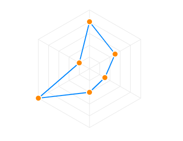 The markers can be customized in the following way.
options = {
  markers: {
    size: 5,
    hover: {
      size: 10
    }
  }
}
Full documentation for markers can be found at options.markers
Customizing the polygons
The polygon lines of the radar chart are the equi-angular spokes, called radii, which looks like a spider's web.
 The styles of this polygon can be controlled by the
 plotOptions.radar.polygons property as below.
options = {
  plotOptions: {
    radar: {
      polygons: {
        strokeColor: '#e8e8e8',
        fill: {
            colors: ['#f8f8f8', '#fff']
        }
      }
    }
  }
}
Customizing the Y-axis labels
The labels that appear on the vertical line of radar chart can be controlled by yaxis property in the configuration.
Customizing the X-axis labels
The labels that appear outside the radar chart can be enabled/disabled by setting xaxis.labels.show. Please note that not all properties of xaxis are applicable in case of radar chart as this chart is a little different as compared to other XY charts. Only the keys listed below are applicable for xaxis of radar chart.
xaxis: {
categories: ['April', 'May', 'June', 'July', 'August', 'September'],
labels: {
  show: true,
  style: {
    colors: ["#a8a8a8"]
    fontSize: "11px"
    fontFamily: 'Arial'
  }
}
}
Customizing the Data Labels
The labels that appear on the data-points of the radar chart are knows as datalabels.
 Data labels can be customized by the following way
dataLabels: {
  enabled: true,
  background: {
    enabled: true,
    borderRadius:2,
  }
}