Tooltip
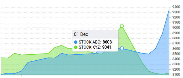
Tooltip allows you to preview data when user hovers over the chart area.
Setting global config for Tooltip
To set global options for the tooltips, define them in Apex.tooltip.
Shared Tooltip
The shared tooltip is the default for axis charts (line, area, bar). It shows values for all series at the same x position when the user hovers anywhere along the x axis:
tooltip: {
  shared: true,     // default true for axis charts; shows all series at the hovered x
  intersect: false  // show tooltip when hovering near a point, not only exactly on it
}
Set intersect: true if you want the tooltip to appear only when the cursor is directly over a data point.
Formatting
Tooltip texts can be modified via formatters. A formatter is a function that receives the raw value and returns the string to display. Formatters are available for the x, y, and z axes:
tooltip.x.formatter- the x-axis value label (axis charts)tooltip.y.formatter- the y-axis value labeltooltip.z.formatter- the z value (bubble charts only)
Y-value formatter
Use tooltip.y.formatter to add units, currency symbols, or any custom formatting to the value shown in the tooltip:
tooltip: {
  y: {
    formatter: function(value, { series, seriesIndex, dataPointIndex, w }) {
      return '$' + value.toLocaleString()
    }
  }
}
The second argument is a destructured object exposing the full series data, the current series and data point indices, and the chart globals via w.
DateTime Formatting
X values for datetime series can be formatted with:
tooltip: {
  x: {
    format: 'DD/MM'
  }
}
View the available options for datetime X values: Datetime format
Custom HTML Tooltip
When you need full control over the tooltip layout, pass a custom function. It receives the series data and context, and must return an HTML string. ApexCharts appends the returned element to the chart container:
tooltip: {
  custom: function({ series, seriesIndex, dataPointIndex, w }) {
    const value = series[seriesIndex][dataPointIndex]
    const label = w.globals.labels[dataPointIndex]
    return (
      '<div class="custom-tooltip">' +
        '<span class="label">' + label + '</span>' +
        '<span class="value">$' + value.toLocaleString() + '</span>' +
      '</div>'
    )
  }
}
Style the tooltip with plain CSS targeting the class you put on the wrapper element:
.custom-tooltip {
  padding: 8px 12px;
  background: #1a1a2e;
  color: #fff;
  border-radius: 4px;
  font-size: 14px;
}

.custom-tooltip .label {
  display: block;
  font-weight: 600;
  margin-bottom: 4px;
}

.custom-tooltip .value {
  color: #a0c4ff;
}
Fixed Tooltip Position
By default the tooltip follows the cursor. Use tooltip.fixed to pin it to a corner of the chart. This is useful when the chart is near an edge of the viewport and the floating tooltip clips off screen:
tooltip: {
  fixed: {
    enabled: true,
    position: 'topRight',  // 'topRight' | 'topLeft' | 'bottomRight' | 'bottomLeft'
    offsetX: 0,
    offsetY: 0
  }
}
Styling Tooltips
The tooltip element is plain HTML, so its appearance is controlled with CSS. The root selector is .apexcharts-tooltip. Override it in your stylesheet to change font, background, padding, or any other property.
Tooltip Theme
You can set the built-in theme to light or dark with tooltip.theme:
tooltip: {
  theme: 'dark'
}
For the full set of options available for the tooltip, see tooltip configuration