chart
Configuration Structure
chart: {}
chart
width
'100%'Width of the chart. Accepts Number (400) which is treated as pixels or String ('400px' or '100%')
height
'auto'Height of the chart. The default value 'auto' is calculated based on the golden ratio 1.618 which makes a height roughly 61.8% of its width. Accepts Number (400) or String ('400px' or '100%')
type
'line'Specify the chart type. Available options:
- line
- area
- bar
- pie
- donut
- radialBar
- scatter
- bubble
- heatmap
- candlestick
- boxPlot
- radar
- polarArea
- rangeBar
- rangeArea
- treemap
foreColor
'#373d3f'Sets the text color for the chart. Defaults to #373d3f.
fontFamily
'Helvetica, Arial, sans-serif'Sets the font family for all text elements of the chart. Defaults to 'Helvetica, Arial, sans-serif'
background
''Background color for the chart area. If you want to set background with css, use .apexcharts-canvas to set it.
offsetX
0Sets the left offset for the entire chart.
offsetY
0Sets the top offset for the entire chart.
dropShadow
enabled
falseEnable a dropshadow for paths of the SVG
enabledOnSeries
undefinedProvide series index on which the dropshadow should be enabled.
top
2Set top offset for shadow
left
2Set left offset for shadow
blur
4Set blur distance for shadow
color
'#000'Give a color to the shadow. If array is provided, each series can have different shadow color
opacity
0.7Set the opacity of shadow.
nonce
undefinedNonce attribute added to the style tag for CSP (Content Security Policy). If set, the nonce will be appended to the style tag.
id
undefinedA chart ID is a unique identifier that will be used in calling certain ApexCharts methods. Also used in group option to sync charts. You will also need chart.id to be set in case you use updateOptions() or exec() methods.
group
undefinedSetting chart.group with a common name for multiple charts will sync the tooltip, panning, and zooming across all charts with the same group name. Each chart needs to have a unique chart.id.
Example:
// Chart 1
var chart1 = new ApexCharts(el, {
  chart: {
    id: 'chart1',
    group: 'social',
  }
})

// Chart 2
var chart2 = new ApexCharts(el, {
  chart: {
    id: 'chart2',
    group: 'social',
  }
})
defaultLocale
'en'Use this option to set the default locale. Requires the locales array to have the locale data for that locale name.
locales
name
Name of the locale you will be defining options for. Can be en, fr, etc.
options
months
['January', ..., 'December']Full month names in your preferred language
shortMonths
['Jan', ..., 'Dec']Abbreviations of months
days
['Sunday', ..., 'Saturday']Full names of days in your language
shortDays
['Sun', ..., 'Sat']Abbreviated day names
toolbar
download
'Download SVG'Tooltip title text which appears when you hover over download icon
selection
'Selection'Tooltip title text which appears when you hover over selection icon
selectionZoom
'Selection Zoom'Tooltip title text which appears when you hover over selection zoom icon
zoomIn
'Zoom In'Tooltip title text which appears when you hover over zoom in icon
zoomOut
'Zoom Out'Tooltip title text which appears when you hover over zoom out icon
pan
'Panning'Tooltip title text which appears when you hover over pan icon
reset
'Reset Zoom'Tooltip title text which appears when you hover over reset icon
parentHeightOffset
15A small padding is applied to the bottom of the chart area to make the chart look neat. You may not need this in case you set a fixed height. This is useful if you have a sparkline chart in a small container.
redrawOnParentResize
trueRe-render the chart when the element is resized. Useful if a chart is rendered in a dynamically sized container.
redrawOnWindowResize
trueRe-render the chart when the window is resized. Useful in cases where auto-resizing on window resize may cause issues.
sparkline
enabled
falsesparkline hides all the elements of the charts other than the primary paths. Helps to visualize data in small areas. See example
stackType
'normal'When stacked, should the stacking be percentage based or normal stacking. Available options:
'normal''100%'
stackOnlyBar
trueWhen using a combo chart (line and bar together), stack only the bar series and leave the line series unstacked.
toolbar
show
trueDisplay the toolbar / menu in the top right corner.
offsetX
0Sets the left offset of the toolbar.
offsetY
0Sets the top offset of the toolbar.
tools
download
true
Show the download menu / hamburger icon in the toolbar. If you want to display a custom icon instead of hamburger icon, you can provide HTML string in this property.
download: true
/* OR */
download: '<img src="/static/icons/download.png" class="ico-download" width="20">'
ApexCharts has built-in support to allow exporting the chart to popular image formats like PNG or SVG and also allows exporting the chart data to a CSV file.
By default, all XY charts have the toolbar enabled in them which has a hamburger icon at the top right corner. Clicking the hamburger icon opens a menu which has following options to download
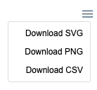
- Export to SVG
- Export to PNG
- Export to CSV creates a comma separated values file, which consists of chart data.
selection
trueShow the rectangle selection icon in the toolbar. If you want to display a custom icon for selection, you can provide HTML string in this property.
Make sure to also enable chart.selection when showing the selection tool.
chart: {
  selection: {
    enabled: true
  }
}
zoom
trueShow the zoom icon which is used for zooming by dragging selection on the chart area. If you want to display a custom icon for zoom, you can provide HTML string in this property.
zoomin
trueShow the zoom-in icon which zooms in 50% from the visible chart area. If you want to display a custom icon for zoom-in, you can provide HTML string in this property.
zoomout
trueShow the zoom-out icon which zooms out 50% from the visible chart area. If you want to display a custom icon for zoom-out, you can provide HTML string in this property.
pan
trueShow the panning icon in the toolbar.
reset
trueReset the chart data to it's initial state after zommin/zoomout/panning. If you want to display a custom icon for reset, you can provide HTML string in this property.
customIcons
Allows to add additional icon buttons in the toolbar. In the below example, index should be used to place at a particular position in the toolbar.
customIcons: [{
icon: '<img src="/static/icons/chart-carpet.png" width="20">',
index: 4,
title: 'tooltip of the icon',
class: 'custom-icon',
click: function (chart, options, e) {
  console.log("clicked custom-icon")
}
}]
export
scale
Scale the exported image. Example: scale: 0.5 or scale: 2
width
Provide a fixed width of the exported image. Don't append unit to the number, just provide a numeric value, it will be considered in px.
csv
filename
Name of the csv file. Defaults to auto generated chart ID
columnDelimiter
','Delimeter to separate data-items. Defaults to comma.
headerCategory
'category'Column Title of X values
headerValue
'value'Column Title of Y values
categoryFormatter
Format the x values when exporting to CSV.
valueFormatter
Format the y values when exporting to CSV.
svg
filename
Name of the SVG file. Defaults to auto generated chart ID
png
filename
Name of the PNG file. Defaults to auto generated chart ID
autoSelected
'zoom'Automatically select one of the following tools when the chart loads.
- zoom
- selection
- pan
zoom
enabled
trueTo allow zooming in axis charts.
Note: In a category x-axis chart, to enable zooming, you will also need to set xaxis.tickPlacement: 'on'.
Read more on the Category Axis Zoom tutorial.
type
'x'Allow zooming either on both x-axis, y-axis or on both axis. Available options
- x
- y
- xy
Known Issue: In synchronized charts, xy or y will not update charts in sync, while x will work correctly.
autoScaleYaxis
falseWhen this option is turned on, the chart's y-axis re-scales to a new low and high based on the visible area. Helpful in situations where the user zoomed in to a small area to get a better view.
Known Issue: This option doesn't work in a multi-axis chart (when you have more than 1 y-axis)
allowMouseWheelZoom
trueWhether to allow zooming using mouse wheel.
zoomedArea
zoomedArea is the area which is drawn when a user drags the mouse from one point to another
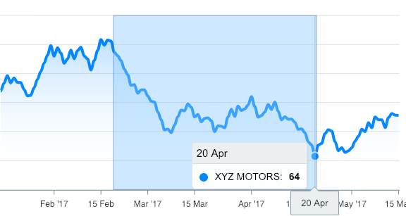
fill
color
'#90CAF9'Background color of the selection zoomed area
opacity
0.4Sets the transparency level of the selection fill
stroke
color
'#0D47A1'Border color of the selection zoomed area
opacity
0.4Sets the transparency level of the selection border
width
1Sets the width selection border
selection
enabled
falseTo allow selection in axis charts. Selection will not be enabled for category x-axis charts, but only for charts having numeric x-axis. For eg., timeline charts.
type
'x'Allow selection either on both x-axis, y-axis or on both axis. Available options
- x
- y
- xy
fill
color
'#24292e'Background color of the selection rect which is drawn when user drags on the chart.
opacity
0.1Opacity of background color of the selection rect.
stroke
width
1Border thickness of the selection rect.
dashArray
3Creates dashes in borders of svg path. Higher number creates more space between dashes in the border.
color
'#24292e'Colors of selection border.
opacity
0.4Opacity of selection border.
xaxis
min
undefinedStart value of x-axis. For a time-series chart, a timestamp should be provided
max
undefinedEnd value of x-axis. For a time-series chart, a timestamp should be provided.
yaxis
min
undefinedStart value of y-axis. (if used in a multiple y-axes chart, this considers the 1st y-axis).
max
undefinedEnd value of y-axis (if used in a multiple y-axes chart, this considers the 1st y-axis).
animations
enabled
trueEnable or disable all the animations that happen initially or during data update.
speed
800Speed at which animation runs.
animateGradually
enabled
trueGradually animate one by one every data in the series instead of animating all at once.
delay
150Speed at which gradual (one by one) animation runs.
dynamicAnimation
enabled
trueAnimate the chart when data is changed and chart is re-rendered.
speed
350Speed at which dynamic animation runs whenever data changes.
brush
enabled
falseTurn on this option to enable brush chart options. After you enable brush, you need to set target chart ID to allow the brush chart to capture events on the target chart.
target
undefinedChart ID of the target chart to sync the brush chart and the target chart. If you have an array of multiple chart IDs, use targets property instead.
autoScaleYaxis
trueIf set to true, the Y-axis will automatically scale based on the visible min/max range.
Note: One important configuration to set in a brush chart is the chart.selection option. The range which you set in chart.selection will act as brush in the brush chart
Here's an example code snippet how brush/target works
var targetChartOptions = {
  chart: {
    id: 'target-chart',
    type: 'line',
    height: 230,
    toolbar: {
      autoSelected: 'pan',
      show: false
    }
  },
}

var brushChartOptions = {
  chart: {
    height: 130,
    type: 'area',
    brush:{
      target: 'chart2',
      enabled: true
    },
    selection: {
      xaxis: {
        min: new Date('19 Jun 2017').getTime(),
        max: new Date('14 Aug 2017').getTime()
      }
    },
  },
}
And, here you will find a complete example of brush charts usage Brush chart demo.
events
animationEnd
Fires when the chart's initial animation is finished
chart: { events: { animationEnd: function (chartContext, options) { // ... } } }
beforeMount
Fires before the chart has been drawn on screen
chart: { events: { beforeMount: function (chartContext, config) { // ... } } }
mounted
Fires after the chart has been drawn on screen
chart: { events: { mounted: function(chartContext, config) { // ... } } }
updated
Fires when the chart has been dynamically updated either with updateOptions() or updateSeries() functions
chart: { events: { updated: function(chartContext, config) { // ... } } }
click
Fires when user clicks on any area of the chart.
chart: { events: { click: function(event, chartContext, opts) { // The last parameter opts contains additional information like `seriesIndex` and `dataPointIndex` for cartesian charts } } }
mouseMove
Fires when user moves mouse on any area of the chart.
chart: { events: { mouseMove: function(event, chartContext, opts) { // The last parameter opts contains additional information like `seriesIndex` and `dataPointIndex` for cartesian charts. } } }
mouseLeave
Fires when user moves mouse outside chart area (exclusing axis).
chart: { events: { mouseLeave: function(event, chartContext, opts) { // ... } } }
legendClick
Fires when user clicks on legend.
chart: { events: { legendClick: function(chartContext, seriesIndex, opts) { // ... } } }
markerClick
Fires when user clicks on the markers.
chart: { events: { markerClick: function(event, chartContext, opts) { // ... } } }
xAxisLabelClick
Fires when user clicks on the x-axis labels.
chart: { events: { xAxisLabelClick: function(event, chartContext, opts) { // ... } } }
selection
Fires when user selects rect using the selection tool. The second argument contains the yaxis and xaxis coordinates where user made the selection
chart: { events: { selection: function(chartContext, { xaxis, yaxis }) { // ... } } }
dataPointSelection
Fires when user clicks on a datapoint (bar/column/marker/bubble/donut-slice).
The third argument (opts) also includes additional information like which dataPointIndex was selected of which series.
If you have allowMultipleDataPointsSelection enabled, the third argument includes selectedDataPoints property to get all selected dataPoints.
Note: When using in line/area charts, this event requires tooltip.intersect: true & tooltip.shared: false along with markers.size has to be greater than 0.
chart: { events: { dataPointSelection: function(event, chartContext, opts) { // ... } } }
dataPointMouseEnter
Fires when user's mouse enter on a datapoint (bar/column/marker/bubble/donut-slice). The third argument also includes additional information like which dataPointIndex was hovered of particular series.
Note: When using in line/area charts, this event requires tooltip.intersect: true & tooltip.shared: false along with markers.size has to be greater than 0
chart: { events: { dataPointMouseEnter: function(event, chartContext, opts) { // ... } } }
dataPointMouseLeave
MouseLeave event for a datapoint (bar/column/marker/bubble/donut-slice).
chart: { events: { dataPointMouseLeave: function(event, chartContext, opts) { // ... } } }
beforeZoom
This function, if defined, runs just before zooming in/out of the chart allowing you to set a custom range for zooming in/out.
  beforeZoom: function(chartContext, { xaxis }) {
    return {
      xaxis: {
        min: timestamp,
        max: timestamp
      }
    }
  }
The range which is returned in the beforeZoom function is used for the next zoom event.
beforeResetZoom
This function, if defined, runs just before the user hits the HOME button on the toolbar to reset the chart to it's original state. The function allows you to set a custom axes range for the initial view of the chart.
  beforeResetZoom: function(chartContext, opts) {
    return {
      xaxis: {
        min: timestamp,
        max: timestamp
      }
    }
  }
The range which is returned in the beforeResetZoom function is used for resetting the chart axes to it's original state.
zoomed
Fires when user zooms in/out the chart using either the selection zooming tool or zoom in/out buttons. The 2nd argument includes information of the new xaxis/yaxis generated after zooming.
chart: { events: { zoomed: function(chartContext, { xaxis, yaxis }) { // ... } } }
scrolled
Fires when user scrolls using the pan tool. The 2nd argument includes information of the new xaxis generated after scrolling.
chart: { events: { scrolled: function(chartContext, { xaxis }) { // ... } } }
brushScrolled
Fires when user drags the brush in a brush chart. The 2nd argument includes information of the new axes generated after scrolling the brush.
chart: { events: { brushScrolled: function(chartContext, { xaxis, yaxis }) { // ... } } }