What's New in ApexCharts 6.9
ApexCharts 6.9 is the largest release in a while, and it is not a grab bag. Two ideas run through most of it.
The first: a chart should be able to take the measurements you actually have. Three types now accept raw observations and do the statistics themselves.
The second: one chart type should be able to become another, in place. The cross-type morph stops crossfading and starts conserving the ink, so a bar visibly comes apart into the dots it was counting.
Key takeaways
- New chart type:
histogramtakes a raw sample and chooses the bins itself. - New input: box plot and violin accept raw observations, so you no longer precompute quartiles or a density profile.
- New method:
chart.rowSeries()returns the rows a mark stands for, which makes the summary and the observations two views of one dataset. - Morph rewritten: a mark is cut into exactly as many cells as there are objects and each one flies to its target. Every mark-family pairing is now offered.
- Also: nested treemaps to any depth, drilldown for line and area plus async levels, and
plotOptions.unit.layout: 'custom'. - Before you upgrade: ApexCharts now has a runtime dependency (
apex-commons), pie slice selection moves instead of recolouring, and grouped stacked totals are now per group.
A histogram takes the sample, not the summary
Every other chart type wants values that have already been aggregated. A histogram is the one that does the aggregating: the series carries one number per event, and the chart chooses the bin width and counts them.
chart: { type: 'histogram' },
series: [{ name: 'Latency', data: [102, 87, 143, 91, 118, 96, /* ... */] }]
There is no x. The bin edges come from the data's own extent.
bins: 'auto' — the narrower of Freedman-Diaconis and Sturges.
bins takes a rule or a fixed count, and the choice is a real editorial decision rather than a formatting detail. Too few bins hide a second peak; too many turn the distribution into noise. Step through the buttons above on the same sample and watch the slow tail appear and disappear.
| Option | What it does |
|---|---|
bins | 'auto' | 'fd' | 'sturges' | 'scott' | 'rice' | 'sqrt', or a fixed count. |
binWidth | Pins the boundaries in value units, for when they carry meaning. |
range | Bin over [min, max] instead of the data's extent. |
normalize | 'count', 'relative' (percent) or 'density' (total area 1). |
cumulative | Running total across bins, i.e. a CDF. |
overlap | Draw series across the full bin so they overlay. Default true. |
With more than one series, all of them share one set of edges derived from their combined extent, so two samples always put their bars in the same places. overlap then draws each series across the full bin rather than grouping them beside each other, because comparison is the reason to put two samples on one axis and grouping is the arrangement that misreads it.
Histogram renders through the bar pathway, like funnel, pyramid, gauge and waffle, so bins get stacking, zoom, export and animation from code that already handles them. The binning itself ships behind apexcharts/features/stats, so it costs nothing if you do not use it.
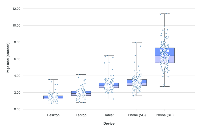
Box plot and violin take the sample too
A box plot required y: [min, q1, median, q3, max], and a violin required a precomputed density profile. Both asked you to do the statistics that give the chart its meaning, which is backwards. The numbers you have are the measurements.
// before — you compute the summary
series: [{ data: [{ x: 'Phone', y: [1.2, 1.9, 2.4, 3.1, 4.1] }] }]

// after — you supply the sample
series: [{ data: [{ x: 'Phone', points: [1.2, 1.9, 3.4, 2.2, 2.8, /* ... */] }] }]
They go in points, the field both types already used for jitter dots, so a sample lives in exactly one place whether you summarize it or we do.
Quartiles interpolate between ranks (R type 7). Whiskers default to the extremes, so nothing is hidden by default; plotOptions.boxPlot.whiskers: 'tukey' switches to the 1.5 × IQR convention, in which case pair it with points.show or the points beyond the fence become invisible.
A precomputed summary is still drawn exactly as given, and ignores both settings.
rowSeries(), so a mark can name the rows it stands for
A histogram bin, a box and a violin all stand for rows the chart is already holding. chart.rowSeries() returns them as a series:
chart.updateOptions({
  chart: { type: 'unit' },
  series: chart.rowSeries()
})
It returns null when the current type has no row source. Like the binning, the sources ship behind apexcharts/features/stats; core keeps only the lookup.
This is what makes "show me the actual data behind this summary" a two-line operation rather than a second dataset you maintain in parallel.
The morph conserves the ink
The unit pairings used to read as "the old chart vanished and a new one animated". The reason was structural: the exit was a photocopy of the whole outgoing chart, fading over the incoming one. Frame by frame that is a double exposure, two pictures both half-visible, neither becoming the other. No amount of easing fixes a crossfade.
A morph between one mark and N objects now cuts the mark into exactly N cells and flies every cell to its object, corners rounding off and fill blending on the way. A summary mark is cut along its own silhouette rather than its bounding box, and a wedge along its curve, which is why a donut's hole survives being taken apart.
Beyond that, any two mark families now pair. The engine used to decline combinations simply because nobody had driven them. The only pairing still closed is a dot cluster against a partition, where a divider has no cut for a tile or an arc and the result would fall back to a fade. Treemap and sunburst pair at every level rather than only the leaves, and a box plot unfolds into its violin and folds back.
Every offered transition is now covered by a motion test that asserts the marks actually travel, rather than counting the elements that exist at the end.
Nested treemaps
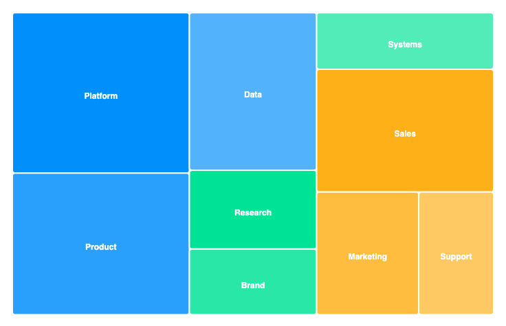
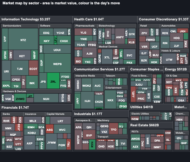
A treemap could only draw two levels, a series and its rows, so anything deeper had to be flattened by hand, throwing away the structure a market map exists to show. A datum may now carry children to whatever depth the data has.
data: [{
  x: 'Technology',
  children: [
    { x: 'Semiconductors', children: [{ x: 'NVDA', y: 3120 }, { x: 'AVGO', y: 780 }] },
    { x: 'Software', children: [{ x: 'MSFT', y: 3080 }] }
  ]
}]
Squarify became recursive: a branch is laid out inside its parent's rect with a header strip and per-level padding, and a container's area is the sum of its children exactly, so a parent always holds what it contains. Flat inputs are untouched and render identically.
The hierarchy resolver is now shared with the sunburst, including the drilldown: '<id>' adapter, which the treemap opts into with nested.drilldownAsLevels.
Drilldown: line and area, and async levels that survive a real backend
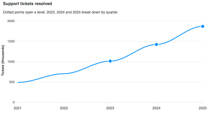
Drilldown was wired for line and area but inert, and worse than inert: a real click did nothing in every default configuration while the pointer cursor promised otherwise. With markers.size: 0 there is no element to click, and even with markers shown, core marks line and area markers no-pointer-events so the shared tooltip can track the plot. The feature now supplies a markers.discrete entry per drillable point, so only those points carry a dot and it reads as "these open".
Async levels close the phase that makes drilldown usable against an API. The organising idea is that a failed fetch is ordinary, not exceptional, so it must never strand the view:
| On | The chart does |
|---|---|
| a throw | stays where it was |
| a rejection | stays where it was |
a resolver returning no data array | stays where it was |
In every case the breadcrumb is untouched, nothing is cached, and drillDownError fires. That last case previously no-opped in silence, which is indistinguishable from "the click did nothing". A second click while one is in flight is ignored rather than starting a second request.
There is also a loading overlay: theme-aware, role="status" with aria-live="polite", whose spinner flattens to a pulse under prefers-reduced-motion. And resolved levels are cached by id, so drilling back down a branch does not re-fetch; clear it with chart.clearDrilldownCache().
A unit chart layout can now come from outside
Every arrangement the unit chart could draw was hard-coded, so a new one meant a core edit and the set was closed. plotOptions.unit.layout: 'custom' opens it:
plotOptions: {
  unit: {
    layout: 'custom',
    positions: (objects, rect) => [{ id: 'a', x: 10, y: 20 }, /* ... */]
  }
}
positions takes (objects, rect) => [{ id, x, y, r? }], or the name of a layout registered with ApexCharts.registerUnitLayout.
A layout is objects in, positions out, and nothing else. It knows nothing about animation, because the engine already tweens position, radius and colour and already keeps a mark's identity across a relayout. That is the whole point of the seam: an arrangement the built-ins cannot express needs no new transition code. Marks the provider omits animate out through the existing exit path; ids matching no mark are ignored.
objects carries identity and data per mark rather than just an index, so a provider can address a specific unit rather than a positional slot.
Unit marks also travel on a spring now. A fixed-duration tween cannot be interrupted: when the next render lands mid-flight it rebuilds the marks at the slot they had not reached yet and re-animates from a standstill. A dragged slider or a scrubbed storyboard interrupts on almost every frame, so that read as a continuous stutter. A spring retargets and keeps its velocity.
A pie slice that moves instead of changing colour
Both state visuals a pie or donut slice had were recolourings: hover lightened the fill, and a click darkened it and redrew it at a 4px larger radius.
Neither says "this slice" as plainly as motion does, and the click one was quietly dishonest, because growing the radius inflates the quantity the slice encodes. A click now slides the slice out along its own mid-angle (plotOptions.pie.expandOffset), and hover traces an outline band (plotOptions.pie.hoverOutline). Legend clicks toggle the slice in and out through the same path.
states.hover.filter.type: 'none' is still the way to turn hover feedback off entirely.
Fixes worth knowing
An exported SVG carries its fonts and images. An exported SVG is a standalone document, and the PNG path rasterizes it through <img src="data:image/svg+xml,...">. An SVG loaded as an image cannot fetch external resources and cannot reach the page's stylesheets or its loaded fonts, so anything the export left as a URL was not merely slow to appear, it was gone. Fonts, images and patterns are now inlined into the download.
A stacked total per group, not per data point. With series[].group each group is its own stack, so a grouped stacked bar should carry one total above each group's bar. It drew one label per data point instead, holding the sum of every series in the chart and centred on the middle of the whole cluster: on two groups of two that meant a single "75" floating between the bars rather than "15" over one and "60" over the other.
A slice tooltip lands on the slice. tooltip.intersect anchors a pie, donut or polar area tooltip on the arc centroid, which each slice stamps on its path in its own user space. Those were read as if they were SVG-root coordinates, dropping the inner group's translate, which is exactly the offset that centres a pie in a chart wider than it is tall. The caption could appear a couple of hundred pixels from the slice it described.
A chart that changes type behaves like the type it became. Type defaults are applied once, when the chart is first rendered, so updateOptions({ chart: { type } }) left every choice the outgoing type had made in place. A box plot that became a violin kept the five-number tooltip formatter and threw on every hover. The leaves that decide what a chart reads, says, hit-tests or offers as interaction are now re-chosen when the type changes; the ones that decide how it is painted deliberately are not, so changing type does not restyle a chart out from under a morph in flight. Anything you set yourself is never re-chosen.
Also fixed: the hover hit-test and bar centres measured from the wrong origin, so the tooltip could caption the neighbouring bar (#5272, thanks @lazerg); datetime gridlines outside the plot drawn on the axis (#5273); annotation label background boxes (#5270, thanks @mrash); xaxis.labels.style.fontSize: 'inherit' yielding NaN (#5064, thanks @waterWang); a legend toggle re-binning a histogram's counts; and a hidden polar area series not giving its slot back.
One change in the package's shape
ApexCharts is no longer dependency-free. It now requires apex-commons (^0.5.0) at runtime.
The licence manager had been a vendored fork that drifted from its origin, which made the family's licence contract two implementations kept in step by hand. And the crossfilter engine was never chart-specific, so keeping the only copy inside a charting library meant a map, a grid or a tree had to install ApexCharts just to coordinate a filter. Both now come from the shared package, along with the spring primitives the unit chart uses.
npm resolves it for you and the browser bundles inline it, so nothing changes for script-tag users and no action is needed for bundler users. But it is a change in the package's shape, and worth knowing before you upgrade.
Upgrading
npm install apexcharts@latest
The React, Vue and Angular wrappers work unchanged. Two things to check before you ship:
- Grouped stacked bars. Totals are now one per group rather than one per data point. If you had worked around the old behaviour, remove the workaround.
- Pie and donut selection. A click moves the slice instead of recolouring it. If you relied on the old darkening,
plotOptions.pie.expandOffsetcontrols the new one.
The full changelog is on GitHub.
Frequently asked questions
What is new in ApexCharts 6.9?
A new histogram chart type that takes raw observations and chooses the bins itself; box plot and violin accepting raw observations too, so they compute their own summary and density; chart.rowSeries(), which returns the rows a mark stands for; a rewritten cross-type morph that cuts a mark into its objects instead of crossfading, with every mark-family pairing now offered; nested treemaps to arbitrary depth; drilldown for line and area plus async levels with real failure handling; plotOptions.unit.layout: 'custom' for supplying your own arrangement; and a pie slice that slides out on click instead of changing colour.
Are there breaking changes in ApexCharts 6.9?
No API was renamed or removed, but the package's shape changed: ApexCharts now depends on apex-commons (^0.5.0) at runtime, so it is no longer dependency-free. npm resolves it for you and the browser bundles inline it, so no action is needed for either script-tag or bundler users. Two behaviours also changed deliberately: a pie or donut slice now slides out on click rather than darkening and growing, and grouped stacked bars now show one total per group rather than one per data point.
How does the ApexCharts histogram choose its bins?
plotOptions.histogram.bins takes a rule name ('auto', 'fd', 'sturges', 'scott', 'rice', 'sqrt') or a fixed bin count. 'auto' takes the narrower of Freedman-Diaconis and Sturges, falling back to Sturges when the IQR is 0. Set binWidth instead to pin the boundaries in value units when they carry meaning, such as decades or 5-minute buckets. With more than one series, all series share one set of edges derived from their combined extent, so two distributions stay comparable.
Do I still have to compute quartiles for an ApexCharts box plot?
No. From 6.9 a datum can supply points (an array of raw observations) instead of a five-number y, and the library computes the summary, interpolating quartiles between ranks (R type 7). Whiskers reach the extremes by default so nothing is hidden; plotOptions.boxPlot.whiskers: 'tukey' switches to the 1.5 x IQR convention. A precomputed y is still drawn exactly as given. The same applies to violin, which will estimate the kernel density from observations rather than requiring a density profile.
Why did my ApexCharts pie slice stop changing colour on click?
That was replaced deliberately in 6.9. Selecting a slice used to darken it and redraw it at a 4px larger radius, but growing the radius inflates the quantity the slice encodes, so the visual said something the data did not. A click now slides the slice out along its own mid-angle, controlled by plotOptions.pie.expandOffset, and hover traces an outline band instead of lightening the fill. Set states.hover.filter.type to 'none' to turn hover feedback off entirely.
How do I upgrade to ApexCharts 6.9?
Run npm install apexcharts@latest, or bump the version on your CDN link. The React, Vue and Angular wrappers work unchanged. Check two things before you ship: grouped stacked bars, whose totals are now per group rather than per data point, and pie or donut charts where you relied on the old click recolouring.