ApexCharts
  • Products
  • Demos
  • Docs
  • Pricing
  • Blog
  • Embedded Analytics
Line ChartsArea ChartsColumn ChartsBar ChartsMixed / Combo ChartsRange Area ChartsTimeline / Range BarFunnel ChartsCandlestick ChartsBoxPlot ChartsViolin ChartsHistogram ChartsBubble ChartsScatter ChartsHeatmap ChartsTreemap ChartsSunburst ChartsUnit ChartsBeeswarm ChartsWaffle ChartsSlope ChartsPie / Donut ChartsRadialBar / CircleGauge ChartsRadar ChartsPolar Area ChartsSparklinesDashboardsCustom SeriesInteractivityNarrative & State

JavaScript Chart Demos

Browse sample charts built with ApexCharts. Every example includes live source code to save your development time.

Line Charts

View all →

Line charts excel at showing trends over continuous data and time series. Read the docs →
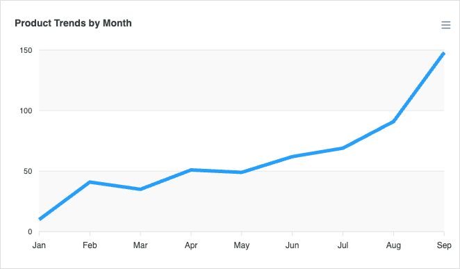
Basic Line Chart
Basic Line Chart
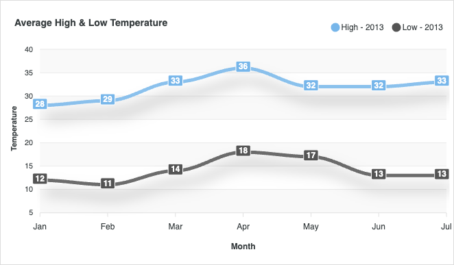
Line with Data Labels
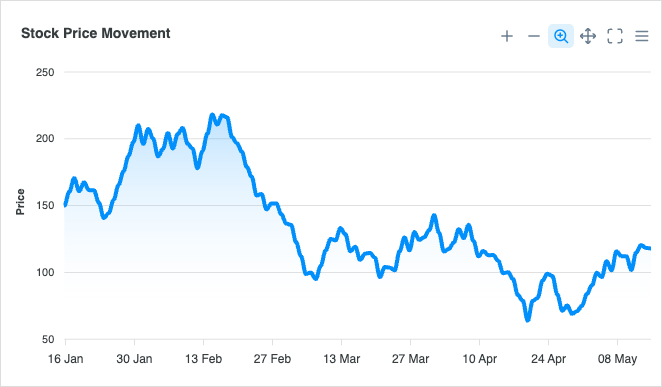
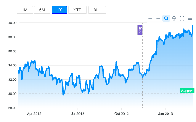
Zoomable Timeseries
Zoomable Timeseries
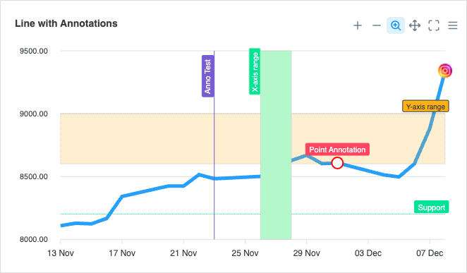
Line with Annotations
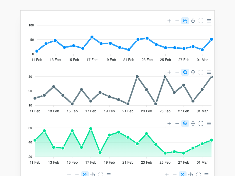
Syncing Charts
Syncing Charts
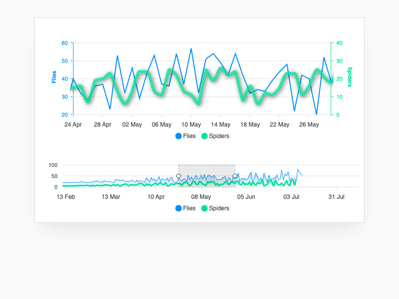
Brush Chart
Brush Chart
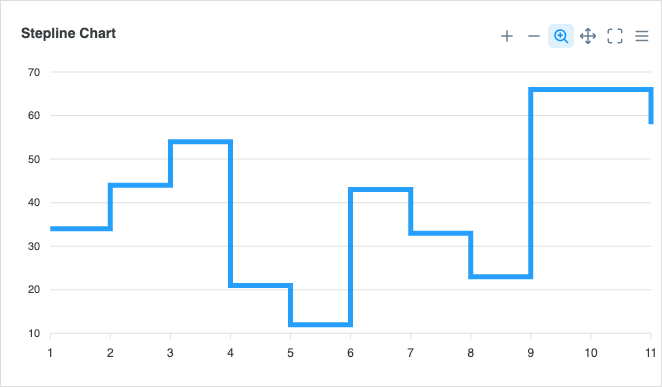
Stepline Chart
Stepline Chart
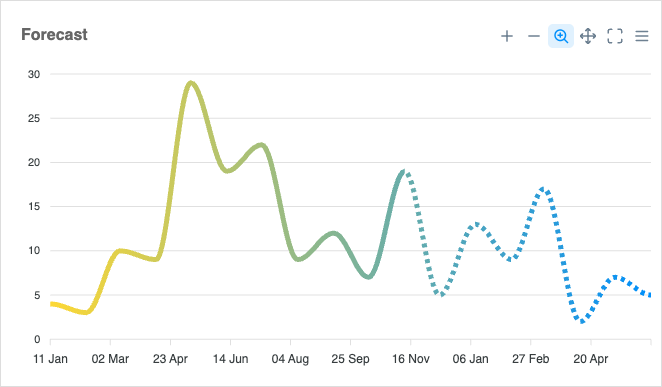
Gradient Line
Gradient Line
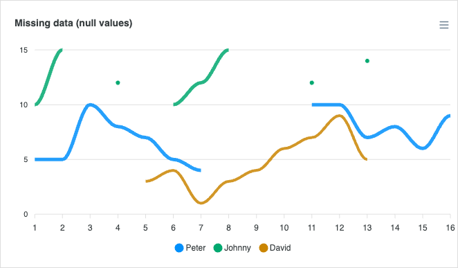
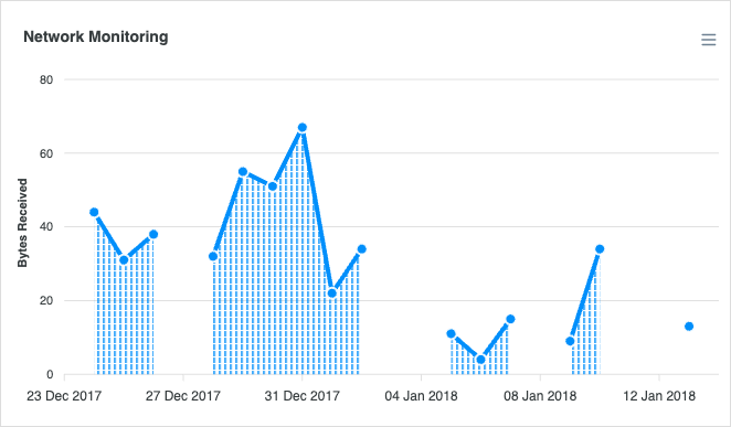
Missing / Null Values
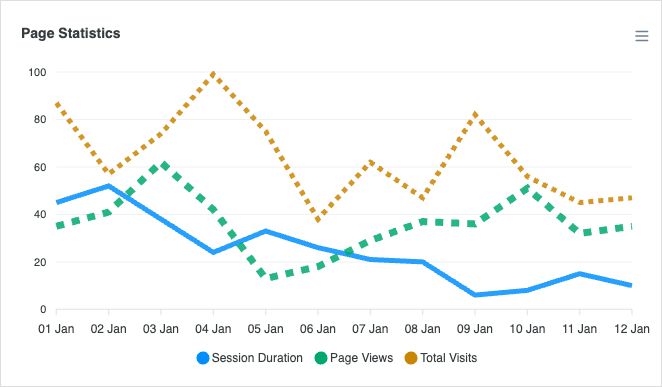
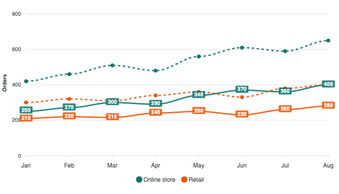
Dashed Line
Dashed Line
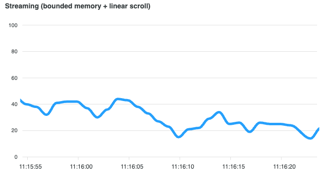
Realtime
Realtime
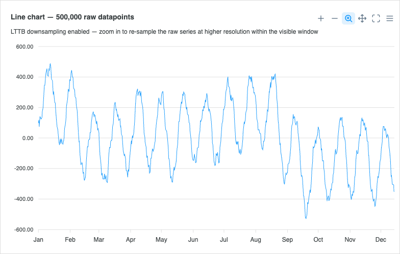
Large Dataset Downsampling
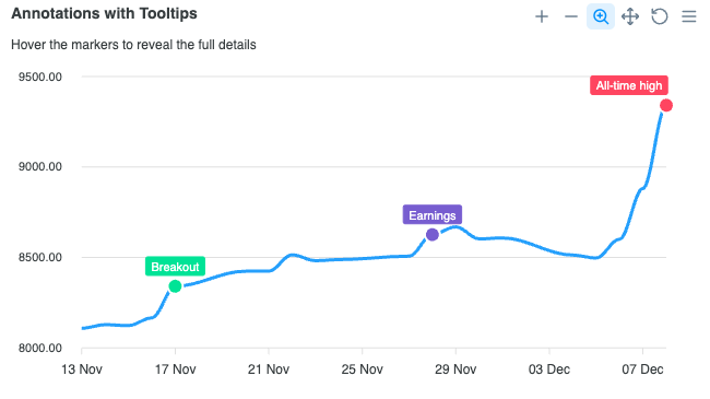
Annotations with Tooltips
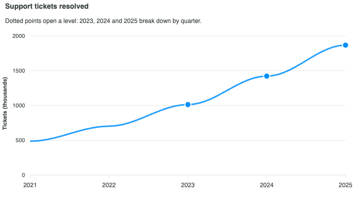
Line with Drilldown
Line with Drilldown

Area Charts

View all →

Area charts emphasize the magnitude of change over time and stacking relationships between series. Read the docs →

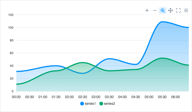
Basic Area
Basic Area
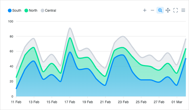
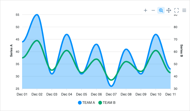
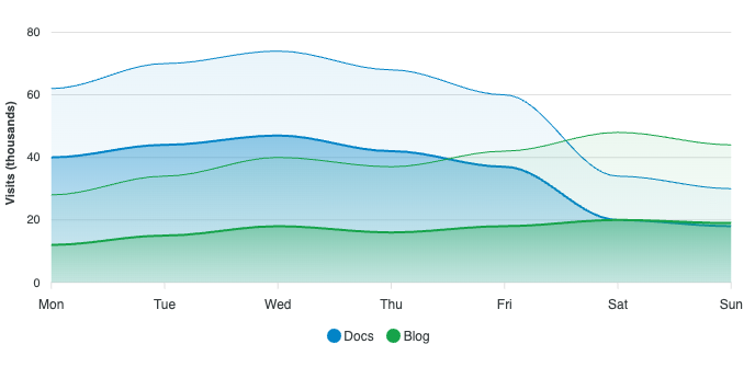
Spline Area
Spline Area
Datetime X-Axis
Datetime X-Axis
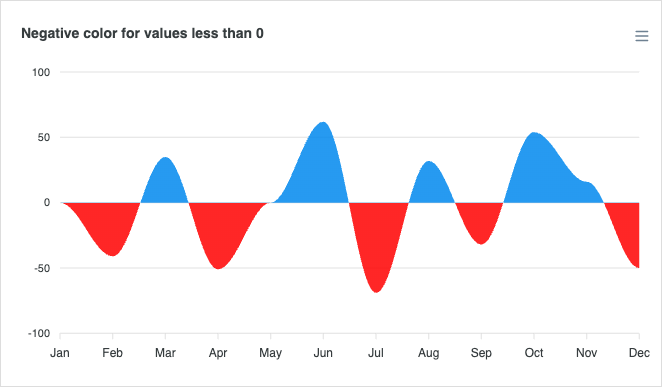
Negative Values
Negative Values
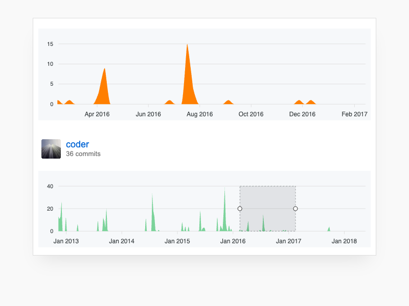
GitHub Style
GitHub Style
Stacked Area
Stacked Area
Missing / Null Values
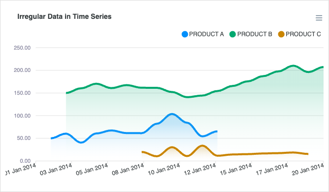
Irregular Timeseries

Column Charts

View all →

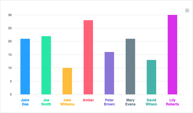
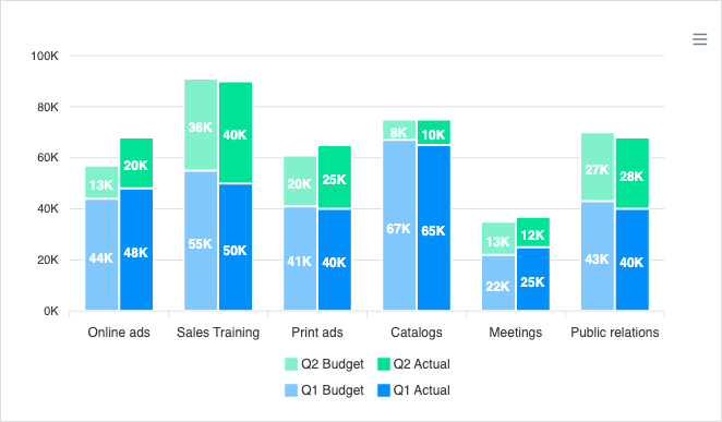
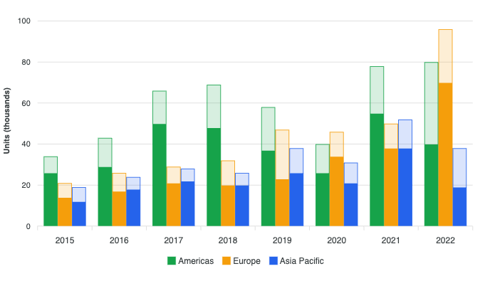
Column charts compare values across discrete categories with vertical bars. Read the docs →
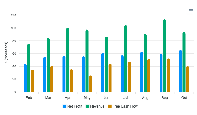
Basic Column
Basic Column
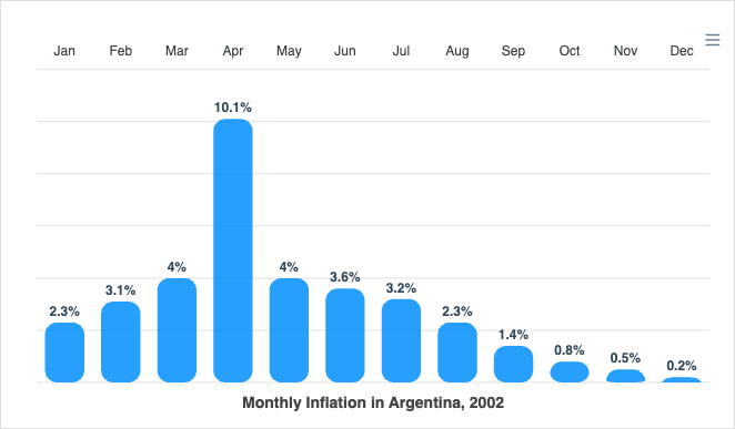
Column with Data Labels
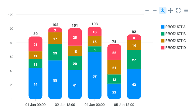
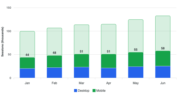
Stacked Column
Stacked Column
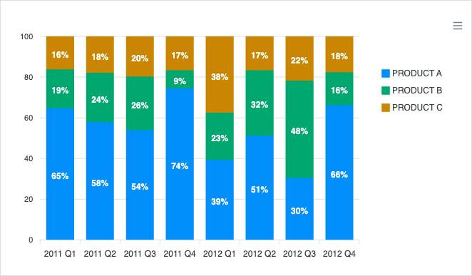
Stacked Column 100%
Stacked Column 100%
Column with Rotated Labels
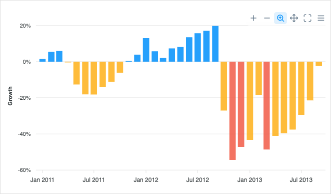
Column with Negative Values
Dynamic Loaded Chart
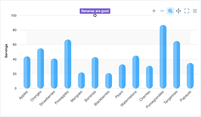
Distributed Columns
Distributed Columns
Range Column
Range Column
Grouped Stacked Column
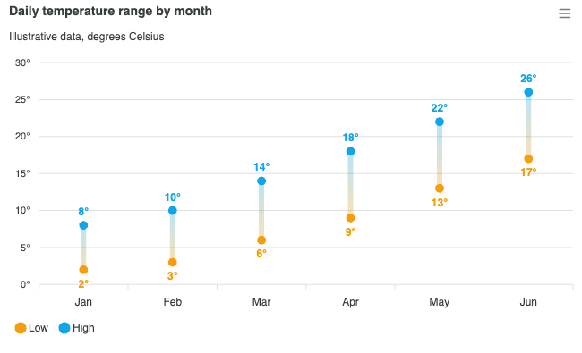
Dumbbell Chart
Dumbbell Chart
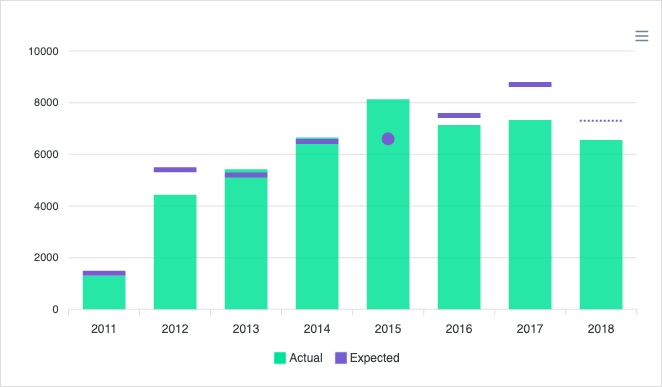
Column with Markers
Column with Markers
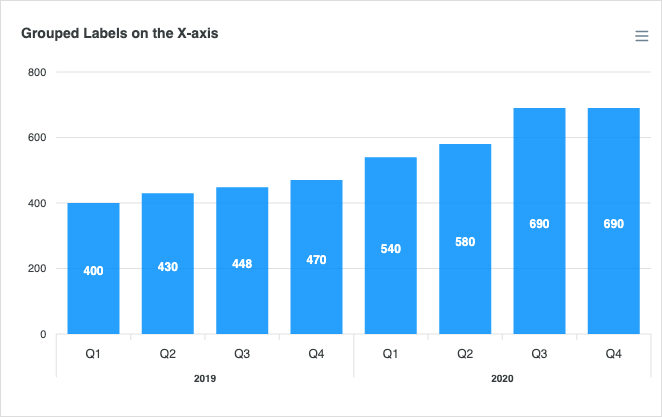
Column with Group Label
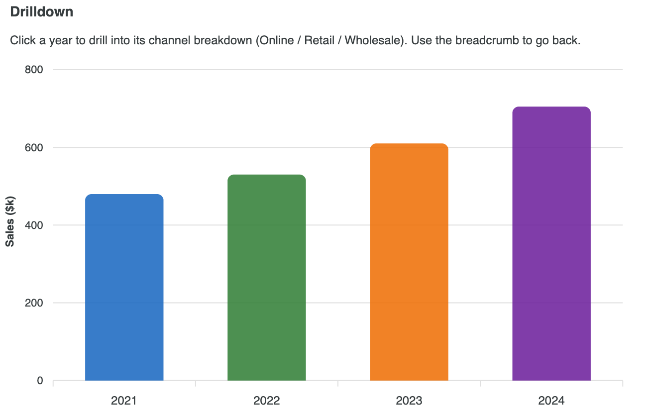
Column with Drilldown
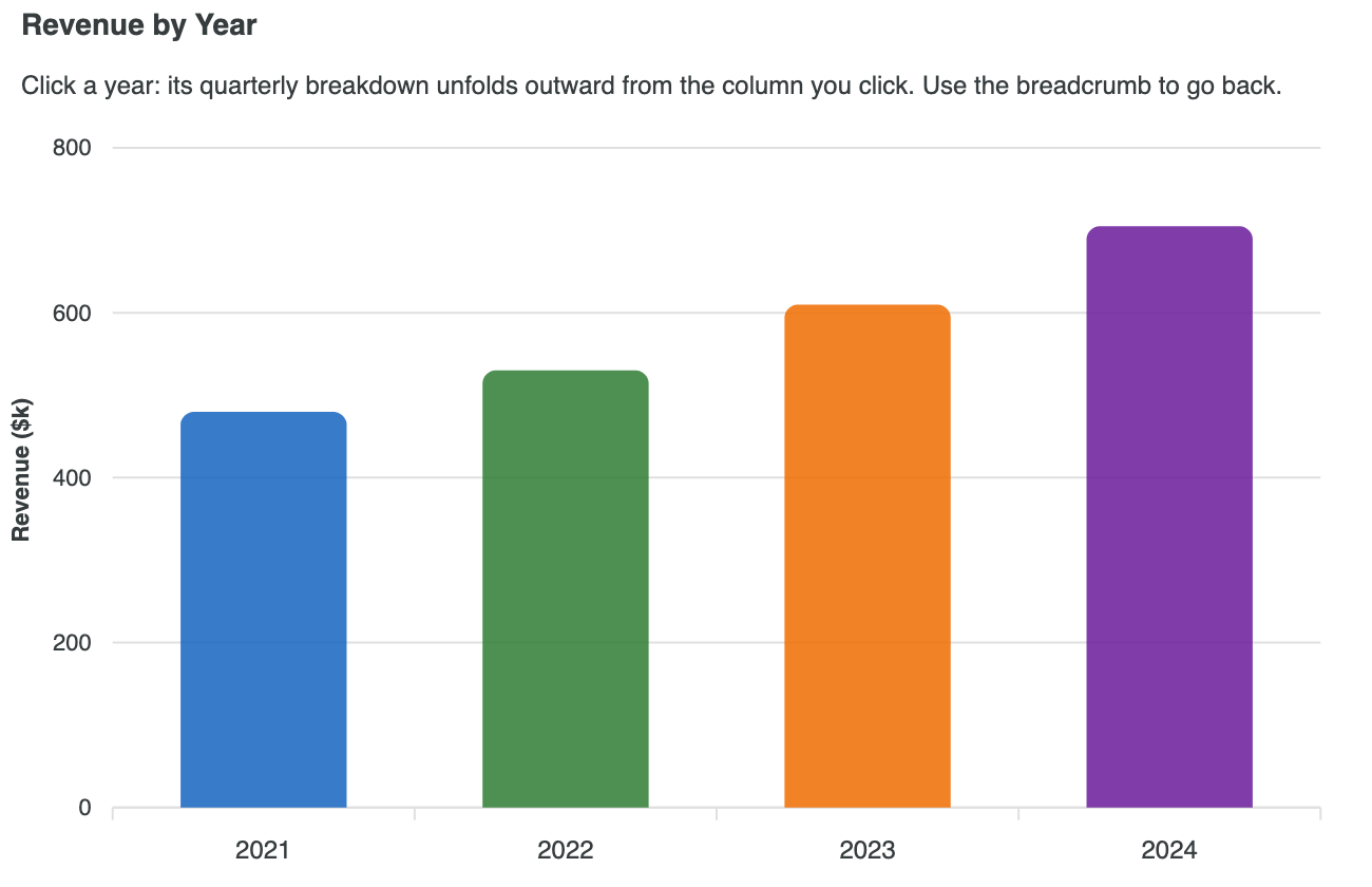
Drilldown with Zoom
Drilldown with Zoom
Async Drilldown Column

Bar Charts

View all →

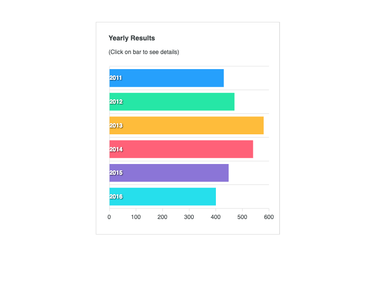
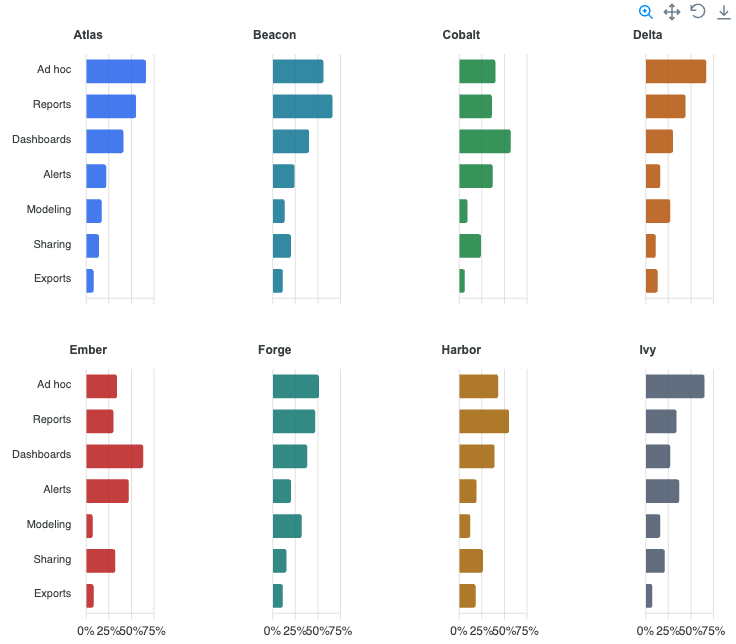
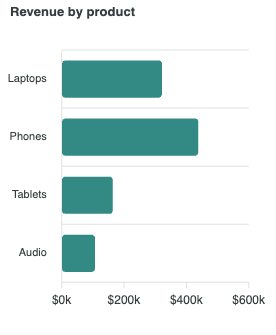
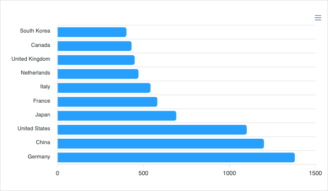
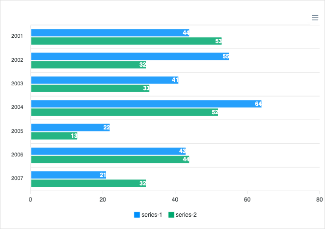
Horizontal bar charts compare values across categories, ideal when labels are long. Read the docs →
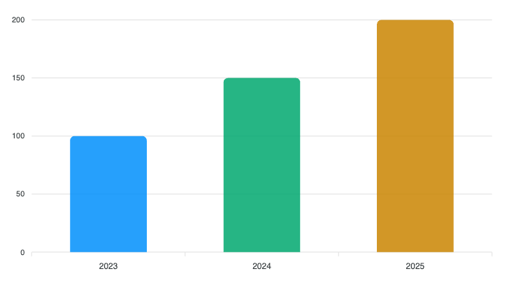
Basic Bar
Basic Bar
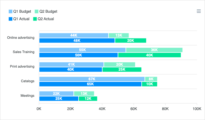
Grouped Bar
Grouped Bar
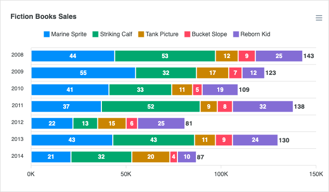
Stacked Bar
Stacked Bar
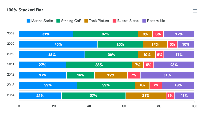
Stacked Bar 100%
Stacked Bar 100%
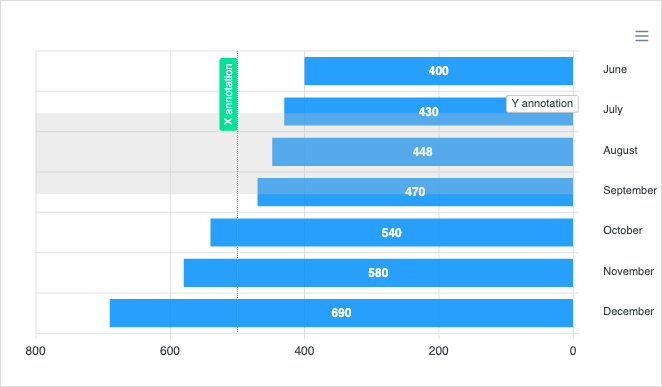
Bar with Negative Values
Reversed Bar
Reversed Bar
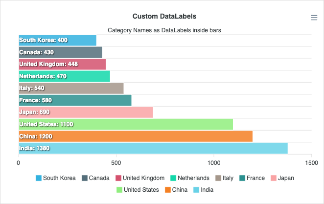
Custom Data Labels
Custom Data Labels
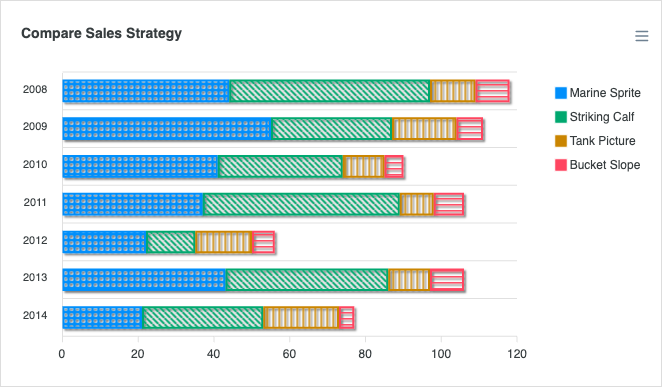
Patterned Bar
Patterned Bar
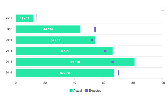
Bar with Markers
Bar with Markers
Grouped Stacked Bar
Grouped Stacked Bar
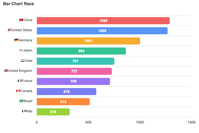
Bar Chart Race
Bar Chart Race

Mixed / Combo Charts

View all →

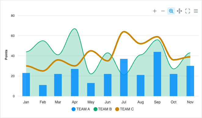
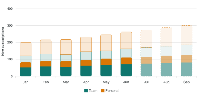
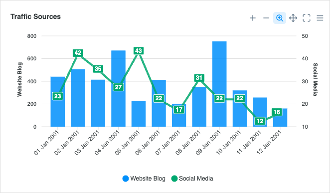
Combine line, column, and area series in a single chart for richer comparisons. Read the docs →
Line & Column
Line & Column
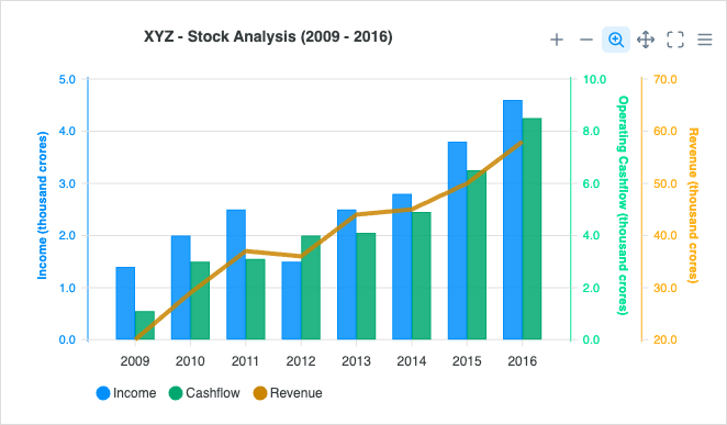
Multiple Y-Axis
Multiple Y-Axis
Line & Area
Line & Area
Line, Column & Area
Line, Column & Area

Range Area Charts

View all →

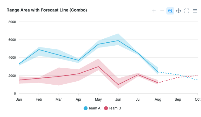
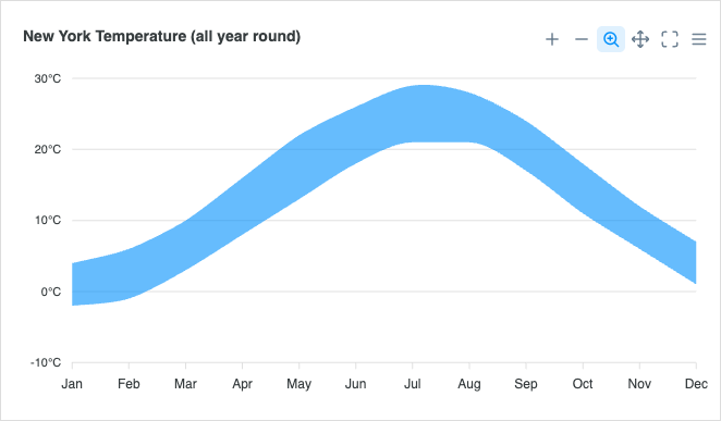
Visualize ranges and uncertainty bands together with a line or trend. Read the docs →
Basic Range Area
Basic Range Area
Range Area + Line Combo

Timeline / Range Bar

View all →

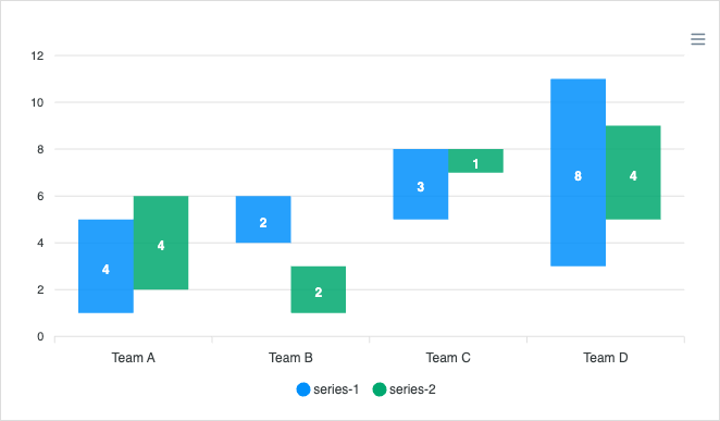
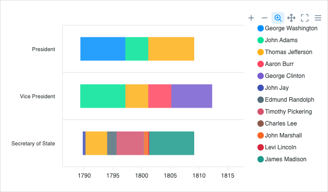
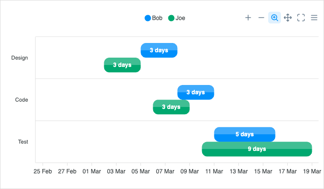
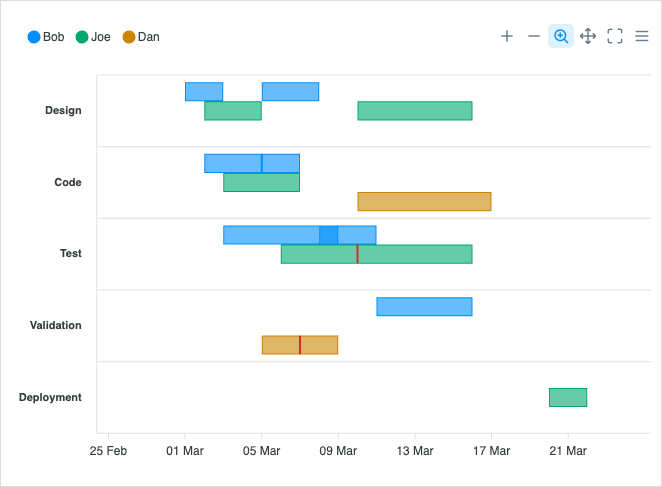
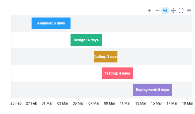
Timeline (range bar) charts show durations, schedules, and gantt-style progress. Read the docs →
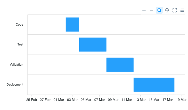
Basic Timeline
Basic Timeline
Grouped Rows
Grouped Rows
Multi Series
Multi Series
Advanced Timeline
Advanced Timeline
Custom Colors
Custom Colors
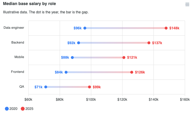
Dumbbell Horizontal
Dumbbell Horizontal

Funnel Charts

View all →

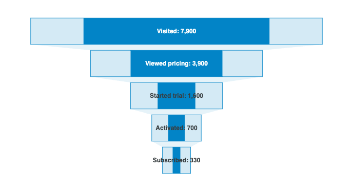
Funnel charts visualize stage-by-stage drop-off in a process or conversion flow. Read the docs →
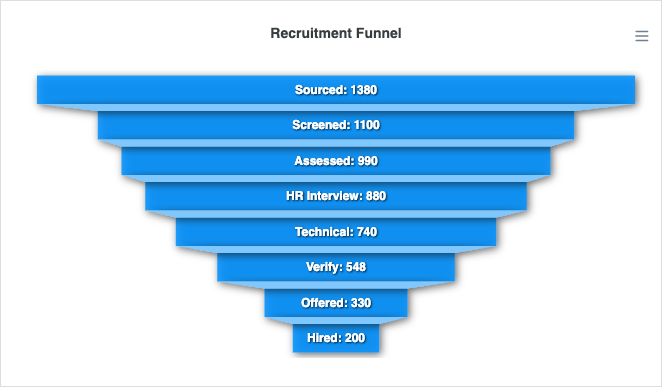
Funnel Chart
Funnel Chart
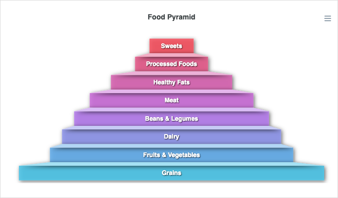
Pyramid Chart
Pyramid Chart
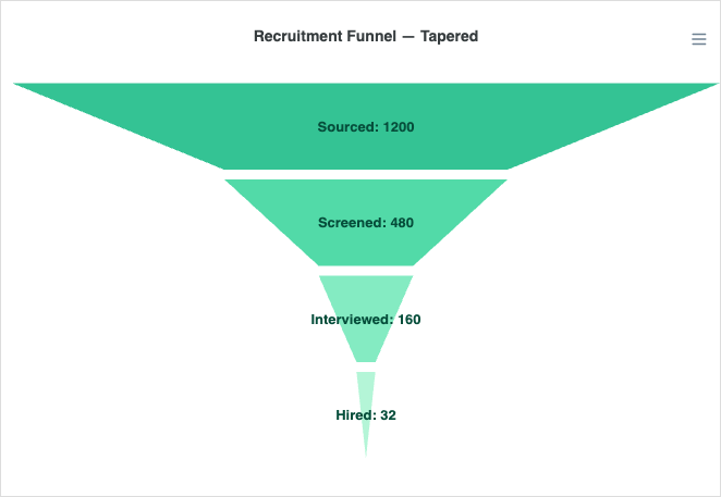
Trapezoid Funnel (Tapered)

Candlestick Charts

View all →

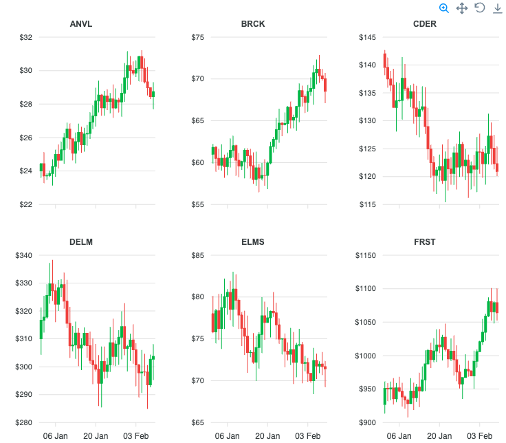
Candlestick charts visualize OHLC financial data over time intervals. Read the docs →
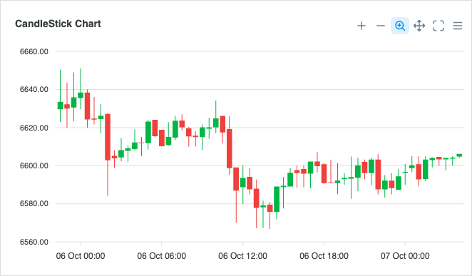
Basic Candlestick
Basic Candlestick
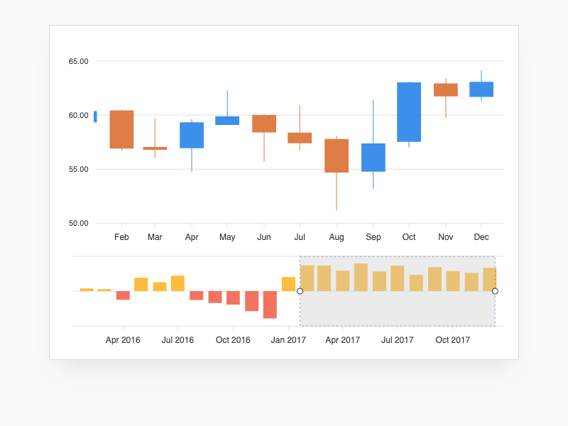
Candlestick + Bar
Candlestick + Bar
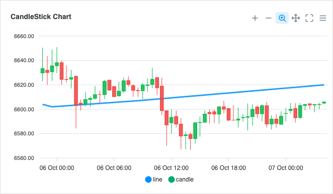
Candlestick + Line
Candlestick + Line

BoxPlot Charts

View all →

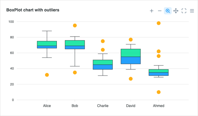
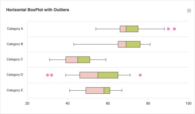
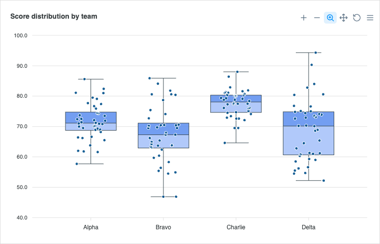
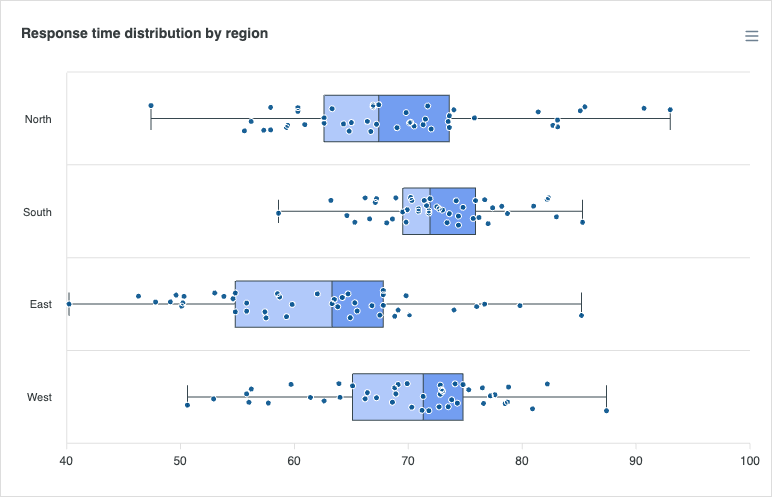
Boxplots summarize the distribution, median, and outliers of a dataset. Read the docs →
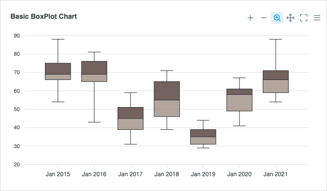
Basic BoxPlot
Basic BoxPlot
BoxPlot + Scatter
BoxPlot + Scatter
Horizontal BoxPlot
Horizontal BoxPlot
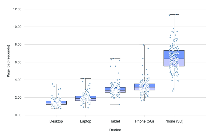
BoxPlot with Points
BoxPlot with Points
Horizontal BoxPlot with Points
BoxPlot from Raw Observations
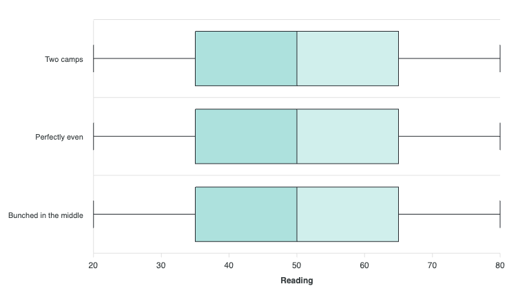
Same Box, Different Data

Violin Charts

View all →

Read the docs →

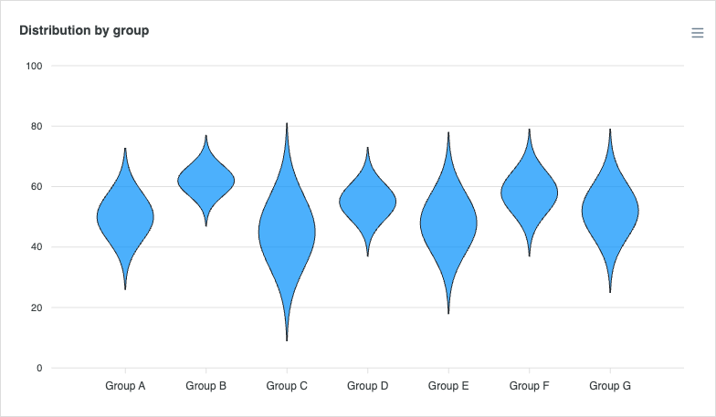
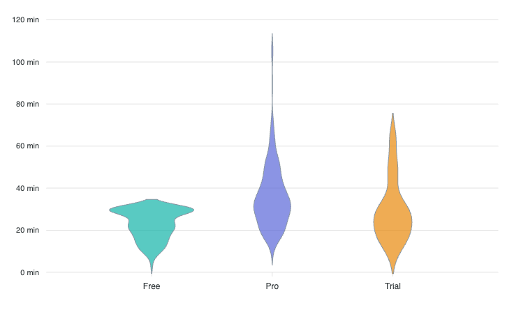
Basic Violin
Basic Violin
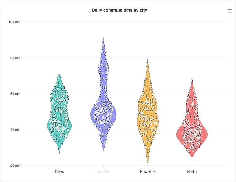
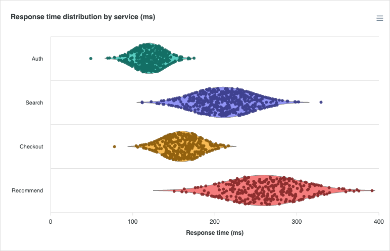
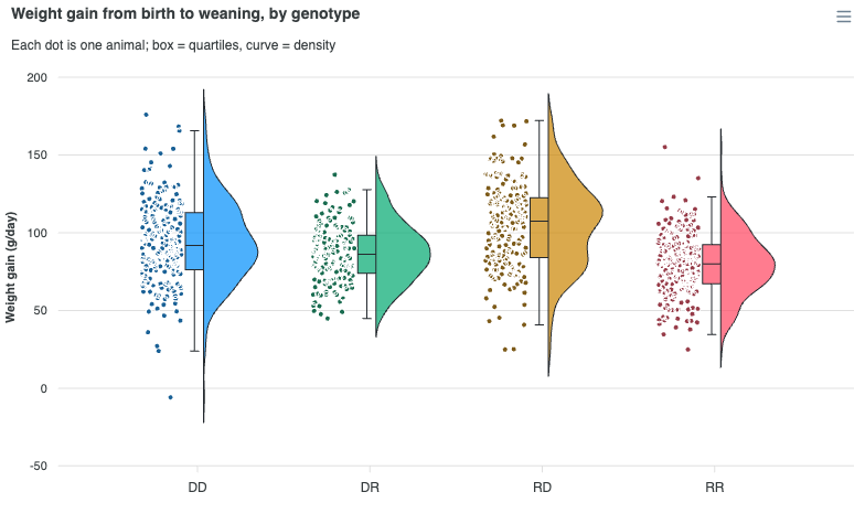
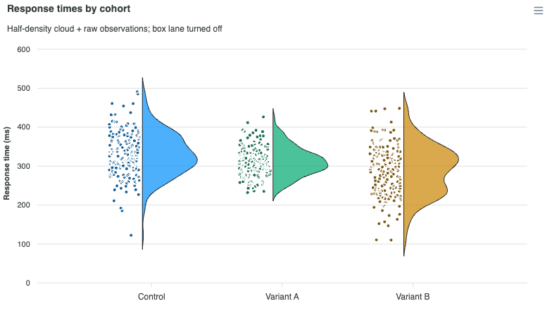
Violin with Jitter
Violin with Jitter
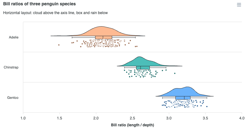
Horizontal Violin
Horizontal Violin
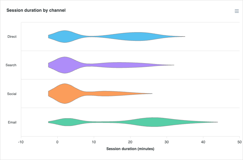
Horizontal Bimodal
Horizontal Bimodal
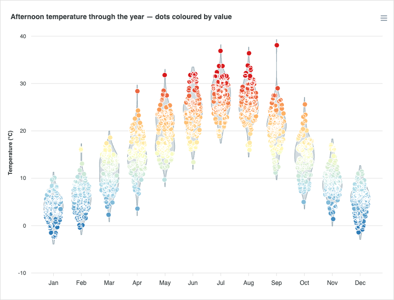
Colour-graded Jitter
Violin to Jitter Morph

Histogram Charts

View all →

Read the docs →

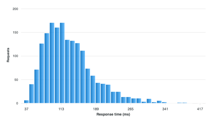
Latency Distribution
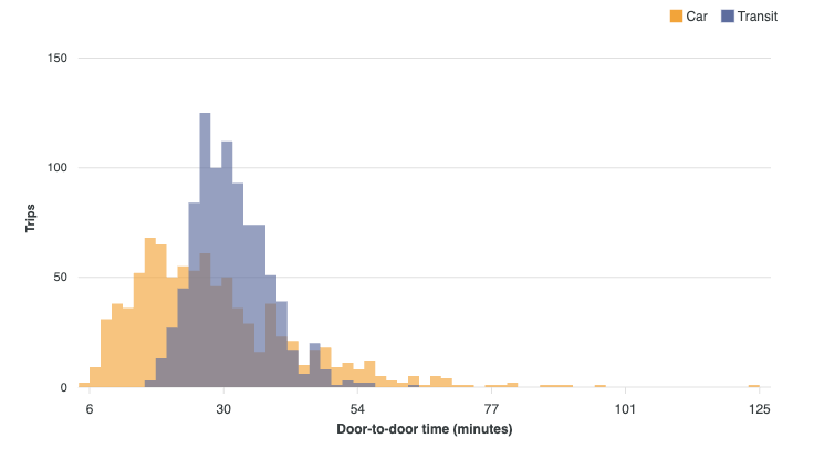
Comparing Distributions
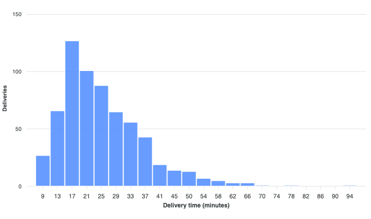
Explode to Observations

Bubble Charts

View all →

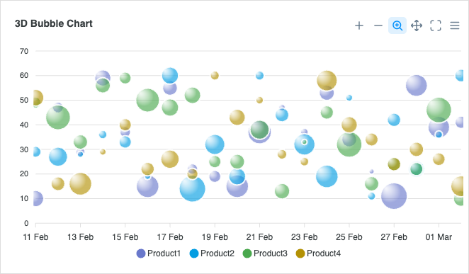
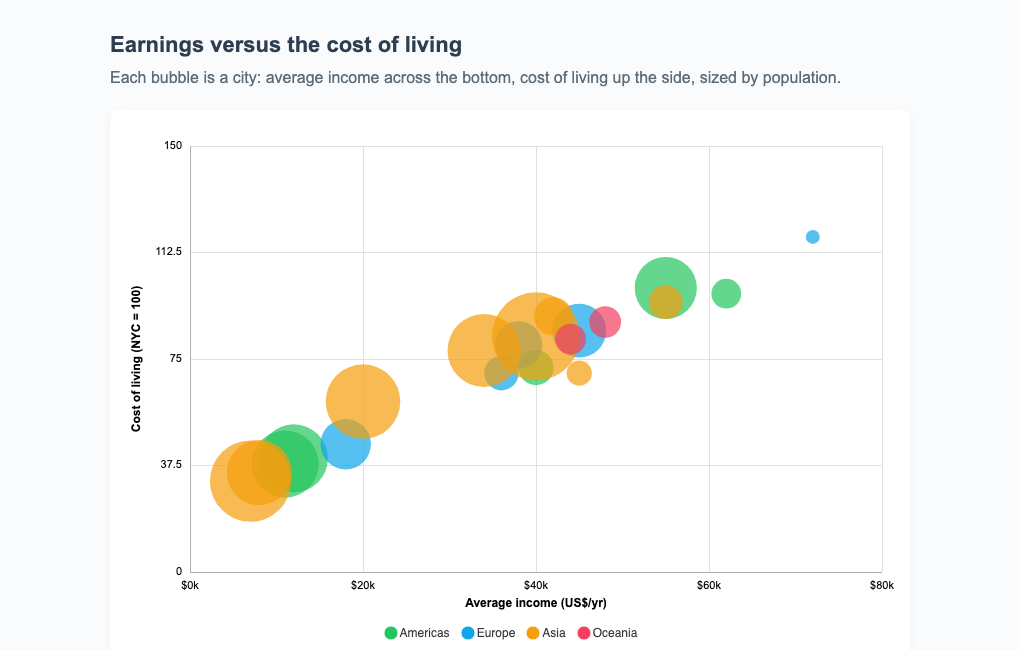
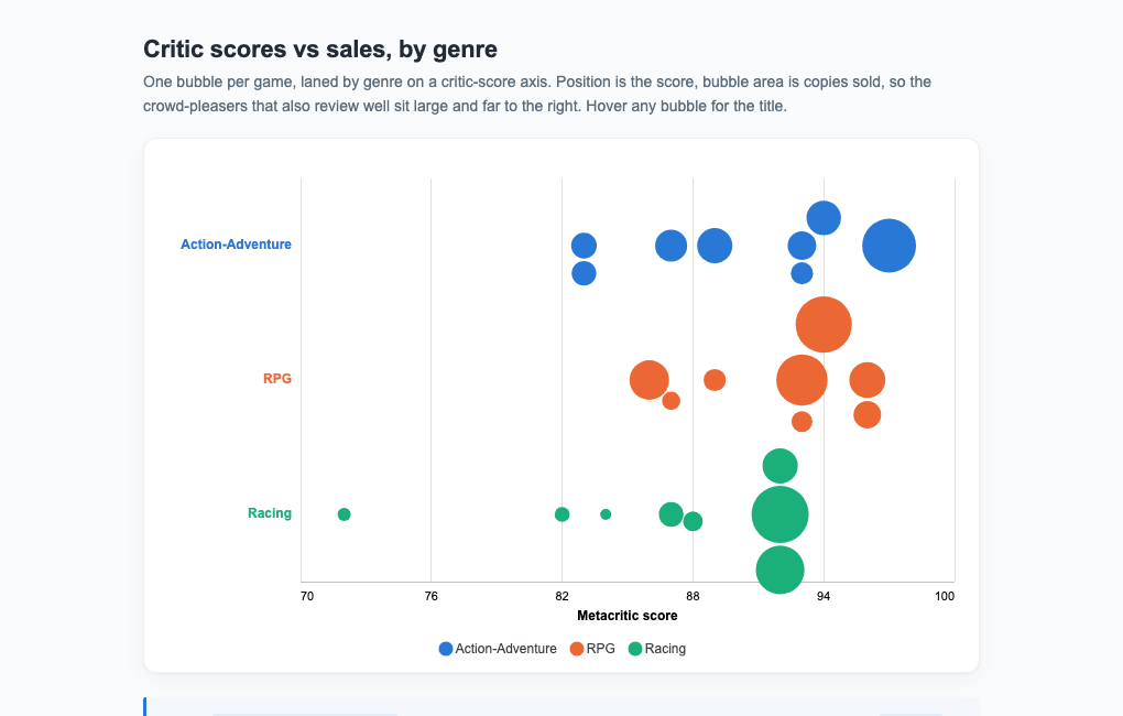
Bubble charts add a third dimension to scatter plots using marker size.
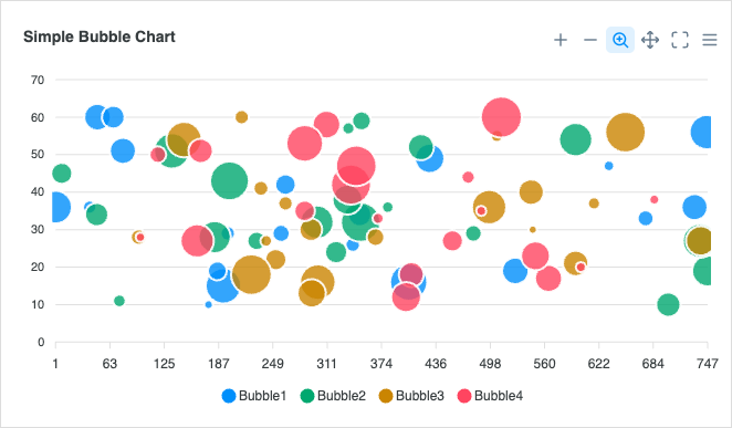
Simple Bubble
Simple Bubble
3D Bubble
3D Bubble

Scatter Charts

View all →

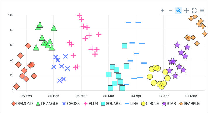
Scatter charts plot pairs of values to reveal correlation and clusters.
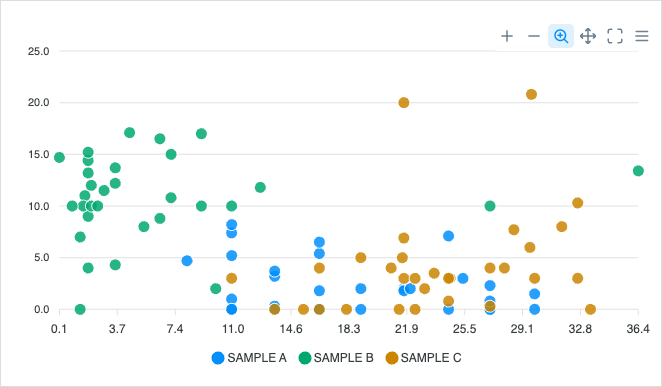
Basic Scatter
Basic Scatter
Datetime Scatter
Datetime Scatter
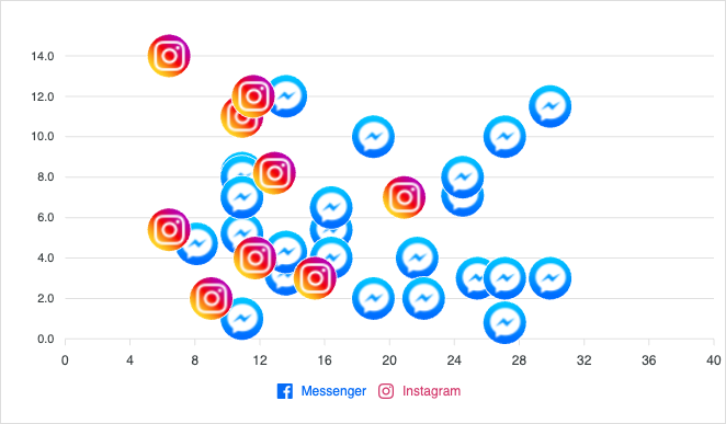
Scatter with Images
Scatter with Images
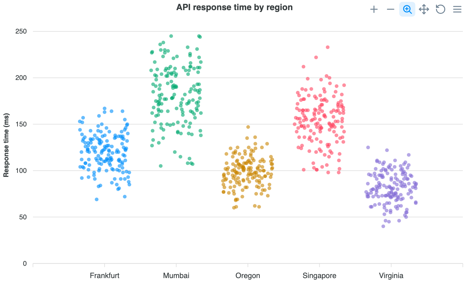
Scatter with Jitter
Scatter with Jitter
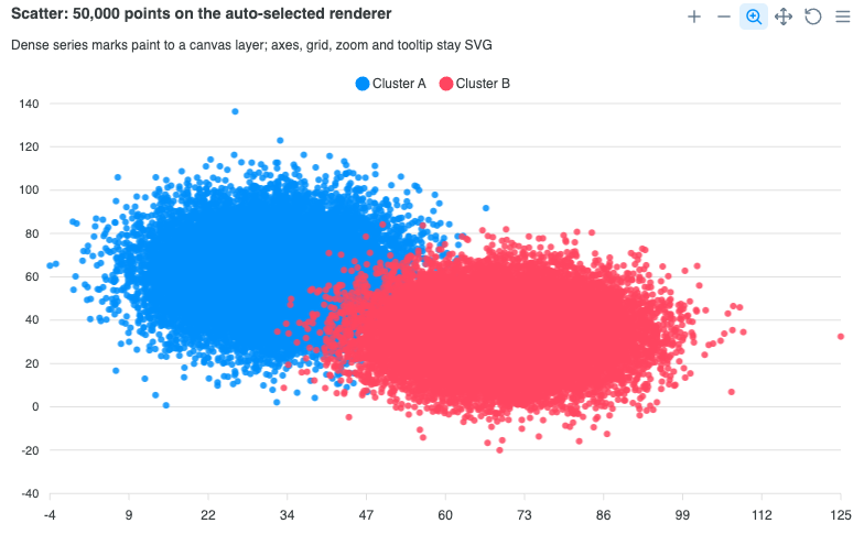
Canvas Renderer (High-Density)

Heatmap Charts

View all →

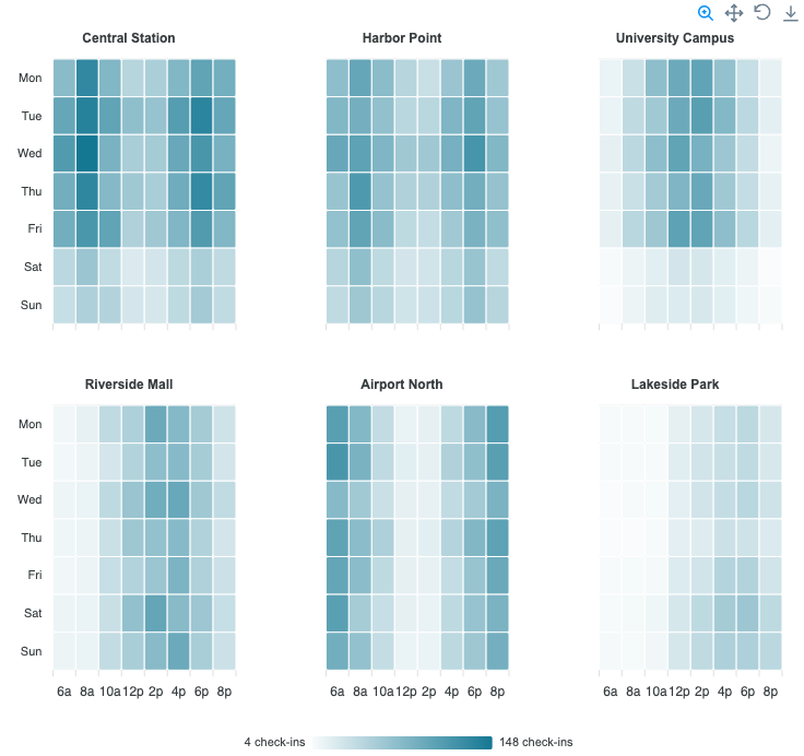
Heatmaps surface intensity patterns across a matrix using color. Read the docs →
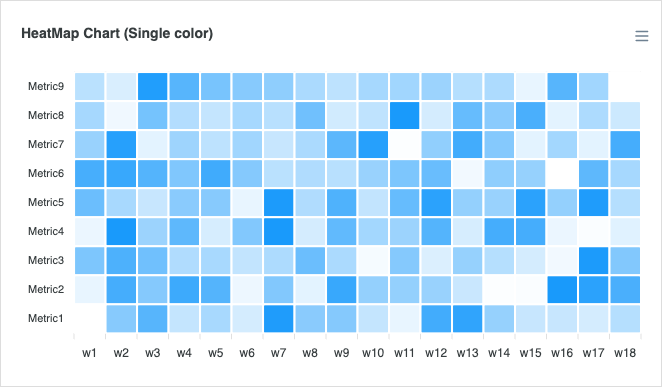
Basic Heatmap
Basic Heatmap
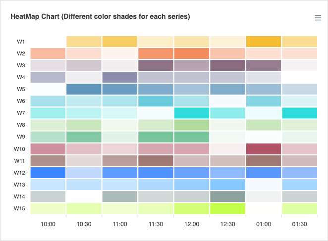
Multiple Colors
Multiple Colors
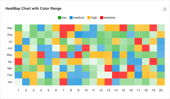
Color Range
Color Range
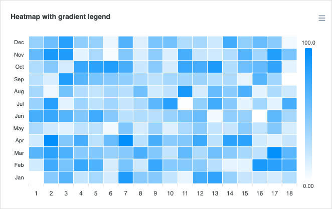
Gradient Legend
Gradient Legend
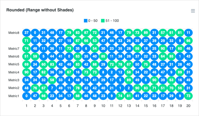
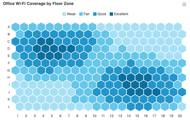
Rounded Heatmap
Rounded Heatmap
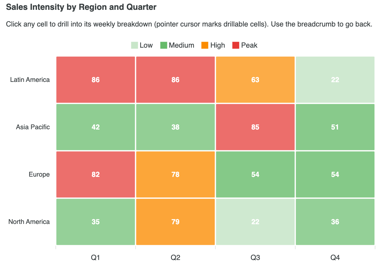
Heatmap with Drilldown
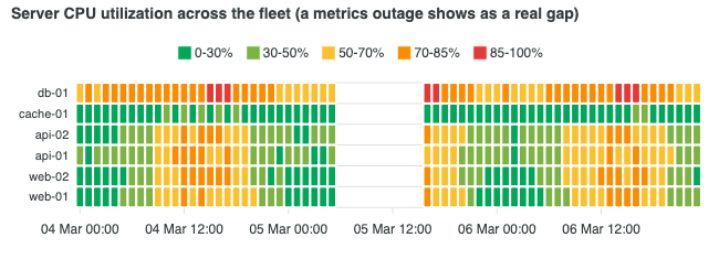
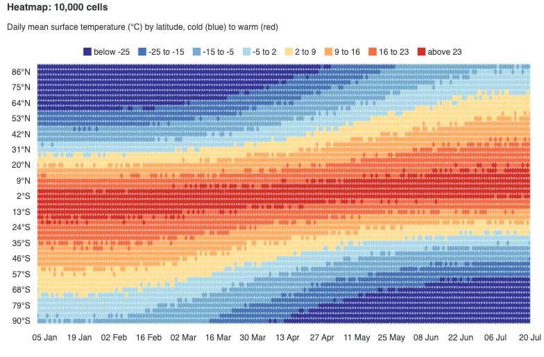
Continuous Datetime
Continuous Datetime
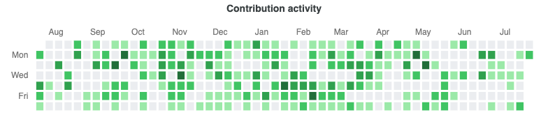
Calendar Heatmap
Calendar Heatmap
Canvas Renderer (High-Density)

Treemap Charts

View all →

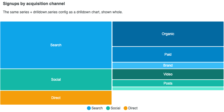
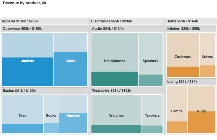
Treemaps visualize hierarchical part-to-whole relationships using nested rectangles. Read the docs →
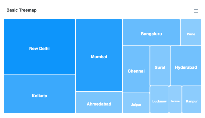
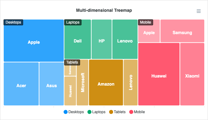
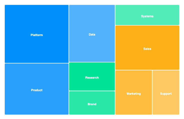
Basic Treemap
Basic Treemap
Multi-Dimensional
Multi-Dimensional
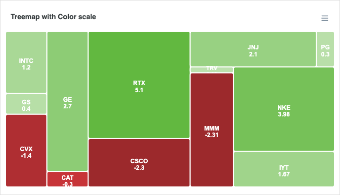
Color Scale
Color Scale
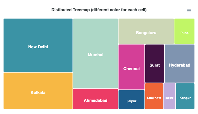
Distributed Treemap
Distributed Treemap
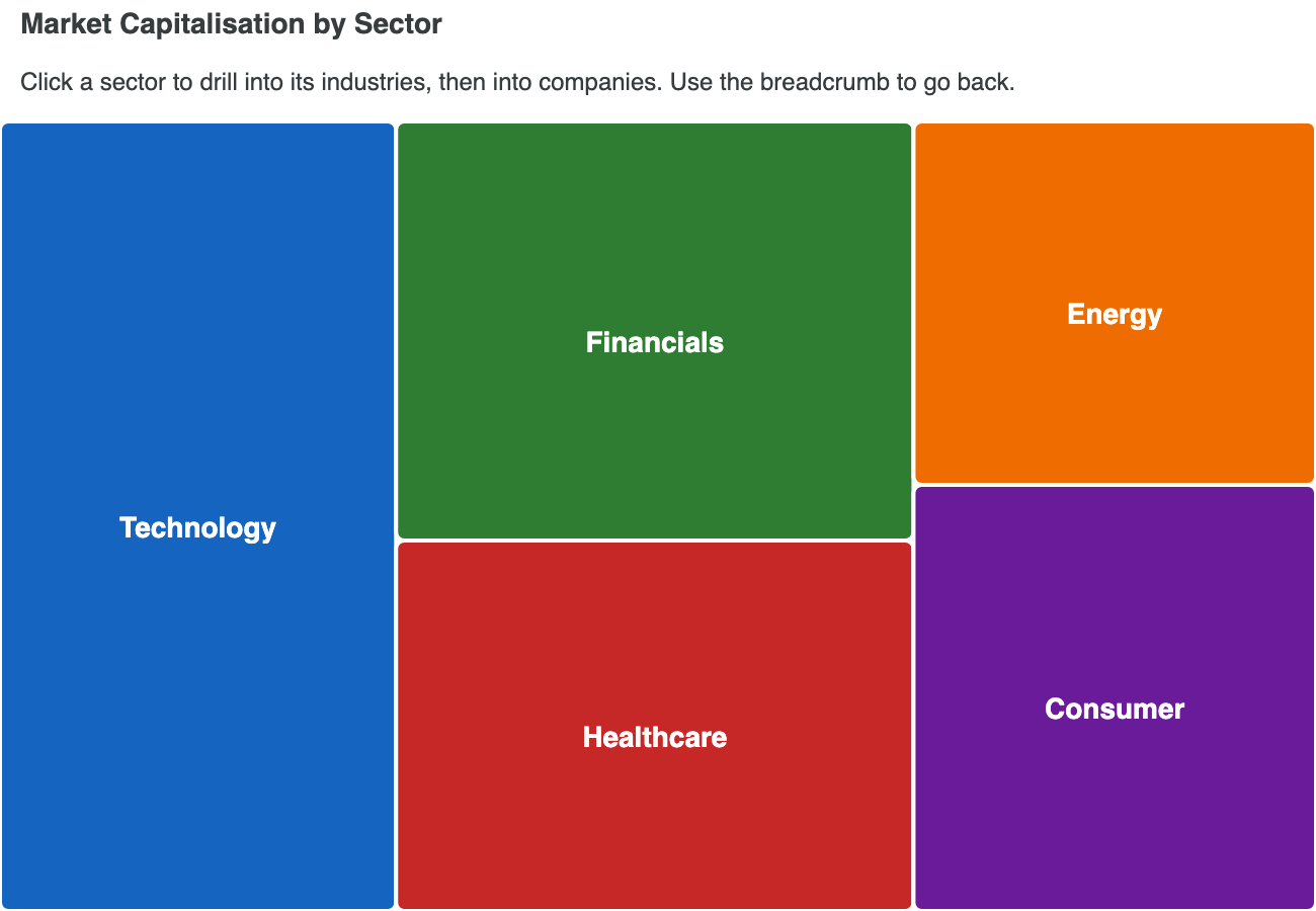
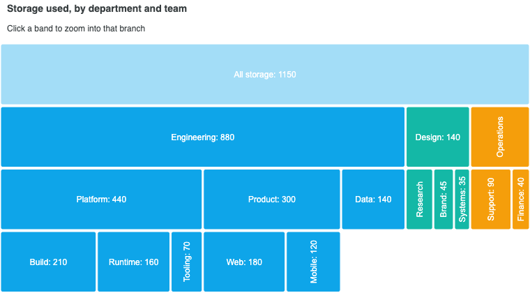
Treemap with Drilldown
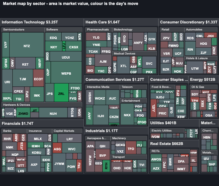
Nested Market Map
Nested Market Map
Treemap / Sunburst Morph

Sunburst Charts

View all →

Read the docs →

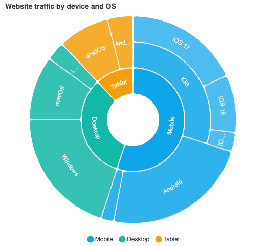
Basic Sunburst
Basic Sunburst
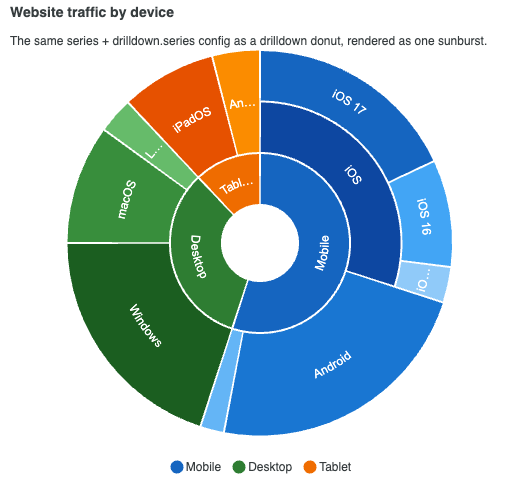
Sunburst from Drilldown
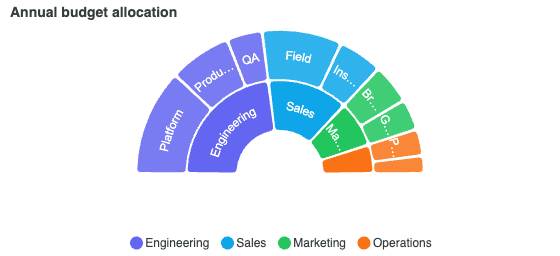
Semi-Circle Sunburst

Unit Charts

View all →

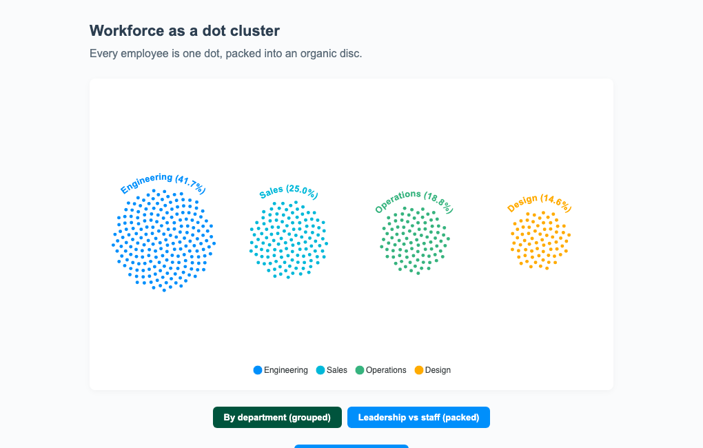
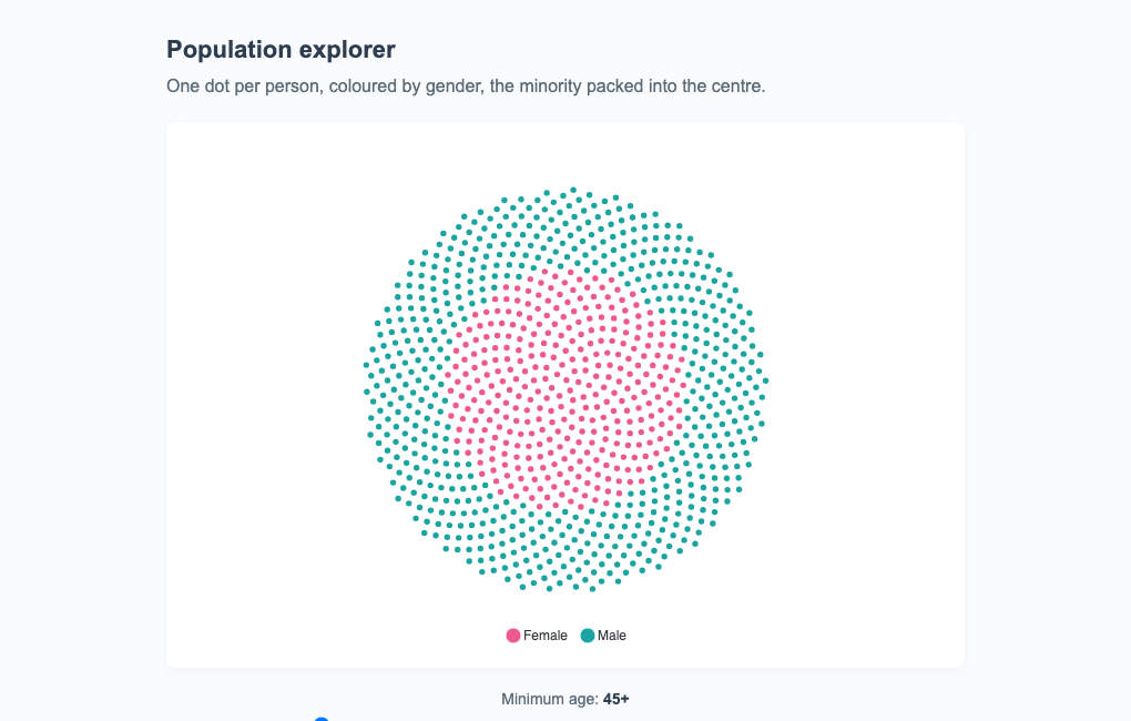
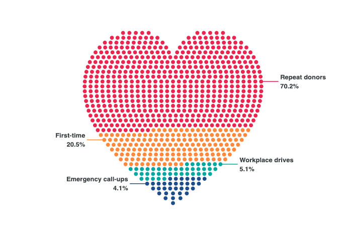
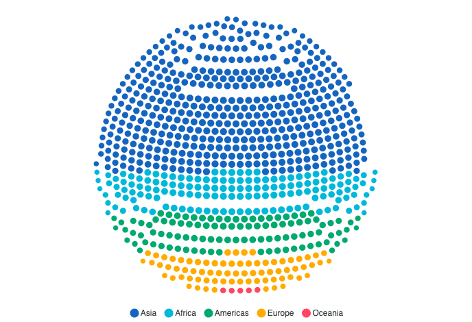
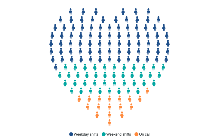
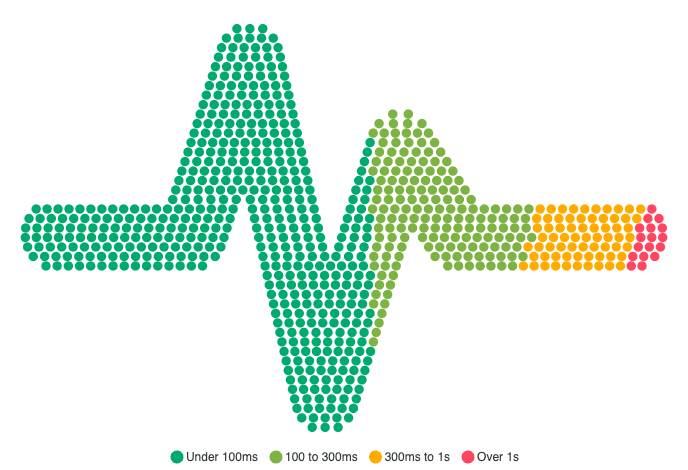
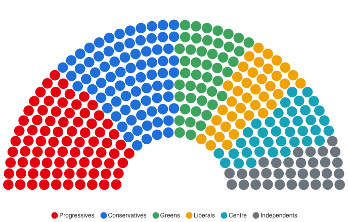
Unit charts draw one mark per thing counted, so a quantity reads as something you could count back. Read the docs →
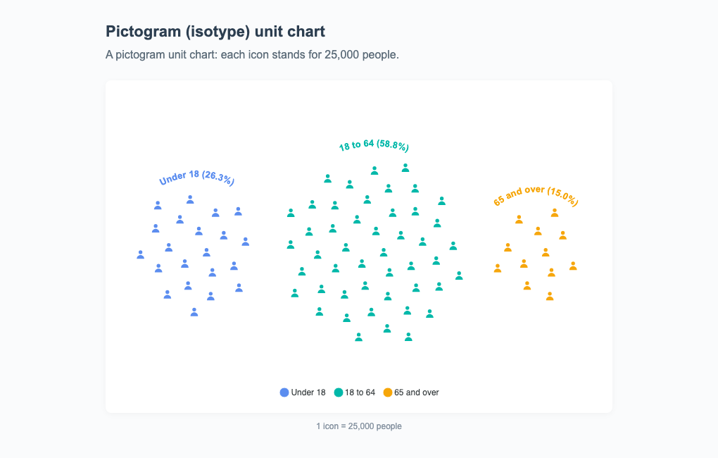
Pictogram PopulationPremium feature
Pictogram Population
ParliamentPremium feature
Parliament
Workforce ClustersPremium feature
Workforce Clusters
Population ExplorerPremium feature
Population Explorer
City BubblesPremium feature
City Bubbles
Heart DonorsPremium feature
Heart Donors
Globe PopulationPremium feature
Globe Population
Every shape, or bring your own →The companion shape kit: a heart, a house, a globe, a heartbeat trace.

Beeswarm Charts

View all →

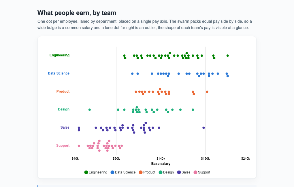
Beeswarms place every observation on a value axis and nudge equal values off the lane centre so nothing overlaps. Read the docs →
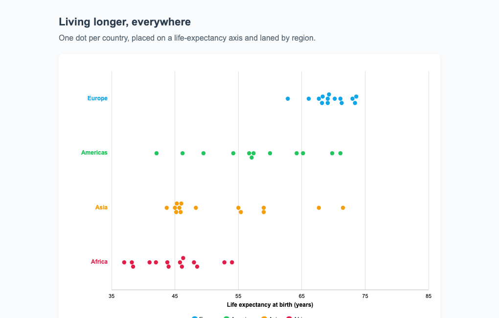
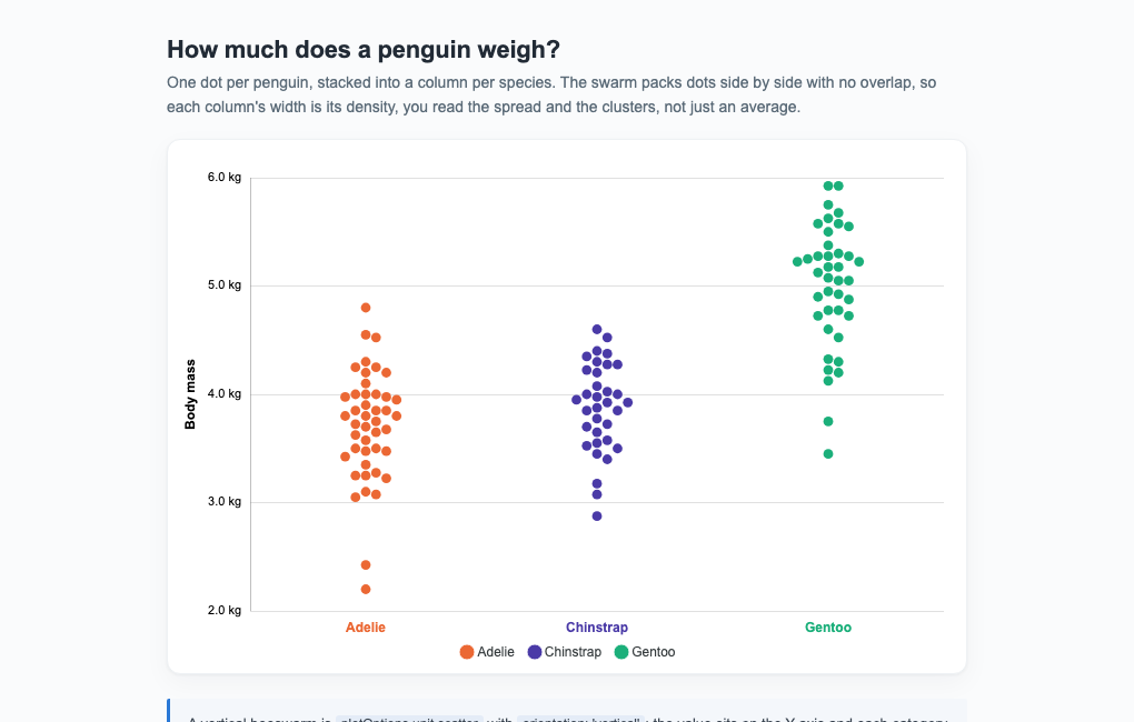
Life Expectancy SwarmPremium feature
Life Expectancy Swarm
Vertical BeeswarmPremium feature
Vertical Beeswarm
Horizontal BeeswarmPremium feature
Horizontal Beeswarm
Bubble BeeswarmPremium feature
Bubble Beeswarm

Waffle Charts

View all →

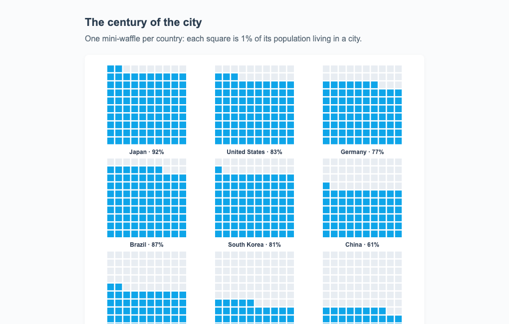
Waffle charts fill a lattice of cells in category order, a countable part-to-whole alternative to a pie. Read the docs →
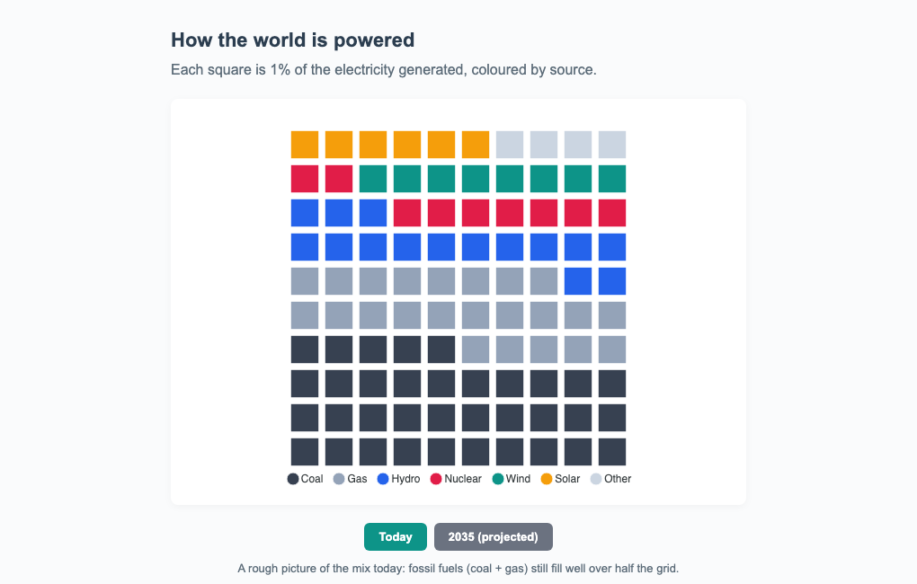
Energy MixPremium feature
Energy Mix
Urban Small MultiplesPremium feature
Urban Small Multiples

Slope Charts

View all →

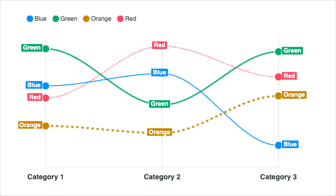
Slope charts compare two points in time across many categories at a glance.
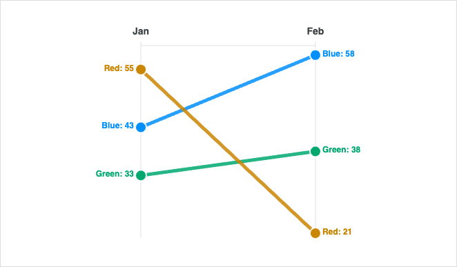
Basic Slope
Basic Slope
Slope Multi Group
Slope Multi Group

Pie / Donut Charts

View all →

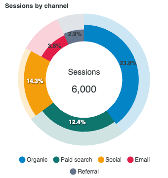
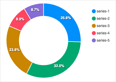
Pie and donut charts show part-to-whole proportions for a small number of categories. Read the docs →
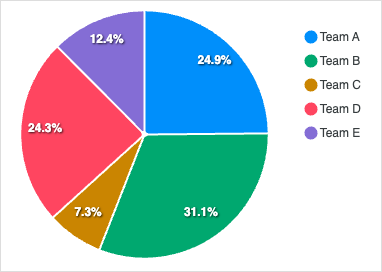
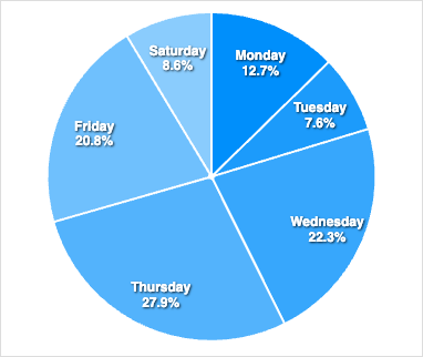
Simple Pie
Simple Pie
Simple Donut
Simple Donut
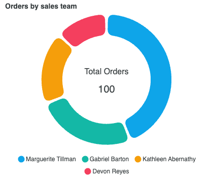
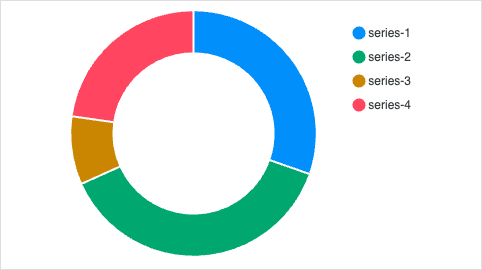
Rounded Donut
Rounded Donut
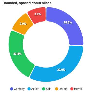
Rounded Spaced Donut
Monochrome Pie
Monochrome Pie
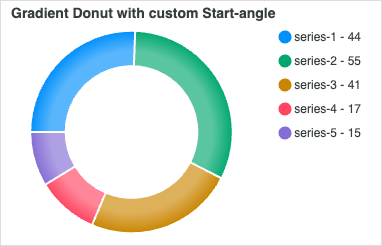
Gradient Donut
Gradient Donut
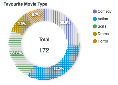
Donut with Pattern
Donut with Pattern
Donut Update
Donut Update
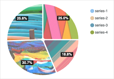
Pie with Image
Pie with Image
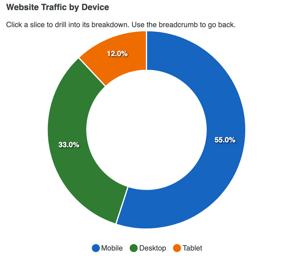
Donut with Drilldown

RadialBar / Circle

View all →

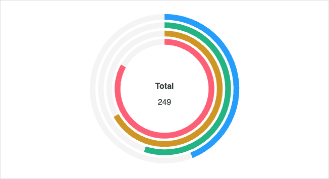
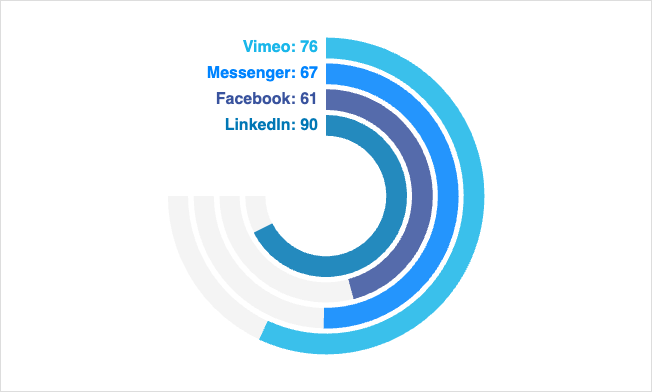
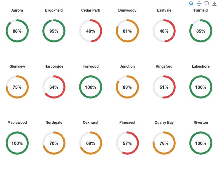
RadialBar and circular charts display progress, KPIs, and goal completion. Read the docs →
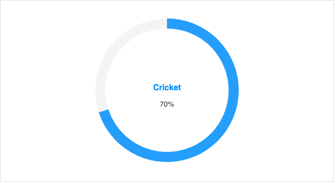
Basic RadialBar
Basic RadialBar
Multiple Band
Multiple Band
Custom Angle
Custom Angle

Gauge Charts

View all →

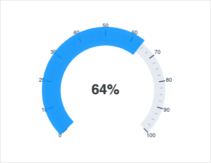
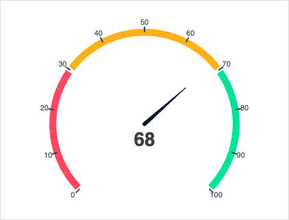
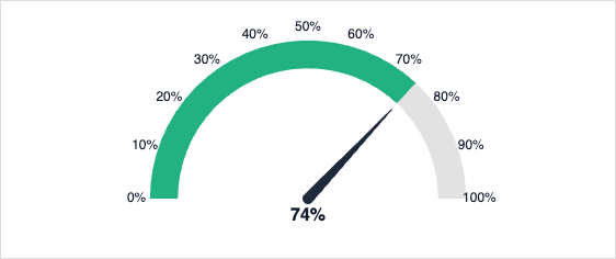
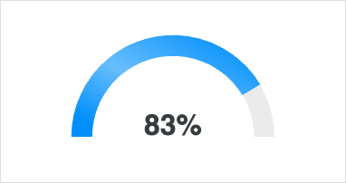
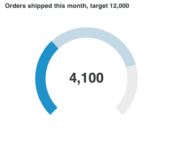
Gauge charts surface a single metric against a goal or threshold range. Read the docs →
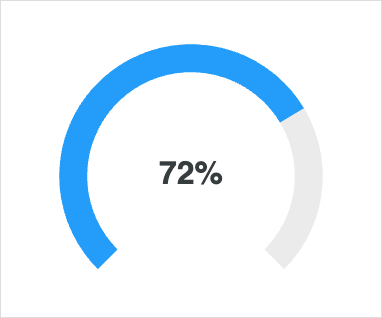
Basic Gauge
Basic Gauge
Gauge with Bands
Gauge with Bands
Gauge with Custom Label
Gauge with Ticks
Gauge with Ticks
Needle Gauge
Needle Gauge
Live Needle Gauge
Live Needle Gauge
Semi-Circle Gauge
Semi-Circle Gauge

Radar Charts

View all →

Radar charts compare multiple variables across one or more series on a polar axis. Read the docs →
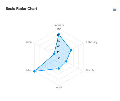
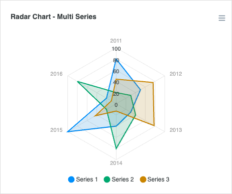
Basic Radar
Basic Radar
Radar Multiple Series
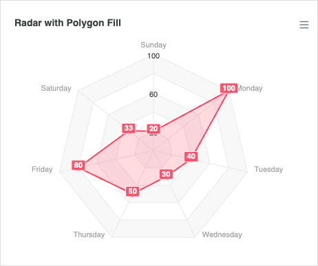
Radar with Polygon Fill

Polar Area Charts

View all →

Polar area charts combine pie segments with bar length to encode two dimensions.
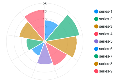
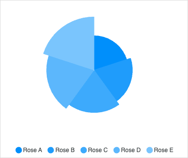
Basic Polar Area
Basic Polar Area
Polar Area Monochrome

Sparklines

View all →

Inline, axis-free mini charts for compact trend display alongside KPIs.
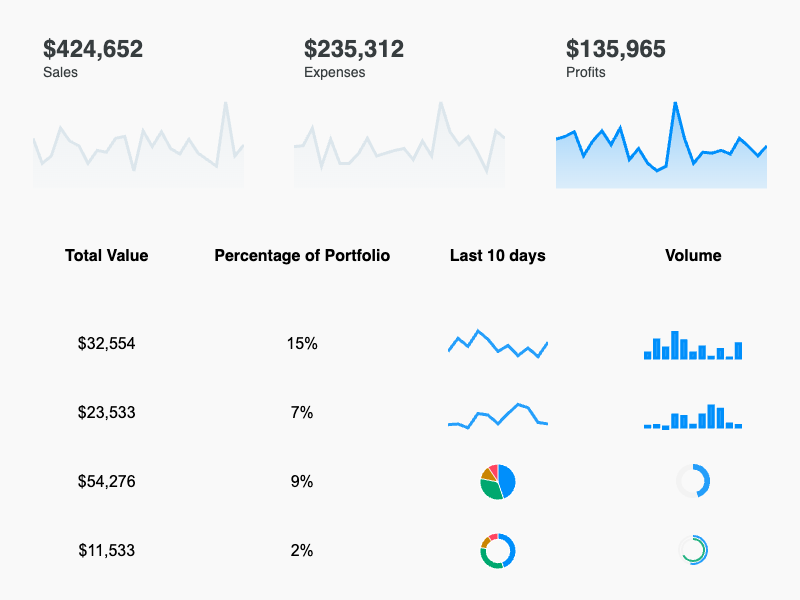
Basic Sparklines
Basic Sparklines

Dashboards

View all →

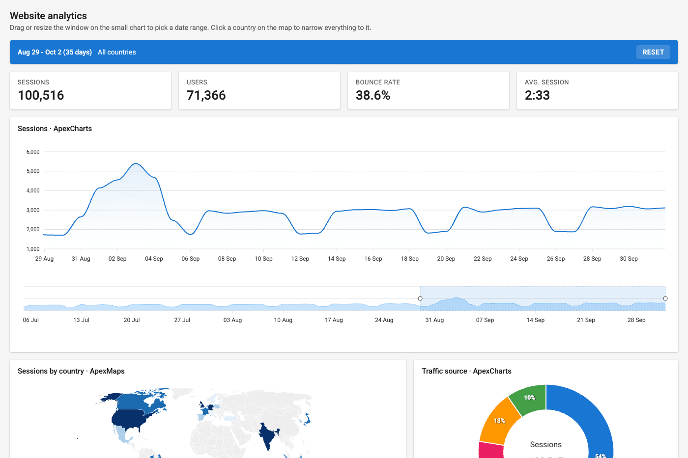
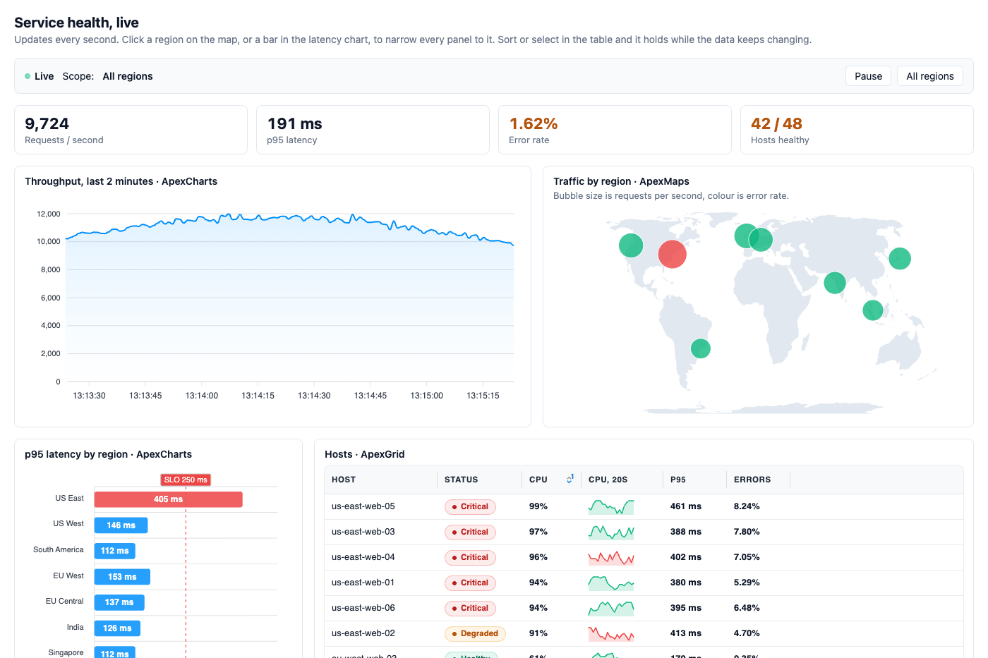
Full ApexCharts dashboard concepts combining multiple chart types in a single page.

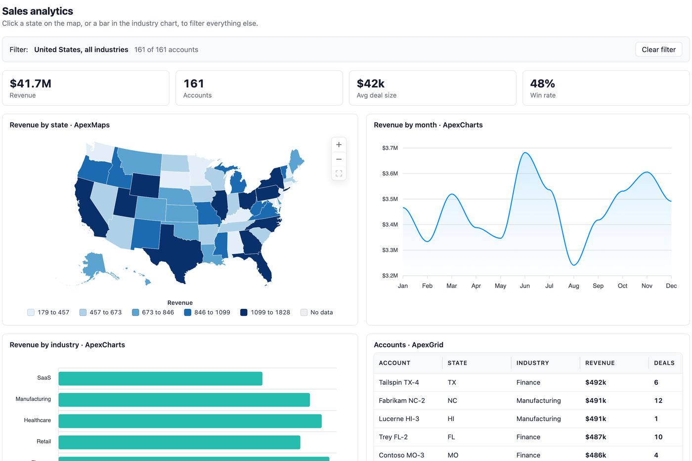
Dashboard Concept – Modern
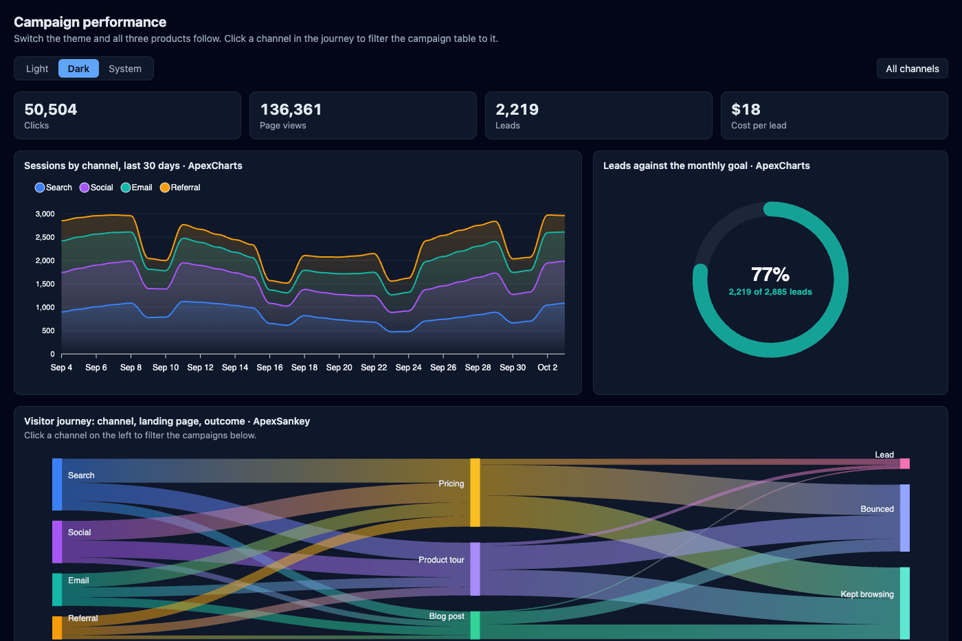
Dashboard Concept – Dark
Realtime Dashboard
Realtime Dashboard

Custom Series

View all →

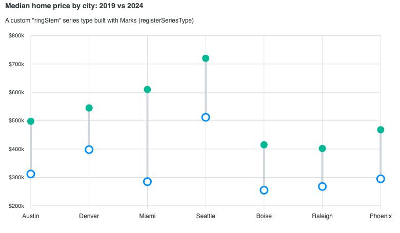
Compose your own series types (bullet, lollipop, dumbbell) with the v6 Marks API, with events, tooltips, and legend built in.
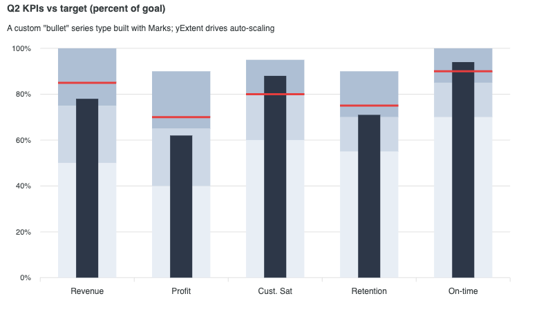
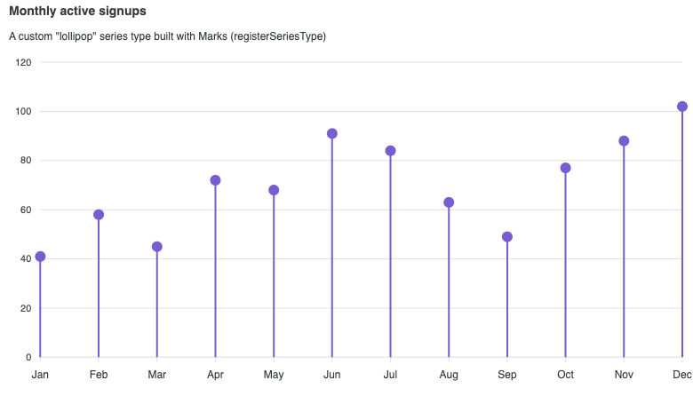
Bullet Chart
Bullet Chart
Lollipop Chart
Lollipop Chart
Dumbbell (Custom Series)

Interactivity

View all →

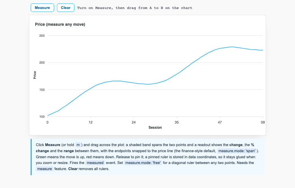
Investigate data directly on the chart: crossfilter across views, measure changes, author annotations, and act at a point with the context menu.
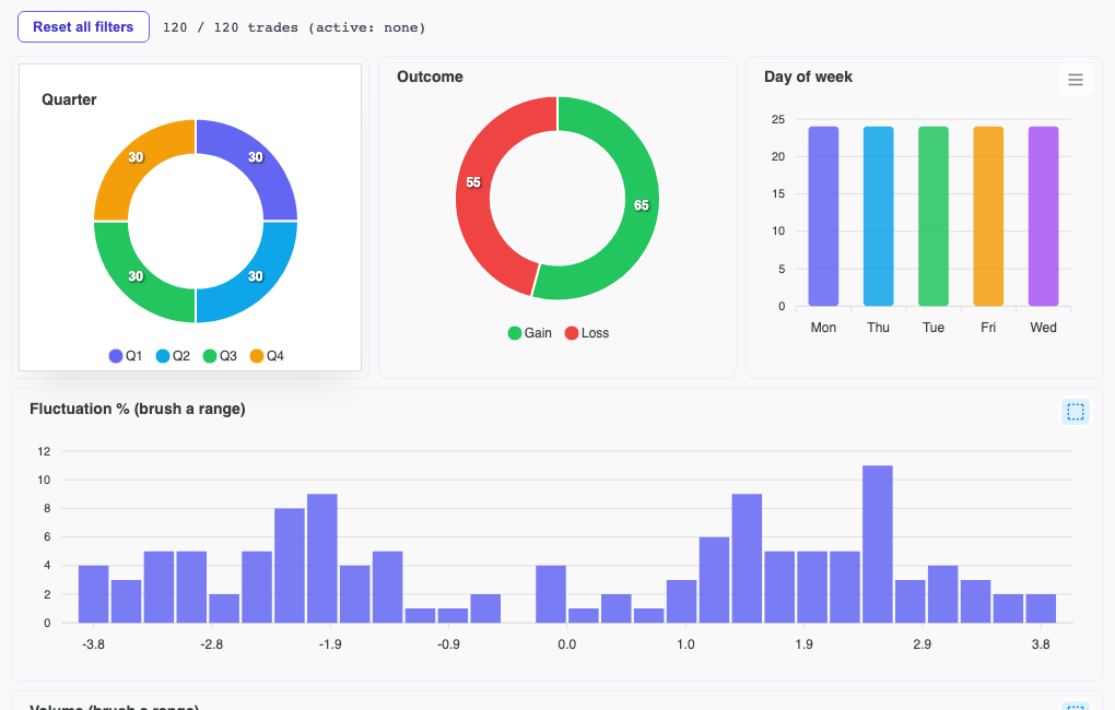
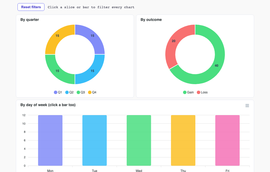
Crossfilter DashboardPremium feature
Crossfilter Dashboard
Crossfilter (Categorical)Premium feature
Crossfilter (Categorical)
Measure RulerPremium feature
Measure Ruler
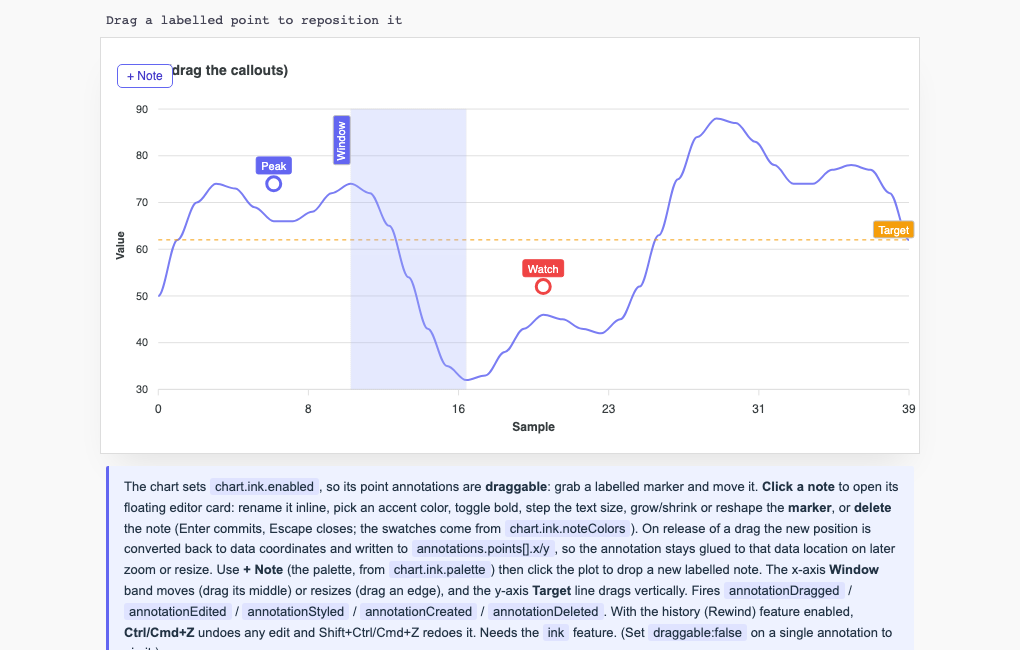
Annotation Authoring (Ink)Premium feature
Annotation Authoring (Ink)

Narrative & State

View all →

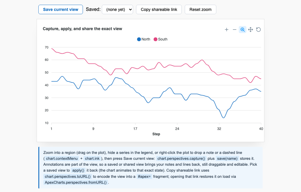
Turn a chart into a surface you can author and share: scroll-driven storyboards, shareable view state, and undo and redo.
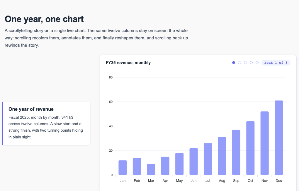
Scrollytelling (Storyboard)Premium feature
Scrollytelling (Storyboard)
Shareable Views (Perspectives)Premium feature
Shareable Views (Perspectives)
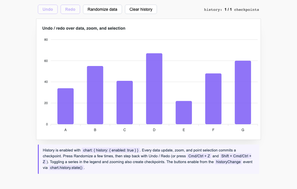
Undo / Redo (Rewind)Premium feature
Undo / Redo (Rewind)