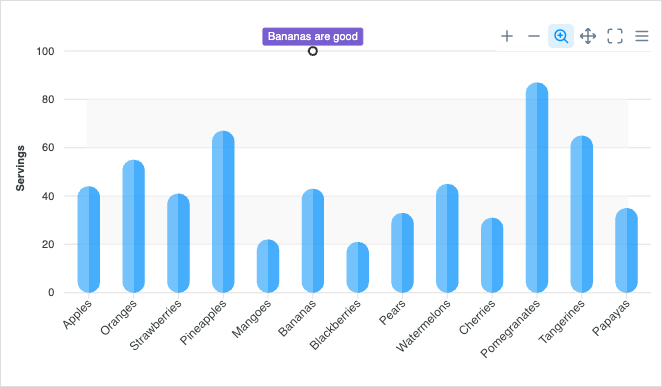
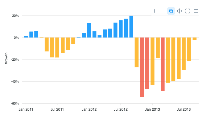
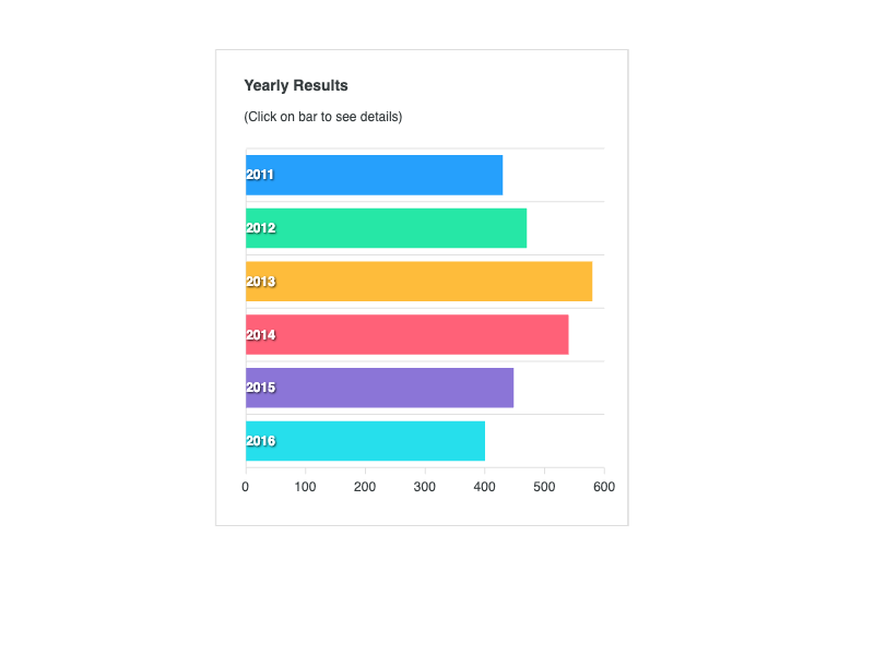
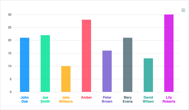
Column Charts

A JavaScript Column Chart, just like other bar graphs uses vertical bars to display data and is used to compare values across categories. The categories (or magnitude) of the data are represented by the column and can be labeled under each column. Unlike histograms, column charts are constructed with spaces between the columns. With ApexCharts, it becomes feasible to have rotated labels and annotations on the column chart.

Below, you will find plenty of examples to show a variety of different column charts available in ApexCharts

Stay Updated

Get the latest news, updates and what's coming next! Sign up for our Newsletter here.

Thank You! You are signed up.

There was an error while trying to send your request. Please try again.

ApexCharts.js will use the information you provide on this form to be in touch with you and to provide updates and marketing.