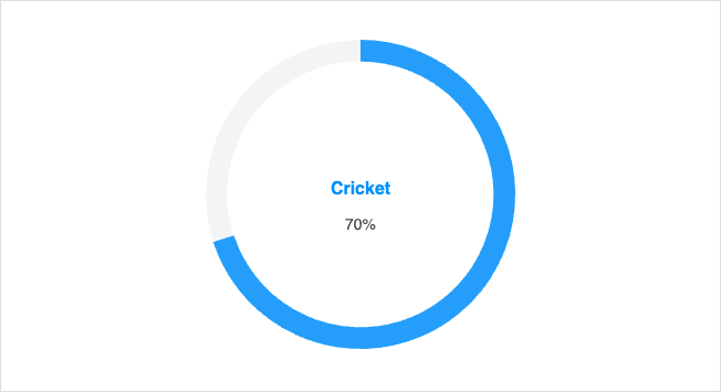
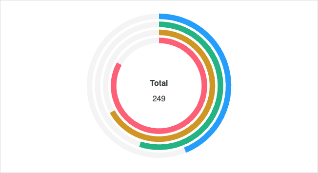
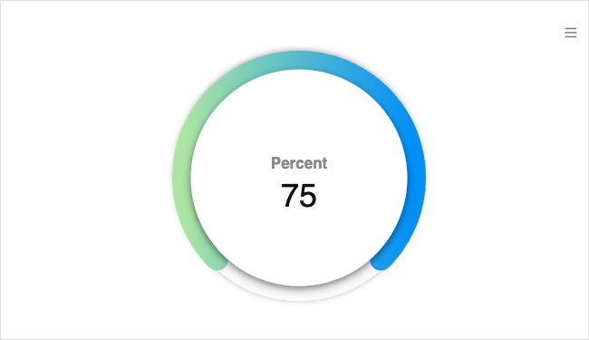
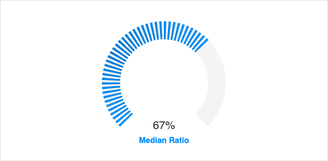
JavaScript RadialBar / Circle
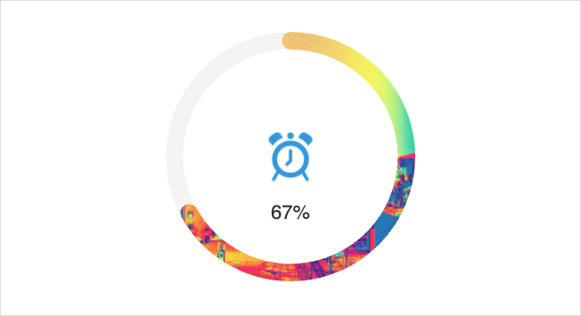
Browse JavaScript radialbar / circle examples built with ApexCharts.js. Click on any example below to see the live chart and source code.
Browse JavaScript radialbar / circle examples built with ApexCharts.js. Click on any example below to see the live chart and source code.