Dumbbell Chart
What is a dumbbell chart?
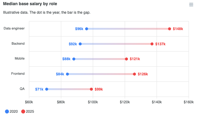
A dumbbell chart compares two or more measures over the same categories: 2020 against 2025, target against actual, women's pay against men's. Each category is one row, the measures are marked as dots on it, and a connector joins them so the gap is the thing you see.
ApexCharts added chart.type: 'dumbbell' in 7.1.0. Each measure is an ordinary series, and the chart does the joining:
import ApexCharts from 'apexcharts'
import 'apexcharts/features/dumbbell'
var options = {
chart: {
type: 'dumbbell',
height: 380
},
colors: ['#3B82F6', '#EF4444'],
series: [{
name: '2020',
data: [
{ x: 'Data engineer', y: 96 },
{ x: 'Backend', y: 92 }
]
}, {
name: '2025',
data: [
{ x: 'Data engineer', y: 148 },
{ x: 'Backend', y: 137 }
]
}]
}
var chart = new ApexCharts(document.querySelector('#chart'), options)
chart.render()
A complete example is on this page.
When to use a dumbbell chart?
- Before and after, on many categories at once. Two grouped bars per category say the same thing with four times the ink and no gap to look at.
- Ranking by change rather than by level. Sort the categories by the size of the gap and the chart becomes a list of what moved most.
- Target against actual, quota against attainment, or any pair where the distance is the measurement.
When to avoid:
- When the values themselves matter more than the distance between them. Use a bar or column chart.
- For more than three measures per category. The dots crowd the connector and only the two extremes get labelled.
- For a time series with many points. A dumbbell compares snapshots; use a line chart for a trend.
Data format
One series per measure, each carrying one value per category. You do not zip the measures into [low, high] pairs.
series: [{
  name: '2020',
  data: [
    { x: 'Data engineer', y: 96 },
    { x: 'Backend', y: 92 },
    { x: 'Mobile', y: 88 }
  ]
}, {
  name: '2025',
  data: [
    { x: 'Data engineer', y: 148 },
    { x: 'Backend', y: 137 },
    { x: 'Mobile', y: 121 }
  ]
}]
This is the point of the type. The renderer underneath draws one interval per row, so the two measures have to meet somewhere. Hand-zipping them into pairs means keeping the order straight yourself and then re-naming the legend after the pair has thrown the series names away. ApexCharts does the merge and keeps hold of which endpoint is which, so the dots, the end labels, the connector gradient, and the tooltip can all still name them.
Rows are joined on x, not on array position, so a series written in a different order or missing a category is fine.
{x, y} objects, [x, y] tuples, and bare numbers alongside xaxis.categories all work.
The legacy pair form still works
plotOptions.bar.isDumbbell on a range bar has always accepted one series of y: [low, high] pairs, and it is unchanged. ApexCharts detects that shape and passes it straight through, with the existing plotOptions.bar.dumbbellColors pathway colouring the endpoints.
The two forms differ in what they can tell you: the pair form names no endpoints, so its tooltip reports the interval and nothing else, and endpoint names have to come from legend.customLegendItems. Prefer one series per measure for anything new.
They also differ in what the page has to load. The range bar renderer draws the flag on its own, so a chart.type: 'rangeBar' chart with isDumbbell needs nothing beyond the default bundle. chart.type: 'dumbbell' needs the dumbbell feature whichever form its data takes.
Rows or columns?
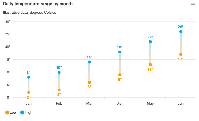
A dumbbell is horizontal by default, because the categories are names and a name reads along the row it labels rather than turned on its side under a column. Set plotOptions.bar.horizontal: false for the column form.
chart: { type: 'dumbbell' },
plotOptions: {
  bar: { horizontal: false }
}
Three or more measures
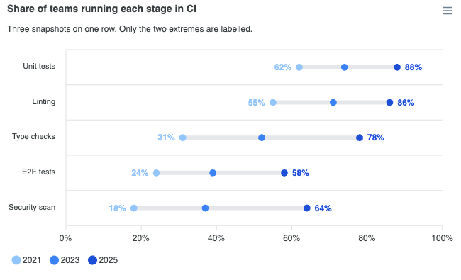
More than two series per category is supported: every measure gets its own dot, and the connector spans from the lowest to the highest.
Only the two extremes are labelled. Anything between them sits on the connector, where a label has nowhere to go that is not over the line or over its neighbour.
Styling the dots, the connector and the labels
The dots and the connector are the bar and its markers, so they are configured as such: the connector's thickness is plotOptions.bar.barHeight (rows) or columnWidth (columns), and the size of the marked ends is markers.size. Everything specific to the type lives under plotOptions.bar.dumbbell.
plotOptions: {
  bar: {
    barHeight: 6,          // connector thickness
    dumbbell: {
      connector: {
        color: '#E5E7EB',  // omit for a gradient between the endpoint colours
        opacity: 1
      },
      dataLabels: {
        enabled: true,
        offset: 6,
        formatter: function (val) { return val + '%' }
      },
      tooltip: {
        differenceLabel: 'Change'
      }
    }
  }
}
colors colours the dots: each endpoint takes the colour of the series it belongs to. Left alone, the connector is a gradient between the two endpoint colours, resolved per row so that a row where the measures cross still runs the right way. Its default opacity is 0.55, because the join is context for the marked ends rather than a third mark competing with them.
End labels are on by default for chart.type: 'dumbbell', since the pair of numbers is the comparison and reading them off an axis costs the glance the chart was meant to save. Each label takes its own end's colour, so a value is tied to a measure by more than its position. They are off by default for the bare isDumbbell flag on a range bar.
One thing to watch: the dataLabels.formatter under plotOptions.bar.dumbbell formats one endpoint value. It defaults to the value axis' own label formatter, not dataLabels.formatter, which on a range bar reads out end - start. That number is the gap, not an endpoint.
What does the tooltip report?
Each visible endpoint on its own row, named after its series and in that series' colour, and then the gap between them under Difference. The gap is the reason the two dots are on one row, so it is read out rather than left to be eyeballed.
The difference row appears only when exactly two endpoints are visible. With three or more, "the difference" names nothing. Hiding a measure from the legend takes its endpoint out of the readout too, so toggling down to two brings the difference row back.
Rename it with the tooltip.differenceLabel key under plotOptions.bar.dumbbell.
Defaults worth knowing
- Legend on, at the bottom, with circular markers. Two named measures is exactly what the series legend is for, and the round marker echoes the marked ends rather than the connector.
dataLabelsoff, end labels on. The centred range label a range bar would draw reads outend - startover the connector, which is the one number a dumbbell can already be seen to say.- No zoom. A dumbbell is a fixed set of named rows, not a window onto a continuum.
- Stacking forced off. The rows are not parts of a whole.
Tree-shaking
A dumbbell is an interval with its two ends marked, which is what the range bar renderer already draws, so dumbbell needs no renderer of its own. What it adds, the endpoint merge, is the dumbbell feature, and since 8.0 that feature is not in the default bundle. The line to add depends on the bundle you start from.
Next to the default bundle, which already has the bar renderer, import the feature on its own:
import ApexCharts from 'apexcharts'
import 'apexcharts/features/dumbbell'
Use the features/ path here, not apexcharts/dumbbell. That entry point is for the lean core: it brings the bar renderer along with the feature, so next to the default bundle it adds a second bar renderer to a page that already has one.
On the lean core, apexcharts/dumbbell is the one import that brings both:
import ApexCharts from 'apexcharts/dumbbell'
Or, alongside an existing bar import:
import ApexCharts from 'apexcharts/core'
import 'apexcharts/bar'
import 'apexcharts/features/dumbbell'
Without a bundler, load the feature's file after the default bundle:
<script src="https://cdn.jsdelivr.net/npm/apexcharts"></script>
<script src="https://cdn.jsdelivr.net/npm/apexcharts/dist/features/dumbbell.js"></script>
The full bundle (import ApexCharts from 'apexcharts/full', or apexcharts.full.min.js from a script tag) already has it. Without the feature, a dumbbell draws nothing and the console names the import to add. See tree-shaking for the full picture.
The dumbbell settings are documented under plotOptions.bar, since a dumbbell is configured as the bar and markers it is drawn from.