Highlight Filter
When a dashboard is filtered by one product, region or channel, the usual approach redraws every chart with the filtered values, and the totals they came from disappear. The reader sees how much the pick sold, but no longer how much of the business that is. The highlight filter keeps both on screen: each value is drawn faded at its full size, and the part of it the pick accounts for is drawn solid in front, from the same baseline.
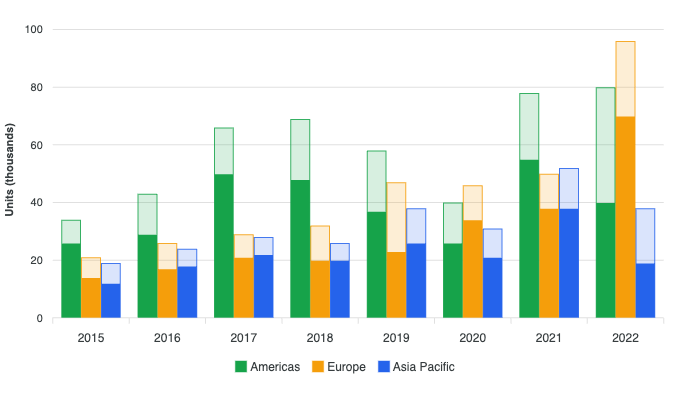
The part is data you hand the chart next to the whole, so picking and clearing are ordinary updates that animate from what is on screen. It works on column, bar and funnel charts, stacked and 100% stacked bars, line and area charts, pie, donut and polar area charts, radial bars and gauges, and treemaps.
See it live
Each demo has buttons to pick a segment and to clear it, so you can watch the parts come and go:
- Filter by a product: click a product in one chart, and the quarters beside it keep every region's revenue, faded, with that product's share solid.
- Columns, stacked columns and bars, lines, areas and a funnel.
- Pie, donut and polar area, gauges and radial bars, and a nested treemap.
- Through a forecast: the part keeps the forecast's dashes and lighter fill.
- Averages past the whole: the case covered below, where a part can be larger than its whole.
Where it is useful
- Filter-by dashboards. Click a product in one chart, and every other chart keeps its totals with that product's share solid inside them.
- A segment's contribution. One channel, customer group or region inside each month's total, on the chart that already shows the total.
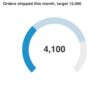
- A share of a target. On a gauge, one region's orders in front of the company's, on the same track.
- Averages against an overall figure. A segment's average beside everyone's. Here the part can be larger than the whole, which has its own section below.
Enable it
import ApexCharts from 'apexcharts'
import 'apexcharts/features/highlight-filter'
const chart = new ApexCharts(document.querySelector('#chart'), {
chart: { type: 'bar', height: 360 },
series: [
{ name: 'Americas', data: [34, 43, 66, 69], highlightData: [26, 29, 50, 48] },
{ name: 'Europe', data: [21, 26, 29, 32], highlightData: [14, 17, 21, 20] },
],
xaxis: { categories: ['2019', '2020', '2021', '2022'] },
})
chart.render()
Each series carries its wholes in data and its parts in highlightData, one entry per data point. Every column is drawn at its full value, faded to fadeOpacity (0.2) with a thin outline, and its part is drawn solid in front from the same baseline. No other option is needed.
Without the add-on, chart.highlightFilter is null, and a chart handed parts draws as usual without them and says so once in the console.
The plan. The highlight filter is a Premium feature. Without a valid Premium key or above, a chart carries the APEXCHARTS trial watermark while it is drawing parts. It is never degraded or blocked, and loading the add-on alone, or clearing the pick, leaves a chart unmarked. See pricing.
Three ways to hand over the parts
| Where the part goes | Chart types | Notes |
|---|---|---|
highlightData on a series | Axis charts and flat treemaps | One value per data point, parallel to data. The simplest fit for number arrays. |
highlight on a point | Axis charts and treemaps | Written as { x, y, highlight }. Wins over highlightData. The form for nested treemaps, and for chart.dataReducer and chart.streaming, which drop and trim points that a parallel array cannot follow. |
highlightFilter.data | Pie, donut, polarArea, radialBar and gauge | One value per slice or ring, because a plain number series has nowhere to carry a field. A slice written as { x, y, highlight } wins over it. |
// a part on each point
series: [{
  name: 'Revenue',
  data: [
    { x: 'Q1', y: 40, highlight: 12 },
    { x: 'Q2', y: 55, highlight: 30 },
  ],
}]
// one part per slice
{
  chart: { type: 'donut' },
  series: [44, 55, 13],
  labels: ['Organic', 'Paid', 'Referral'],
  highlightFilter: { data: [20, 31, 4] },
}
highlightFilter.data is ignored, with a console warning, while its length differs from the number of slices, so a pick written for other data never lands on the wrong slice.
null and 0 mean different things. null, or a missing entry, is "no part here": the whole stays faded with no label, and the tooltip shows the whole alone. 0 is "the pick leaves nothing here": nothing solid is drawn, but the label and the tooltip state 0. A chart counts as highlighted as soon as any series carries highlightData, any point carries a highlight key, or highlightFilter.data is an array, even when every value in them is null. Every whole is then faded, with nothing in front.
Picking and clearing
A pick is the same series with parts, and a clear is the same series without them, sent through the usual update methods. Both animate from what is on screen. On a first pick each part starts as its whole and drains to its size while the whole fades, so the first frame is the chart the reader was already looking at.
// pick
chart.updateSeries([
  { name: 'Americas', data: [34, 43, 66, 69], highlightData: [26, 29, 50, 48] },
])

// clear
chart.updateSeries([
  { name: 'Americas', data: [34, 43, 66, 69] },
])
The framework wrappers need nothing extra: pass the new series as props and the wrapper sends the update. On pie, donut, polarArea, radialBar and gauge charts the parts live in the options, so send them through updateOptions, and null to clear:
chart.updateOptions({ highlightFilter: { data: [20, 31, 4] } })
chart.updateOptions({ highlightFilter: { data: null } })
highlightFilter.enabled: false keeps the parts in the data and draws the plain chart.
The instance API
With the add-on loaded, chart.highlightFilter builds that update for you:
await chart.highlightFilter.set([
  [26, 29, 50, 48],   // one row per series
  [14, 17, 21, 20],
])

// or work each part out from its data point
await chart.highlightFilter.set(({ seriesName, dataPointIndex }) =>
  onlineSales[seriesName][dataPointIndex]
)

chart.highlightFilter.valueAt(0, 2)   // 50
chart.highlightFilter.isActive()      // true

await chart.highlightFilter.clear()
set() takes one row per series, one value per slice or ring on the circular types, or a function of the data point, which receives seriesIndex, dataPointIndex, seriesName, x, value, datum and w. valueAt() reads back the part at a series and data point. Pass { animate: false } to skip the transition, or { series } to replace the wholes and the parts in one render. Both set() and clear() return a promise that resolves when the update is drawn. See methods.
The event
highlightFilterChanged fires once the render that changed the pick is drawn. Its phase is 'enter' when parts arrive on a plain chart, 'update' when they change, and 'clear' when they are removed.
chart: {
  events: {
    highlightFilterChanged(chart, { active, phase }) {
      clearButton.disabled = !active
    },
  },
}
Drilldown. A pick belongs to the page, not to a drill level. Drilling in or back up drops the parts and fires highlightFilterChanged with phase: 'clear' once the new level is drawn, so send the pick again for the level on screen.
What each chart type draws
| Chart type | The whole | The part |
|---|---|---|
| column, bar | Faded, with a thin outline | Solid in the same slot and width, from the same baseline. Grouped, horizontal, distributed and negative bars included. |
| stacked and 100% stacked bars | Each segment faded | The parts form their own stack, solid in front, from the same baseline. In a 100% stack the parts are shares of the same category total as the wholes. |
| funnel | Each stage faded | Solid and centred inside its stage. |
| line, spline, step line | Dashed at full strength rather than faded (line.dashArray) | A solid line in the series colour. |
| area, stacked area | Fill faded, with an outline | A solid area from the same baseline. On a stacked area the parts stack on each other. An unstacked area's part keeps the fill's own opacity, because unstacked areas overlap by design. |
| pie, donut | Each slice faded, at its full angle | From the centre (pie) or the hole (donut) out to its share of the radius. pie.encoding: 'area' makes its area the share instead. |
| polarArea | Each slice faded | From the centre out to its own value on the chart's radial scale. |
| radialBar, gauge | Each ring faded on its track | A solid arc in front, from the same start. On a needle gauge (shape: 'needle'), a second needle points at the part and the gauge's own needle fades. |
| treemap | Each tile faded | The part's share of the tile, filled solid from the bottom of the tile. Flat and nested treemaps. |
Every other chart type, and combo charts, draw as usual and warn once in the console.
Labels, tooltips and the legend
- Data labels state the part. Bar, line and area labels, slice labels and the radial centre value state the part by default;
dataLabels.value: 'whole'keeps the usual labels. Stacked totals and the donut and radialBar centre totals state the sum of the parts;dataLabels.total: 'whole'keeps the whole's total. A data point with no part has no label: its faded whole is the backdrop, not a reading. - One tooltip row per series. Each row reads "part / whole", the part bold and the whole muted, beside a marker drawn half solid and half faded. A data point with no part shows its whole alone, muted.
tooltip.share: trueadds the part's share of its whole ("50 / 66 · 76%"),tooltip.formatter(part, whole, opts)returns the row's value text instead, andtooltip.show: falsekeeps the plain row. In a custom tooltip,opts.ctx.highlightFilter.valueAt(opts.seriesIndex, opts.dataPointIndex)reads the part. - Radial charts turn the tooltip on. A radialBar or gauge has no tooltip by default. While a pick is active it shows one, a row per ring, unless the page set
tooltip.enableditself. - The legend lists the series and nothing else. There are no extra legend entries for the parts: the chart, the labels and the tooltip explain them. Clicking a series in the legend hides its whole and its part together.
- Formatters are told about the part. Pie, donut and polarArea slice labels, treemap tile labels and slice tooltip rows receive
opts.highlight, which is{ value, total, share, overflow }. So do the donut and radialBar centre formatters:value.formatter(val, w, { highlight })andtotal.formatter(w, { highlight }). A nested treemap's parent header and tooltip formatters readopts.node.highlight, which adds up the parts of the leaves under it.
Customising the look
highlightFilter: {
  fadeOpacity: 0.15,                  // the faded whole (default 0.2)
  outline: { width: 1, opacity: 1 },  // keeps a faded whole readable; width 0 for none
  enter: 'baseline',                  // a first pick grows the parts from the baseline
  line: { dashArray: 6 },             // the dashed whole on a line chart
  tooltip: {
    formatter: (part, whole) =>
      part == null ? `${whole}` : `${part} of ${whole}`,
  },
}
With the default enter: 'whole', a first pick starts each part as its whole and drains it to its size. 'baseline' grows each part from the baseline instead, which reads better when the parts are small.
The part's needle on a needle gauge takes its own styling. Each key falls back to plotOptions.radialBar.needle, and the colour to the series colour, so it reads apart from the gauge's own needle:
highlightFilter: {
  radialBar: {
    needle: { color: '#ea580c', length: '80%', baseWidth: 6, tipWidth: 1 },
  },
}
Every key, with its default, is in the options reference.
Averages: when the part is larger than the whole
Most parts fit inside their whole, because they are a subset of a sum: one channel's sales inside the total. A part is larger than its whole only when it is an average or a ratio, such as a product line's average profit per order beside the store's average across every product, or one region's satisfaction score beside the company's. The highlight filter draws these honestly as well.
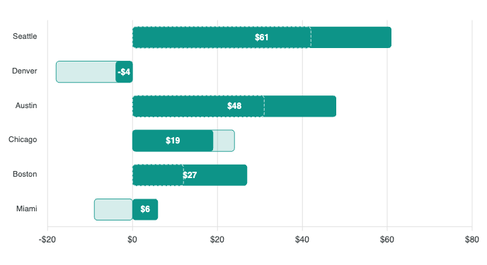
- The axis makes room. By default the value axis extends to fit a part past its whole (
axis: 'extend').axis: 'clamp'keeps the axis the wholes set, and a part beyond it is cut off at the edge of the plot. - The end of the whole stays marked. Where a solid part covers its whole, a dashed edge traces where the whole ends on bars, columns, pie and donut slices and polar areas. On a radial arc a short tick across the track marks it.
- A fixed edge holds the part. A funnel stage, a 100% stack, the rim of a pie or donut, a treemap tile and the end of a gauge cannot grow, so the part is drawn to that edge, and labels and tooltips still state its true value. Except on a funnel, a part held this way carries the
apexcharts-highlight-overflowclass. - A part of the other sign is drawn on its own side of zero on bars and lines. On a pie, donut or treemap it has no share to draw, and
opts.highlight.overflowis'sign'.
On a gauge the solid arc covers the faded one when the part is larger, leaving only the tick. radialBar.indicator: 'lanes' splits each ring's band in two instead: the outer lane is the whole, drawn light (lanes.opacity, 0.45), and the inner lane is the part, solid, each on a track of its own, so neither covers the other. Each lane shows its own tooltip row (tooltip.formatter is told which through opts.lane), and the centre adds a smaller, muted line with the whole under the part. The word the whole lane's row uses for the part comes from the locale key highlightFilter.part.
{
  chart: { type: 'gauge' },
  series: [78],          // the company's score
  highlightFilter: {
    data: [84],          // one region's, which can beat it
    radialBar: { indicator: 'lanes' },
  },
}
The gauges and pie, donut and polar area demos each show the sums first and the averages second, so the two cases can be compared side by side.
Works with the rest of the library
- Canvas renderer. Parts are drawn on the canvas renderer too, landing each pick at once.
- Server-side rendering.
renderToStringoutputs the landed picture: wholes faded, parts solid, labels on the parts. - Exports. PNG and SVG exports include the faded wholes and the solid parts.
- Trellis. Each trellis panel draws its own parts, and a shared y scale makes room for them.
- Chart type changes. A morph to another chart type carries the wholes, and the parts come in once it lands.
- Linked Views. The crossfilter in Linked Views re-aggregates each chart over the filtered rows and replaces its values. The highlight filter does not compute parts for you: pass in the ones your own query or aggregation produces.
Limitations
- CSV export writes the wholes only. The parts are not in it.
- Combo charts, and chart types not in the table above, draw without parts and warn once.
- A stacked chart with more than one y axis, or a logarithmic y axis, draws without parts and warns.
highlightDatacannot followchart.dataReducerorchart.streaming, and warns when it meets either. Put the part on each point as{ x, y, highlight }instead.- Treemap tiles with a gradient, pattern or image fill draw without their parts, with a warning. A nested treemap ignores
highlightData, and ahighlighton a branch: a branch adds up its leaves.
Reference
Every option is in the highlightFilter options reference. The data fields are on the series page, the methods under highlightFilter, and the event under chart.events. Every chart type is live in the highlight filter demos.
The highlight filter ships as a tree-shakeable entry point; see the tree-shaking guide.