tooltip
Configuration Structure
tooltip: {}enabled
trueShow tooltip when user hovers over chart area.
enabledOnSeries
undefinedShow tooltip only on certain series in a multi-series chart. Provide indices of those series which you would like to be shown.
followCursor
falseFollow user's cursor position instead of putting tooltip on actual data points.
Note: This option doesn't have any effect in pie/donut/radialbar/radar/treemap/heatmap charts.
Ignored while interactive is enabled, because a tooltip that trails the cursor can never be entered.
intersect
falseShow tooltip only when user hovers exactly over datapoint.
inverseOrder
falseIn multiple series, when having shared tooltip, inverse the order of series (for better comparison in stacked charts).
interactive
falseKeep the tooltip visible while the pointer is over it, so a link, a button or any other control returned by custom can actually be reached. Added in 7.6.0.
A default tooltip sets pointer-events: none, which is why a link inside a custom tooltip cannot be clicked without this: the pointer passes straight through, and moving toward the tooltip counts as leaving the data point, so it disappears on the way. Turning this on flips pointer-events to auto and defers the close by 150ms, which is the time the pointer needs to cross the gap between the data point and the tooltip. Entering the tooltip cancels that close; leaving it closes the tooltip.
tooltip: {
  interactive: true,
  custom: ({ series, seriesIndex, dataPointIndex }) => {
    const value = series[seriesIndex][dataPointIndex]
    return `<div class="tooltip-card">
              <strong>${value}</strong>
              <a href="/reports/${dataPointIndex}">Open report</a>
            </div>`
  },
}
Two things follow from it:
followCursoris ignored while this is on. A tooltip that trails the cursor can never be entered, so the two are mutually exclusive rather than additive.- On grouped charts, leaving the tooltip dismisses the tooltips on every chart in the group, not just the one under the pointer.
Leave it off unless the tooltip actually contains something to click. It is off by default because holding a tooltip open is the wrong behaviour for the ordinary read-a-value case.
arrow
trueRender a connector arrow pointing from the tooltip box at the data point. The arrow is auto-suppressed for followCursor, fixed.enabled, fillSeriesColor, non-axis charts, and most shared multi-series cases.
Available Options:
- true (default)
- false
compact
falseOne tight line instead of a card: the x label sits inline before the value, the marker goes, and the padding and font shrink.
For panels a normal card would cover, which is where it earns its place: small multiples, sparklines and dashboard tiles.
Available Options:
- false (default)
- true
A single-series chart also drops the series-name label, since there is nothing to tell apart. With several series the names stay, because they are what tells the rows apart.
custom
undefinedDraw a custom html tooltip instead of the default one based on the values provided in the function arguments.
Custom Tooltip Example
tooltip: {
  custom: function({series, seriesIndex, dataPointIndex, w}) {
    return '<div className="arrow_box">' +
      '<span>' + series[seriesIndex][dataPointIndex] + '</span>' +
      '</div>'
  }
}
You can even return an HTML element instead of a string
tooltip: {
  custom: function({series, seriesIndex, dataPointIndex, w}) {
      const customElement = document.createElement('div')
      customElement.style.padding = '10px'
      customElement.innerHTML = 'My custom Tooltip: ' + series[seriesIndex][dataPointIndex]

      return customElement
  }
}
Note: In a multi-seris/combo chart, you can pass an array of functions to customize tooltip for different chart types. For instance, a combo chart with a candlestick and a line will have different tooltips.
hideEmptySeries
falseIn multiple series, hide those series which have zero values or null data for a particular category
fillSeriesColor
falseWhen enabled, fill the tooltip background with the corresponding series color
theme
'light'Available Options
- light
- dark
If you further want to customize different background and forecolor of the tooltip, you should do it in CSS
.apexcharts-tooltip { background: #f3f3f3; color: orange; }
fontFamily
undefinedFont-family to apply on tooltip texts
fontSize
'12px'Font-size to apply on tooltip texts
background
undefinedBackground color of the tooltip container. Accepts any CSS color value and overrides the theme-derived background.
onDatasetHover
highlightDataSeries
falseWhen user hovers over a datapoint of a particular series, other series will be grayed out making the current series highlight.
x
show
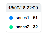
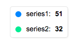
trueWhether to show the tooltip title (x-axis values) on tooltip or not
tooltip.x.show: true, the tooltip results in
tooltip.x.show: false, the tooltip results in
format
'dd MMM'The format of the x-axis value to show on the tooltip. To view how to format datetime Strings, view the Datetime Formatter guide.
formatter
undefinedA custom formatter function which you can override and display according to your needs (a use case can be a date formatted using complex moment.js functions)
y
In a multiple series, the tooltip.y property can accept array to target formatters of different series scales.
Example
formatter
To format the Y-axis values of tooltip, you can define a custom formatter function. By default, these values will be formatted according yaxis.labels.formatter function which will be overrided by this function if you define it.
tooltip: {
  y: {
    formatter: function(value, { series, seriesIndex, dataPointIndex, w }) {
      return value
    }
  }
}
z
formatter
undefinedTo format the z values of a Bubble series, you can use this function.
title
'Size: 'A custom text for the z values of Bubble Series.
marker
show
trueWhether to show the color coded marker shape in front of Series Name which helps to identify series in multiple datasets.
items
display
'flex'The css property of each tooltip item container.
fixed
enabled
falseSet the tooltip to a fixed position
position
'topRight'When having a fixed tooltip, select a predefined position.
Available Options:
- topLeft
- topRight
- bottomLeft
- bottomRight
offsetX
0Sets the left offset for the tooltip container in fixed position
offsetY
0Sets the top offset for the tooltip container in fixed position
cssClass
''Extra CSS class on the tooltip element, for styling it from a stylesheet.
fillColors
undefinedColours for the tooltip markers, one per series, overriding the series colours they would otherwise take.
title
The text shown before each y value in the tooltip. Carries a formatter receiving the series name.
formatter
Formats the text before each y value. Receives the series name and returns the string to show; return '' to drop it entirely.
y: { title: { formatter: function(seriesName) { return seriesName + ':' } } }