Raincloud Chart
What is a raincloud plot?
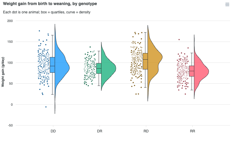
A raincloud plot shows a distribution three ways at once (Allen et al., 2019). The half-violin above is the shape, the box beside it is the summary, and the "rain" of jittered dots underneath is the observations themselves. Nothing is hidden behind a smoothing choice, because the raw sample is drawn next to the curve derived from it.
ApexCharts added chart.type: 'raincloud' in 7.1.0. Give it the raw observations and it derives both the density and the five-number summary:
import ApexCharts from 'apexcharts'
import 'apexcharts/raincloud'
var options = {
chart: {
type: 'raincloud',
height: 460
},
series: [{
name: 'Weight gain',
data: [
{ x: 'DD', points: [97, 101, 88, 94, 110, 92] },
{ x: 'DR', points: [84, 79, 91, 80, 76, 88] }
]
}],
plotOptions: {
bar: { distributed: true } // one colour per group
},
legend: { show: false }
}
var chart = new ApexCharts(document.querySelector('#chart'), options)
chart.render()
A complete example is on this page.
Raincloud is Premium and always an explicit import
Two separate things, and they are independent of each other.
The plan. Raincloud is a Premium chart type, like unit. Enforcement is trial mode: without a valid Premium key or above the chart renders in full and carries the APEXCHARTS watermark. It is never degraded or blocked. See pricing.
The import. Raincloud has never been in the default bundle and is not planned to be, so import ApexCharts from 'apexcharts' alone does not include it. Since 8.0 the violin renderer it draws through has left the default bundle too, and each route below brings both:
| Situation | What to write |
|---|---|
| Default bundle, with a bundler | import 'apexcharts/raincloud' after importing apexcharts (pulls in the violin renderer too) |
| Lean core, with a bundler | import 'apexcharts/bar' and import 'apexcharts/raincloud' after importing apexcharts/core |
| Script tag, no bundler | dist/violin.js, then dist/features/raincloud.js, after the main bundle |
| Everything in one file | import ApexCharts from 'apexcharts/full', or apexcharts.full.min.js by script tag |
<script src="https://cdn.jsdelivr.net/npm/apexcharts"></script>
<script src="https://cdn.jsdelivr.net/npm/apexcharts/dist/violin.js"></script>
<script src="https://cdn.jsdelivr.net/npm/apexcharts/dist/features/raincloud.js"></script>
A 7.x page that loads only dist/features/raincloud.js needs dist/violin.js in front of it on 8.0. Both files exist in 7.9.1 as well, so the page can carry the pair before it upgrades.
Without these imports a raincloud chart logs a console warning and an error, both naming import 'apexcharts/raincloud' (or dist/violin.js then dist/features/raincloud.js), and renders blank. It does not fail silently and it does not fall back to a violin.
When to use a raincloud plot?
- Reporting a distribution honestly to a technical audience. A box plot hides bimodality behind a median; a violin hides the sample size behind a smooth curve. A raincloud shows both, plus the summary statistics a reader is going to want to quote.
- Small to medium samples, where every observation can be drawn. Fifty to a few hundred points per group is the sweet spot.
- Comparing a handful of groups measured the same way: genotypes, cohorts, species, treatment arms.
When to avoid:
- Very large samples. The rain becomes a solid block. The
points.maxPointskey underplotOptions.violincaps each group (default3000, stride-thinned beyond that), but past a few hundred points the individual dots stop carrying information; a plain violin or histogram is clearer. - Many groups. Each raincloud needs a wide slot for three lanes, so about six groups is the practical ceiling.
- Audiences unfamiliar with density plots. A box plot is universally understood.
Data format
One datum per group, with the observations in points:
series: [{
name: 'Weight gain',
data: [
{ x: 'DD', points: [97, 101, 88, 94, 110, 92, 105] },
{ x: 'DR', points: [84, 79, 91, 80, 76, 88, 83] },
{ x: 'RD', points: [101, 96, 112, 108, 99, 104] }
]
}]
A flat number array as y is also accepted. From the sample, ApexCharts derives:
- the kernel density estimate that draws the cloud, using
plotOptions.violin.kde, - the five-number summary that draws the box, using Tukey fences by default.
Both are re-derived when you change the relevant options, so updateOptions({ plotOptions: { violin: { kde: { bandwidth: 4 } } } }) actually re-smooths the curve rather than redrawing a frozen first estimate.
You can also hand-supply either statistic. A datum carrying y.density has its curve drawn exactly as given and only the missing summary is derived; a datum carrying both y.density and y.summary is drawn untouched. y.summary is [whiskerLow, q1, median, q3, whiskerHigh].
Why Tukey whiskers by default?
The raincloud preset sets plotOptions.violin.box.whiskers: 'tukey' (1.5 x IQR fences, clamped to the data), where a plain violin or box plot defaults to 'minmax'.
Tukey fences are the canonical raincloud box, and they are safe here precisely because the rain draws every observation: nothing beyond the whiskers is hidden. On a chart without the raw points, 'tukey' silently drops the extremes from view, which is why it is not the default elsewhere.
The three layers
Raincloud is not a separate renderer. It routes through the violin pathway, and every layer is a plotOptions.violin capability that the raincloud preset switches on. That means you configure a raincloud with plotOptions.violin, and you can build any part of the layout on a plain violin too.
| Layer | Option | Raincloud preset |
|---|---|---|
| Cloud (half density) | violin.side | 'right', or 'top' when horizontal |
| Box (five-number summary) | violin.box.show | true, with whiskers: 'tukey' |
| Rain (observations) | violin.points.position | 'left', or 'bottom' when horizontal |
Vertical layout is rain left, box middle, cloud right, which is the classic published arrangement. Horizontal mirrors it: cloud on top, box and rain below.
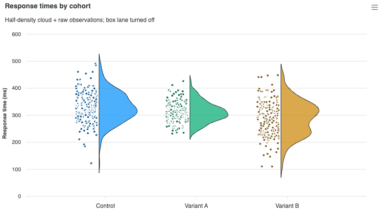
Every one of these is a plain default you can set back. Turning the box off, for instance, reflows its lane so the rain sits directly against the density baseline rather than leaving a dead strip:
plotOptions: {
bar: { distributed: true },
violin: {
box: { show: false }
}
}
Horizontal raincloud
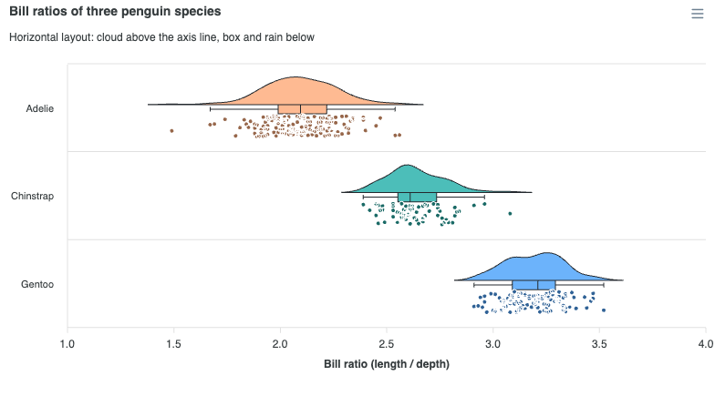
Set plotOptions.bar.horizontal: true. The whole layout mirrors, so the cloud sits above the category line with the box and rain below it.
chart: { type: 'raincloud' },
plotOptions: {
bar: {
horizontal: true,
distributed: true
}
}
Lane widths and jitter
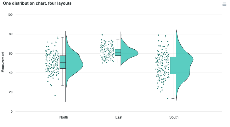
The box and the rain each get their own lane out of the category slot.
plotOptions: {
violin: {
box: {
width: '15%', // fraction of the slot for the box lane
capWidth: 0.5 // whisker cap length, 0..1 of the box lane width
},
points: {
laneWidth: '40%', // fraction of the slot for the rain lane
jitter: 0.85, // raincloud preset; fills most of the lane
size: 2.5,
opacity: 0.9
}
}
}
jitter defaults to 0.85 for a raincloud against 0.5 for a centred violin, because the lane is the dots' whole home rather than something they share with the density body. constrainToViolin is ignored once points.position is off-centre: the dots no longer sit under the curve, so there is no width to clamp them to.
Colouring the groups
plotOptions.bar.distributed: true gives each group its own colour from the palette, which is what most raincloud plots want, and it makes the legend redundant (the categories are already on the axis), so the demos turn the legend off.
Without distributed, all groups take the series colour, which is the right choice when you have more than one series and the series is the thing being compared.
Limitations
- The box draws no outlier dots of its own. The rain is the outlier display, so duplicating them would double-plot the same observations.
plotOptions.violin.sideaccepts'left'/'right'on vertical charts and'top'/'bottom'on horizontal ones. Mixing the axes ('left'on a horizontal chart) is not meaningful.- In a lean-core page without the stats feature, exploding a group into its observations is unavailable. The raincloud feature registers no row source of its own; it reuses the stats feature's violin one.
Tree-shaking
Raincloud draws through the violin renderer, so its entry point pulls in that renderer plus the statistics transform. The violin renderer in turn draws on the bar renderer, which the default bundle has and the lean core does not, so a lean-core page imports apexcharts/bar as well:
import ApexCharts from 'apexcharts/core'
import 'apexcharts/bar'
import 'apexcharts/raincloud'
Or, alongside an existing violin import, add only the statistics transform:
import ApexCharts from 'apexcharts/core'
import 'apexcharts/bar'
import 'apexcharts/violin'
import 'apexcharts/features/raincloud'
apexcharts/features/raincloud on its own carries no violin renderer, so it suits only a page that already has the violin type. Neither apexcharts nor apexcharts.min.js includes raincloud; apexcharts/full and apexcharts.full.min.js do. See tree-shaking for the full picture.
The layer options are documented under plotOptions.violin.