Streamgraph
What is a streamgraph?
A streamgraph is a stacked area chart whose baseline is not the zero line but a curve chosen to keep the bands as flat as possible. Each series becomes a band whose thickness is its value, and the whole stack drifts up and down so that the thick bands stay level instead of being pushed around by whatever sits below them. The reader follows the shape of the mix rather than the height of a total.
ApexCharts added chart.type: 'streamgraph' in 7.1.0. Since 8.0 it is an opt-in feature, one import on top of the default bundle:
import ApexCharts from 'apexcharts'
import 'apexcharts/features/streamgraph'
var options = {
chart: {
type: 'streamgraph',
height: 380
},
series: [
{ name: 'Drama', data: [{ x: '2024-01-01', y: 32 }, { x: '2024-02-01', y: 35 }] },
{ name: 'Comedy', data: [{ x: '2024-01-01', y: 24 }, { x: '2024-02-01', y: 22 }] }
],
xaxis: { type: 'datetime' }
}
var chart = new ApexCharts(document.querySelector('#chart'), options)
chart.render()
A complete example is on this page.
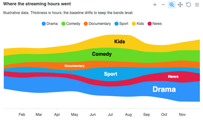
When to use a streamgraph?
- Many categories over many periods, where a legend-and-colour lookup would be the whole reading task. Twenty bands is normal for this form and unreadable as twenty stacked areas.
- Composition that turns over: threads that appear, swell, and go. A streamgraph is at its best where the set of contributors changes, not just their sizes.
- Showing that a mix moved without asking the reader to measure how much. The drifting baseline is precisely what removes the ability to read a value off an axis.
When to avoid:
- When someone needs to read a number. No band except the bottom one sits on a fixed line, so every value has to be estimated as a thickness. Use a stacked area chart (
chart.type: 'area'withchart.stacked: true) when the totals matter. - For a handful of series. With three or four bands the wiggle buys nothing and a stacked area is easier to read.
- For data that goes below zero. A streamgraph stacks parts of a whole and a negative part has no thickness to draw. See Negative values.
Data format
Ordinary series. One entry per series, values in the shape you would give a line or area chart:
series: [{
  name: 'Drama',
  data: [
    { x: '2024-01-01', y: 32 },
    { x: '2024-02-01', y: 35 },
    { x: '2024-03-01', y: 41 }
  ]
}, {
  name: 'Comedy',
  data: [
    { x: '2024-01-01', y: 24 },
    { x: '2024-02-01', y: 22 },
    { x: '2024-03-01', y: 20 }
  ]
}]
{x, y} objects, [x, y] tuples, and bare numbers alongside xaxis.categories all work. You never write stacking offsets: ApexCharts computes the baseline and turns your N series into the N bands the range-area renderer draws.
Columns are joined on x, not on array position. Two series written in a different order, or one that skips a period the others have, are both fine. A column a series never mentions contributes zero to the stack.
Where does the baseline go?
plotOptions.streamgraph.offset picks the baseline. This is the option that decides what the chart is claiming.
offset | Baseline | Reads as |
|---|---|---|
'wiggle' (default) | Minimizes the total weighted slope of the bands | The classic streamgraph: thick bands stay level |
'silhouette' | Centres the stack on one horizontal line | A symmetric river, total still visible as width |
'zero' | The zero line | An ordinary stacked area |
'expand' | Each column normalized to its own total | Composition rather than volume: every column is 100% tall |
plotOptions: {
  streamgraph: {
    offset: 'expand',
    order: 'inverse'
  }
}
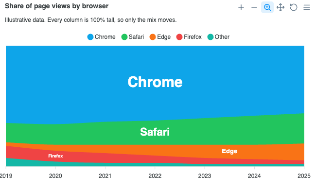
Because the form has no zero line and no axis worth reading against, ApexCharts hides the y axis by default for a streamgraph. An axis of stacking offsets would be actively misleading. Set yaxis: { show: true } if you want it back.
How are the bands ordered?
plotOptions.streamgraph.order sets the stacking order, bottom first.
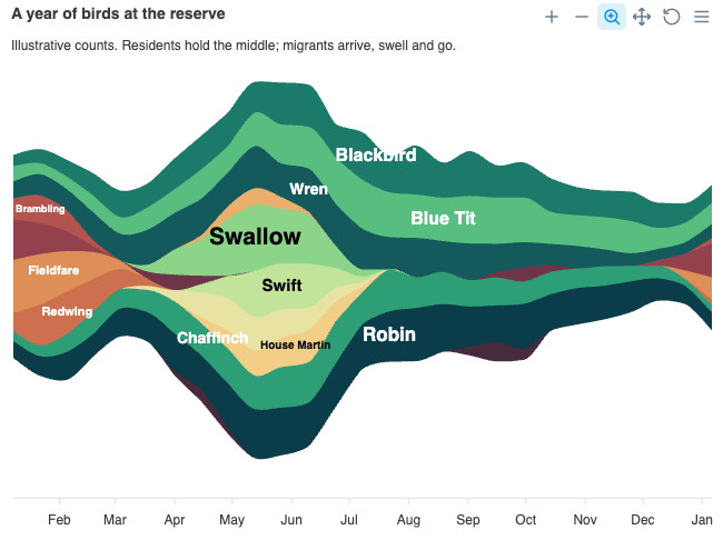
'inside-out'(default): series that peak earliest sit in the middle, and later peaks fan outward to whichever side is currently thinner. The middle of a stack moves least under a wiggle baseline, so this is the ordering that keeps a streamgraph readable.'inverse': the series order, reversed.'none': the series order exactly as given.
order and offset are independent, but 'inside-out' exists because of 'wiggle'. On a 'zero' baseline the ordering is a pure aesthetic choice.
Why are the series names drawn on the bands?
A drifting band is far easier to find by its own name than by matching a colour to a legend key, so plotOptions.streamgraph.labels is on by default and writes each series name on its band, at the band's thickest point.
By default each name is sized to the band it sits on (style.fontSize: 'auto', bounded by minFontSize and maxFontSize). That is the convention of the form and it is what makes a streamgraph read at a glance: the chart's whole claim is that thickness is quantity, and one fixed size would state that claim in the same voice for a band carrying half the total and a band carrying a rounding error. Give a literal size to draw every name the same:
plotOptions: {
  streamgraph: {
    labels: {
      minWidth: 24,          // bands thinner than this px are left unlabelled
      style: {
        fontSize: '12px',    // or 'auto' (default) to size each name to its band
        fontWeight: 600
      }
    }
  }
}
A band narrower than minWidth is left unlabelled rather than given a name truncated past the point of being a name. Each label takes black or white automatically, whichever reads on its own band; style.colors overrides that per series.
The legend stays on even though the bands are already named. The two are not doing the same job: a label says which band this is, and the legend is the only thing on the chart you can click. Collapsing a band with a legend click removes it from the stack and re-solves the baseline under the rest, which is most of what there is to do on a streamgraph.
What happens on hover?
Hovering a band fades the others. How far they drop is hover.opacity under plotOptions.streamgraph, and it defaults to 0.35.
It fades the others rather than marking the hovered band because the bands touch edge to edge and leave no room to mark anything: a drop shadow falls onto both neighbours, and an edge stroke is centred on a boundary the band shares. Fading needs no room and it leaves the hovered band's colour exactly as it was.
plotOptions: {
  streamgraph: {
    hover: {
      show: true,
      opacity: 0.35
    }
  }
}
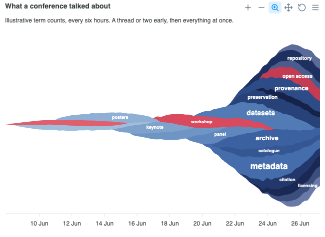
What does the tooltip report?
The whole hovered column: every visible band with the value you supplied, in stacking order top down so the list matches the picture, plus the column total.
The total is stated rather than left to be estimated because it is the one number a streamgraph genuinely cannot be read for. The drifting baseline is exactly what hides it. On an 'expand' baseline the total row is dropped, since every column sums to the same thing by construction.
The numbers reported are yours, not the stacking offsets the renderer drew. A tooltip.y.formatter you configure still wins.
Negative values and gaps
A negative value has no band to draw, so it is floored at zero and ApexCharts warns once in the console, naming the stacked area chart as the type you want instead. Nulls, missing columns, and non-finite values contribute zero rather than propagating through the accumulator.
Curve and stroke defaults
Streamgraph sets stroke.curve: 'monotoneCubic', not 'smooth'. 'smooth' places its control points at a fixed fraction of the x gap without consulting the slope on either side, which puts an inflection at every point: a band that simply declines (18, 9, 0) is drawn as a run of little S-curves, so it appears to stall and dip repeatedly on the way down. On a stack of twenty bands that invented wobble is most of what the reader sees. Fritsch-Carlson interpolation is shape preserving, so a falling band reads as one continuous fall.
stroke.width is 0 and fill.opacity is 1. Bands meet edge to edge, so any stroke draws a seam down the middle of every boundary, and at less than full opacity the boundary between two neighbours turns into a third, muddier colour.
Tree-shaking
A streamgraph band is a band between two per-x edges, which is what the range area renderer already draws, so streamgraph needs no renderer of its own. What it adds, the baseline arithmetic and the band labels, is the streamgraph feature, and since 8.0 that feature is not in the default bundle. The line to add depends on the bundle you start from.
Next to the default bundle, which already has the line and area renderer, import the feature on its own:
import ApexCharts from 'apexcharts'
import 'apexcharts/features/streamgraph'
Use the features/ path here, not apexcharts/streamgraph. That entry point is for the lean core: it brings the line and area renderer along with the feature, so next to the default bundle it adds a second line and area renderer to a page that already has one.
On the lean core, apexcharts/streamgraph is the one import that brings both:
import ApexCharts from 'apexcharts/streamgraph'
Or, alongside an existing line or area import:
import ApexCharts from 'apexcharts/core'
import 'apexcharts/rangeArea'
import 'apexcharts/features/streamgraph'
Without a bundler, load the feature's file after the default bundle:
<script src="https://cdn.jsdelivr.net/npm/apexcharts"></script>
<script src="https://cdn.jsdelivr.net/npm/apexcharts/dist/features/streamgraph.js"></script>
The full bundle (import ApexCharts from 'apexcharts/full', or apexcharts.full.min.js from a script tag) already has it. Without the feature, a streamgraph draws nothing and the console names the import to add. See tree-shaking for the full picture.
The complete list of streamgraph settings is documented under plotOptions.streamgraph.