Waterfall Chart
What is a waterfall chart?
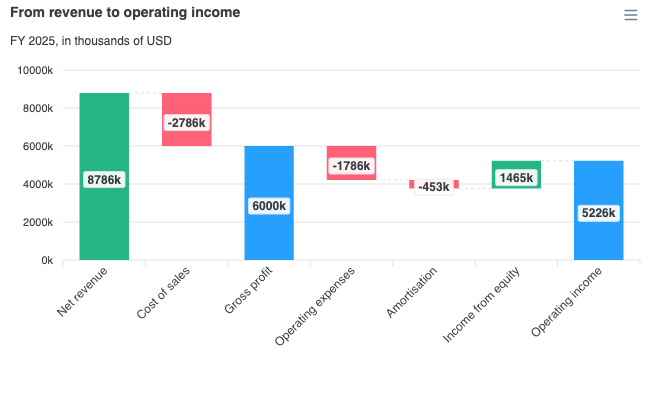
A waterfall chart shows how a starting value becomes an ending value through a sequence of signed steps. Each step is drawn as a column floating between the level the running total started at and the level it left behind, so the reader follows a walk from one figure to another: revenue down to operating income, opening headcount to closing headcount, last quarter's ARR to this quarter's.
ApexCharts added chart.type: 'waterfall' in 7.1.0. The series holds the deltas and the chart does the accumulation:
import ApexCharts from 'apexcharts'
import 'apexcharts/features/waterfall'
var options = {
chart: {
type: 'waterfall',
height: 380
},
series: [{
name: 'Operating income',
data: [
{ x: 'Net revenue', y: 8786000 },
{ x: 'Cost of sales', y: -2786000 },
{ x: 'Gross profit', isSubtotal: true },
{ x: 'Operating expenses', y: -1786000 },
{ x: 'Operating income', isTotal: true }
]
}]
}
var chart = new ApexCharts(document.querySelector('#chart'), options)
chart.render()
A complete example is on this page.
When to use a waterfall chart?
- Bridging two figures: a P&L walk, a budget-to-actual variance, a period-over-period reconciliation.
- Showing the composition of a change, where a stacked bar would show the composition of a level instead.
- Any explanation of the form "we started here, these things happened, we ended there".
When to avoid:
- For parts of a whole at one point in time. That is a stacked bar or a pie.
- For more than about a dozen steps. The connectors and the floating columns stop reading as one walk.
- When the steps have no meaningful order. A waterfall's left-to-right sequence is a claim, and the staggered reveal animation traces it.
Data format
One series. Each datum is either a step or a running total.
| Datum | Carries | Draws |
|---|---|---|
| Step | y, the signed amount it moves the running total by | A column from the previous level to the new one |
| Subtotal | isSubtotal: true, no y | A column from the last cut to the running total, and starts a new cut |
| Total | isTotal: true, no y | A column from zero to the running total, and starts a new cut |
data: [
  { x: 'Net revenue', y: 8786000 },
  { x: 'Cost of sales', y: -2786000 },
  { x: 'Gross profit', isSubtotal: true },      // sum of the steps since the last cut
  { x: 'Operating expenses', y: -1786000 },
  { x: 'Amortisation', y: -453000 },
  { x: 'Income from equity', y: 1465000 },
  { x: 'Operating income', isTotal: true }      // sum of every step from zero
]
You never supply the running total, an open value, or a [start, end] pair. Supplying y on a flagged datum is unnecessary: a subtotal or total bar is measured for you.
{x, y} objects, [x, y] tuples, and bare numbers alongside xaxis.categories all work, though a waterfall is normally written as {x, y} because the steps are named.
isSubtotal vs isTotal
Both draw the running total; they differ in where the bar starts and what "the last cut" means afterwards.
isSubtotalspans from the previous cut to the running total. It is the sum of the steps since the last flagged bar, so a second subtotal further down reports only the steps between the two.isTotalspans from zero to the running total. It is the sum of every step so far.
Both start a new cut, so the steps that follow accumulate from there.
What do the labels and tooltip report?
Every bar reads out end - start, its own signed height. That is the delta for a step bar and the accumulated figure for a subtotal or total bar, which is the one rule that makes all three read correctly without a special case.
dataLabels is on by default for a waterfall, since the step is the whole point. The labels are drawn without a background chip, in ink that follows chart.foreColor rather than the range column's white text: small steps are normal in a waterfall, and a label wider or taller than its bar gets placed outside it, where white text would land on the chart background and vanish. Following the theme's foreground colour keeps the label readable off the bar in both light and dark mode, and legible enough over a rising, falling or total bar.
To put a chip back behind each label, set dataLabels.background.enabled to true and give it colours, for example backgroundColor: '#fff', foreColor: '#373d3f', borderColor: '#e3e8ee' and opacity: 0.92 (the chip a waterfall drew before). enabled: true alone falls back to the standard data-label background, which is white text on a near-white chip in the dark theme. A waterfall is usually a dense row of steps, so bear in mind that a chip per label is a second rectangle competing with the bar it names.
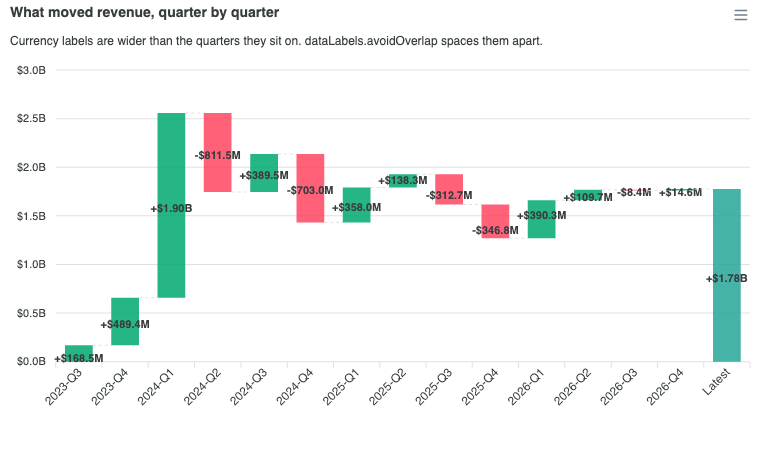
Where a bridge is crowded enough that neighbouring labels would touch, dataLabels.avoidOverlap spaces them apart automatically.
dataLabels: {
  formatter: function (val) {
    return (val > 0 ? '+' : '') + val.toLocaleString('en-US')
  }
}
The crowded currency labels demo shows avoidOverlap at work on a dense bridge: fourteen quarterly steps from 2023-Q3 to 2026-Q4, closed by a Latest total, each labelled in millions or billions of dollars. Its code never sets avoidOverlap, because the option is on by default.
Colours and connectors
Rising, falling, and running-total bars are coloured by what they mean. Under plotOptions.waterfall, the colors.positive and colors.negative keys default to green and red, because up-is-good is the one convention a waterfall is read by. The isSubtotal and isTotal bars default to the series colour from the active palette, so they stay distinct from the steps and still follow the theme.
A datum's own fillColor always wins over all four.
plotOptions: {
  waterfall: {
    colors: {
      positive: '#00A86F',
      negative: '#FF4560',
      subtotal: '#008FFB',
      total: '#008FFB'
    },
    connectors: {
      show: true,
      strokeDashArray: 3
    }
  }
}
The connectors are the dashed segments joining each bar's finish to the next one's start. Without them the floating columns read as unrelated bars rather than one walk, so they are on by default. Their colour falls back to grid.borderColor, which keeps them theme-aware. Bars are drawn at 60% of the slot rather than the usual 70%, because the gaps are load-bearing here: the connectors are drawn in them.
Horizontal waterfall
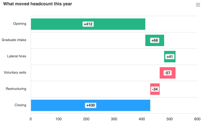
Set plotOptions.bar.horizontal: true for a left-to-right walk down the rows. Useful when the step names are long.
chart: { type: 'waterfall' },
plotOptions: {
  bar: { horizontal: true }
}
Defaults worth knowing
- No legend. A waterfall is one series, so the series legend would show a single swatch named after it, and clicking that swatch empties the chart. The legend a waterfall actually wants names the kinds of bar (increase, decrease, total), which the series legend cannot express.
- No zoom. A waterfall is a fixed set of named steps, not a window onto a continuum. Without this a horizontal waterfall would inherit the timeline range bar's zoom toolbar.
- Staggered reveal on. The bars are a left-to-right sequence, so
animations.animateGraduallytraces the walk. A plain timeline range bar turns this off; a waterfall wants it. - Stacking forced off. The bars are already a cumulative walk, so
chart.stackedis ignored.
Tree-shaking
A waterfall bar is a float between two levels, which is what the vertical range column renderer already draws, so waterfall needs no renderer of its own. What it adds, the accumulation and the connectors, is the waterfall feature, and since 8.0 that feature is not in the default bundle. The line to add depends on the bundle you start from.
Next to the default bundle, which already has the bar renderer, import the feature on its own:
import ApexCharts from 'apexcharts'
import 'apexcharts/features/waterfall'
Use the features/ path here, not apexcharts/waterfall. That entry point is for the lean core: it brings the bar renderer along with the feature, so next to the default bundle it adds a second bar renderer to a page that already has one.
On the lean core, apexcharts/waterfall is the one import that brings both:
import ApexCharts from 'apexcharts/waterfall'
Or, alongside an existing bar import:
import ApexCharts from 'apexcharts/core'
import 'apexcharts/bar'
import 'apexcharts/features/waterfall'
Without a bundler, load the feature's file after the default bundle:
<script src="https://cdn.jsdelivr.net/npm/apexcharts"></script>
<script src="https://cdn.jsdelivr.net/npm/apexcharts/dist/features/waterfall.js"></script>
The full bundle (import ApexCharts from 'apexcharts/full', or apexcharts.full.min.js from a script tag) already has it. Without the feature, a waterfall draws nothing and the console names the import to add. See tree-shaking for the full picture.
The complete list of waterfall settings is documented under plotOptions.waterfall.