Unit Shapes
What is apexcharts/unit-shapes?
apexcharts/unit-shapes is a companion module, added in ApexCharts 6.10, that ships 39 shapes a unit chart can pack its dots into: a heart, a house, a globe, a checkmark, a heartbeat trace, or the figure 1,024 drawn in 1,024 dots.
The important part is what a shape is. A shape is a function of the marks and the plot rectangle, not a picture. The dots are packed, not stamped onto a template: rows are cut across the outline, each row is split into the spans that fall inside it, and the gap between dots is then bisected until the spans hold exactly the number of marks the data asks for. Density follows the shape's own area, which is why one outline serves 40 dots in a sparkline and 3,000 in a poster.
See every shape repack live on the unit shapes page.
Quick Start
A shape is a plain callable, so it goes straight into plotOptions.unit.positions with no registration step. The kit needs the unit chart itself too, which since 8.0 is its own import.
import ApexCharts from 'apexcharts'
import 'apexcharts/unit'
import { heart } from 'apexcharts/unit-shapes'

new ApexCharts(el, {
  chart: { type: 'unit' },
  series: [57600, 16800, 4200, 3400],
  labels: ['Repeat donors', 'First-time', 'Workplace drives', 'Emergency call-ups'],
  plotOptions: {
    unit: { layout: 'custom', positions: heart, unitValue: 100 },
  },
}).render()
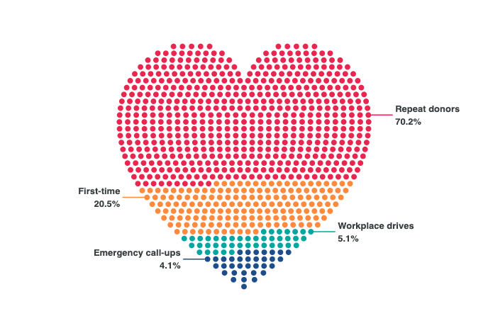
From a script tag, load dist/unit-shapes.js after dist/unit.js. It exposes the kit as ApexUnitShapes with every shape pre-registered, so positions: 'heart' resolves by name.
<script src="https://cdn.jsdelivr.net/npm/apexcharts"></script>
<script src="https://cdn.jsdelivr.net/npm/apexcharts/dist/unit.js"></script>
<script src="https://cdn.jsdelivr.net/npm/apexcharts/dist/unit-shapes.js"></script>
apexcharts.full.min.js (apexcharts/full in a bundler) has the unit chart and registers every shape by name as well, so with it you need neither add-on.
Bundle Size
The whole catalog is about 48 KB raw and 14 KB gzipped, and it is tree-shaken per shape: importing one costs roughly 4 KB gzipped. Importing catalog pulls in every shape, so it is for galleries and tests rather than charts.
The Three Kinds
Things in the world are not all areas, so a shape is packed one of three ways.
| Kind | Count | What it is | Shapes |
|---|---|---|---|
silhouette | 29 | Fills an outline | heart droplet human tree house battery shield rocket leaf sun flame fish star arrow crown cross bolt bulb flask car plane group trophy moneybag funnel gear robot pin mountain |
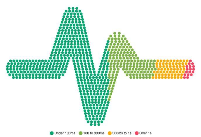
stroke | 7 | A thickened centreline, for a thing with no interior | check wifi pulse xmark percent question spiral |
| generated | 3 | No outline at all, positions from maths | globe (latitude rings with a tilt), target (concentric bands), pyramid (tiers) |
A stroke degrades kindly where a thin silhouette feature would simply vanish: run one short of dots and it becomes a dotted line, which still reads as the same line.
Shape Metadata
Every shape carries its own definition on .shape, which is what the docs, the previews and the tests all read.
heart.shape
// { name: 'heart', category: 'symbols', kind: 'silhouette',
//   minUnits: 40, source: 'original', path: 'M 50 93 C 20 71 …' }
| Field | Meaning |
|---|---|
name | Registered name and export name. Frozen: renaming is a breaking change. |
category | One of nature, objects, people, business, technology, symbols, geography. |
minUnits | The count below which the shape stops being recognisable. Ask for fewer and the chart warns in the console naming the shape, rather than drawing mush. |
kind | silhouette, stroke, rings, globe or tiers. |
order | The shape's own fill order, when it has an opinion (battery fills like a charge meter). |
source | 'original' for an outline drawn in the ApexCharts repo, 'generated' where there is no outline. |
On provenance: every outline in the kit was drawn in the ApexCharts repository. No third-party path is admitted, permissively licensed or not, because an outline ships verbatim inside the bundle and a copied path would carry its licence notice into every consumer's build forever. Brand marks are excluded outright, and a test enforces it.
Fill Order
order decides which slots the first category takes, and therefore where each series band lands inside the shape. It is the answer to "how do I make the categories readable in this one". .with() returns a variant and never mutates the original.
import { pulse } from 'apexcharts/unit-shapes'

// Bands run along the trace instead of slicing it horizontally.
const pulseByTime = pulse.with({ order: 'cols' })
order | Where the first series lands |
|---|---|
rows | Top, bands running down (the default) |
rowsUp | Bottom, bands running up |
cols | Left, bands running right |
colsRev | Right, bands running left |
centerOut | The centre, later series ringing outward |
centerIn | The rim, the last series at the centre |
Outlined Variants
outlined() traces a shape's outline instead of filling it, which gives all 29 silhouettes a hollow twin for no new artwork (a stroked closed path is a ring).
import 'apexcharts/unit'
import { outlined, heart } from 'apexcharts/unit-shapes'

plotOptions: { unit: { layout: 'custom', positions: outlined(heart) } }
It throws for the three generated shapes (globe, target, pyramid): they compute positions directly, so there is no path to stroke.
Numbers as Shapes
glyphs() returns a shape that packs dots into the figure they count, so the headline and the data are the same object. It accepts digits plus -, ., , and :.
import 'apexcharts/unit'
import { glyphs } from 'apexcharts/unit-shapes'

// 1,024 dots, arranged as "1,024"
plotOptions: { unit: { layout: 'custom', positions: glyphs('1,024') } }
digitsPath(text, gap) returns the seven-segment centreline behind it, if you want the path directly.
Rendering a Shape Without a Chart
preview() renders a shape to a standalone SVG string with no chart and no DOM, so galleries, README images and launch graphics can be generated at build time or on a server from the catalog alone.
import { preview, heart } from 'apexcharts/unit-shapes'

const svg = preview(heart, {
  count: 240,
  // Pass `series` whenever the preview stands in for a real chart: it splits
  // the dots the way the chart does (largest remainder, exact total, at least
  // one dot for any category with a value). One flat colour quietly says the
  // categories cannot be told apart.
  series: [576, 168, 42, 34],
  width: 160,
})
Bring Your Own Shape
The shape you want is probably not in the catalog, and it does not have to be. plotOptions.unit.positions is a function from the marks and the plot rectangle to places, and everything in the kit is one of those. Three routes in, depending on what you have.
import { shapeFrom, strokeFrom } from 'apexcharts/unit-shapes'

// 1. You have an outline. Packed exactly like the built-ins.
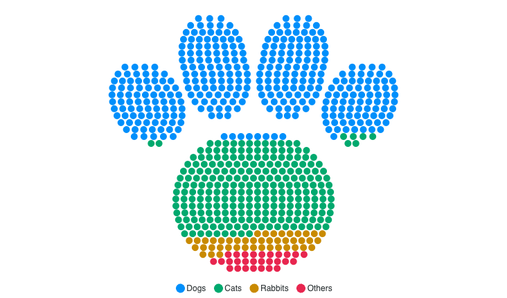
const paw = shapeFrom('M 26 71 A 24 21 0 1 1 74 71 …', { name: 'paw', minUnits: 180 })

// 2. Your thing is a line. Give the centreline and a width, not both sides.
const ridge = strokeFrom('M 6 76 L 24 44 L 40 60 …', { width: 12, order: 'cols' })

// 3. You have a rule, not a picture. This imports nothing.
positions: (objects, rect) => objects.map((o, i) => ({ id: o.id, x: …, y: … }))
Authoring an outline
- Winding first. Subpaths wound the same way union; one wound the other way cuts a hole. That mistake produces a shape that still renders and still looks deliberate, so it is the first thing to check when a shape comes out inverted.
- Start each subpath with an absolute
Mand close it withZ. - Keep a subpath from crossing itself. Two overlapping subpaths are fine.
- Any coordinate box works: the shape is fitted to the plot rectangle, so 0-100 is as good as 0-1024.
- Give a
minUnitsfor the count below which your shape stops being recognisable, and the chart will warn instead of drawing mush.
Naming Shapes
Shapes can be registered so positions: '<name>' resolves by string, which is what the script-tag build does for the whole catalog.
import 'apexcharts/unit'
import { registerShapes, heart, house } from 'apexcharts/unit-shapes'

registerShapes({ heart, house }) // -> ['heart', 'house']

plotOptions: { unit: { layout: 'custom', positions: 'heart' } }
unregisterShapes(names) and registeredShapeNames() complete the set.
Outer Name Labels
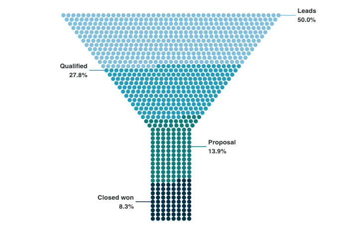
A shape packed with four categories used to need a legend, which asks the reader to match a swatch to a band. Since 6.10 the names can sit in the margin with a leader line to their own dots, the way a pie names its slices.
plotOptions: {
  unit: {
    clusterLabels: { external: { show: true } },
  },
}
The gutter is reserved on both sides before the dot size is chosen, so the shape is sized for the room it will actually get instead of being scaled down afterwards. That also means outer labels need width: below roughly 520px of chart width the shape itself goes small, so use a single-column card at that size or drop back to a legend.
Version Note
apexcharts >= 6.10.0 is required, and not only for the kit itself. Before 6.10, update() compared incoming options with the previous ones through JSON.stringify, which drops function values, so a second update that changed only positions (or only a formatter, or only a custom tooltip) serialised identically and was thrown away. A chart that morphs between two shapes would therefore move once and then freeze, which looks like a shape bug and is not.
From 8.0 the unit chart is outside the default bundle, so the kit also needs import 'apexcharts/unit' (or dist/unit.js before dist/unit-shapes.js). Without it the console names the missing import and the chart draws nothing.
Reference
The full list of unit-specific settings is documented under plotOptions.unit. See the unit chart guide for the layouts, transitions and data formats the shapes sit on top of.