Data visualizations are an indispensable part of your business; they make it easy for you or viewers to understand, and also make your data interesting to read. However, if you are the type that feels depressed immediately you see a chart, then something is wrong.
Charts are supposed to make it easier for you to comprehend a piece of information, and not to make the information more confusing and complicated.
If the visualization is made well, it will be very easy to understand even if the person is not really a data literate. This guide will help you to choose the right colors for your charts.
Here are some tips on choosing the right colors for your Charts
Don’t Be Too Colorful
Creating a data visualization is not all about using different shades of colors. Too many colors can distract the viewer from the information the data visualization is supposed to convey. However, this doesn’t mean you should make use of colors that are too dull, and won’t be easily seen. Also, remember to put some viewers that suffer from some kind of color blindness into consideration, especially green or red.
Use Similar Colors
Using different shades of colors that are not alike, and do not blend well can really be the perfect way to confuse the viewer. So, you should either choose from a cool color palette or a warm color palette.
Use Colors of the Same Shades to Represent
In order to ensure the viewers of the charts are fully focused and not distracted by the colors, you can use different shades of the same color to represent different values. This also helps to reflect a uniform appearance of the data visualization, and also make it appear clear and more easy to understand. However, don’t just use dark or light shades of the color in the middle of the chart, ensure the colors follow a progressive pattern.
Make Consistent Use of the Colors

If you decided to use warm colors, then make sure you continue making consistent use of the colors. Also, if you decided to use cool colors, keep it consistent too. Don’t color one side of the data chart orange, and then color the other side gray, that is not ideal. Keeping the colors consistent is a basic principle of design that must be followed, and also makes it easy for viewers to understand. For instance, if the viewers already know what color represents a particular value, when they see the color again they will easily understand what it is representing.
Use Bright Colors to Highlight Important Points
Although it is important to ensure the data visualization is not too colorful, there will be one or two particular points you really want the viewers to focus on. So what you do in this situation is to highlight the particular color with a bright color like yellow or orange. This will help to capture the attention of the viewer and bring their attention to that point. So do you see why it’s not ideal to use too many bright colors now? Viewers won’t know which of the points they should direct their attention to.
Use A Darker Shade to Highlight a Particular Point
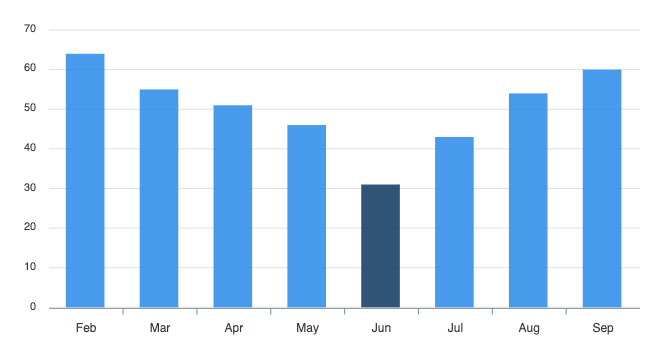
This is also similar to the previous point, just that this time you are not using an entirely different color to highlight the important point. For instance, if you have been using a lighter shade of blue, you can decide to use a deeper shade of blue to highlight the important blue to make it different and captivating.
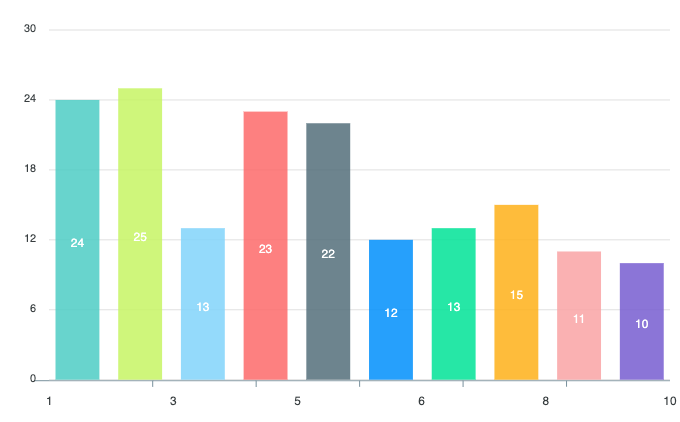
However, this method of highlighting only works for a chart where the points are not attached. This means the method can not work on a pie-chart where the points are attached but will work perfectly on a bar chart.
Make Use of Intuitive Colors
When you are choosing the colors you want to use, ensure you consider the meaning of the color in the viewer’s culture. In fact, it is better you even use colors that are generally accepted to have a particular meaning. For instance, everyone knows color red is used to represent danger, and the color green is used to represent forest or anything plants at all. So you can use the color green to represent a forest when you are creating the chart. This way the viewers will easily understand the chart.
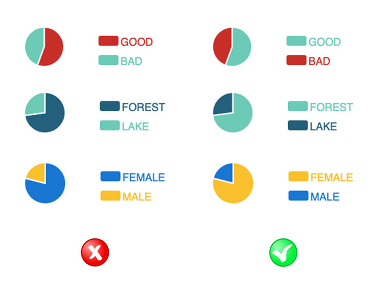
Then, when it comes to choosing colors to encode genders, consider not going with the blue-pink combination, but choose a warmer color for female, and a cool color for men. It is known generally that women love warm colors and men love cool colors, except in rare cases.
Use Colors That Matches the Color of the Themes
It is also a good practice to ensure the color you are using for the data visualization matches the theme of the presentation. This helps to reflect an image of the organization and much more professional. Also, by using the same color your chart won’t be looking like a drawing made by a fourth-grader.
Conclusion
Whenever you are creating data visualization, always remember that the primary objective of creating the chart is for viewers to have a better understanding of particular information, and to also provide better insight and clarity to the information.
Remember this primary objective at all times and choose the right colors for your charts, and you will never go wrong when deciding colors for your visualization.