Pie charts often have a less than pleasing reputation when it comes to data visualization. Despite being a valuable and effective way of showcasing data, using pie charts for visualization is considered an amateur move, one that shows a lack of knowledge and experience. However, regardless of the criticism, pie charts are still used every day and with good reason.
Why the Debate Around the Use of Pie Charts?
Pie charts are considered bad for visualization as humans can compare length better than angles – making other graphs far more suitable. What most users fail to understand is that pie charts are meant to showcase the part-to-whole relationship between the given data, and not for comparison.

Many complain that there are better methods for visualization, but in defense of pie charts, you should consider what you are trying to show rather than criticize the medium of delivery. You need to understand that pie charts are an intriguing way to represent straightforward data.
The Advantages of Pie Charts
Pie charts have clear advantages in data visualization across industries, let’s take a look at some of these:
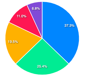
- Clarity – Pie charts are easy to understand for the average individual. You don’t need to study statistics or repeatedly view the chart to comprehend what it’s trying to convey. This is crucial when presenting data visualizations to customers or for general public consumption.
- Simple Communication – Pie charts are a great way to represent a basic set of data. A circle divided into numerous parts is uncomplicated and easy to grasp.
- Visual appeal – Pie charts are visually intriguing, as they can be customized to match the situation. Creating a chart for younger audiences? Use bright colors. Want to create a chart for a business meeting? Use company colors.
- Puts the readers first – Unlike other forms of visualization, when reading a pie chart, they do not have to know how to examine the underlying data and calculations to grasp what the graph represents.
Making Great Pie Charts
There’s nothing wrong with using pie charts for data visualization, provided you know how to use them. Here are a few pointers:
- Data is king – Since the primary goal of a pie chart and other graphs is portraying data, understand what works for you. Data for pie charts need to be categorized, cannot overlap, and have no negative values. The divisions in a pie chart must also add up to a meaningful whole.
- Organization – Now that you have chosen the right data, you must organize it from largest to smallest so you can make accurate divisions. Group your data into three to five meaningful categories.

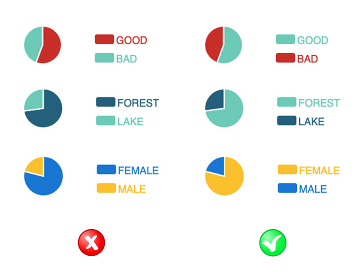
- Colors – Use colors that are suited for the occasion. Bright colors are, however, useful for specific ad campaigns. Typically, it is recommended to use grey on slices that represent around 1-2% of the data.
- Combine smaller slices – When you have slices that represent small amounts of data, combine them into a larger slice. For example, if you have six slices and two of them represent small portions, you can combine them into an “others” group or similar categories.
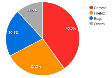

- Labels – You can label bigger slices inside or around the chart but smaller slices can be labeled outside, either through a key or by using arrows.
- Placement – Since pie charts are not flexible, you should consider placing it alongside the text, in a column or sidebar to avoid too much white space around it.
Wrapping it Up
Pie charts are an excellent form of visualization provided you understand when and how to use them. Remember that pie charts are perfect for representing simple data but cannot be used to show correlation and other complex relations.
The key to an effective pie chart, or any other graph for that matter, is understanding the data at hand and making the best use of it. When users fail to do this, they often blame the chart. So, in conclusion, before questioning the worth of pie charts, it is more logical to question a user’s understanding of the data presented to them.

Please wait...