ApexCharts 6.10.0 is built around one question: what if the arrangement of a chart's marks were something you could hand it?

The unit chart already drew one dot per thing counted, and 6.9.0 opened a seam for supplying the positions yourself. This release ships the thing that seam was for. apexcharts/unit-shapes is a companion kit of 39 shapes a count can take: a heart, a house, a globe, a checkmark, a heartbeat trace, or the figure 1,024 drawn in 1,024 dots.

The part worth internalising: a shape is a function of the marks and the plot rectangle, not a picture. That is why the same outline serves 40 dots in a sparkline and 3,000 in a poster, and it is the difference between a kit and a folder of images.

Key takeaways

ChangeWhat it is
apexcharts/unit-shapes39 packable shapes as a new tree-shaken entry point. ~4 KB gzipped per shape.
29 silhouettesFill an outline: heart, house, tree, funnel, battery, rocket, and 23 more.
7 strokesA thickened centreline for a thing with no interior: check, wifi, pulse, spiral, and 3 more.
3 generatedNo outline at all, positions from maths: globe, target, pyramid.
Compositionoutlined(), .with({ order }), glyphs(), preview() — rather than a bigger catalog.
Outer name labelsclusterLabels.external names each band in the margin, so a crowd reads without a legend.
Fix: update()An update changing only a function value is no longer silently discarded.
Fix: Date as xMillisecond resolution survives, and the type definitions accept it.

What does a unit shape actually do?

The dots are packed, not stamped onto a template. Rows are cut across the outline, each row is split into the spans that fall inside it, and the gap between dots is then bisected until the spans hold exactly the number of marks the data asks for.

Density follows the shape's own area, which is why one outline covers three orders of magnitude of dot count. A thin limb, fin or tip keeps its single dot rather than dropping out, which is what stops a shape dissolving as the count falls.

Swap positions and watch it: the same 820 marks, seven arrangements, one chart instance.

positions: house — 29 silhouettes fill an outline.

820 households, one dot each. Only positions changes between these seven views — same instance, same marks, same colours, so every dot carries its value from one shape into the next.

A shape is a plain callable, so it goes straight into plotOptions.unit.positions with no registration step, and positions already accepted a function. Nothing in the chart had to learn about shapes.

import ApexCharts from 'apexcharts'
import { heart } from 'apexcharts/unit-shapes'

new ApexCharts(el, {
  chart: { type: 'unit' },
  series: [57600, 16800, 4200, 3400],
  labels: ['Repeat donors', 'First-time', 'Workplace drives', 'Emergency call-ups'],
  plotOptions: {
    unit: { layout: 'custom', positions: heart, unitValue: 100 },
  },
}).render()

Why three kinds of shape?

Because things in the world are not all areas.

Silhouettes (29) fill an outline: heart, house, tree, leaf, flame, droplet, fish, sun, human, group, star, crown, trophy, moneybag, funnel, shield, gear, robot, bulb, flask, car, plane, rocket, battery, pin, mountain, cross, bolt, arrow.

Strokes (7) pack a thickened centreline, for a thing with no interior: check, wifi, pulse, xmark, percent, question, spiral. A dotted checkmark still reads as a checkmark, which is how a stroke degrades where a thin silhouette feature would simply vanish.

Generated (3) compute their positions from maths and have no outline at all: globe (latitude rings with a tilt), target (concentric bands), pyramid (tiers).

Every shape carries its own metadata: which category it belongs to, how it was made, and minUnits, the count below which it stops being recognisable. Ask for fewer and the chart says so in a console warning naming the shape, rather than rendering mush.

heart.shape
// { name: 'heart', category: 'symbols', kind: 'silhouette',
//   minUnits: 40, source: 'original', path: 'M 50 93 C 20 71 …' }

Composition, rather than a bigger catalog

Four helpers do more for the catalog's reach than another twenty outlines would.

outlined(heart)                  // trace the outline instead of filling it
heart.with({ order: 'cols' })    // where each series band lands inside the shape
glyphs('1,024')                  // the number, drawn in that many dots
preview(heart, { series })       // -> an SVG string, no chart and no DOM

outlined() gives all 29 silhouettes a hollow twin for no new artwork, since a stroked closed path is a ring. It throws for the three generated shapes, which have no path to trace.

The fill order is what decides where each category sits, and it is the answer to "how do I make the categories readable in this shape". rows bands a shape top to bottom, cols left to right (which is why battery fills like a charge meter), and centerOut puts the first series at its heart. .with() returns a variant and never mutates the original, so two charts on one page can order the same shape differently.

preview() renders a shape to standalone SVG with no chart and no DOM at all, so docs galleries, README images and launch graphics can be generated at build time or on a server from the catalog alone. Pass it a series whenever it stands in for a real chart: it splits the dots the way the chart does, and a preview in one flat colour quietly argues that the categories cannot be told apart.

Browse all 39 and move the dot count yourself →

Outer name labels

A shape packed with four categories used to need a legend, which asks the reader to match a swatch to a band. Names can now sit in the margin with a leader line to their own dots, the way a pie names its slices.

plotOptions: {
  unit: { clusterLabels: { external: { show: true } } },
}

The gutter is reserved on both sides before the dot size is chosen, so the shape is sized for the room it will actually get instead of being scaled down afterwards, and it stays centred. Each label anchors on a real dot of its own band, sides are assigned from how the bands are actually arranged, and crowded labels are spaced apart in one pass before they reach the DOM. The implementation is the one pie and donut already use, extracted rather than rewritten.

The practical consequence is width: below roughly 520px of chart width the shape itself starts to go small, so give an outer-labelled chart a full-width card, or drop back to a legend at narrow sizes.

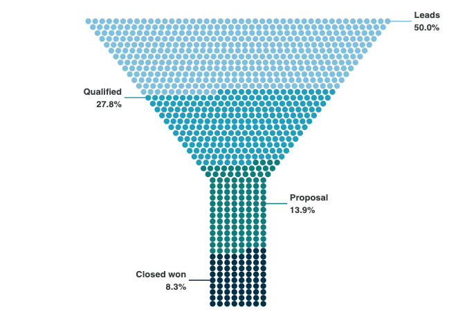
A funnel silhouette with outer name labels

Bring your own shape

The shape you have in mind is probably not one of the 39, and it does not have to be. plotOptions.unit.positions is a function from the marks and the plot rectangle to places, and everything in the kit is one of those. Three routes in, depending on what you already have.

import { shapeFrom, strokeFrom } from 'apexcharts/unit-shapes'

// 1. You have an outline. Packed exactly like the built-ins.
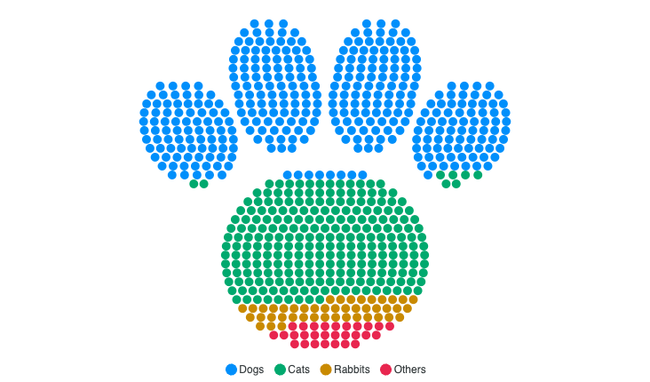
const paw = shapeFrom('M 26 71 A 24 21 0 1 1 74 71 …', { name: 'paw', minUnits: 180 })

// 2. Your thing is a line. Give the centreline and a width, not both sides.
const ridge = strokeFrom('M 6 76 L 24 44 L 40 60 …', { width: 12, order: 'cols' })

// 3. You have a rule, not a picture. This imports nothing from the kit.
positions: (objects, rect) => objects.map((o) => ({ id: o.id, x: /* … */ 0, y: 0 }))

If you author an outline, check the winding first. Subpaths wound the same way union; one wound the other way cuts a hole. That mistake produces a shape which still renders and still looks deliberate, so it is rarely the first thing anyone suspects.

Three routes to your own shape

On provenance

Every outline in the kit was drawn in the ApexCharts repository. No third-party path is admitted, permissively licensed or not, because an outline ships verbatim inside the bundle: a copied path would make its licence notice travel into every consumer's build forever. Brand marks are excluded outright. A test enforces it.

The fix worth reading even if you never draw a heart

update() skips a redundant render by comparing the incoming options with the previous ones, and that comparison went through JSON.stringify, which drops function values. Two configs differing only in a callback therefore serialised identically and the update was thrown away.

Any function-valued option was affected: a new dataLabels.formatter, a new custom tooltip, a new plotOptions.unit.positions.

// Before 6.10.0 — the second call did nothing.
chart.updateOptions({ dataLabels: { formatter: (v) => `${v} units` } })  // lands
chart.updateOptions({ dataLabels: { formatter: (v) => `${v} kg` } })     // discarded

The first such update always worked, since there was nothing to compare against yet, which is exactly what made it look like a rendering problem rather than an update problem. A chart morphing between two shapes would move once and then freeze.

Functions are now compared by identity: passing the same function twice still skips, so the optimisation keeps paying, while a different one gets the render it asked for. A caller who builds a fresh closure on every update now gets a render every time, which is the safe direction to err in, since the closure may capture new state.

Separately, a data point whose x is a Date object had its milliseconds truncated, so points inside the same second collapsed onto each other, and the type definitions refused a Date there despite it being the natural thing to pass. Both are fixed. Thanks to @aron-intframe (#5277).

Upgrading

npm install apexcharts@^6.10.0

Nothing in 6.10.0 is breaking. apexcharts >= 6.10.0 is a hard floor for the shape kit, though, and not only because the module is new: without the update() fix above, a chart that swaps positions more than once will move a single time and then stop.

The unit chart is a Premium chart type. Without a license key it renders in trial mode with an APEXCHARTS watermark; the shape kit adds no further requirement. See the pricing page for current terms.

Where to go next

Frequently asked questions

What is new in ApexCharts 6.10.0?

A companion module, apexcharts/unit-shapes, with 39 shapes a unit chart can pack its dots into, split across 29 silhouettes, 7 strokes and 3 generated shapes. Alongside it: composition helpers (outlined, .with({ order }), glyphs, preview), outer name labels for custom unit layouts, a fix for update() silently dropping any option change that was function-valued, and millisecond resolution for a Date passed as a data point's x.

Is a unit shape an image or an SVG file I ship?

Neither. A shape is a function of the marks and the plot rectangle. Rows are cut across the outline, each row is split into the spans that fall inside it, and the gap between dots is bisected until the spans hold exactly the number of marks the data asks for. Change the dot count and the shape repacks, which is why one outline serves 40 dots in a sparkline and 3,000 in a poster.

How much does apexcharts/unit-shapes add to my bundle?

About 48 KB raw and 14 KB gzipped for the whole catalog, tree-shaken per shape. Importing one shape costs roughly 4 KB gzipped. Importing the catalog export pulls in all 39, so it is meant for galleries and tests rather than charts.

Can I use my own shape instead of the 39?

Yes, and that is the expected case. shapeFrom(path) packs your own SVG outline with the same engine the built-ins use, strokeFrom(path, { width }) takes a centreline for a thing with no interior, and a plain function returning { id, x, y } per mark is already a valid layout that imports nothing from the kit.

Why did my unit chart morph once and then freeze before 6.10?

That is the update() bug fixed in this release, not a shape bug. update() skipped a redundant render by comparing incoming options with the previous ones through JSON.stringify, which drops function values. Two configs differing only in a callback serialised identically, so the second update was thrown away. The first one always worked, since there was nothing to compare against yet. Functions are now compared by identity.

Where did the outlines in the kit come from?

Every outline was drawn in the ApexCharts repository. No third-party path is admitted, permissively licensed or not, because an outline ships verbatim inside the bundle and a copied path would carry its licence notice into every consumer's build forever. Brand marks are excluded outright, and a test enforces it.