What's New in ApexCharts 6.9
ApexCharts 6.9.0 shipped on August 16 with a histogram chart type, raw-observation input for box plot and violin, and a cross-type morph that moves marks instead of crossfading. No API was removed, but pie selection, grouped stacked totals and the package's dependencies changed, so check the table below before you upgrade.
Key takeaways
- New histogram chart type: pass a raw sample and the chart chooses the bins.
- Box plot and violin accept raw observations, so you no longer precompute quartiles or a density profile.
- New
chart.rowSeries(), and a morph that cuts a mark into its objects instead of crossfading. - Also new: nested treemaps, async drilldown levels and
plotOptions.unit.layout: 'custom'. - Check before you ship: pie selection, grouped stacked totals and the new
apex-commonsdependency. - Upgrading is
npm install apexcharts@6.9.0.
Which defaults changed?
| Change | Release | What you will see | How to reverse or upgrade |
|---|---|---|---|
| Pie and donut click | 6.9.0 | A clicked slice slides out along its mid-angle instead of darkening and growing by 4px | plotOptions.pie.expandOffset: 0 keeps the slice in place |
| Pie and donut hover | 6.9.0 | Hover traces an outline band (plotOptions.pie.hoverOutline) and the fill keeps its colour | plotOptions.pie.hoverOutline.show: false brings back the lightened fill; states.hover.filter.type: 'none' turns hover feedback off entirely |
Grouped stacked totals (series[].group) | 6.9.0 | One total above each group's bar, instead of one label per data point summing every series | No option: the old label was wrong. Remove any workaround |
apex-commons (^0.5.0) runtime dependency | 6.9.0 | A new package in your dependency tree; ApexCharts is no longer dependency-free | No action: npm resolves it and the browser bundles inline it |
Histogram
A histogram takes one number per event and does the aggregating itself. There is no x; the bin edges come from the data's own extent.
chart: { type: 'histogram' },
series: [{ name: 'Latency', data: [102, 87, 143, 91, 118, 96, /* ... */] }]
bins: 'auto' (the narrower of Freedman-Diaconis and Sturges).
plotOptions.histogram.bins takes a rule ('auto', 'fd', 'sturges', 'scott', 'rice', 'sqrt') or a fixed count. Step through the buttons above on the same sample and watch the slow tail appear and disappear. binWidth, range, normalize and cumulative cover the rest. Several series share one set of edges and overlay by default (overlap: true), so two samples stay comparable. The binning ships behind apexcharts/features/stats, so it costs nothing if you do not use it. See Choosing the bins.
Box plot and violin take the sample
Put the measurements in points, the field both types already used for jitter dots, and the chart computes the summary or the density.
// before: you compute the summary
series: [{ data: [{ x: 'Phone', y: [1.2, 1.9, 2.4, 3.1, 4.1] }] }]

// after: you supply the sample
series: [{ data: [{ x: 'Phone', points: [1.2, 1.9, 3.4, 2.2, 2.8, /* ... */] }] }]
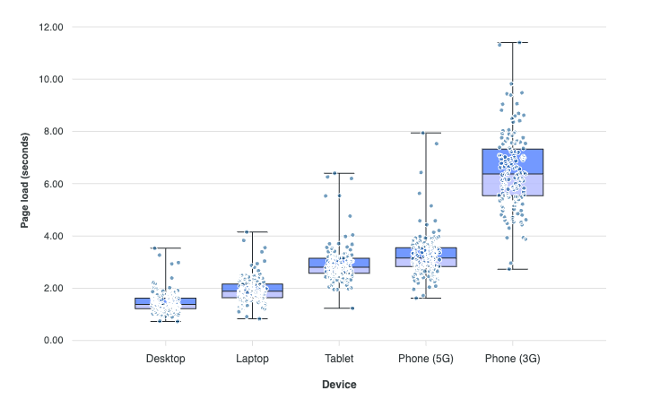
Quartiles interpolate between ranks (R type 7). Whiskers reach the extremes by default; plotOptions.boxPlot.whiskers: 'tukey' switches to the 1.5 × IQR convention, so pair it with points.show or the points beyond the fence disappear. A precomputed y is still drawn exactly as given. See Raw observations.
rowSeries() and a morph that conserves the ink
chart.rowSeries() returns the rows a histogram bin, box or violin stands for, so the summary and its observations are two views of one dataset. It returns null when the current type has no row source.
chart.updateOptions({
  chart: { type: 'unit' },
  series: chart.rowSeries()
})
The morph no longer crossfades. A mark is cut into one cell per object, along its own silhouette rather than its bounding box (a wedge along its curve), and every cell flies to its target. Any two mark families now pair, except a dot cluster against a partition. Treemap and sunburst pair at every level, and a box plot unfolds into its violin and folds back.
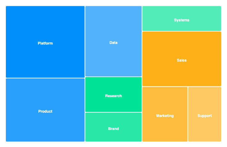
The unit chart type needs a Premium licence or above; without one it renders in full with a trial watermark. See Morphing between chart types.
Other fixes
- An exported SVG or PNG now carries its fonts, images and patterns inline.
- A
tooltip.intersecttooltip on a pie, donut or polar area slice lands on the slice in charts wider than they are tall. - Changing type through
updateOptions({ chart: { type } })re-chooses the new type's reading, tooltip and hit-testing defaults, so a box plot turned violin no longer throws on hover. Options you set yourself are never re-chosen. - Line and area drilldown works with a real click: each drillable point gets its own marker.
- The hover hit-test and bar centres measure from the right origin, so the tooltip no longer captions the neighbouring bar (#5272, thanks @lazerg).
- Datetime gridlines outside the plot are skipped instead of drawn on the axis (#5273).
- An annotation label's background box is fixed (#5270, thanks @mrash).
xaxis.labels.style.fontSize: 'inherit'no longer yields NaN (#5064, thanks @waterWang).- A legend toggle no longer re-bins a histogram's counts, and a hidden polar area series gives its slot back.
The full list is in the 6.9.0 GitHub release, and every change is in the v6.8.0...v6.9.0 diff.
Upgrading
npm install apexcharts@6.9.0
Or with a script tag:
<script src="https://cdnjs.cloudflare.com/ajax/libs/apexcharts/6.9.0/apexcharts.min.js"></script>
- Check pie and donut charts against the new selection and hover.
- Remove any workaround for the old grouped stacked totals.
The React, Vue and Angular wrappers work unchanged. Apart from the Premium unit chart, everything in this post is covered by the Community License, free under $2M in annual revenue, budget or funding. See pricing and the license.
Frequently asked questions
Will upgrading to ApexCharts 6.9 break my charts?
No API was renamed or removed. A clicked pie or donut slice now slides out rather than darkening, and grouped stacked bars carry one total per group. Set `plotOptions.pie.expandOffset: 0` to keep a clicked slice in place. The grouped totals have no switch, because the old labels summed the whole chart.
How does the ApexCharts histogram choose its bins?
`plotOptions.histogram.bins` takes a rule name or a fixed count. `'auto'` takes the narrower of Freedman-Diaconis and Sturges, falling back to Sturges when the IQR is 0. Set `binWidth` instead when the boundaries carry meaning, such as decades or 5-minute buckets.
Do I still have to compute quartiles for an ApexCharts box plot?
No. From 6.9 a datum can supply `points`, an array of raw observations, instead of a five-number `y`, and the library works out the summary. Violin does the same for its kernel density. Charts that already pass a summary keep rendering it untouched.
Does ApexCharts 6.9 add a dependency?
Yes. It now requires `apex-commons` (^0.5.0) at runtime, which carries the licence manager, the crossfilter engine and the spring primitives the unit chart uses. npm installs it for you and the browser bundles inline it, so neither script-tag nor bundler users need to do anything.