ApexCharts 7.5 and 7.6: Icicle Charts, Interactive Tooltips, and Weave v6
Two releases, six days apart, aimed at two different people.
7.6 is for whoever is drawing the chart. A new chart type, a tooltip you can actually click into, and a fix for a bug that arrived in support as "our charts stopped animating."
7.5 is for whoever is writing the plugin. The Weave contract went to v6, and the theme running through all four additions is the same: the chart knew something a plugin had no way to ask for, so the plugin guessed, reached into the caller's config, or did without.
Key takeaways
- Icicle charts draw a hierarchy as nested bands, with
direction: 'up'giving you a flame graph. It is opt-in, and it is the first chart type the full bundle does not carry. tooltip.interactivemakes a link or button inside acustomtooltip reachable, whichpointer-events: nonehad made impossible.- Reduced motion was a one-way trip. A chart that saw the preference on at mount never animated again, even after it was turned off. Fixed, along with
respectReducedMotion: falsenever reaching the stylesheet. - Weave v6 adds
api.can(),api.claim(),api.drawn()andapi.declare(). All of it is reachable from a plugin still declaringapiVersion: 2. - No breaking changes in either release. Upgrading is
npm install apexcharts@7.6.0.
| gzip | |
|---|---|
| 7.4.0 default bundle | 268,612 B |
| 7.5.0 default bundle | 269,856 B |
| 7.5.1 default bundle | 269,879 B |
| 7.6.0 default bundle | 271,534 B |
All four are dist/apexcharts.min.js gzipped at the default level, which is the figure npm run build prints. Note this is a different basis from the one notes before 7.5 used, a shell gzip, which differs between macOS and Linux and so could not be computed the same way twice.
What is an icicle chart, and when is it the right one?
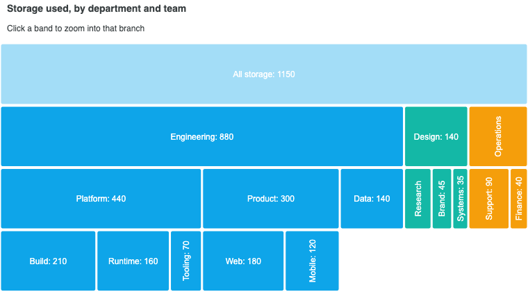
An icicle chart draws a hierarchy as one band per depth level, each child cell nested inside its parent's extent along the value axis. It is the sunburst's layout in cartesian coordinates, and it takes exactly the same data: a native children tree, or an existing drilldown config read as plain data, with no dependency on the drilldown runtime.
import ApexCharts from 'apexcharts/icicle'
const chart = new ApexCharts(el, {
chart: { type: 'icicle' },
series: [{
data: [
{ x: 'All storage', children: [
{ x: 'Engineering', children: [
{ x: 'Build', y: 210 },
{ x: 'Runtime', y: 160 },
]},
{ x: 'Design', y: 140 },
]},
],
}],
})
chart.render()
Straight bands buy you three things a ring cannot: labels that stay horizontal and legible at every depth, depth as a straight axis so same-depth siblings line up across branches, and room for long names.
| Icicle | Sunburst | |
|---|---|---|
| Labels | Horizontal at every depth | Curved, and cramped near the centre |
| Comparing siblings across branches | Directly, by length on a shared axis | Hard, angles are not lengths |
| Deep trees | Degrades to a dense but honest shape | Outer rings get thin fast |
| Part-to-whole at the top level | Fine | Better, the root gets the most room |
| Reads as one object | No | Yes |
Pick the icicle when labels matter or the tree is deep. Pick the sunburst when the story is part-to-whole and the top levels carry the weight.
Flame graphs
A flame graph is an icicle with two settings changed, and it is the reason this layout exists in cartesian form:
plotOptions: {
icicle: {
direction: 'up', // root at the bottom, stacks growing upward
sort: 'name', // alphabetical siblings
dataLabels: { align: 'left', minSizeToShow: 44 },
},
}
sort: 'name' carries the whole idea. Alphabetical ordering holds a frame in the same place across profiles, so two runs of the same program can be compared by eye. Ordering by size would move every frame between runs and lose exactly that. align: 'left' matters for the same kind of reason: a profiler reader scans the left edge of the stack, where a frame lines up with the one that called it.
Clicking zooms the value axis, not the layout
Clicking a branch used to re-lay the chart out on both axes: the branch became the top level and every band moved. That is a re-layout rather than a zoom, and it costs the reader their place along with the ancestors that gave the branch its meaning.
zoomType: 'value', now the default, rescales the value axis only. The branch stretches to fill the plot, its subtree stretches with it, and no level moves. Ancestors stay above it as context. zoomType: 'both' keeps the old behaviour for charts that would rather spend the whole plot on the focused branch.
The values are not called 'x' and 'y' because direction decides which screen axis the value axis is.
The import is not optional
The icicle is the first chart type that is not in the default bundle. The full apexcharts.js carries its settings literals and a few string branches, and none of its renderer.
// Bundler
import ApexCharts from 'apexcharts/icicle'
<!-- Script tag: after the core script -->
<script src="https://cdn.jsdelivr.net/npm/apexcharts"></script>
<script src="https://cdn.jsdelivr.net/npm/apexcharts/dist/icicle.js"></script>
Miss it and the chart throws chart type "icicle" is not registered at render. That is deliberate: unlike raincloud, which falls back to the violin renderer it is built on, the icicle has no base renderer to degrade into, so failing loudly is the only honest option.
Four defaults also differ from the sunburst's, each because filling the plot is what a treemap does and an icicle has to read as a hierarchy: leaf: 'stop' ends a shallow branch at its own band so the white space below shows how deep each branch goes, tint: 0 keeps one hue per branch so the eye can follow it down, the palette lands on the shallowest level that branches, and the legend is off because every cell already carries its label.
How do I put a link inside a tooltip?
Set tooltip.interactive: true.
tooltip: {
interactive: true,
custom: ({ series, seriesIndex, dataPointIndex }) => {
const value = series[seriesIndex][dataPointIndex]
return `<div class="tooltip-card">
<strong>${value}</strong>
<a href="/reports/${dataPointIndex}">Open report</a>
</div>`
},
}
The reason this needed a feature rather than CSS is worth knowing. A default tooltip sets pointer-events: none, so the pointer passes straight through it and a link inside is not clickable at any specificity. Moving toward the tooltip also counts as leaving the data point, so it closes on the way there.
Turning interactive on flips pointer-events to auto and defers the close by 150ms, which is the time the pointer needs to cross the gap. Entering the tooltip cancels the close; leaving it closes the tooltip. On grouped charts, leaving dismisses the tooltips across the group.
followCursor is ignored while it is on, because a tooltip that trails the cursor can never be entered. Leave interactive off unless the tooltip actually contains something to click.
"Our charts stopped animating"
This one arrived as a bug report about animations not working, with the detail that made it solvable: they worked on mobile and not on desktop. That is the shape of an accessibility preference, not of a chart bug.
Since 5.12 a chart skips its animations while the OS asks for reduced motion, which is what WCAG 2.3.3 asks of an interface that moves on its own. Two things were wrong with how that was implemented.
It was a one-way trip. The policy wrote enabled = false straight into the merged config that every update merges onto. Nothing ever put the original value back, and no merge could: an updateOptions({ series }) carries no opinion about animations, so the false survived it. A viewer who had the preference on when the chart mounted got a chart that never animated again for the life of the page, even after turning the preference off. The disable is now a latch, and the values it overwrites are restored the moment the query stops matching.
And the opt-out only half worked. respectReducedMotion: false turned the JavaScript tweens back on, but no JavaScript flag can reach a stylesheet, and the @media (prefers-reduced-motion: reduce) block in apexcharts.css went on flattening every duration inside .apexcharts-canvas with !important. Everything CSS-driven stayed frozen: the pie slice-offset slide, the tooltip and crosshair fades, the drilldown spinner. That block is now scoped :not(.apexcharts-ignore-reduced-motion), and the class goes on the canvas when the option is false.
A side effect worth knowing: the reduced-motion fallback for the drilldown spinner had never actually run. It swaps the spin for an opacity pulse, which is what 2.3.3 asks for while still showing the drill is working, and the blanket rule had been flattening the fallback too, leaving a drill with no loading indication at all.
If you are diagnosing this, the one-liner is:
matchMedia('(prefers-reduced-motion: reduce)').matches
true means the preference is on and the chart is behaving as designed. Windows Battery Saver forces it, and most remote-desktop and VDI sessions report it, which is how a developer ends up with charts that never animate on their desktop while the same page animates on their phone. Reduced motion covers the rest.
Page CSS now wins by default
Related, and its own fix: the library's stylesheet was appended to <head>. It is injected when the first chart renders, long after the page's own stylesheets have parsed, so appending put it last in the cascade. An author rule at equal specificity lost on document order alone, wherever they had put it, and the only way through was to repeat a class to out-specify us.
It is prepended now, which makes the library the weakest author styles on the page. That is what a library's defaults should be, and it matches what the Shadow DOM branch has always done.
Weave v6: asking instead of guessing
Four additions, all additive, all reachable from a plugin still declaring apiVersion: 2.
The rule that has not changed: do not declare the newest version
The gate is forward-compatible. A host serves a plugin declaring an older version and skips only a plugin that needs a newer host than itself, silently. So apiVersion is a minimum requirement, not a statement of what you built against, and declaring the newest is actively harmful.
What v6 changes is the other half. Until now, discovering anything above your declared minimum meant sniffing the facade for function members, so every plugin reimplemented the same guesswork against a surface it is deliberately not supposed to know the shape of:
// Before
if (typeof api.reserve === 'function') { /* ... */ }
// After
if (api.can?.('reserve')) { /* ... */ }
The ?. is not decoration. A host older than 7.5 has no can at all, so a plugin supporting both has to guard the guard. Seven capability names exist today: layer, derived, reserve, pointer, stroke-info, claim and drawn. Each is probed off the facade that was actually built rather than copied from a constant, so a member that is ever made conditional drops out of the list instead of being advertised and then missing.
api.claim(): set an option for your own series
stroke.dashArray and dataLabels.enabledOnSeries are indexed by series position, with no per-series form. A plugin that adds a computed series and wants it dashed has had to write the array covering every series including the caller's, then restore what it found.
7.4 added api.info.stroke so it could at least see what to restore, which made the pattern survivable rather than sound. Four things are wrong with it, and three are unfixable from inside a plugin:
- The restore is stale the moment the caller runs their own
updateOptions. - It leaks permanently if the plugin throws in between.
- A caller who wrote a single number gets it flattened into an array.
- Two plugins doing it at once fight, and the winner is whichever released last.
const claim = api.claim('stroke.dashArray', [
{ series: 'Revenue (forecast)', value: 6 },
])
claim.release()
A claim is resolved where the option is read. Nothing is written, so releasing is a deletion rather than a restore, and a caller's own updateOptions composes with the claim instead of reverting it. Name the series rather than its position where you can: the name is resolved each time the option is read, so the claim follows that series when others are added or reordered.
The allowlist is the point rather than a limitation. An unbounded claim(path, value) would be "write anything to the caller's config", which is the thing this platform refuses to do.
api.drawn() and api.declare(): what is on the chart
A plugin that wants to list what a chart is showing had no way to learn it. It knows its own overlays and can read the series off api.data, but the caller's annotations and another plugin's overlays were invisible. A layers panel and an export summary are the same question, and both were unanswerable.
api.declare({ id: 'trend-1', label: 'Trend' })
api.drawn()
// [{ id, kind: 'series' | 'annotation' | 'overlay', label, owner, visible }, ...]
Every entry names its owner, and that is the point rather than decoration: the list is only ever as complete as the features that opted into it, so a reader can say what the inventory covers instead of presenting a partial list as everything. It is read only, deliberately. Removing another feature's output would mean one plugin reaching into another's state with no way for the owner to refuse.
If you consume this, require 7.5.1. On 7.5.0 declarations were dropped only on a chart redraw, so an overlay switched off by an interaction (which empties its layer and repaints without a render) stayed in the list. A reader can see that a list covers only the features that opted in; they cannot see that a row in it is stale.
Two small reads
api.info.title is the name the page already gave the chart, for a readout that would otherwise head each row with a container id written for a stylesheet. It is an empty string rather than undefined when untitled, so it drops into a template without a guard.
modifiers on the pointer payload reports the keys held, which is what makes shift-click to add to a selection expressible. Always the same four booleans, shift, ctrl, alt and meta, never partial, because a plugin writes e.modifiers.shift inside a viewer's click and a sometimes-missing key is how that becomes a crash. All four are false where there was no DOM event, which is the honest answer for a keyboard selection.
Full detail in the plugins guide.
Other fixes
- A series declared
hidden: truecame back fromresetSeries()empty, and its data was gone for the life of the chart. The same emptied baseline made shared tooltips silently drop to a single series the moment the viewer un-hid it from the legend, which is what made it read as a tooltip bug rather than a data one. - A hierarchy branch that omits its own value is documented to be the sum of its children, but non-axis parsing required every datum to carry both
xandy, so such a branch was dropped with a warning about pie data. With every branch dropped the chart drew nothing at all. Sunburst had this hole since it shipped; its samples all gave their top-level nodes ay, which hid it. rangeAreacharts now scale the y axis to their data.- Data labels on a 100% stacked combo (#2429).
- An icicle zoom ran on the wrong clock, pacing itself with
animations.speed, the first-render clock, so a click took 800ms and read as lag. OndynamicAnimation.speedit finishes in 350ms.
The Playwright interaction suite now runs in CI on every push and pull request. It had been green on developer machines and ungated for months, and it caught a stacked-total label regression within a day of being switched on.
Contributors
Thanks to @lovasoa, @gioboa, @mrash and @mmilanovic4, whose work is in the fixes above.
Upgrading
npm install apexcharts@7.6.0
No option was removed and no default changed in a way that alters an existing chart's output. If you draw icicle charts, add the entry-point import. If you maintain a Weave plugin, you do not need to change anything, and you should not raise your apiVersion.
Bundle-size figures per entry point are in the tree-shaking guide, re-measured on 7.6.0.
Frequently asked questions
What is an icicle chart, and how do I make one in ApexCharts?
An icicle chart draws a hierarchy as one band per level, with each child cell nested inside its parent's extent along the value axis. It is the sunburst's layout in cartesian coordinates and takes the same data: a `children` tree, or an existing `drilldown` config read as plain data. Set `chart.type: 'icicle'` and load the entry point, because it is not in the default bundle: `import ApexCharts from 'apexcharts/icicle'`, or add `dist/icicle.js` after the core script tag.
Why do I get 'chart type icicle is not registered'?
Because the icicle is opt-in and the import is missing. Unlike every other chart type, the default `apexcharts` bundle carries no icicle renderer, only its settings literals. Add `import ApexCharts from 'apexcharts/icicle'` with a bundler, or `<script src="https://cdn.jsdelivr.net/npm/apexcharts/dist/icicle.js"></script>` after the core script. Note that loading the full `apexcharts.js` is not enough on its own, which is the one case where that advice does not apply.
How do I build a flame graph in JavaScript with ApexCharts?
Use an icicle chart with two settings changed: `direction: 'up'` so the stack grows upward from the root frame, and `sort: 'name'` so siblings are alphabetical. The sort is the part that matters. Alphabetical ordering holds a frame in the same place across profiles, so two runs of the same program can be compared by eye, where ordering by size would move every frame. `dataLabels.align: 'left'` also helps, because a profiler reader scans the left edge of the stack.
Why did my ApexCharts charts stop animating on desktop but not on mobile?
That is almost certainly the OS reduced-motion preference rather than a chart bug, and 7.6 fixes the part of it that was ours. Since 5.12 a chart skips its animations while `prefers-reduced-motion: reduce` matches. Before 7.6 that was a one-way trip: the policy wrote `enabled: false` into the merged config and nothing put the original value back, so a viewer who had the preference on when the chart mounted got a chart that never animated again for the life of the page, even after turning it off. Check which side you are on with `matchMedia('(prefers-reduced-motion: reduce)').matches`. Windows Battery Saver forces the preference on, and most remote-desktop sessions report it.
How do I put a clickable link or button inside an ApexCharts tooltip?
Set `tooltip.interactive: true`, added in 7.6. A default tooltip sets `pointer-events: none`, so a link inside a `custom` tooltip cannot be clicked: the pointer passes through it, and moving toward the tooltip counts as leaving the data point, so it disappears on the way. Turning it on flips `pointer-events` to `auto` and defers the close by 150ms so the pointer can cross the gap. `followCursor` is ignored while it is on, because a tooltip that trails the cursor can never be entered.
Do I need to update my Weave plugin for API v6?
No. Every change has been additive and the version gate is forward-compatible, so a plugin declaring `apiVersion: 1` runs unchanged on a v6 host. What you should not do is raise your `apiVersion` to 6 to reach the new surface, because a host older than the version you declare skips your plugin outright rather than serving it a smaller API. Declare the oldest version you genuinely need and ask for the rest with `api.can('claim')`. If you support hosts older than 7.5, optional-chain the check itself with `api.can?.('claim')`, since `can` does not exist before v6.