ApexCharts 7.7 and 7.8: Three Default Changes and a Round of Update-Path Fixes
ApexCharts 7.7.0 shipped on October 1 and 7.8.0 the day after. Read them together, because between them they change three defaults, and each of those can alter a chart you already have in production.
Each default change can be reversed in your options. Trellis panel headers no longer promote on click, overlapping data labels are nudged apart, and a waterfall's labels have lost their chip. Everything else in the two releases is a fix, a speed-up or the new trellis.minPanelHeight option, and needs nothing from your code. The one other item to read is the licence wording, if your organisation has funding or a budget but little revenue.
Key takeaways
trellis.promotenow defaults tofalse(7.7). A header click no longer expands its panel. Addpromote: trueto get it back;promotePanel()andrestorePanels()work either way.dataLabels.avoidOverlapis on by default (7.8). Labels that land on each other move apart along the value axis.avoidOverlap: falserestores the old placement.- Waterfall labels have no chip (7.8). The ink follows
chart.foreColorinstead.dataLabels.background.enabled: truedraws a chip again, but the pale 7.7 chip also needs its old colours. updateOptionsreaches more of the chart (7.7). New series now reach the waterfall, histogram, dumbbell, streamgraph, treemap and downsampler, and tooltip options such asthemenow update.- A trellis now fits its host (7.7), with a new
trellis.minPanelHeightfloor and a batch of fixes from a single field report. - Hover blocking time on a large chart fell from 2,537ms to 170ms with a shared tooltip, measured on charts of 300 and 700 series (7.8).
- Upgrading is
npm install apexcharts@7.8.0.
| Default change | Release | What you will see | How to reverse it |
|---|---|---|---|
trellis.promote is false | 7.7.0 | Clicking a panel header does nothing | trellis: { promote: true } |
dataLabels.avoidOverlap is on | 7.8.0 | Labels that overlapped now sit apart | dataLabels: { avoidOverlap: false } |
| Waterfall label chip removed | 7.8.0 | Labels drawn in the theme's text colour, no rectangle | dataLabels.background with enabled: true and the old colours |
| gzip | |
|---|---|
| 7.6.1 default bundle | 271,606 B |
| 7.7.0 default bundle | 272,129 B |
| 7.8.0 default bundle | 273,832 B |
All three are dist/apexcharts.min.js gzipped at the default level, which is the figure npm run build prints and the same basis the 7.5 and 7.6 notes used. The two releases add 2,226 B between them.
Why does clicking a trellis panel header no longer expand it?
Because promotion is now opt-in. Since 7.7.0, trellis.promote defaults to false, so a header click leaves the grid alone unless you set promote: true. This is the one change in either release marked as breaking.
// 7.6 and earlier: a header click expanded that panel by default
trellis: { by: 'region' }

// 7.7 and later: ask for the interaction explicitly
trellis: { by: 'region', promote: true }
The reasoning is about what a reader expects. A trellis embedded in a page is usually read rather than driven, and nothing on a header says it is a button until the cursor changes over it. Taking over the whole grid on a stray click was a large surprise for an interaction nobody had asked for.
The methods are untouched. chart.promotePanel(key) and chart.restorePanels() work whatever promote is set to, so a page that promotes a panel from its own controls needs no change. The 7.0 release notes describe click-to-promote as part of the trellis; that was the 7.0 default and is now opt-in. The panel promotion demo now sets promote: true in its own config, and Promoting a panel covers the rest.
Why did my data labels move after upgrading to 7.8?
Because two of them were landing on each other, and 7.8.0 turns on dataLabels.avoidOverlap by default. After every label is drawn, a pass nudges colliding pairs apart along the value axis. A chart whose labels already clear each other is untouched: across the 320 demo charts that predate the option, not one renders differently.
// 7.8 default: overlapping labels move apart
dataLabels: { enabled: true }

// Place every label strictly at its own mark, as 7.7 did
dataLabels: { enabled: true, avoidOverlap: false }

// Keep the nudge, and drop a label that still collides
dataLabels: { enabled: true, avoidOverlap: { hide: true } }
The object form also takes gap, the clear space between two separated labels (default 2px), and maxShift, how far a label may travel from its own mark.
Why a dual-axis chart needs this most
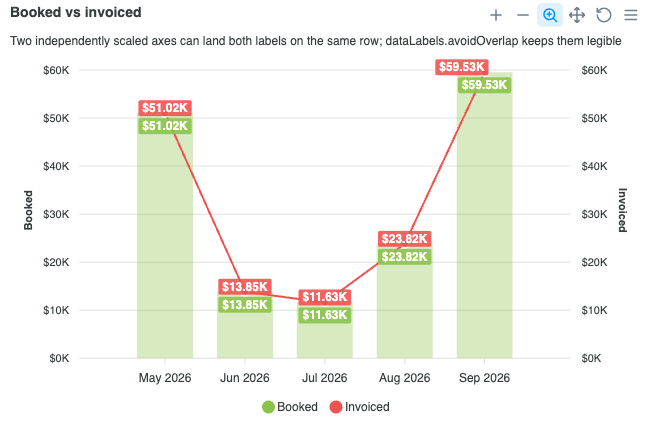
On a chart with two y-axes, a collision has nothing to do with how close the values are. The two axes are scaled independently, so only pixels decide. A column at 59.5K and a line at 68K can land on the same row, while 51K and 51.3K sit well apart.
The report that started this was a combo chart printing "$59.53K$59.53K" where a column and a line coincided. Sweeping the line series from -30% to +30% of the columns in 1% steps, 34 of 61 configurations collided, 88 pairs in total. With the pass on, none do.
What the pass will and will not do
| Situation | Behaviour |
|---|---|
| Vertical columns, lines, areas | Labels move up or down |
| Horizontal bars | Labels move left or right, so they never walk into the next row |
A pair that cannot be separated within maxShift | Left overlapping, unless hide: true |
Rotated labels (plotOptions.bar.dataLabels.orientation: 'vertical') | Treated as obstacles, never moved |
| Pie, donut, polar area, radial bar, radar | Skipped; they keep their own placement |
| A label already outside the plot | Keeps its place; the plot edge limits movement, it never forces it |
Dropping a label is opt-in for a reason. A default-on pass that silently deletes a value is worse than the overlap it set out to fix, so an unseparable pair renders exactly as it did before. Overlapping data labels has the guide-level version.
What happened to the chip behind waterfall labels?
It is gone by default since 7.8.0. A waterfall now prints each step with no background rectangle, in ink that follows chart.foreColor.
Getting the old chip back takes more than enabled: true. Up to 7.7 the waterfall supplied its own chip colours, and 7.8.0 dropped those along with the chip. A bare enabled: true therefore gets the standard data-label background, which fills the chip with the label's ink and writes the text in white. On the light theme that is a dark chip; on the dark theme it is white text on a near-white chip. Pass the 7.7 values to get the pale chip back as it was:
// The pale chip a 7.7 waterfall drew by default
dataLabels: {
  background: {
    enabled: true,
    backgroundColor: '#fff',
    foreColor: '#373d3f',
    borderColor: '#e3e8ee',
    opacity: 0.92,
  },
}
The chip had been doing a job, so removing it alone would have broken something. Small steps are normal in a waterfall, and a label wider or taller than its bar is placed outside it. The range-column defaults a waterfall inherits draw labels in white, so without the chip those labels would be white text on the chart background, and the smallest steps of a P&L bridge would vanish.
Following chart.foreColor solves that without a second rectangle per bar. It resolves to #373d3f on the light theme and #f6f7f8 on the dark one, which reads over a rising, falling or total bar and on the background beside a small one. The waterfall chart docs explain the defaults.
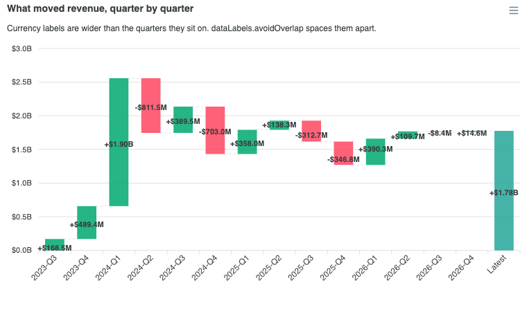
The new crowded-labels demo puts both 7.8 changes on one chart: fourteen quarterly steps with currency labels wider than the bars they sit on.
A related type fix: entries in dataLabels.style.colors may be functions. That has always worked at runtime and the docs said so, but the TypeScript declaration said string[]. It now matches.
What is trellis.minPanelHeight?
It is the floor a height-derived trellis panel will not shrink below, added in 7.7.0 with a default of 80px. A grid that cannot fit its container now overflows and logs once how much room is missing, rather than squeezing its panels past the point where anyone can read them.
trellis: {
  by: 'region',
  minPanelHeight: 60,   // default 80
}
Lower it when fitting a short container matters more than legibility. Before 7.7 the overflow happened silently, which made it look like a layout bug rather than a decision. The option is in the trellis options reference.
Which trellis bugs did 7.7 fix?
The fixes below all trace to one field report against a viewer built on the trellis. Most were about the grid not fitting its host, or an update doing more or less than it should.
Sizing
- A
'100%'host height was read as 100 pixels.parseFloat('100%')is 100, so a full-height grid laid itself out for a 100px box. A percentage now resolves against the container's parent, the same rule a standalone chart follows. In a 500px box, panel height went from 80 to 454. - A height-only resize did not refit the panels. The observer only watched width. It tracks height too.
- The grid ignored its own chrome. The title, toolbar band and shared legend were not subtracted, so a grid overflowed its host by exactly their height. The trellis demos now sit inside the height they declare.
Scales
- A shared y scale ignored stacking. The domain came from the largest single value, so a panel stacking 40 + 40 drew its second series 114px above the grid top. Stacked panels now measure per-x totals.
- A
stackType: '100%'trellis lost its 0 to 100 axis on the first update, dropping to the raw range (0 to 60 on the reported data). The domain is now fixed at 0 to 100. Fresh-render tick labels change from 0 / 33 / 67 / 100 to 0 / 50 / 100. - Scatter and bubble panels dropped duplicate x values, and
dataPointIndexpointed into the union of every panel's points rather than the panel's own. They now keep their own points while still sharing the x domain.
Updates and events
- An update before the first render settled drew a stray plain chart beside the half-built grid. Updates now wait for the mount.
- Every
updateOptionsrebuilt the grid, losing hover state and focus. A change that only affects how a panel paints now goes to the live panels. panelMounted,trellisMounted,panelPromotedandpanelRestorednever reachedchart.events. They only fired throughaddEventListener. They now fire through both.- Header and legend colours ignored
theme.mode, staying grey and unreadable on a dark background. They now follow the resolvedchart.foreColor, and a page-level--apx-foretoken still wins.
chart: {
  events: {
    panelPromoted: (chart, { key }) => console.log('promoted', key),
    panelRestored: (chart, { key }) => console.log('restored', key),
  },
},
One question from the same report turned out not to be a bug: dropping the trellis key from a rebuilt options object leaves the grid in place. updateOptions merges, so an absent key keeps its value. Pass trellis: null instead, as Turning a trellis back into a single chart shows.
Why did updateOptions ignore my new series or tooltip theme?
Two separate bugs, both fixed in 7.7.0. One affected chart types whose series are computed from your input; the other affected every tooltip option.
Derived series ignored new data
A waterfall computes running totals from the steps you pass. Before 7.7, updateOptions({ series }) was ignored by every type built that way, while updateSeries worked:
| Chart type | updateSeries | updateOptions({ series }) before 7.7 | From 7.7 |
|---|---|---|---|
| Waterfall | Updated | Kept the first dataset | Updated |
| Histogram | Updated | Kept the first dataset | Updated |
| Dumbbell | Updated | Kept the first dataset | Updated |
| Streamgraph | Updated | Kept the first dataset | Updated |
| Treemap | Updated | Kept the first dataset | Updated |
| Zoom-aware downsampler | Updated | Kept the first dataset | Updated |
The cause was a stash of your raw input that the update path never cleared, so each transform kept rebuilding from the first dataset. Both update paths now clear it through one shared helper.
// Before 7.7 this was silently ignored on a waterfall
await chart.updateOptions({
  series: [{ name: 'Revenue bridge', data: nextQuarterSteps }],
})
Tooltip options were frozen at creation
Toggling a theme at runtime turned the axes dark and left the tooltip white. The tooltip module captured its options when the chart was created and never saw an update.
// Before 7.7 the axes went dark and the tooltip stayed white
await chart.updateOptions({
  theme: { mode: 'dark' },
  tooltip: { theme: 'dark' },
})
It now reads the live config. Measured on a bar chart, four options that updateOptions silently dropped now apply: theme, shared, intersect and x.show.
What else changed in tooltips and axis labels?
Four placement and hover fixes, all in 7.7.0:
- The column crosshair is centred on the bar you see. With a bar stroke the hover band sat up to a full stroke width left of the painted column. The centre error was -0.704 / -2.704 / -6.704px for stroke widths 0 / 2 / 6, and is now 0 for all three.
- A treemap tooltip sits on the tile it describes (#5321). It used to land half a tile above, and off-screen on a chart near the top of a page. A heatmap with
tooltip.arrow: falsehad the same fault and gets the same fix. - Axis labels no longer raise a native browser tooltip repeating their own text (#5318). The SVG
<title>stays only on a label that was cut short bymaxWidth,trimor a horizontal bar's y-axis, where hovering reveals the full text. - The tooltip closes when the pointer leaves the plot sideways. With
shared: false, intersect: false, hovering the y-axis labels or the padding past the last column could leave an empty box or a stale card on screen.
How much faster is hovering a large chart?
Much faster on a chart with hundreds of series. A CPU profile of a hover sweep over a 700-series chart put 38% of hover time inside querySelector and another 10% in forced layout, because lookups ran once per marker rather than once per gesture. 7.8.0 does them once per gesture.
| Measurement (700 series x 10 points, and 300 series x 40) | Before | 7.8 |
|---|---|---|
| Hover blocking time, shared tooltip | 2,537ms | 170ms |
| Hover blocking time, non-shared tooltip | 3,576ms | 715ms |
updateSeries median | 108.4ms | 77.4ms |
One of the changes is specific to the non-shared tooltip. It built one row per series but only ever shows one, so a 700-series chart built about 9,800 DOM nodes and rewrote them on every hover. It now allocates the one row it shows.
Data label backgrounds got the same treatment. Each label used to be measured, then have its background inserted, which forced the SVG to lay out again before the next measurement. All measurements now happen first. On thousands of labels that is the difference between seconds and milliseconds.
One visible side effect: on a chart with more label backgrounds than chart.animations.largeDatasetThreshold (default 1000), they now appear without a per-element animation, the same bail-out series paths already take at that threshold. Set it to 0 to always animate them.
What changed in the licence text?
7.7.0 keeps the $2M figure and changes what it is measured against. A paid licence is now needed at annual revenue, operating budget, funding, or equivalent financial resources of $2 million USD or more, and the test counts your parent company, affiliates and any entity under common control: reaching $2M on any one of those measures is enough.
The old revenue-only wording missed two common cases: a funded startup with no revenue yet, and a non-profit with a $3M budget. Both are over the threshold. See the licence and pricing pages for which plan applies.
Other fixes
- The AJAX demos load again. They fetched sample data from a third-party mock API that no longer resolves, so they showed "Loading..." indefinitely. They now read the same
db.jsonfrom jsDelivr, and the AJAX tutorial uses the new URL. If you copied the old URL into a prototype, swap it too, and note the shape: the new URL returns the whole file, so the series is under itsyearlykey.
Upgrading
npm install apexcharts@7.8.0
Before you deploy, check the three defaults against your charts:
- Trellis with clickable headers? Add
promote: true. - Visual snapshot tests on charts with data labels? Expect diffs wherever two labels used to overlap. Re-baseline, or set
avoidOverlap: falseto keep the old placement. - Waterfall styled around the chip? Set
dataLabels.backgroundwithenabled: trueand the 7.7 colours;enabled: truealone draws a different chip. - Calling
updateSeriesonly becauseupdateOptions({ series })did not work? Either now works.
Coming from 6.x rather than 7.6, start with the 7.0 migration guide.
Frequently asked questions
Why does clicking a trellis panel header no longer expand the panel?
Because `trellis.promote` defaults to `false` since ApexCharts 7.7.0. A header click used to expand its panel to the grid's full width; it now does nothing unless you ask for it. Add `promote: true` to the `trellis` block to get the click back. `chart.promotePanel(key)` and `chart.restorePanels()` are unchanged and work whatever the setting, so a page that promotes from its own buttons needs no change.
Why did my data labels move after upgrading to ApexCharts 7.8?
Because `dataLabels.avoidOverlap` is on by default since 7.8.0, and two of your labels were landing on each other. The pass only moves labels that overlap; a chart whose labels already clear each other renders exactly as before. Labels move along the value axis, so a horizontal bar's labels move sideways. Set `dataLabels: { avoidOverlap: false }` to put every label back at its own mark.
How do I get the background chip back on waterfall data labels?
Set `dataLabels.background` with its colours, not just `enabled: true`. Since 7.8.0 a waterfall draws its labels with no chip, in ink that follows `chart.foreColor`, and it no longer supplies chip colours either. A bare `background: { enabled: true }` therefore gets the standard data-label chip, filled with the label's ink and written in white: a dark chip on the light theme, and white text on a near-white chip on the dark one. To get the pale chip a 7.7 waterfall drew, pass `dataLabels: { background: { enabled: true, backgroundColor: '#fff', foreColor: '#373d3f', borderColor: '#e3e8ee', opacity: 0.92 } }`.
Why does updateOptions not change the data of my waterfall or histogram?
On versions before 7.7.0, `updateOptions({ series })` was ignored by every chart type whose series is derived from your raw input: waterfall, histogram, dumbbell, streamgraph, treemap and the zoom-aware downsampler. The transform kept rebuilding the first dataset while `updateSeries` worked. Upgrade to 7.7.0 or later; on an older version, call `updateSeries` instead.
Why does the ApexCharts tooltip stay white after switching to a dark theme?
Before 7.7.0 the tooltip module kept the tooltip options the chart was created with, so `updateOptions` could not change `tooltip.theme`, `shared`, `intersect` or `x.show`. A runtime theme toggle turned the axes dark and left the tooltip white. From 7.7.0 the tooltip reads the live config, and the same `updateOptions` call changes both.
How do I turn a trellis back into a single chart with updateOptions?
Pass `trellis: null`, for example `chart.updateOptions({ trellis: null })`. Leaving the `trellis` key out of a rebuilt options object keeps the grid, because `updateOptions` merges and an absent key keeps its current value. That is true of every option, not only this one.
Will upgrading from ApexCharts 7.6 to 7.8 break my charts?
No option was removed and no API changed shape, but three defaults changed, so a chart can look or behave differently. A trellis header no longer promotes on click (`trellis.promote: true` restores it), overlapping data labels move apart (`dataLabels.avoidOverlap: false` restores the old placement), and a waterfall's labels have no chip (`dataLabels.background` with `enabled: true` and the old colours restores it). The upgrade is `npm install apexcharts@7.8.0`.