ApexCharts 7.1 adds four chart types, and the thing they have in common is worth more than the list: each one takes the data you already have and does the arithmetic itself.

A waterfall takes your deltas and accumulates them. A dumbbell takes one series per measure and joins them. A streamgraph takes ordinary series and solves the baseline. A raincloud takes the raw sample and derives both the density and the five-number summary. In every case the alternative was to precompute the shape the renderer wanted, keep it consistent by hand, and redo it when one number changed.

7.1 is purely additive. No option removed, no default changed, no method added or dropped. The upgrade is one command.

Key takeaways

ChangeWhat it is
New: streamgraphStacked bands on a wiggle-minimizing baseline, with the series names written on the bands. In the default bundle.
New: waterfallSigned deltas in, running total drawn. isSubtotal / isTotal rows measure themselves. In the default bundle.
New: dumbbellOne series per measure, joined per category with a connector. No hand-zipped pairs. In the default bundle.
New: raincloudHalf violin + box + raw observations. Premium, and always an explicit import.
New: chart.printRe-lays the chart out for the printed sheet and restores it. On by default.
Default bundle264,326 B gzipped, up from 252,005 B. Still 27,328 B below 6.10.0.
Fix worth readingBar slots now size from the axis, not from the smallest gap inside one series. May change existing charts.
FixesContainer resize during animation, autoScaleYaxis, pie centring in tall boxes, Date x on a non-datetime axis, tooltips past leading nulls.

Do I have to change anything?

No. Nothing was removed and no default moved, so npm install apexcharts@7.1.0 is the whole upgrade.

One fix deserves a look, because it is the kind that changes a picture without raising an error. Bar and column charts on a numeric or datetime axis now derive their slot width from the axis rather than from minXDiff, the smallest gap within a single series. Three things were wrong with that, and all three could be sitting in a chart you already ship:

  • Series that do not share their x values. Series A on the 1st and the 4th plus series B on the 2nd gives a 2-day smallest-inner-gap, while the axis really has a 1-day gap. Every bar was drawn 1.4 days wide and neighbours overlapped by 9.5px.
  • A single data point. With no gaps to measure, minXDiff fell back to a sentinel and both bar paths dropped through to a slot the width of the whole grid. One bar covered 70% of the chart when stacked and 35% when not.
  • columnWidth in pixels on a stacked numeric axis. It was read as a percentage, so columnWidth: '18' came out as 24.8px, 40.6px or 18.4px depending on how many points the series happened to have.

If your series all share their x values, nothing moves: the merged gap is minXDiff, which is why the library's own 301-test e2e suite is unchanged. Sparse data still buckets by its own spacing, so two points 30 days apart keep wide bars, because there is no daily granularity in that data to infer.

Streamgraph

A streamgraph is a stacked area whose baseline is not the zero line but a curve chosen to keep the bands as flat as possible. You give up reading any value off an axis, and you get a dozen bands you can actually follow.

The demo below is the argument. The Baseline control is not styling: the two ends of it are different charts.

Baseline
Band order
plotOptions: { streamgraph: { offset: 'wiggle', order: 'inside-out' } }

Twelve topics over two years, each arriving, swelling and fading. wiggle is the classic streamgraph: the baseline drifts so the thick bands stay level.

The two ends of the Baseline control are different charts, not different styling. zero can be read for a total off the top edge; expand has thrown volume away entirely and reports only composition. wiggle is in between and is the trade the form exists to make: you give up reading any value off an axis, and you get twelve bands you can actually follow.

Band order matters most under wiggle. The middle of a stack moves least, so inside-out puts the early peaks there and fans later ones outward. Switch to none and the bands land in series order, which is what makes a streamgraph thrash.

Two things are live and neither needed configuring: hover a band and the others fade to 0.35, and click a legend entry to drop that band out of the stack and watch the baseline re-solve under the rest. The names on the bands are sized to the band they sit on, so a topic carrying a rounding error is not announced in the same voice as one carrying half the total.

new ApexCharts(el, {
  chart: { type: 'streamgraph' },
  series: [
    { name: 'Drama', data: [{ x: '2024-01-01', y: 32 }, { x: '2024-02-01', y: 35 }] },
    { name: 'Comedy', data: [{ x: '2024-01-01', y: 24 }, { x: '2024-02-01', y: 22 }] },
  ],
  xaxis: { type: 'datetime' },
}).render()

Ordinary series. You never write a stacking offset. Columns are joined on x rather than on array position, so a series written in a different order, or one that skips a period the others have, is fine, and a column a series never mentions contributes zero rather than poisoning the accumulator above it.

Four things it decides for you, each for a stated reason:

  • stroke.curve is monotoneCubic, not smooth. smooth places its control points at a fixed fraction of the x gap without consulting the slope either side, which puts an inflection at every point: a band that simply declines (18, 9, 0) is drawn as a run of little S-curves and appears to stall and dip on the way down. On twenty bands that invented wobble is most of what the reader sees. Fritsch-Carlson interpolation is shape preserving, so a falling band reads as one continuous fall.
  • The series names go on the bands, sized to the band they sit on. A drifting band is far easier to find by its own name than by matching a colour to a legend key, and one fixed size would state the chart's central claim (thickness is quantity) in the same voice for a band carrying half the total and one carrying a rounding error. A band thinner than 24px is left unlabelled rather than given a name truncated past the point of being a name.
  • Hovering a band fades the others, rather than marking the hovered one. The bands touch edge to edge and leave no room to mark anything: a drop shadow falls onto both neighbours, and an edge stroke is centred on a boundary the band shares. Fading needs no room and leaves the hovered colour exactly as it was.
  • The y axis is hidden unless you ask for it, because an axis of stacking offsets would be actively misleading.

The tooltip reads out the whole hovered column, top down in stacking order, plus the total. The total is stated rather than left to be estimated because it is the one number a streamgraph genuinely cannot be read for: the drifting baseline is exactly what hides it.

A negative value has no band to draw, so it is floored at zero and the console says so once, naming the stacked area chart as the type you actually wanted.

Waterfall

The series holds the deltas. The chart accumulates.

new ApexCharts(el, {
  chart: { type: 'waterfall' },
  series: [{
    name: 'Operating income',
    data: [
      { x: 'Net revenue', y: 8786000 },
      { x: 'Cost of sales', y: -2786000 },
      { x: 'Gross profit', isSubtotal: true },     // sum since the last cut
      { x: 'Operating expenses', y: -1786000 },
      { x: 'Amortisation', y: -453000 },
      { x: 'Income from equity', y: 1465000 },
      { x: 'Operating income', isTotal: true },    // sum from zero
    ],
  }],
}).render()
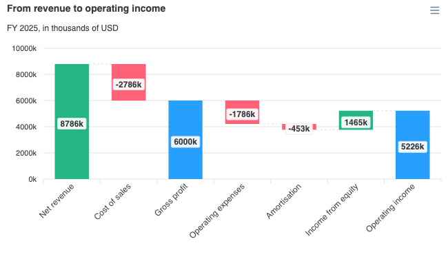
ApexCharts waterfall chart

No open, no [start, end], no stepValue. Three kinds of bar, matching what the shape means: a step carries y and moves the running total by it; isSubtotal spans from the last cut to the running total and starts a new cut; isTotal spans from zero and starts a new cut.

The rule that makes all three read correctly without a special case: every bar reports end - start, its own signed height. That is the delta for a step and the accumulated figure for a running total.

Two defaults are opinions worth naming. Rising bars are green and falling bars are red, because up-is-good is the one convention a waterfall is read by, so it is a default rather than something to configure; a datum's own fillColor still wins. And there is no legend, because a waterfall is one series, so the series legend would show a single swatch whose click empties the chart. The legend a waterfall actually wants names the kinds of bar, which the series legend cannot express.

The dashed connectors are on by default too: without them the floating columns read as unrelated bars rather than one walk. Bars are drawn at 60% of the slot instead of the usual 70% because the gaps are load-bearing here, the connectors live in them.

Requested in #847.

Dumbbell

Each measure is an ordinary series. The chart joins them.

new ApexCharts(el, {
  chart: { type: 'dumbbell' },
  colors: ['#3B82F6', '#EF4444'],
  series: [
    { name: '2020', data: [{ x: 'Backend', y: 92 }, { x: 'Mobile', y: 88 }] },
    { name: '2025', data: [{ x: 'Backend', y: 137 }, { x: 'Mobile', y: 121 }] },
  ],
}).render()

ApexCharts dumbbell chart

plotOptions.bar.isDumbbell has drawn an interval with both ends marked for years, and it still does. What it always needed was for you to zip the two measures into [low, high] pairs first, keep the order straight, and then rebuild the legend by hand, because the pair has thrown the series names away.

So the merge moved into the library, and it keeps hold of which endpoint is which. That is what lets the dots take their series colour, the end labels take each end's own colour, the connector run a gradient between the two (resolved per row, so a row where the measures cross still runs the right way), and the tooltip name both measures and then read out the gap between them.

Three details that come out of keeping the identities:

  • The difference row appears only when exactly two endpoints are visible. With three or more, "the difference" names nothing. Hide a measure from the legend and toggling down to two brings the row back.
  • With three or more measures, only the two extremes are labelled. Anything between them sits on the connector, where a label has nowhere to go that is not over the line or over its neighbour.
  • The end-label formatter defaults to the value axis' formatter, not dataLabels.formatter. On a range bar that one reads out end - start, which is the gap rather than an endpoint.

Horizontal by default, because the categories are names and a name reads along the row it labels rather than turned on its side under a column. plotOptions.bar.horizontal: false for the column form.

Raincloud

A raincloud shows a distribution three ways at once: the half-violin is the shape, the box is the summary, and the rain underneath is the observations themselves. Nothing hides behind a smoothing choice, because the raw sample is drawn next to the curve derived from it.

Raincloud is Premium, and it is always an explicit import. Those are two independent facts and both matter:

import ApexCharts from 'apexcharts'
import 'apexcharts/features/raincloud'   // never in the default bundle

new ApexCharts(el, {
  chart: { type: 'raincloud' },
  series: [{
    name: 'Weight gain',
    data: [
      { x: 'DD', points: [97, 101, 88, 94, 110, 92] },   // the raw sample
      { x: 'DR', points: [84, 79, 91, 80, 76, 88] },
    ],
  }],
  plotOptions: { bar: { distributed: true } },
  legend: { show: false },
}).render()
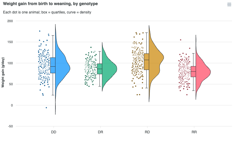
ApexCharts raincloud plot

Three routes to the import, depending on how you build:

SituationWhat to write
Full bundle, with a bundlerimport 'apexcharts/features/raincloud'
Lean core, with a bundlerimport ApexCharts from 'apexcharts/raincloud' (brings the violin renderer too)
Script tag, no bundler<script src=".../dist/features/raincloud.js"></script> after the main tag

Without the feature the chart warns in the console and renders blank. It does not fail silently and it does not quietly fall back to a violin.

On the plan: enforcement is trial mode, the same contract as the unit chart. Without a Premium or OEM key the chart renders in full and carries a watermark. It is never degraded and never blocked, so you can build against it before buying.

There is no plotOptions.raincloud. A raincloud routes through the violin renderer and every layer is a plotOptions.violin capability that the preset switches on, which means you can build any part of the layout on a plain violin too:

LayerOptionRaincloud preset
Cloudviolin.side'right', or 'top' when horizontal
Boxviolin.box.showtrue, with whiskers: 'tukey'
Rainviolin.points.position'left', or 'bottom' when horizontal

That preset includes one statistical choice worth stating. box.whiskers defaults to 'minmax' everywhere else and to 'tukey' here, and the reason it is safe here is precisely that the rain draws every observation. On a chart without the raw points, Tukey fences quietly drop the extremes from view; on a raincloud nothing beyond the whiskers is hidden.

Give it the sample and it derives the kernel density estimate and the five-number summary, and re-derives both when you change the relevant options, so updateOptions({ plotOptions: { violin: { kde: { bandwidth: 4 } } } }) actually re-smooths rather than redrawing a frozen first estimate. Hand-supply y.density and it is drawn exactly as given, with only the missing summary derived.

chart.print

The printed sheet is a layout the page never sees. Nothing measures it, no resize is reported for it, and matchMedia('print') is still false while beforeprint runs. So a chart sized from a 1600px screen printed at 1600px and the right-hand side fell off the paper.

chart: {
  print: {
    enabled: true,
    width: 700,   // CSS px; suits A4 and Letter portrait
  },
}

On by default. ApexCharts hooks beforeprint / afterprint, lays the chart out again at a printable width, and restores it when the dialog closes. A chart already narrower than print.width is left alone, and anything left over is shrunk to fit by the print stylesheet, so the value only has to be close.

Re-laying out beats scaling: it keeps the labels at their intended size, where a scaled-down SVG shrinks the type along with everything else. Widen it for landscape, or set print: false to opt out and leave printing to the browser.

Requested in #3352.

What each type costs

None of the four is a new renderer. Each is a preset over an existing one plus the arithmetic that existing one has no opinion about, which is why they are small.

You setRenders throughOwn entry pointAdds to core
'streamgraph'rangeAreaapexcharts/streamgraph+14.7 KB
'waterfall'rangeBarapexcharts/waterfall+18.7 KB
'dumbbell'rangeBarapexcharts/dumbbell+18.3 KB
'raincloud'violinapexcharts/raincloud+19.5 KB

Those figures include the base renderer. The arithmetic alone is the smaller half of each: features/streamgraph is 4.6 KB, features/waterfall 1.6 KB, features/dumbbell 1.1 KB, features/raincloud 1.4 KB, measured with esbuild --bundle --minify then gzip -9 as a delta over apexcharts/core.

The full bundle is 264,326 B gzipped, up from 252,005 B, because three of the four joined it. Still 27,328 B below 6.10.0. The lean core moved too, from 136,921 to 141,506 B, and it is worth knowing why: the option trees and the presets live in core, so a release that adds chart types costs the floor a little even if you import none of them.

Because the type is a preset, chart.type is rewritten to the pathway it routes through and what you asked for is recorded on chart.requestedType. That matters in exactly two places: the entry point you import when tree-shaking is the base one, and a chart.type read back off a rendered chart is the base type, not the alias.

Fixes worth knowing about

Each of these came out of a reported issue, and the numbers are measured rather than estimated.

A container resize that arrived mid-animation was thrown away, not postponed. A ResizeObserver reports each size change exactly once, and the gate in front of it required animationEnded, so nothing ever asked again. Two everyday cases land in that window: collapsing a sidebar just after load, since a line entrance animation runs about 1.6s, and any dashboard calling updateSeries on a timer, where animationEnded is false most of the time. Measured on the reported layout, the container went 816px to 576px and the SVG stayed at 816px indefinitely. (#1584)

The follow-up is worth a line too: the resize timer was not being cleared before a new one was set, so a container animated with a CSS transition queued a render per frame. One 300ms sidebar transition cost 16 full chart rebuilds; it is now 1. The visible consequence is that the redraw lands 150ms after the last size rather than the first, which is what a debounce means and what dragging a window edge has always done.

autoScaleYaxis was sized by series that draw nothing in the window. The trim loops stopped as soon as their two indices met, so a series with nothing inside the zoom window was left pointing at one surviving point, and that point sized the axis. The same clamp collapsed the axis onto one end of a series that straddles the window with no point inside it, giving [899, 901] for a segment running from 100 to 900 and clipping the line drawn across the window. Separately, stacked charts summed every point regardless of the window, so zooming a stacked chart moved the x axis and nothing else. (#1260)

Pie, donut, polarArea and radialBar took their vertical centre from min(gridWidth, gridHeight). When the height is the larger side, that value is the width, so the circle was centred as if the band were only as tall as it is wide: the drawing stuck to the top and the vertical surplus piled up underneath. On the reporter's 250x500 box that left a 111px void between the rings and the legend. Only containers taller than they are wide were ever affected. (#4875)

A Date used as x on a numeric or category axis became NaN, because it went through parseFloat(), which reads the Date via toString(). A Date's numeric value is its epoch, which the datetime branch directly above already read. And isValidDate(new Date('garbage')) threw rather than answering false, so a single bad x took the whole render down with a TypeError.

Tooltips resolved the hovered index short by a series' leading-null count. The error is one bar-width per null, so it hides at full extent and grows without bound as the chart is zoomed in: a series with a 20-bar warm-up put the crosshair 837px off after a single zoomX past it. Leading nulls are the everyday shape of an indicator warm-up, so a stock chart with a moving average and two oscillator panes had all three disagreeing about where the cursor was, each by its own warm-up length.

What we hit upgrading this site, again

The 7.0 post ended with a warning about unversioned CDN URLs during a release window. We wrote it after being bitten. We were bitten again, in exactly the same place, which is the reason to repeat it rather than assume it was learned.

These are two separate cache entries, and on release day they resolved to different versions:

cdn.jsdelivr.net/npm/apexcharts                             -> 7.0.0
cdn.jsdelivr.net/npm/apexcharts/dist/features/raincloud.js  -> 7.1.0

The bare package URL was still on 7.0.0 while the deep add-on path had already moved to 7.1.0.

The failure is worse this release than last, because three of the four new types are in the core bundle. A 7.0.0 core simply does not have chart.type: 'streamgraph'. We checked rather than assumed, by downloading what the CDN was actually serving and counting:

StringCDN, serving 7.0.0The 7.1.0 bundle
streamgraph048
waterfall040
raincloud011

So if you load ApexCharts from an unversioned CDN URL, a brand-new chart type is not available to you until that specific cache entry flips, no matter what the release notes say. And it does not resolve itself inside a deploy window: we assumed last time that the cache would simply age out, checked this time, and it had not.

  • Pin core and add-ons to the same exact version, or
  • purge both paths together and confirm the version actually flipped before you rely on it. On jsDelivr the served version is in the x-jsd-version response header, so one curl -sI answers it.

Two unversioned URLs are not one atomic thing. Still the whole lesson.

Upgrading

npm install apexcharts@7.1.0

A short checklist:

  1. Nothing is required. No option was removed and no default changed.
  2. Look at any bar or column chart on a numeric or datetime axis whose series do not all share their x values, or that has a single data point, or that sets columnWidth in pixels while stacked. Those three cases were being sized wrongly and now are not, so the picture may change.
  3. If you want raincloud, add an apexcharts/features/raincloud import. It is the only one of the four that needs an import.
  4. If you load from script tags, confirm your core and your add-ons are the same version before trusting a new chart type.
  5. Decide about printing. chart.print is on by default; set print: false if you had your own print handling.

Framework wrappers need no new version. react-apexcharts, vue3-apexcharts, vue-apexcharts, stencil-apexcharts and ng-apexcharts@3.1.0 all accept 7.x already.

Where to go next

Frequently asked questions

Will upgrading to ApexCharts 7.1 break my charts?

No. 7.1 is purely additive: no option was removed, no default changed, and no public method was added or taken away. The upgrade is `npm install apexcharts@7.1.0`. One fix is worth looking at though: bar and column charts on a numeric or datetime axis now size their slot from the axis rather than from the smallest gap inside a single series, so a chart whose series do not share their x values may draw different bar widths than it did on 7.0.

What chart types did ApexCharts 7.1 add?

Four. Streamgraph (a stacked area on a baseline chosen to keep the bands level), waterfall (signed deltas that accumulate into a running total), dumbbell (two or more measures per category joined by a connector) and raincloud (a half violin, a box and the raw observations at once). Streamgraph, waterfall and dumbbell are in the default bundle; raincloud is Premium and is always an explicit import.

How do I use the raincloud chart type in ApexCharts?

Raincloud is never in the default bundle, so `import ApexCharts from 'apexcharts'` alone does not include it. Add a side-effecting import of `apexcharts/features/raincloud` next to it, or import `apexcharts/raincloud` if you are assembling from a lean core, or load `dist/features/raincloud.js` as a second script tag. Then set `chart.type: 'raincloud'` and give each group its observations in a `points` array. It is a Premium chart type, so it renders in full with a trial watermark until a licence key is applied.

Do I have to calculate the running total for an ApexCharts waterfall?

No, and that is the point of the type. The series holds the deltas, signed, and the chart accumulates. A datum flagged `isSubtotal` or `isTotal` carries no `y` at all: it draws the running total, measured for you. Every bar's label and tooltip report `end - start`, its own signed height, which is the delta for a step bar and the accumulated figure for a running-total bar.

Does an ApexCharts dumbbell chart need [low, high] pairs?

No. Each measure is an ordinary series carrying one value per category, and the chart joins them on x and draws the connector. Hand-zipping the measures into pairs is what the type exists to remove, since the pair form throws the series names away and then the legend has to be rebuilt by hand. The old `plotOptions.bar.isDumbbell` pair form still works unchanged.

What does chart.print do in ApexCharts?

It re-lays the chart out for the printed sheet and puts it back afterwards. The printed page is a layout the browser never reports: nothing measures it, no resize fires for it, and `matchMedia('print')` is still false while `beforeprint` runs, so a chart sized from a wide screen printed at its screen width and lost the right-hand side off the paper. `chart.print` is on by default with a 700px layout width that suits A4 and Letter portrait. Set `print: false` to opt out.

How big is the ApexCharts 7.1 bundle?

The default bundle is 264,326 B gzipped, up from 252,005 B in 7.0.0, because streamgraph, waterfall and dumbbell joined it. That is still 27,328 B below 6.10.0. The lean core is 141,506 B. If you assemble from `apexcharts/core` you pay only for the types you import: streamgraph adds 14.7 KB, waterfall 18.7 KB, dumbbell 18.3 KB, raincloud 19.5 KB, each including the base renderer it draws through.