React Chart Demos
Browse React sample charts built with ApexCharts. Every example includes live source code to save your development time.
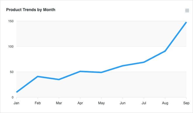
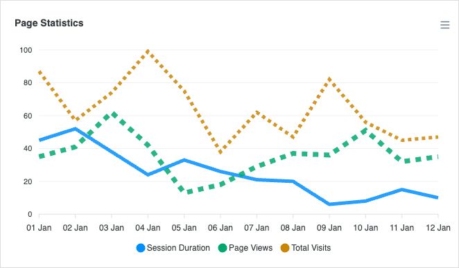
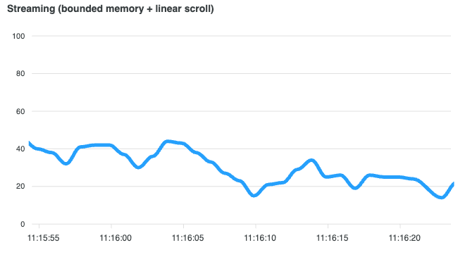
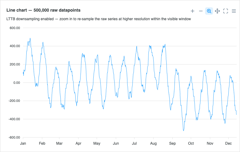
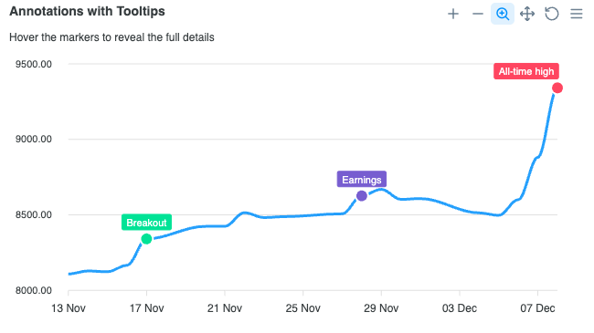
Line Charts
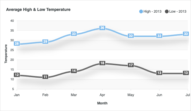
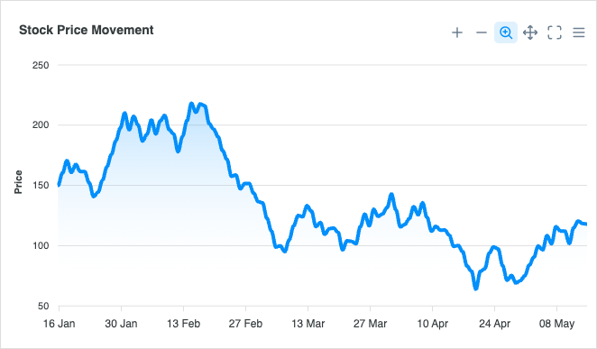
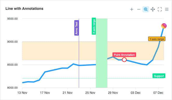
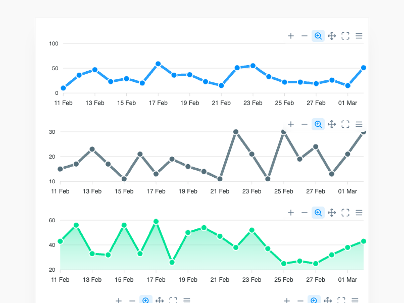
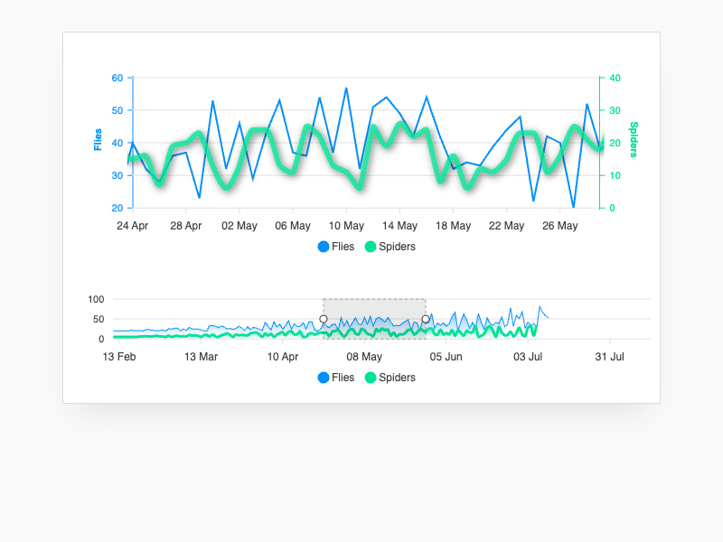
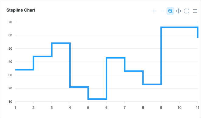
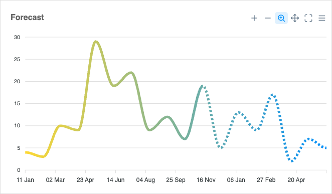
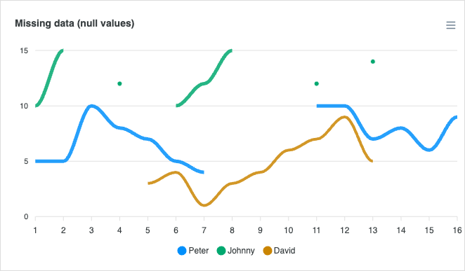
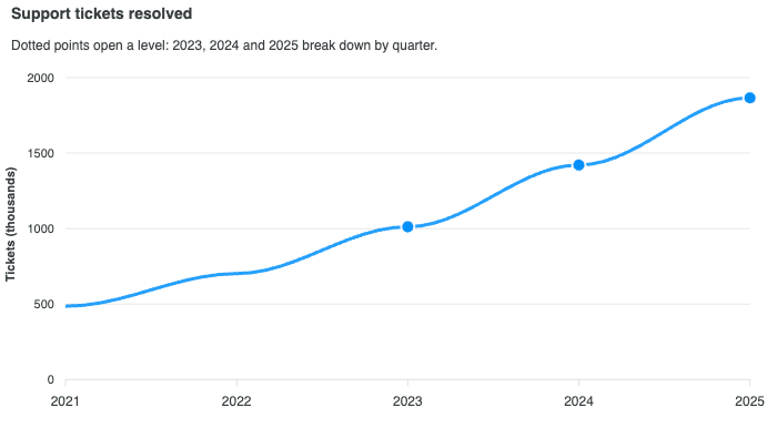
View all →Line charts excel at showing trends over continuous data and time series. Read the docs →
Area Charts
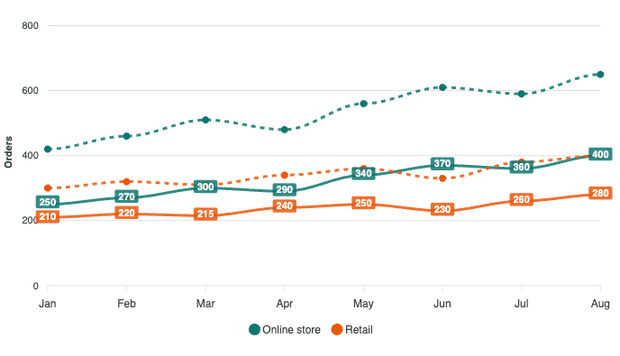
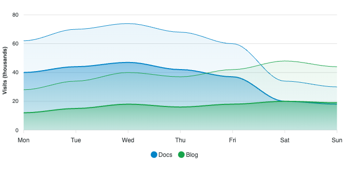
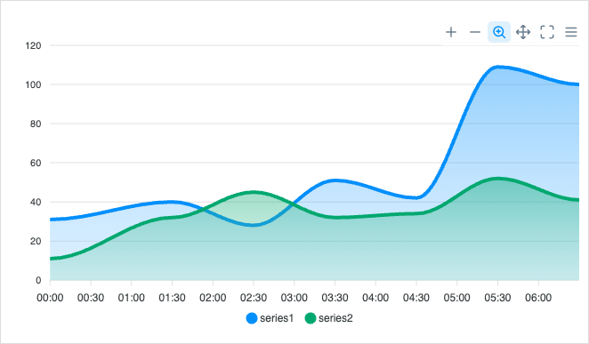
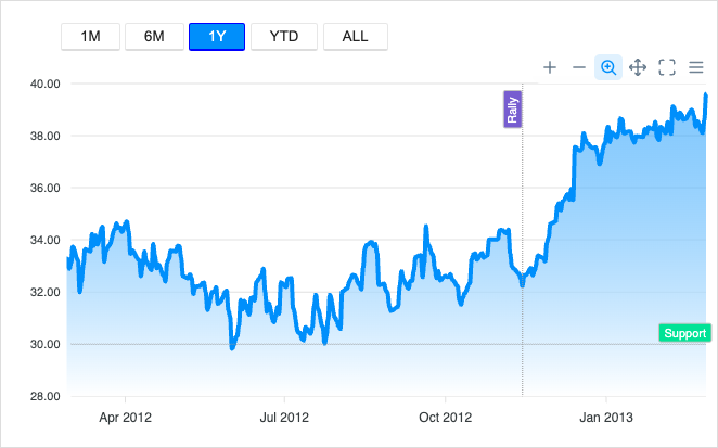
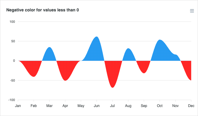
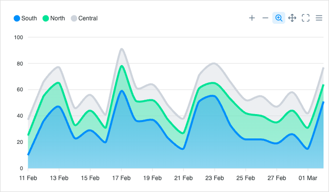
View all →Area charts emphasize the magnitude of change over time and stacking relationships between series. Read the docs →

Column Charts
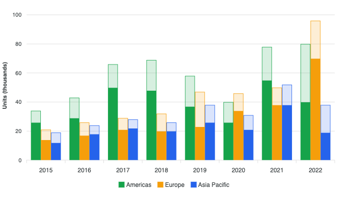
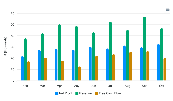
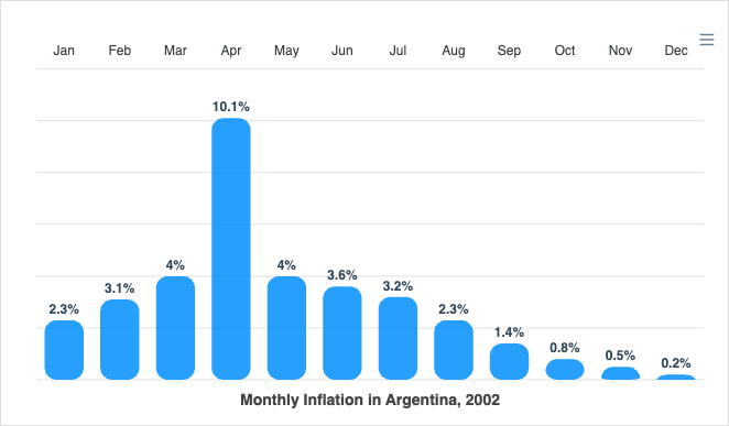
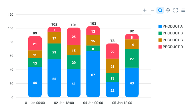
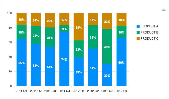
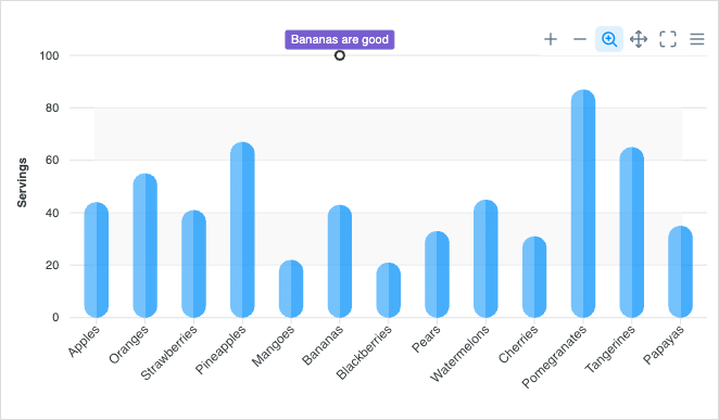
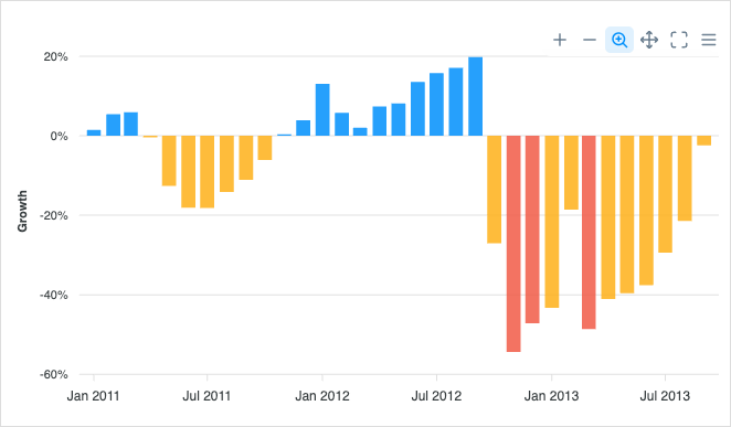
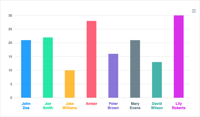
View all →Column charts compare values across discrete categories with vertical bars. Read the docs →
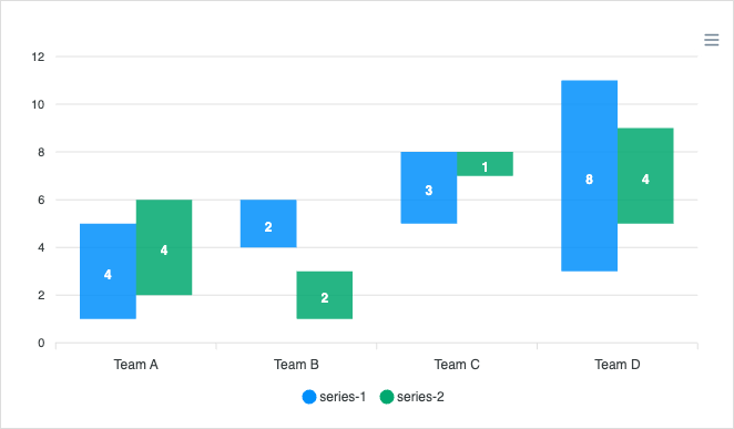
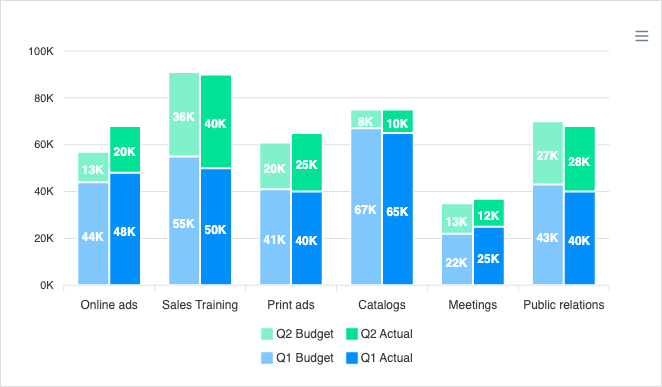
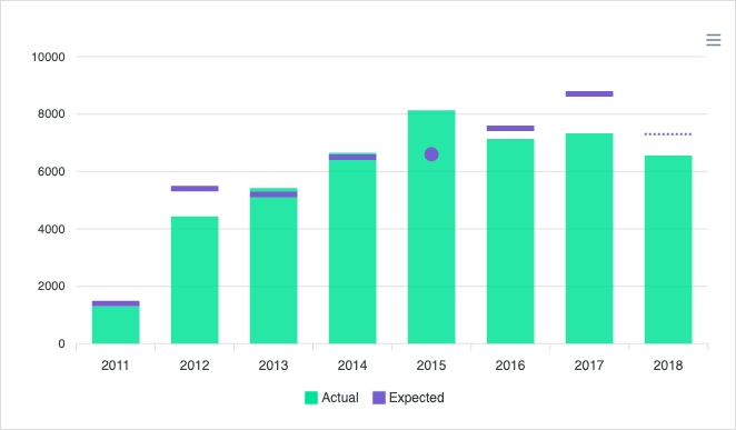
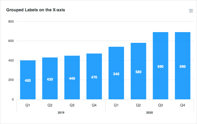
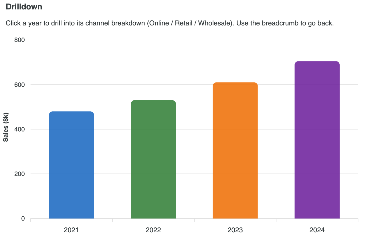
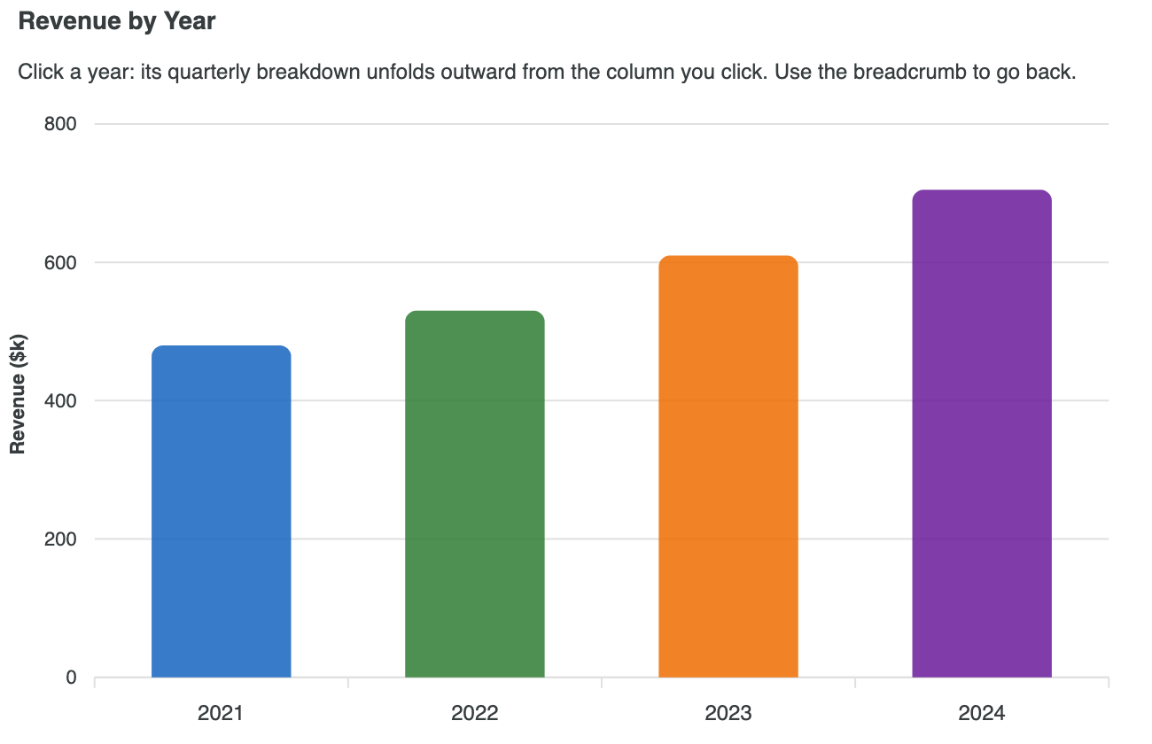
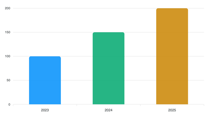
Bar Charts
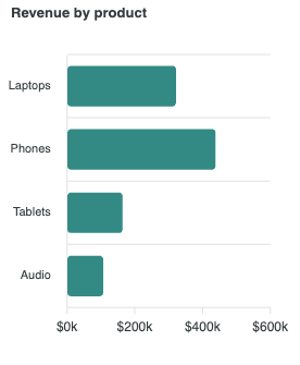
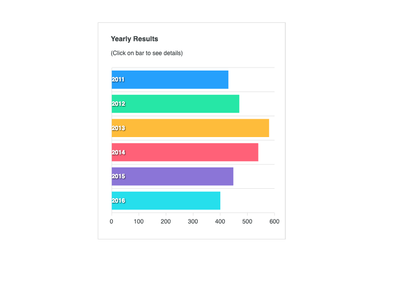
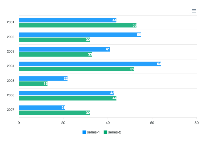
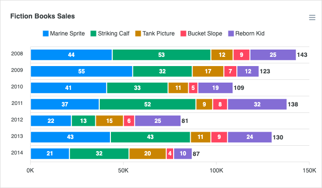
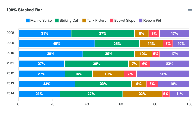
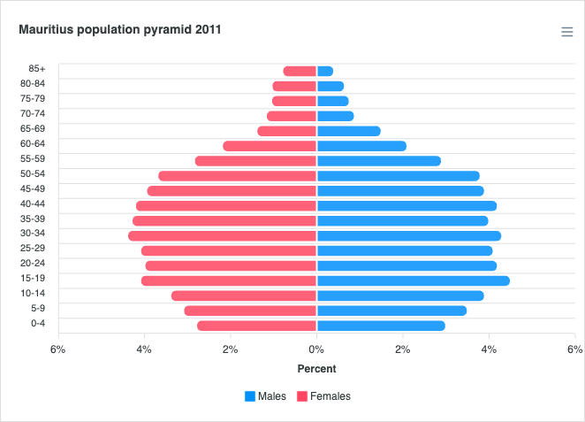
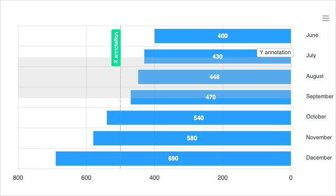
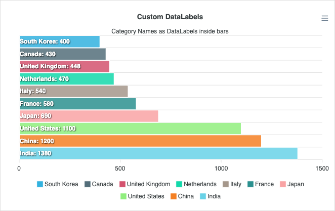
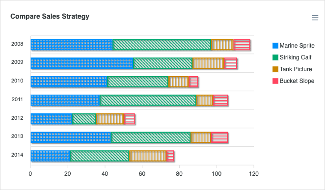
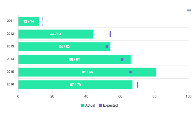
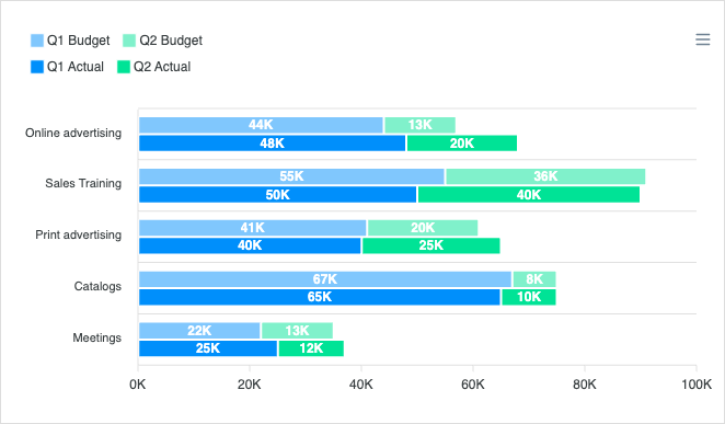
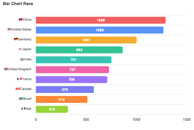
View all →Horizontal bar charts compare values across categories, ideal when labels are long. Read the docs →
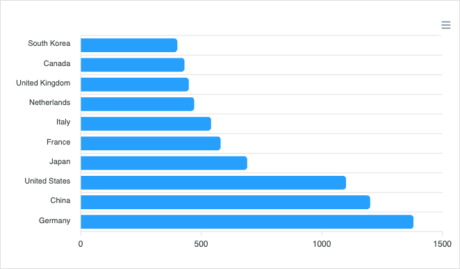
Mixed / Combo Charts
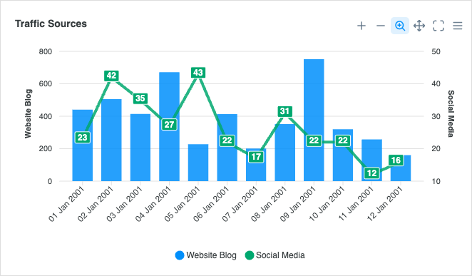
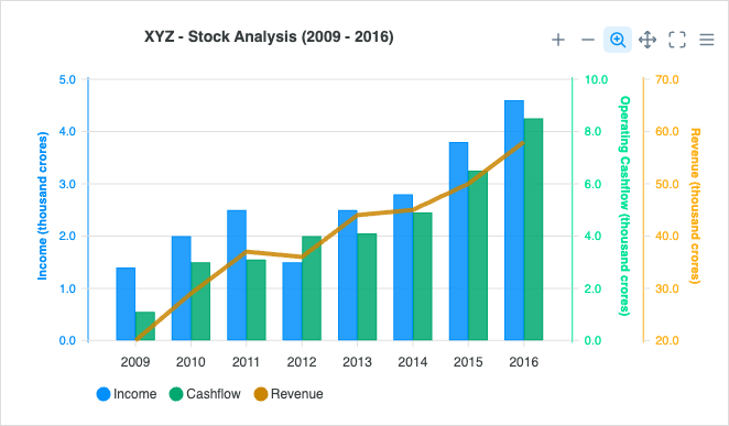
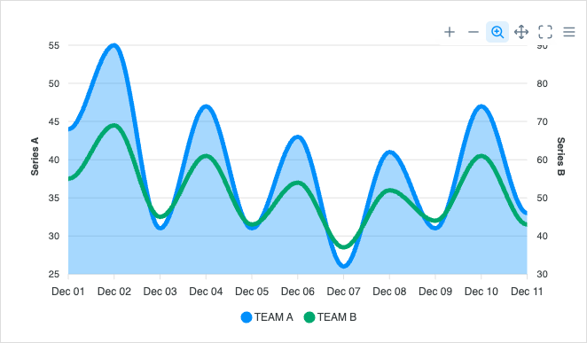
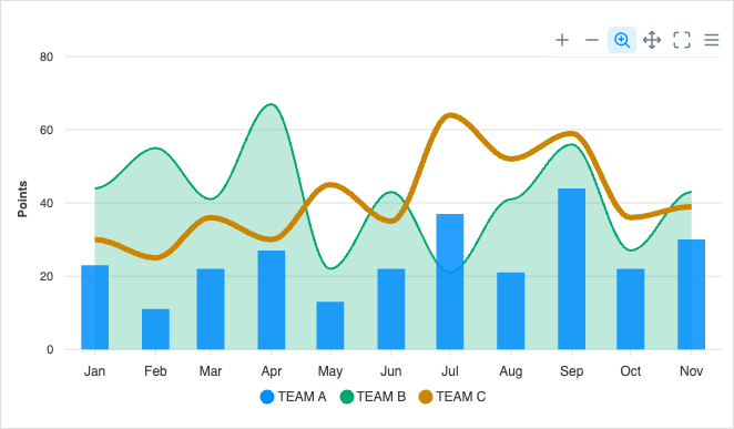
View all →Combine line, column, and area series in a single chart for richer comparisons. Read the docs →
Range Area Charts
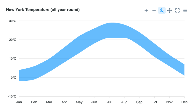
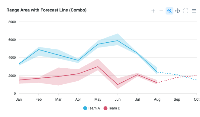
View all →Visualize ranges and uncertainty bands together with a line or trend. Read the docs →
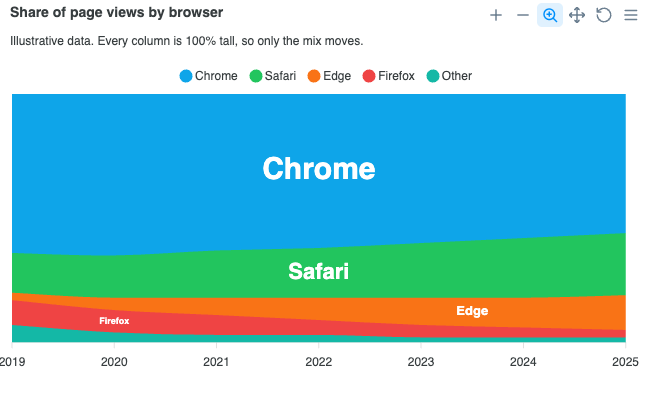
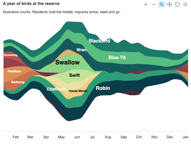
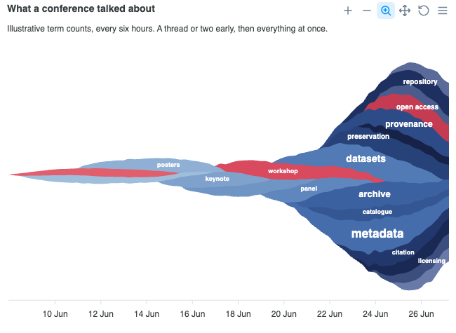
Streamgraphs
View all →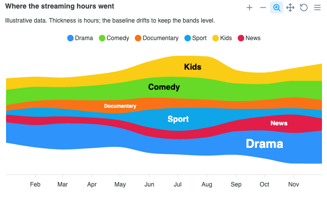
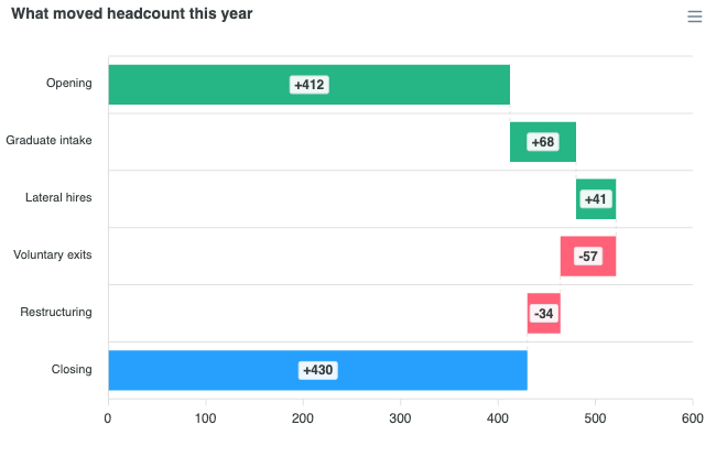
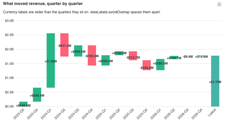
Waterfall Charts
View all →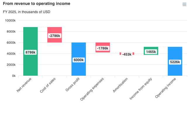
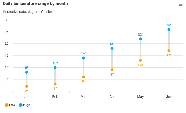
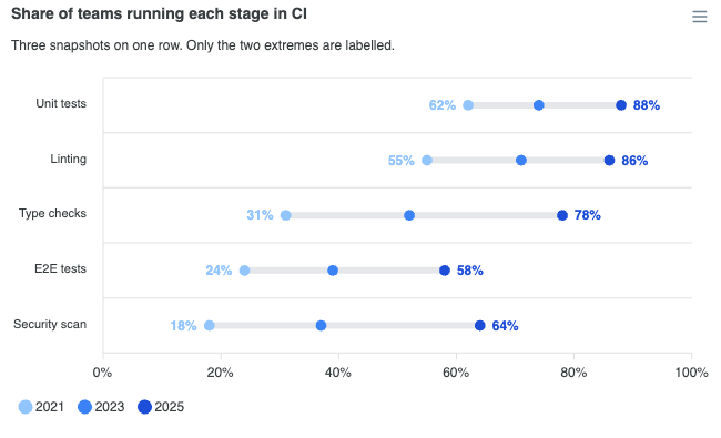
Dumbbell Charts
View all →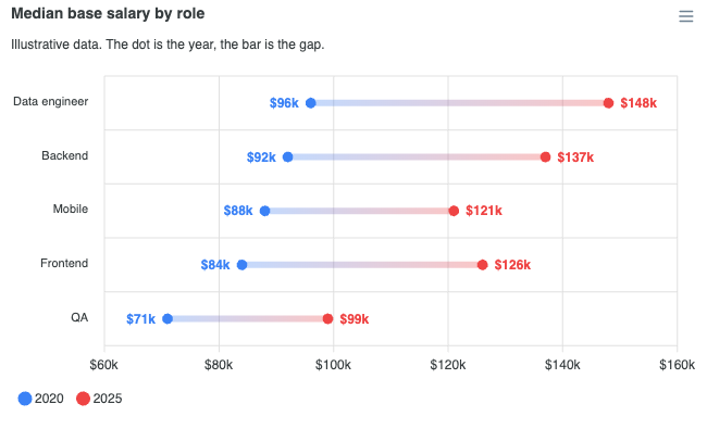
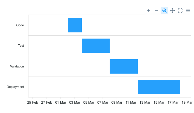
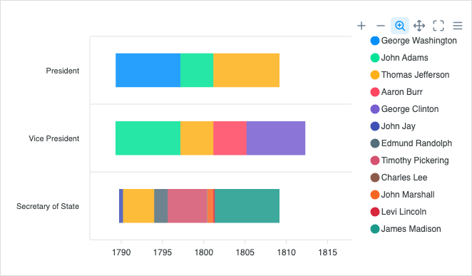
Timeline / Range Bar
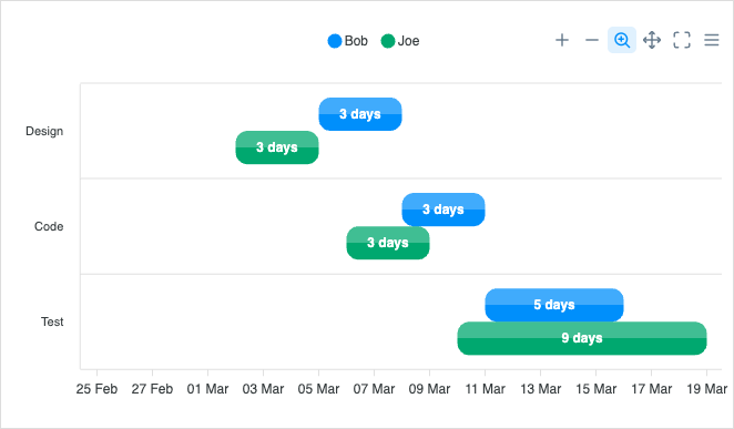
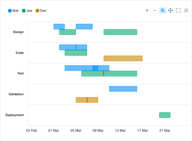
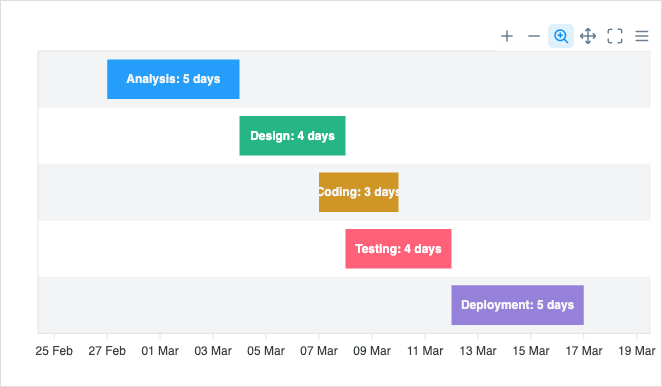
View all →Timeline (range bar) charts show durations, schedules, and gantt-style progress. Read the docs →
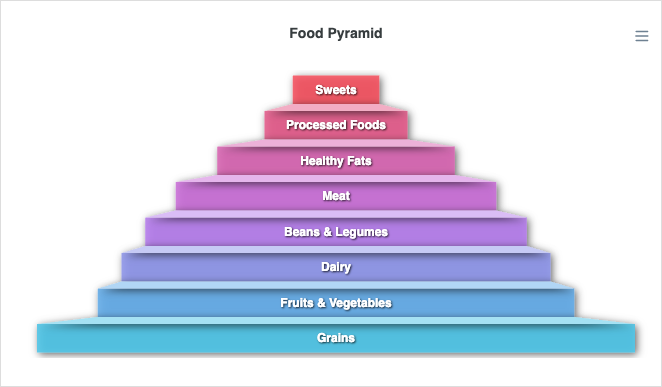
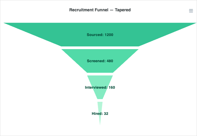
Funnel Charts
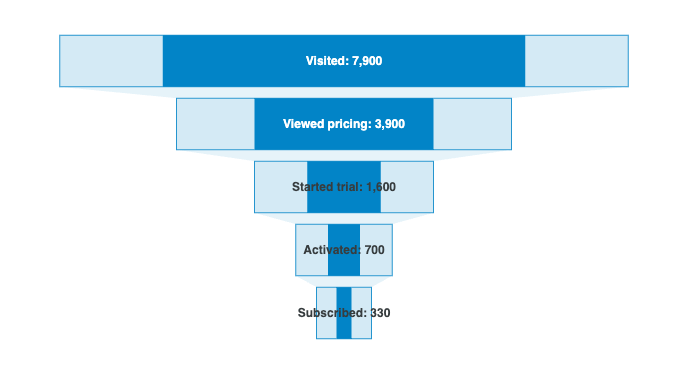
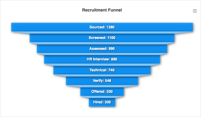
View all →Funnel charts visualize stage-by-stage drop-off in a process or conversion flow. Read the docs →
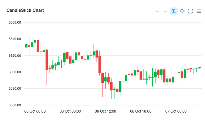
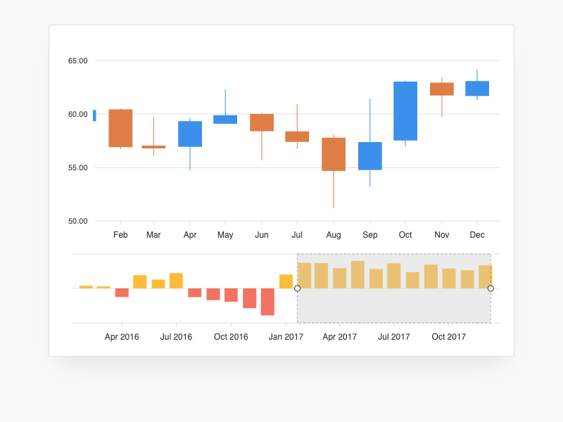
Candlestick Charts
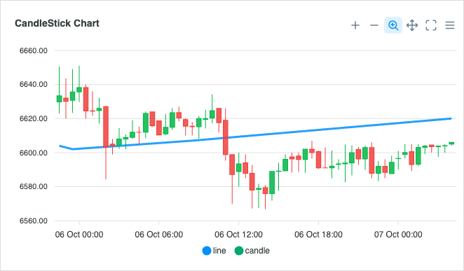
View all →Candlestick charts visualize OHLC financial data over time intervals. Read the docs →
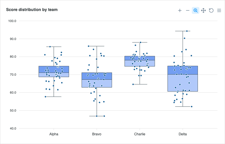
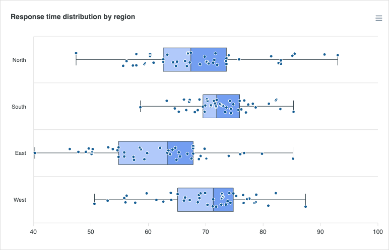
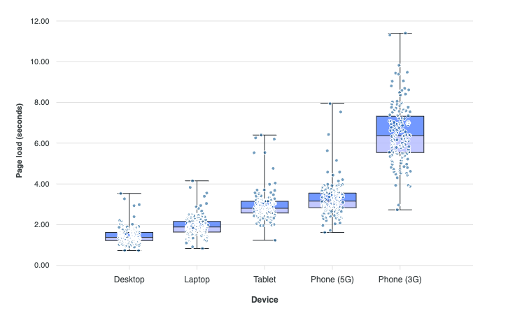
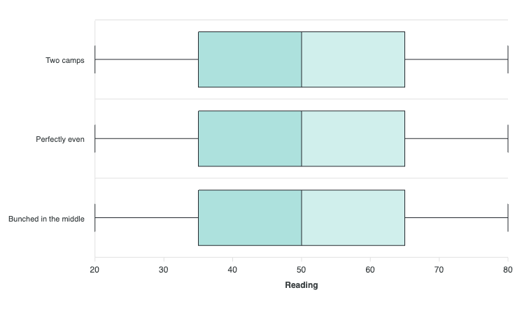
BoxPlot Charts
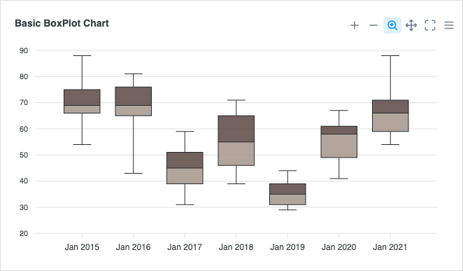
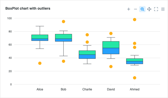
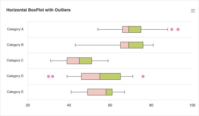
View all →Boxplots summarize the distribution, median, and outliers of a dataset. Read the docs →
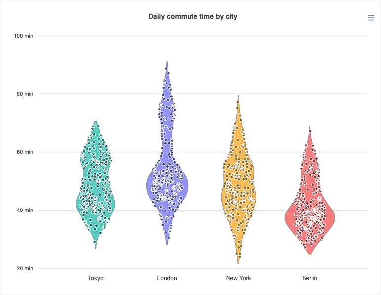
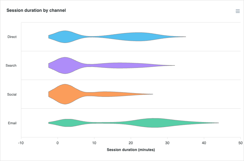
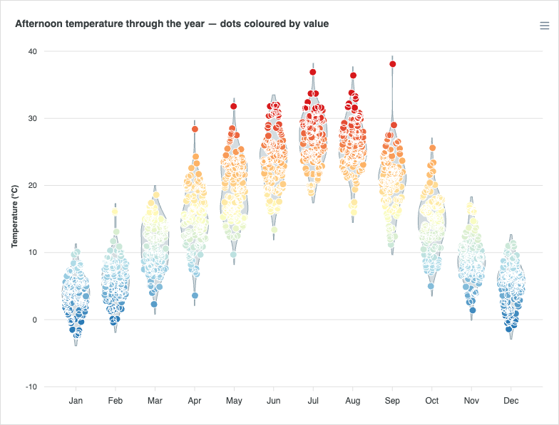
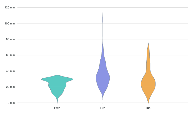
Violin Charts
View all →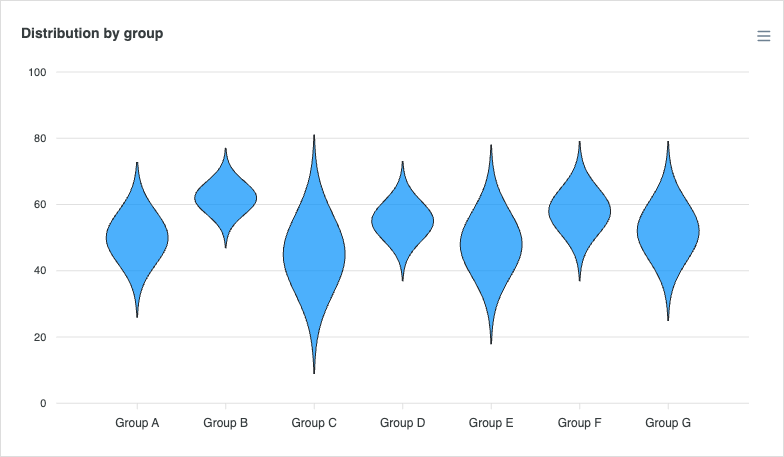
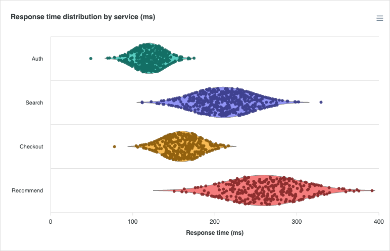
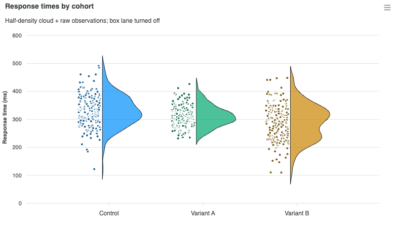
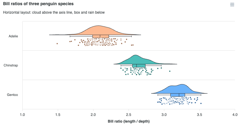
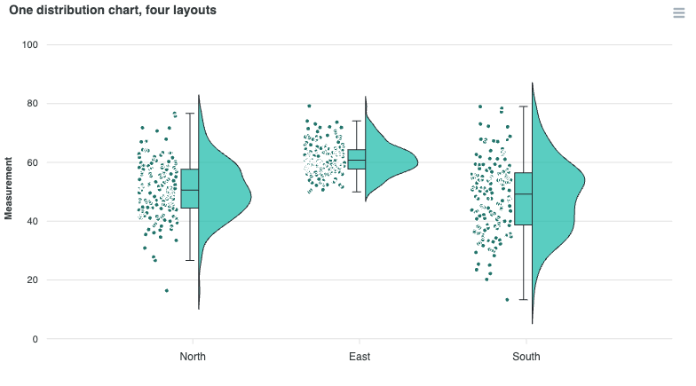
Raincloud Charts
View all →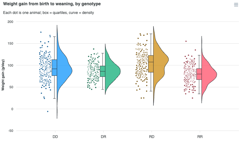
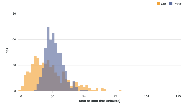
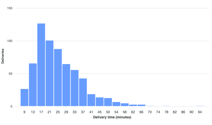
Histogram Charts
View all →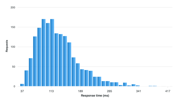
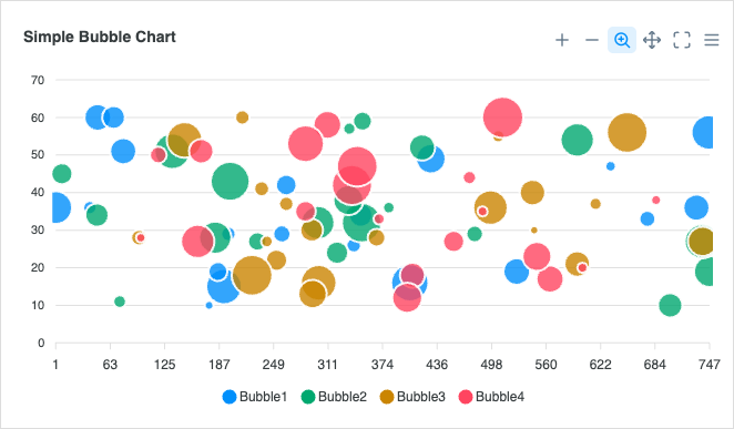
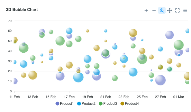
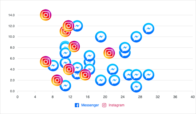
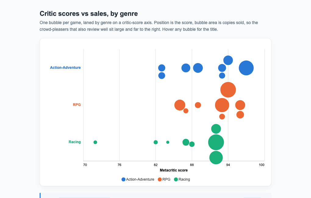
Bubble Charts
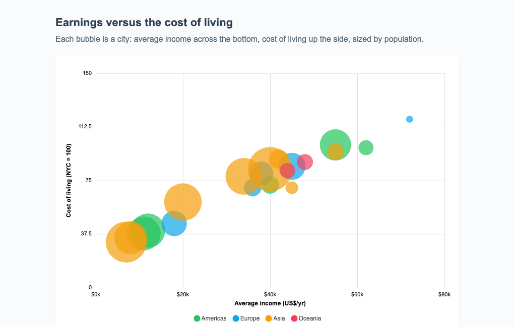
View all →Bubble charts add a third dimension to scatter plots using marker size.
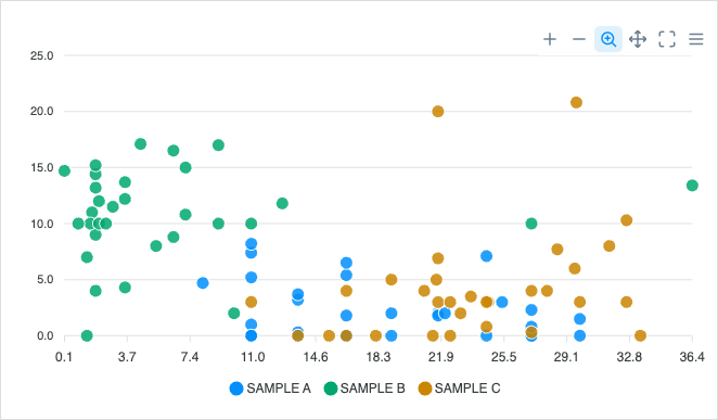
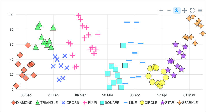
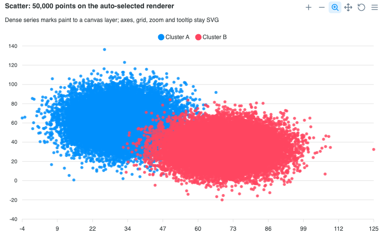
Scatter Charts
View all →Scatter charts plot pairs of values to reveal correlation and clusters.
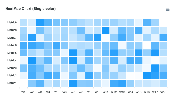
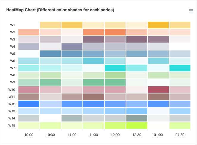
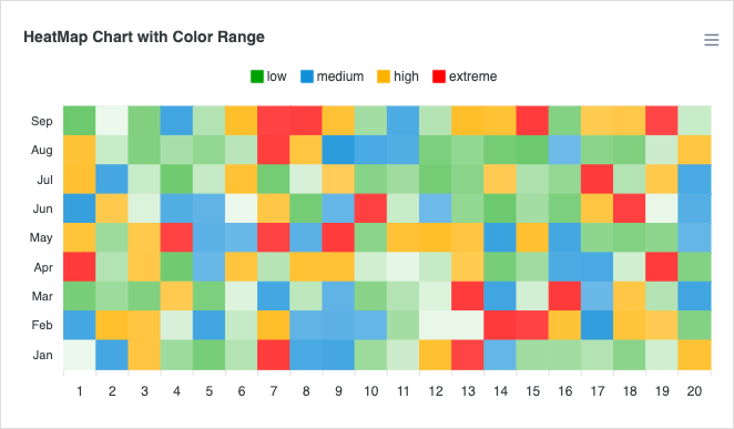
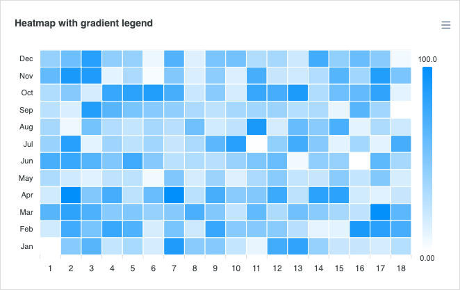
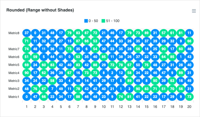
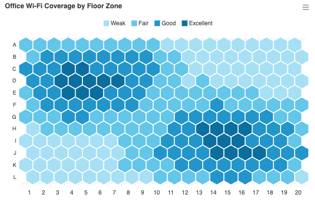
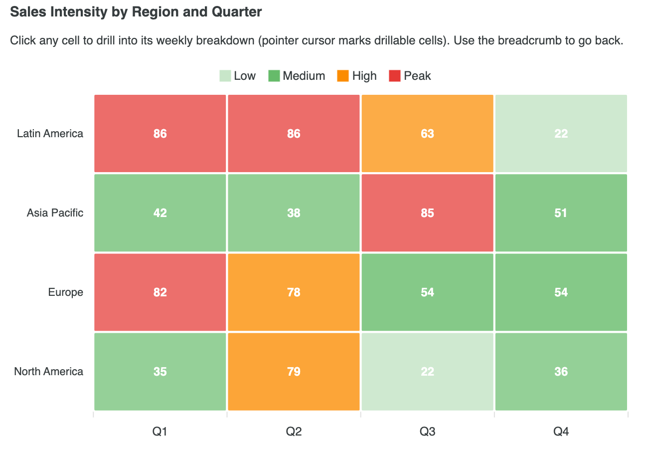
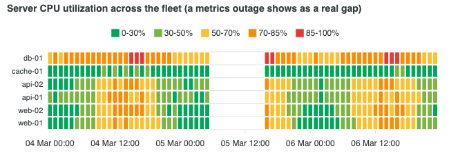
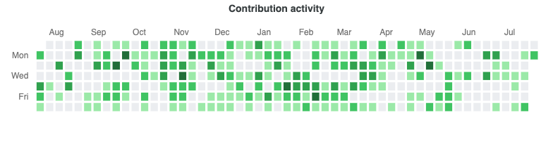
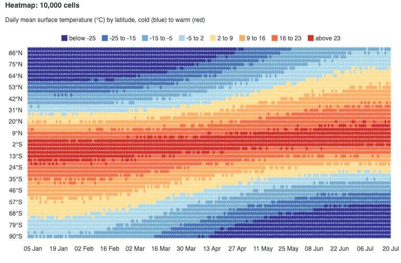
Heatmap Charts
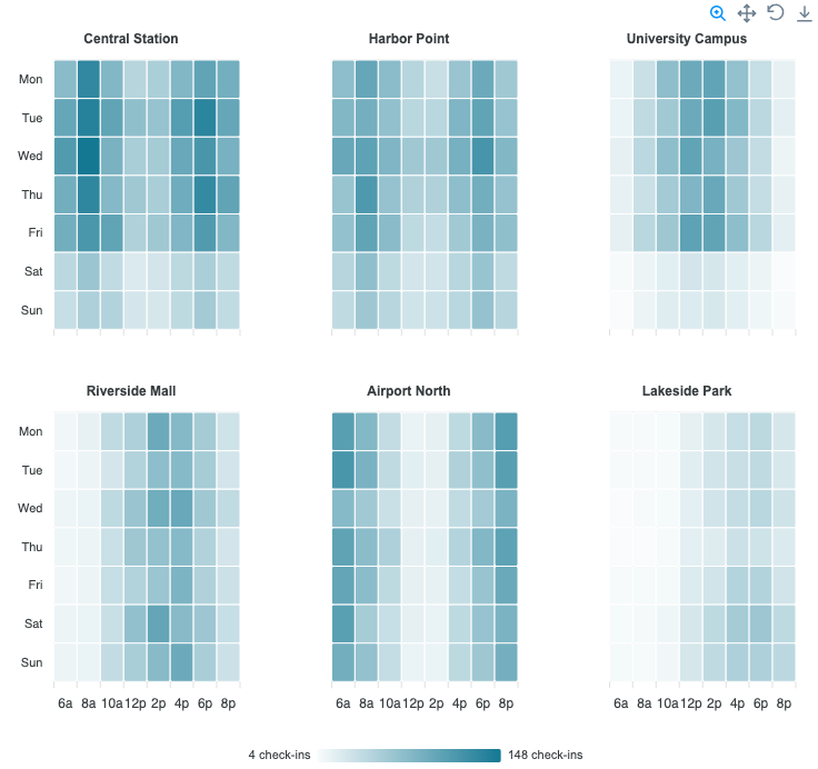
View all →Heatmaps surface intensity patterns across a matrix using color. Read the docs →
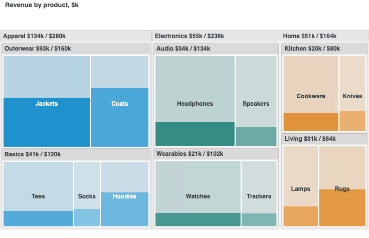
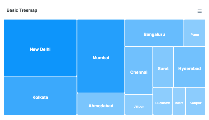
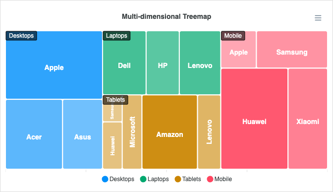
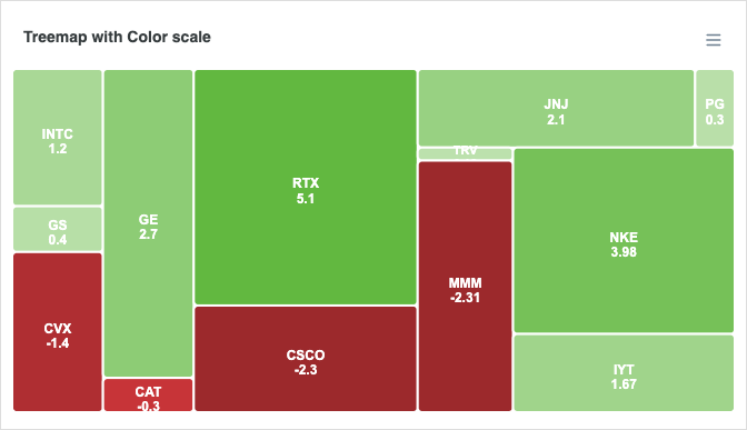
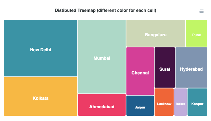
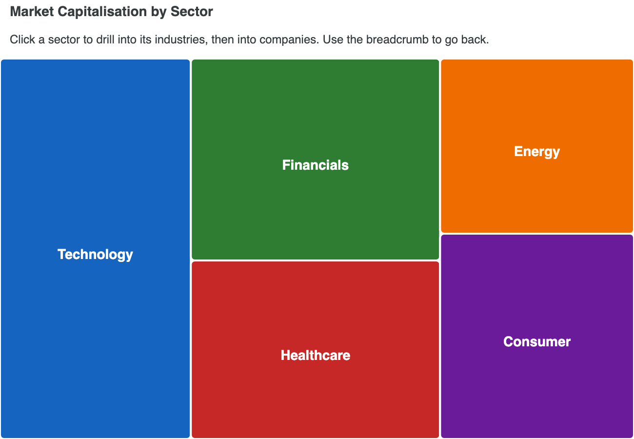
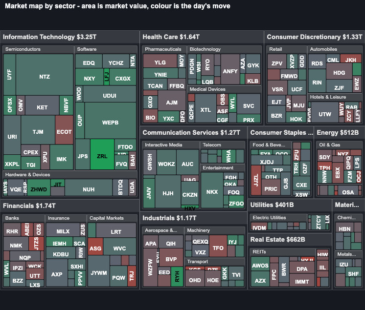
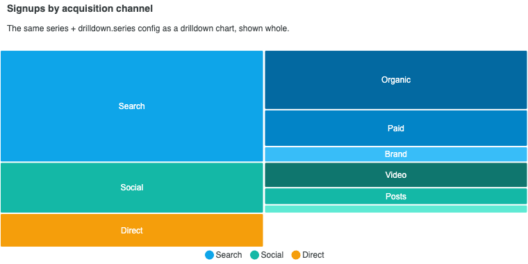
Treemap Charts
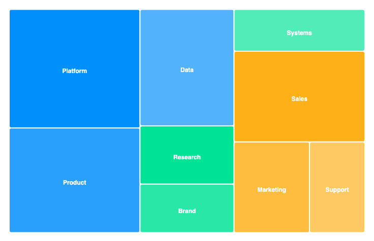
View all →Treemaps visualize hierarchical part-to-whole relationships using nested rectangles. Read the docs →
Sunburst Charts
View all →
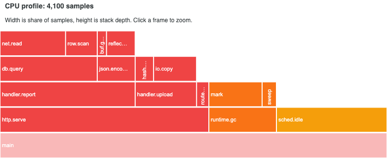
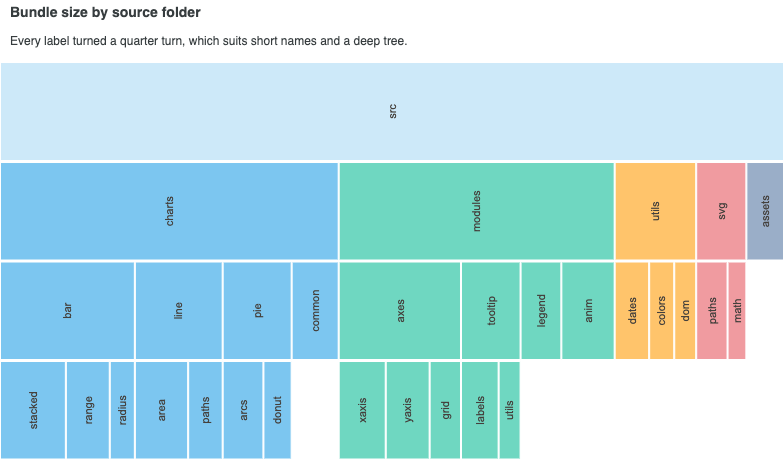
Icicle Charts
View all →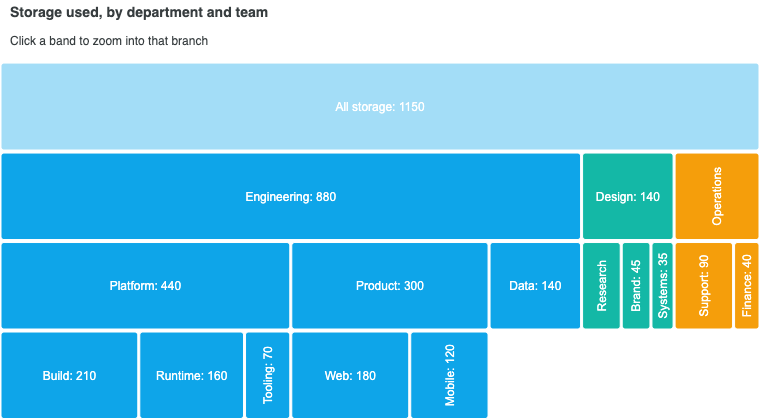
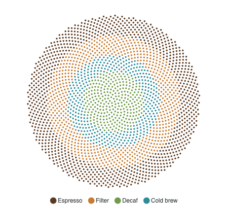
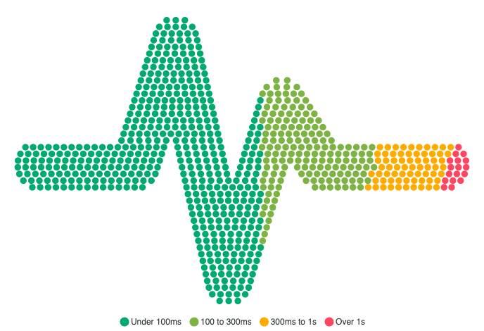
Unit Charts
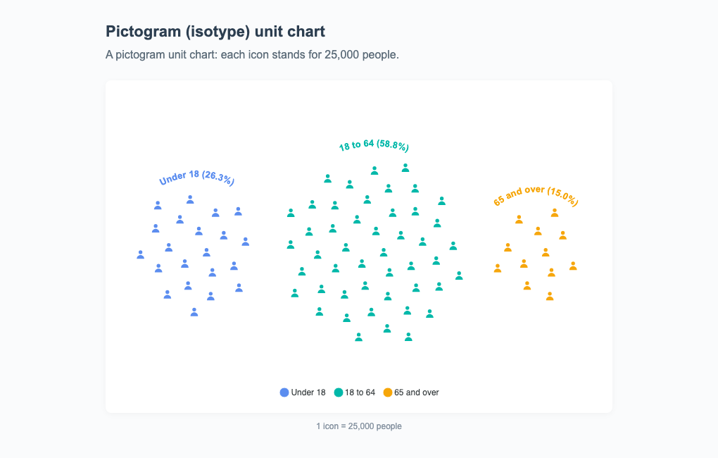
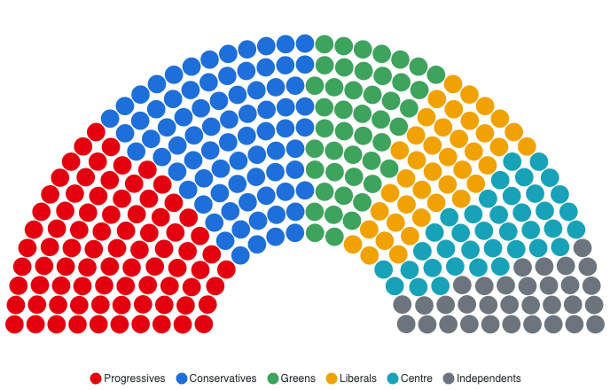
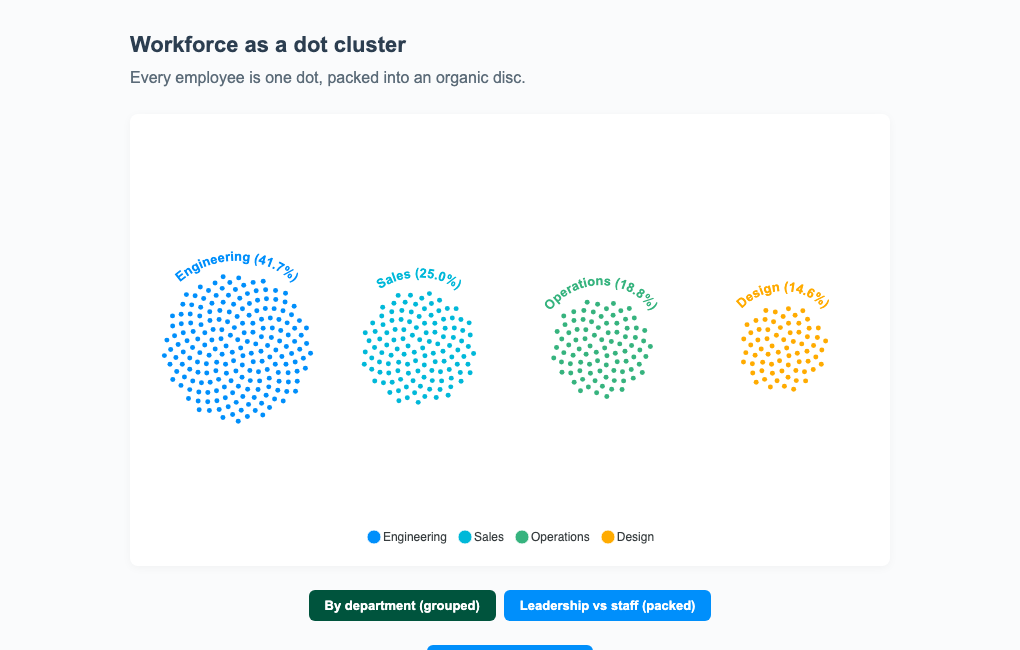
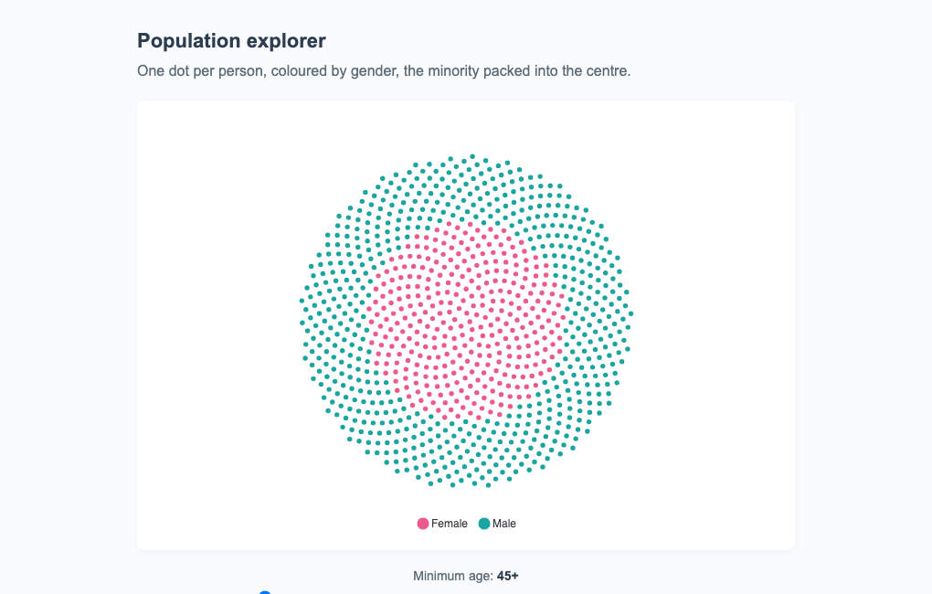
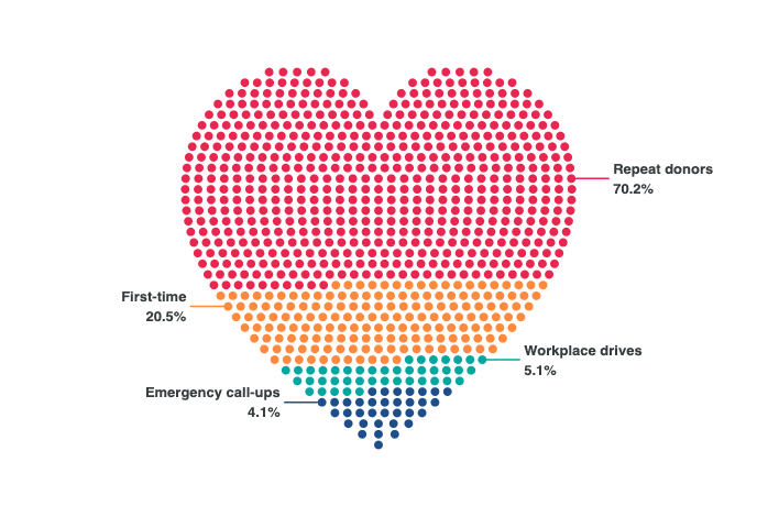
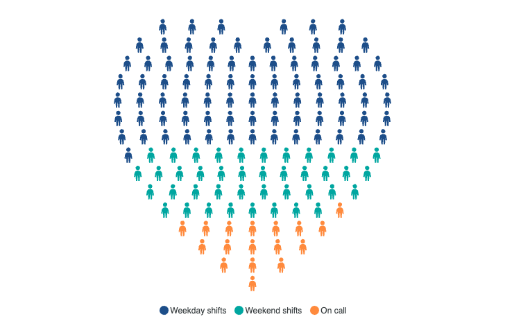
View all →Unit charts draw one mark per thing counted, so a quantity reads as something you could count back. Read the docs →
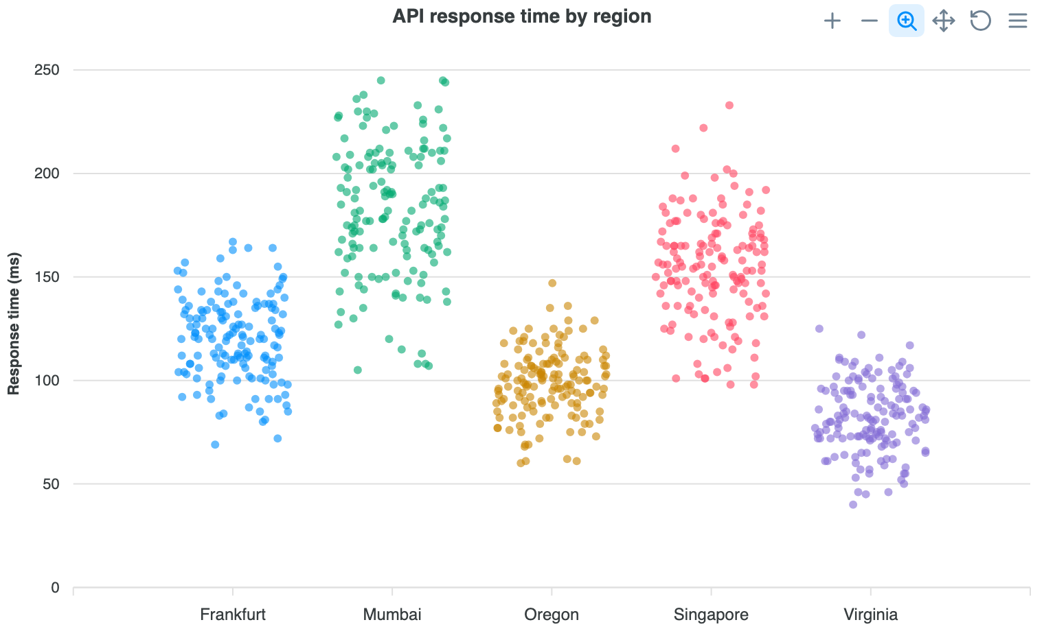
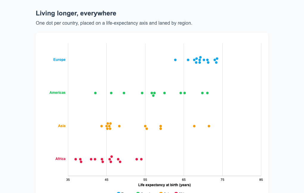
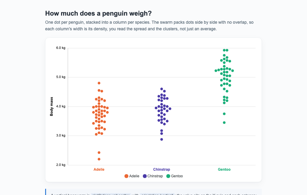
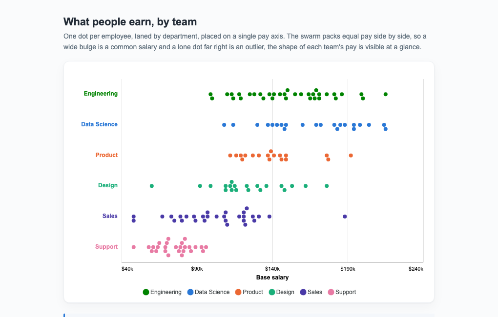
Beeswarm Charts
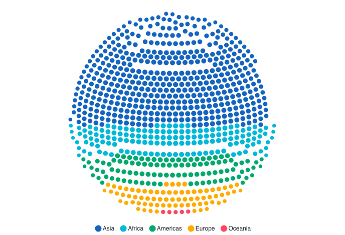
View all →Beeswarms place every observation on a value axis and nudge equal values off the lane centre so nothing overlaps. Read the docs →
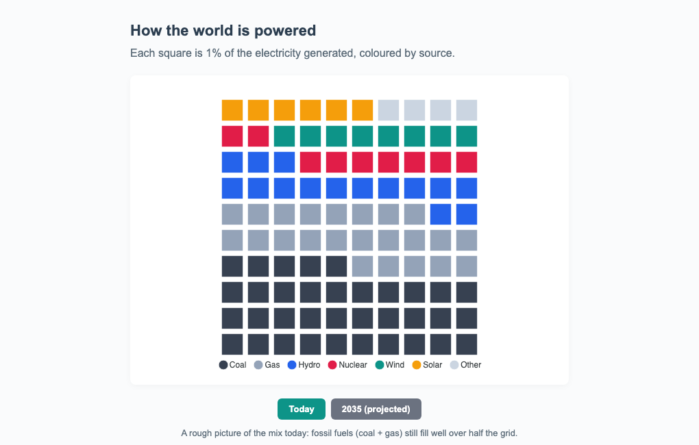
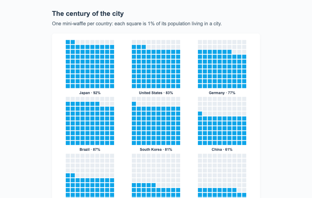
Waffle Charts
View all →Waffle charts fill a lattice of cells in category order, a countable part-to-whole alternative to a pie. Read the docs →
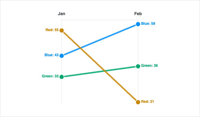
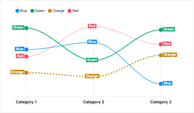
Slope Charts
View all →Slope charts compare two points in time across many categories at a glance.
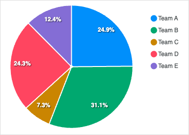
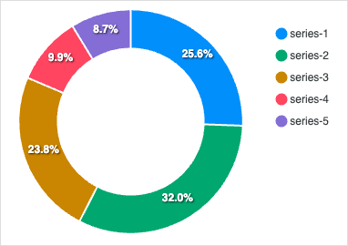
Pie / Donut Charts
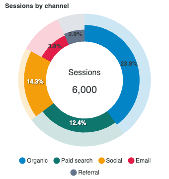
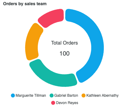
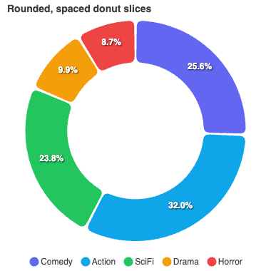
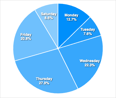
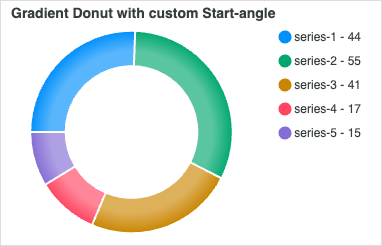
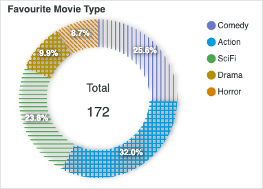
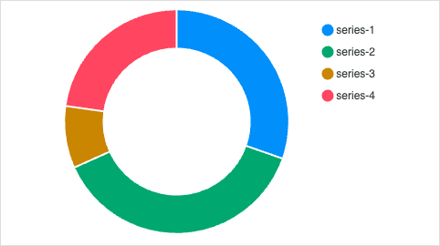
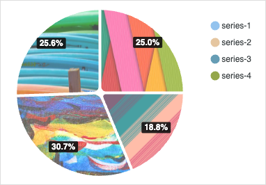
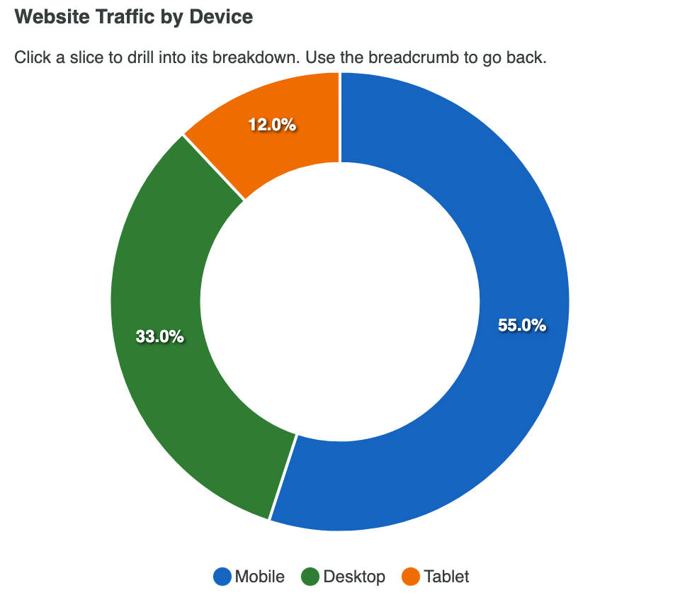
View all →Pie and donut charts show part-to-whole proportions for a small number of categories. Read the docs →
RadialBar / Circle
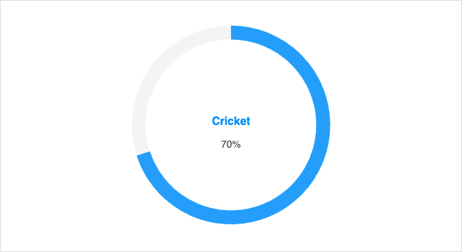
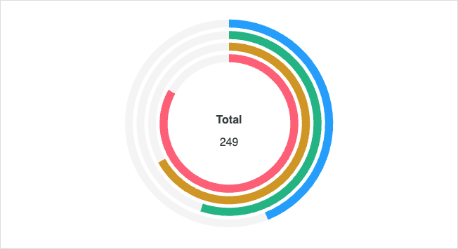
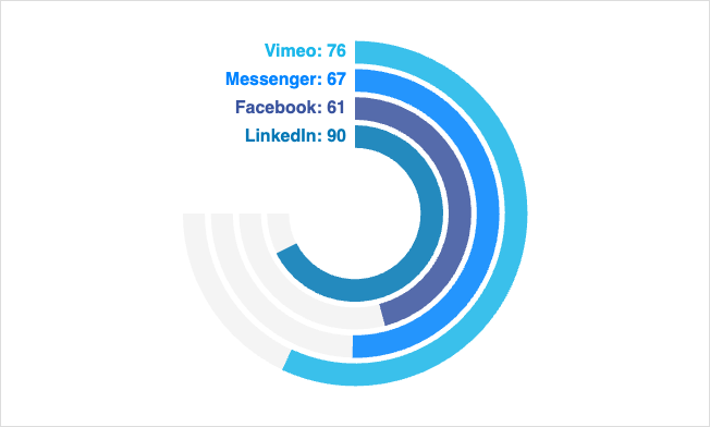
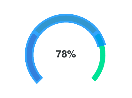
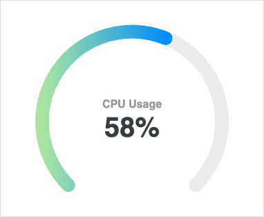
View all →RadialBar and circular charts display progress, KPIs, and goal completion. Read the docs →
Gauge Charts
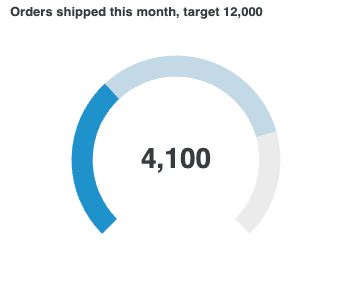
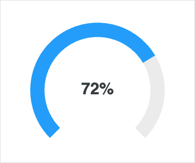
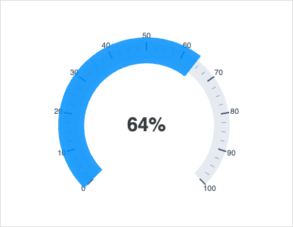
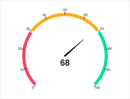
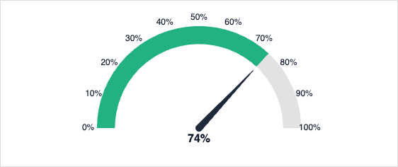
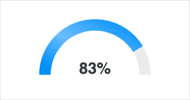
View all →Gauge charts surface a single metric against a goal or threshold range. Read the docs →
Radar Charts
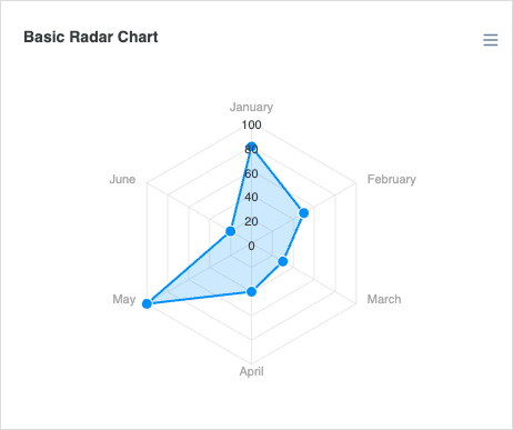
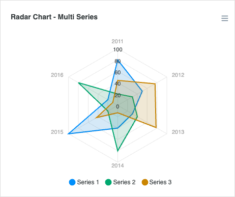
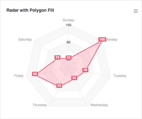
View all →Radar charts compare multiple variables across one or more series on a polar axis. Read the docs →
Polar Area Charts
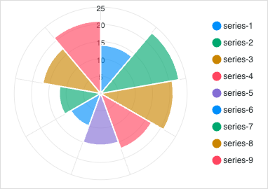
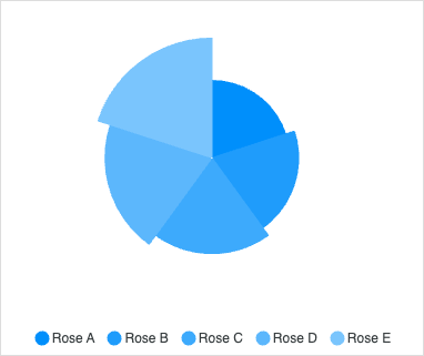
View all →Polar area charts combine pie segments with bar length to encode two dimensions.
Sparklines
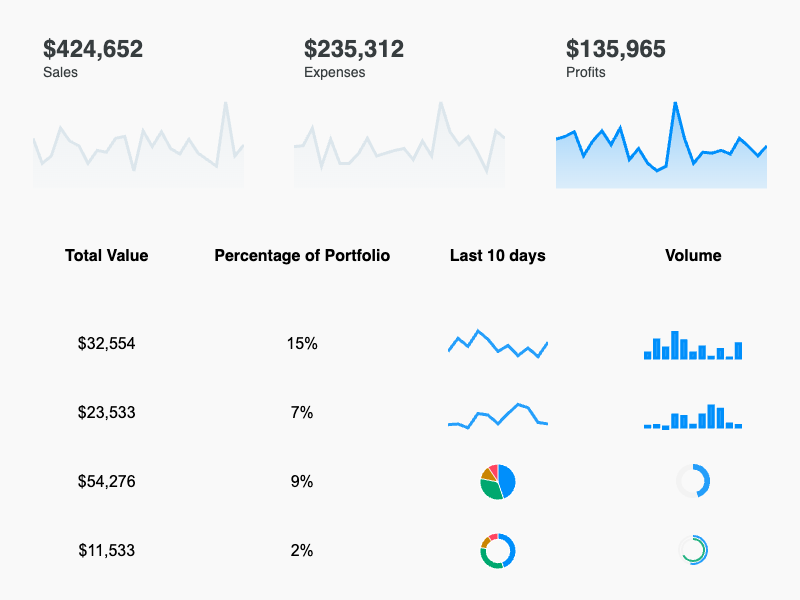
View all →Inline, axis-free mini charts for compact trend display alongside KPIs.
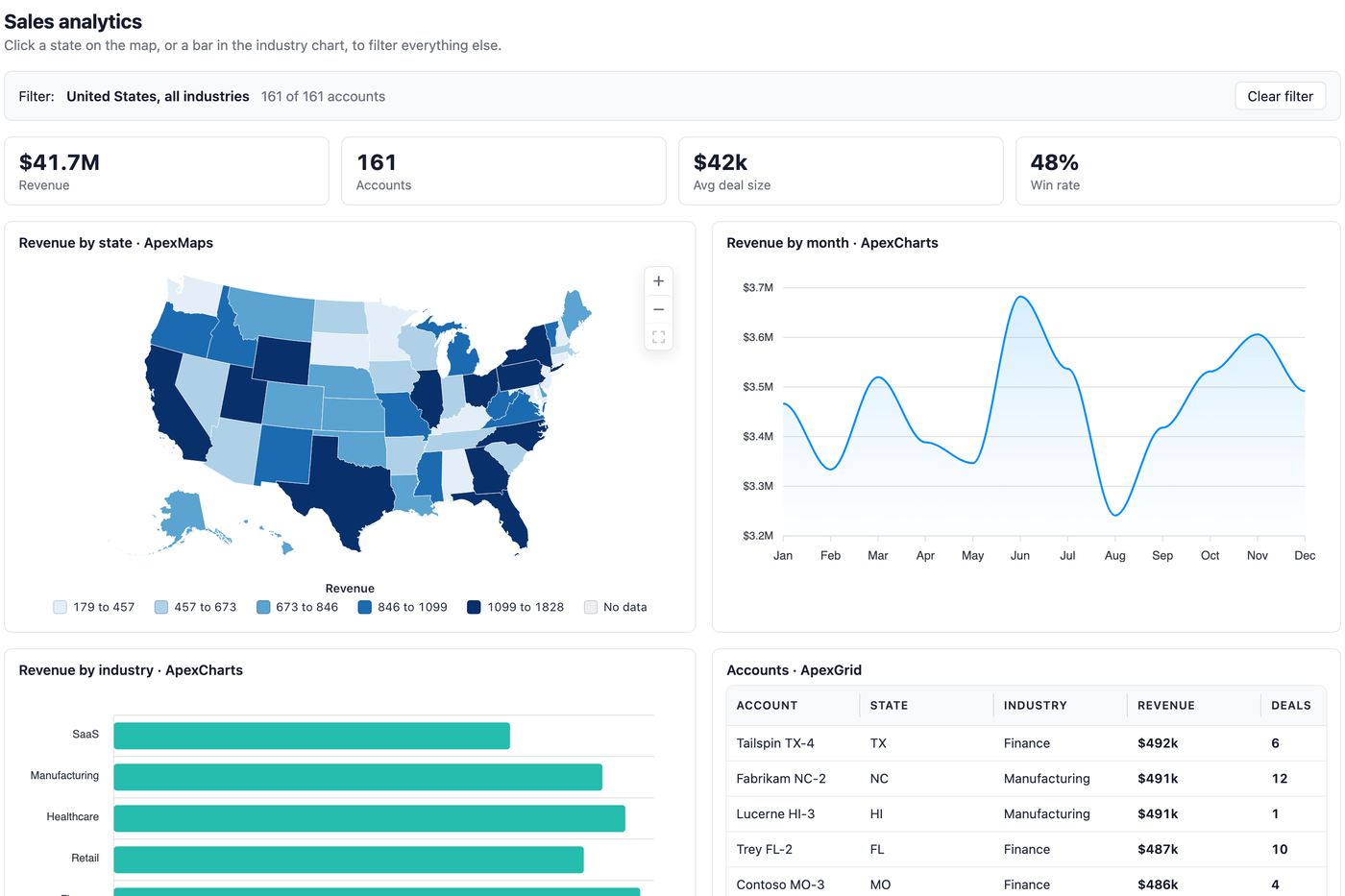
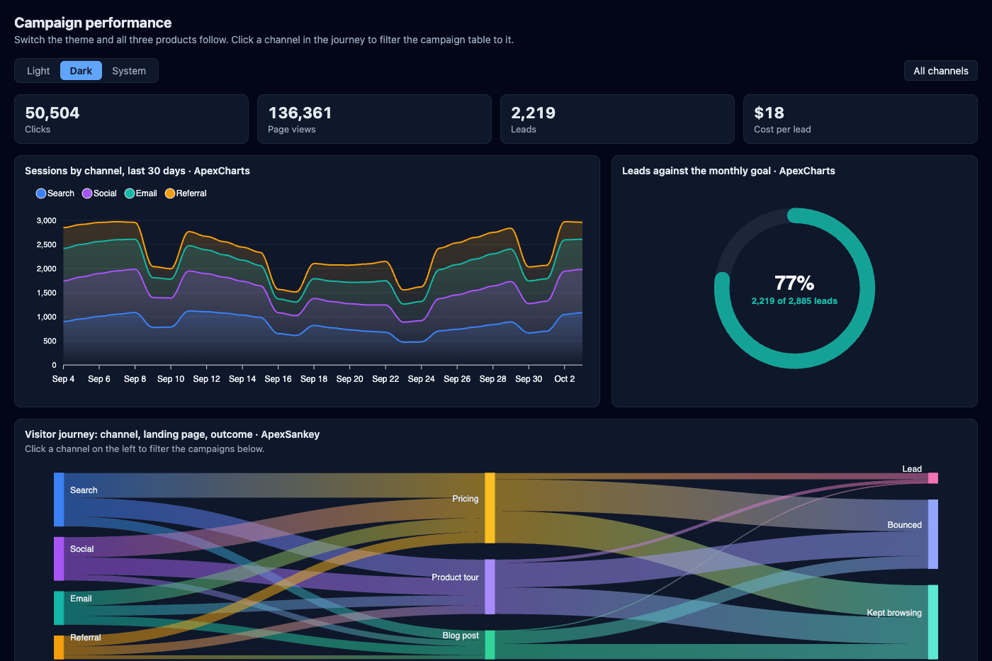
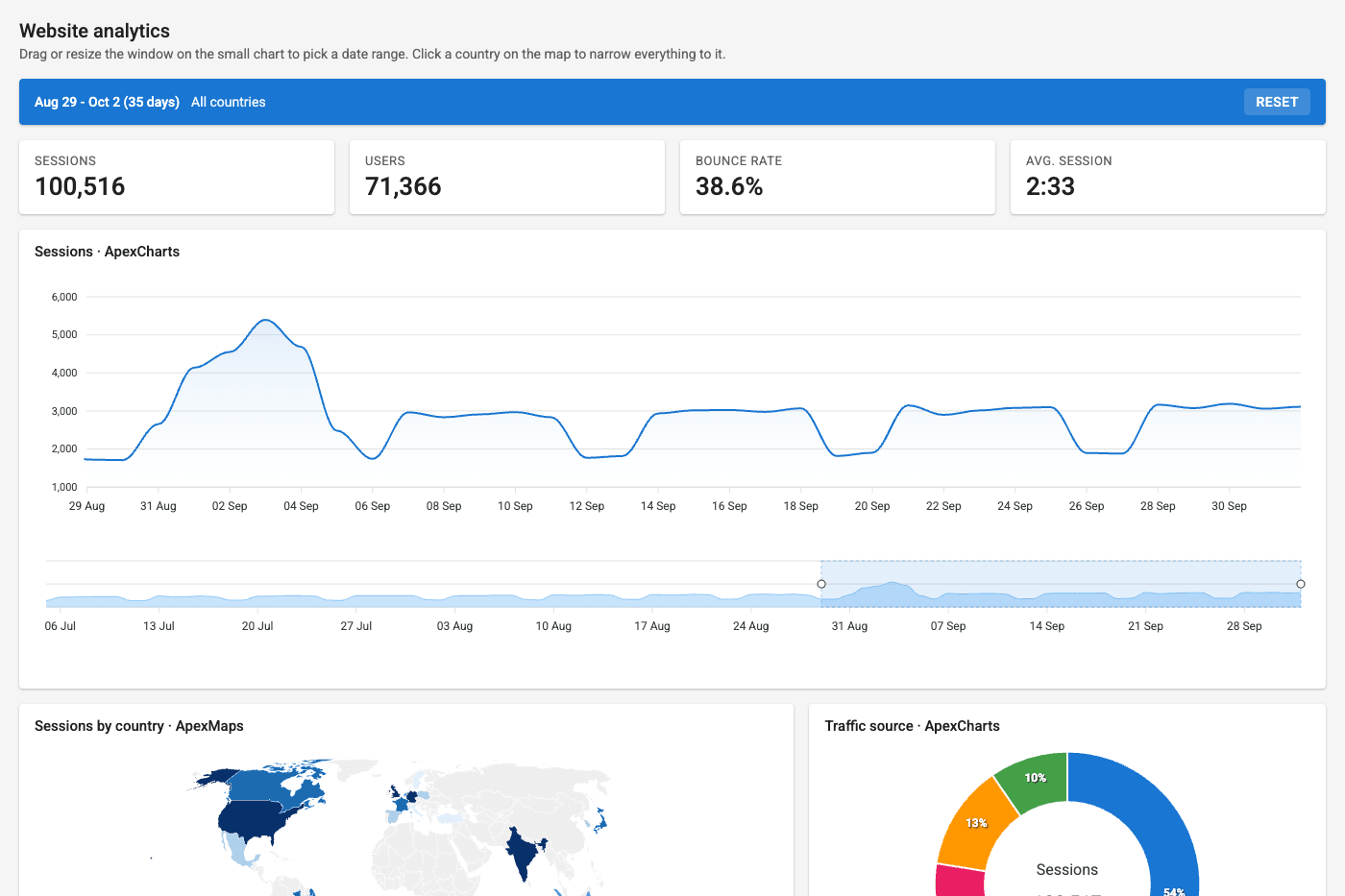
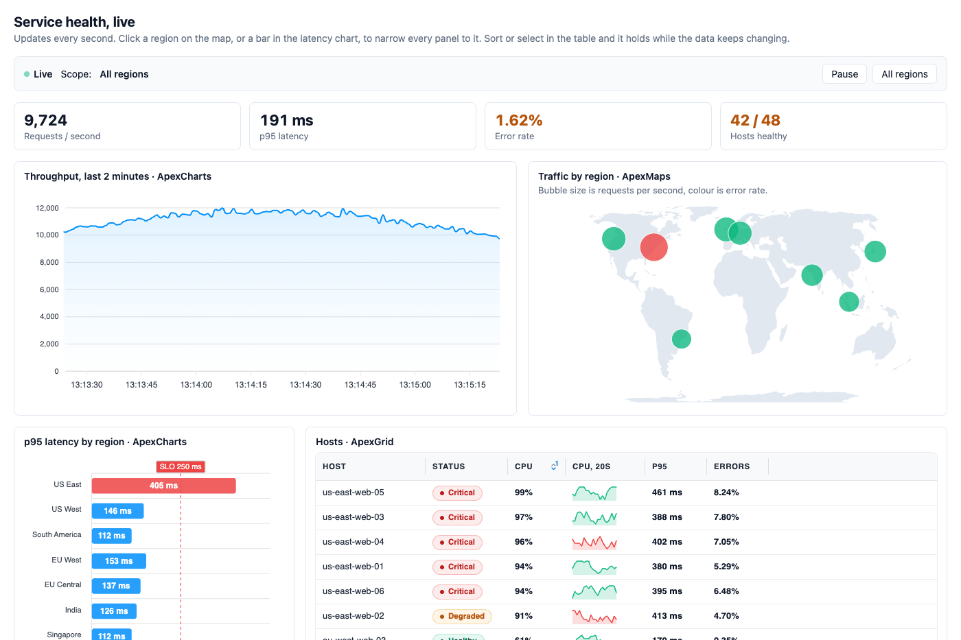
Dashboards
View all →Complete dashboards that pair ApexCharts with ApexGrid, ApexMaps or ApexSankey, each with the code that wires them together.
Custom Series
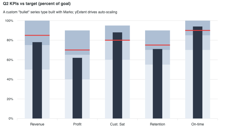
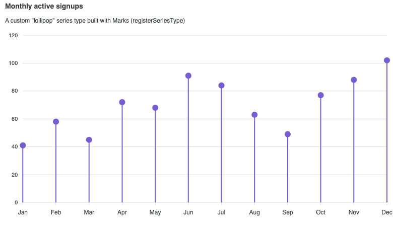
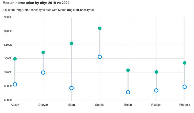
View all →Compose your own series types (bullet, lollipop, dumbbell) with the v6 Marks API, with events, tooltips, and legend built in.
Interactivity
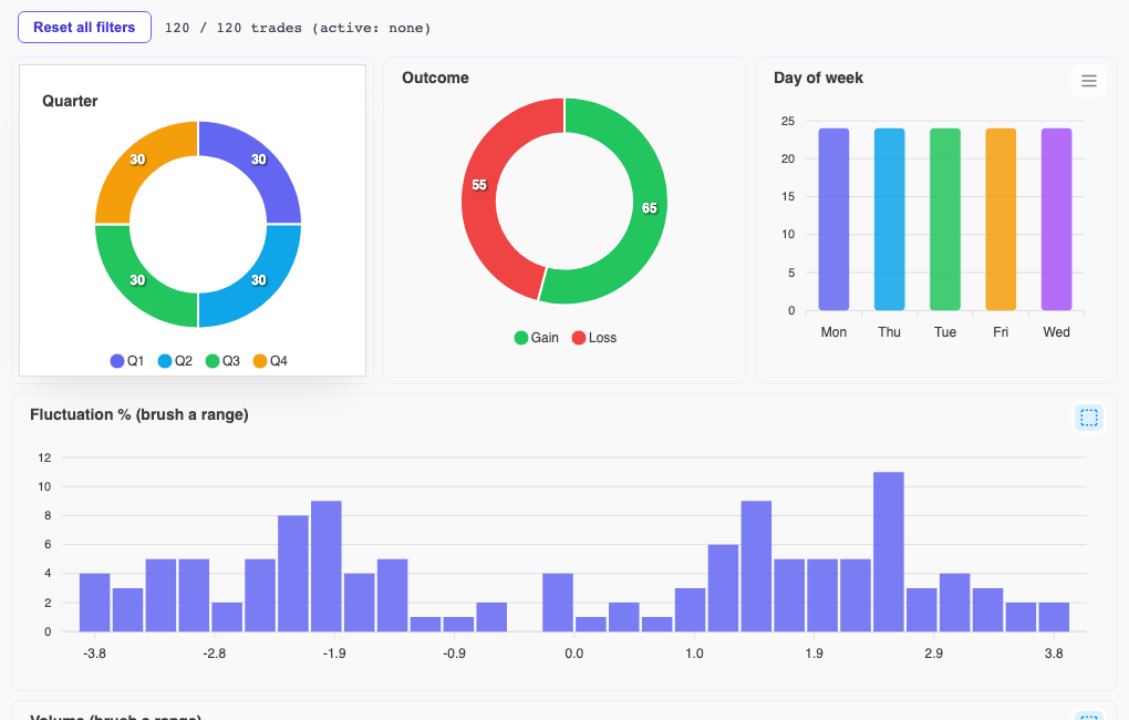
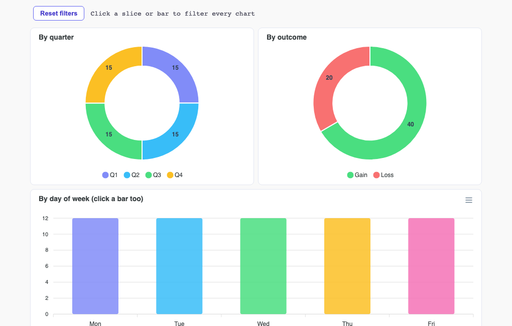
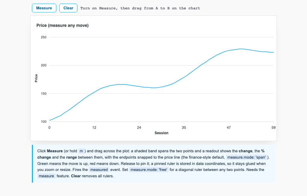
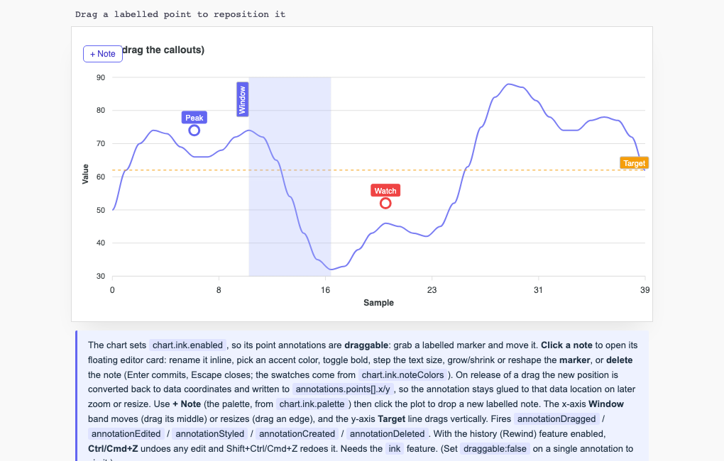
View all →Investigate data directly on the chart: crossfilter across views, measure changes, author annotations, and act at a point with the context menu.
Narrative & State
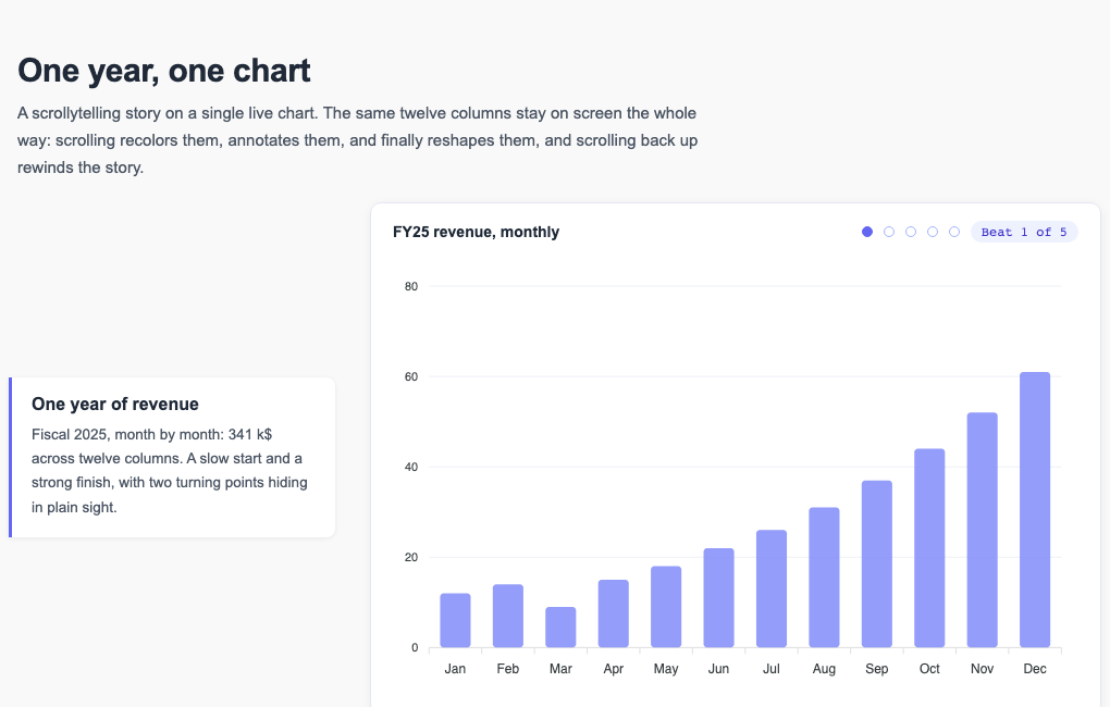
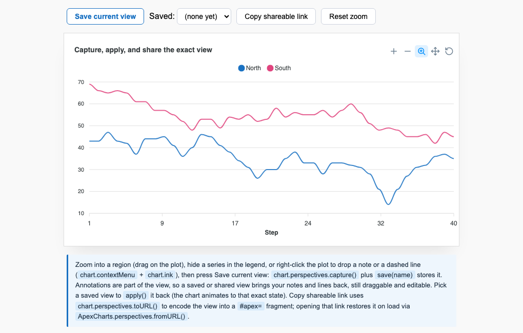
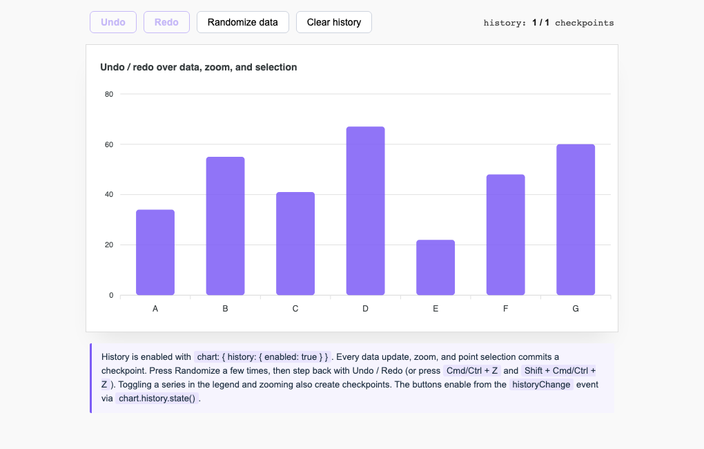
View all →Turn a chart into a surface you can author and share: scroll-driven storyboards, shareable view state, and undo and redo.
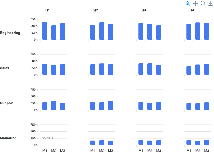
Trellis
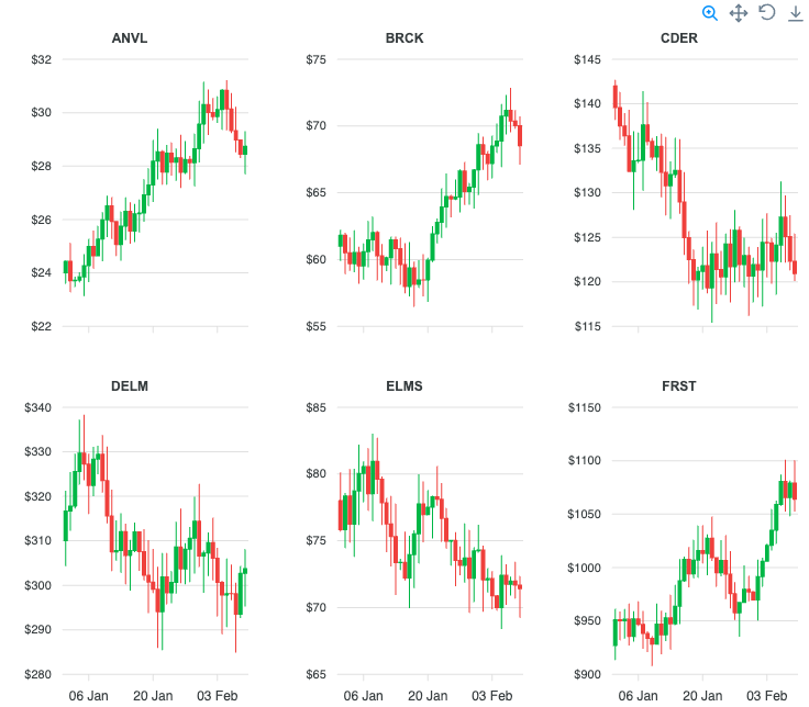
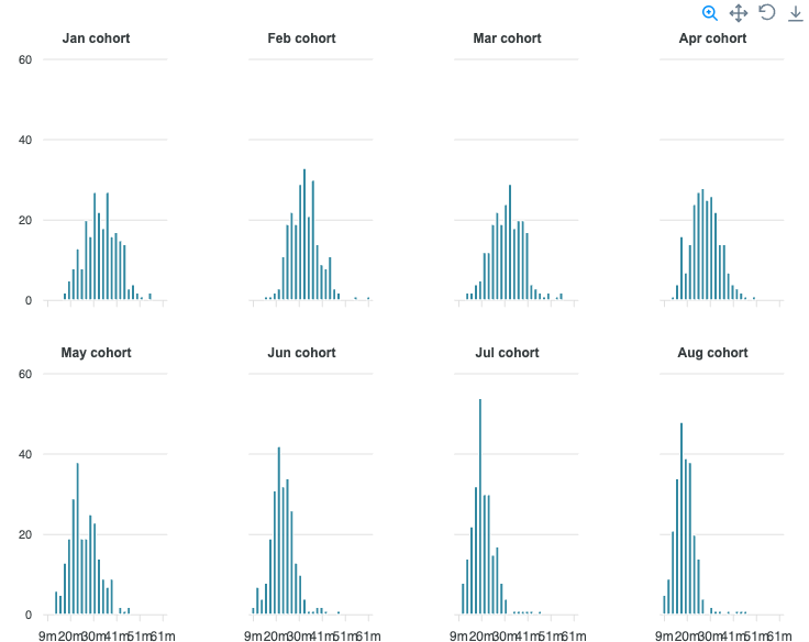
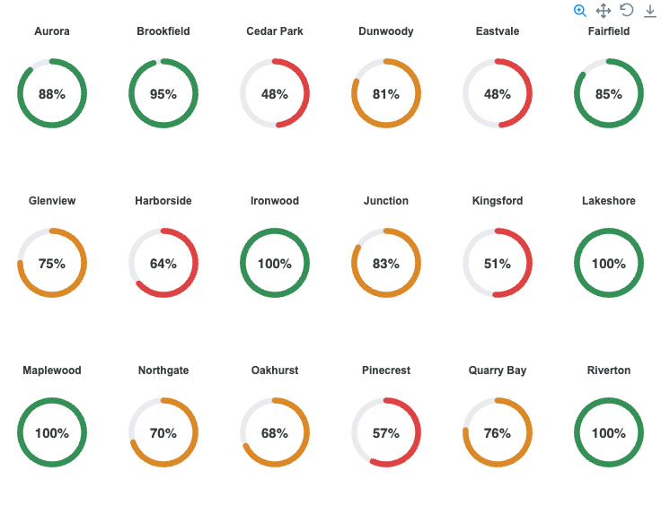
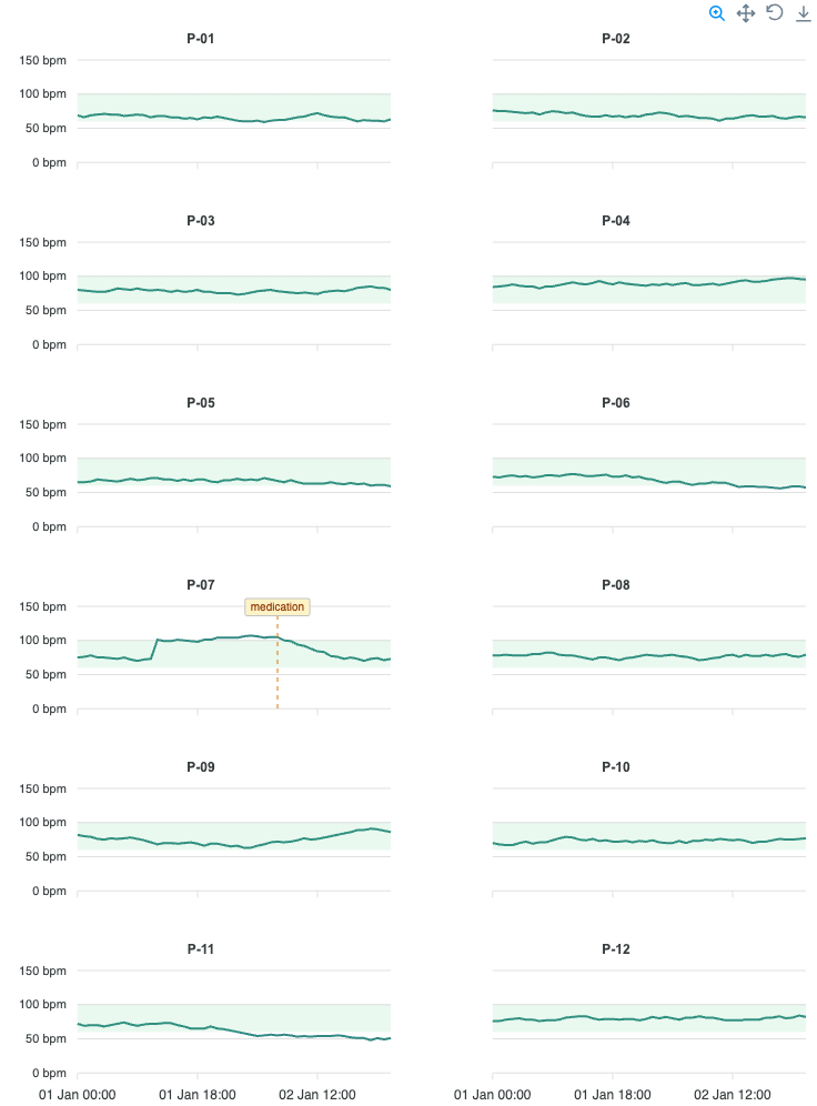
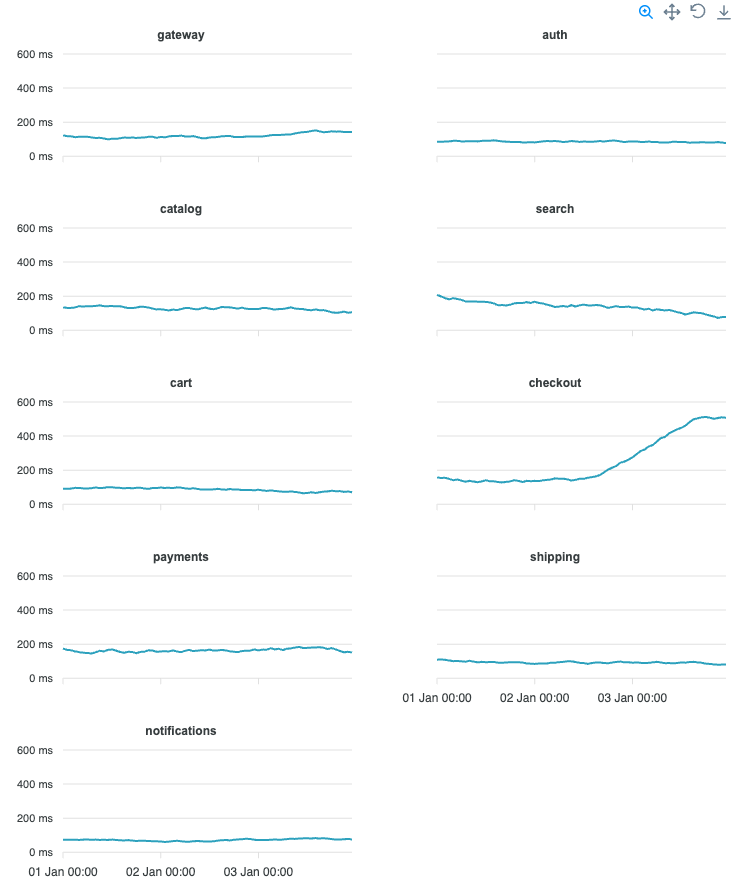
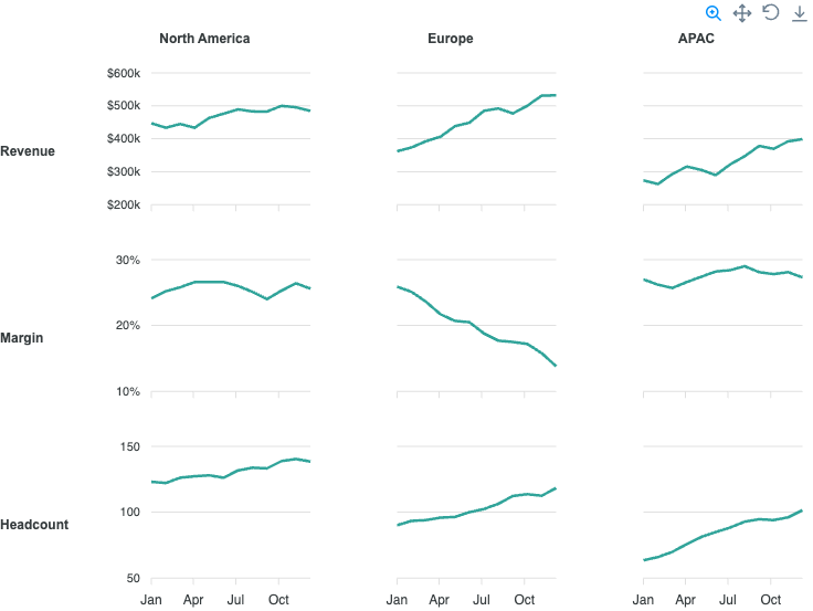
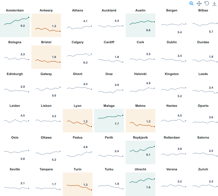
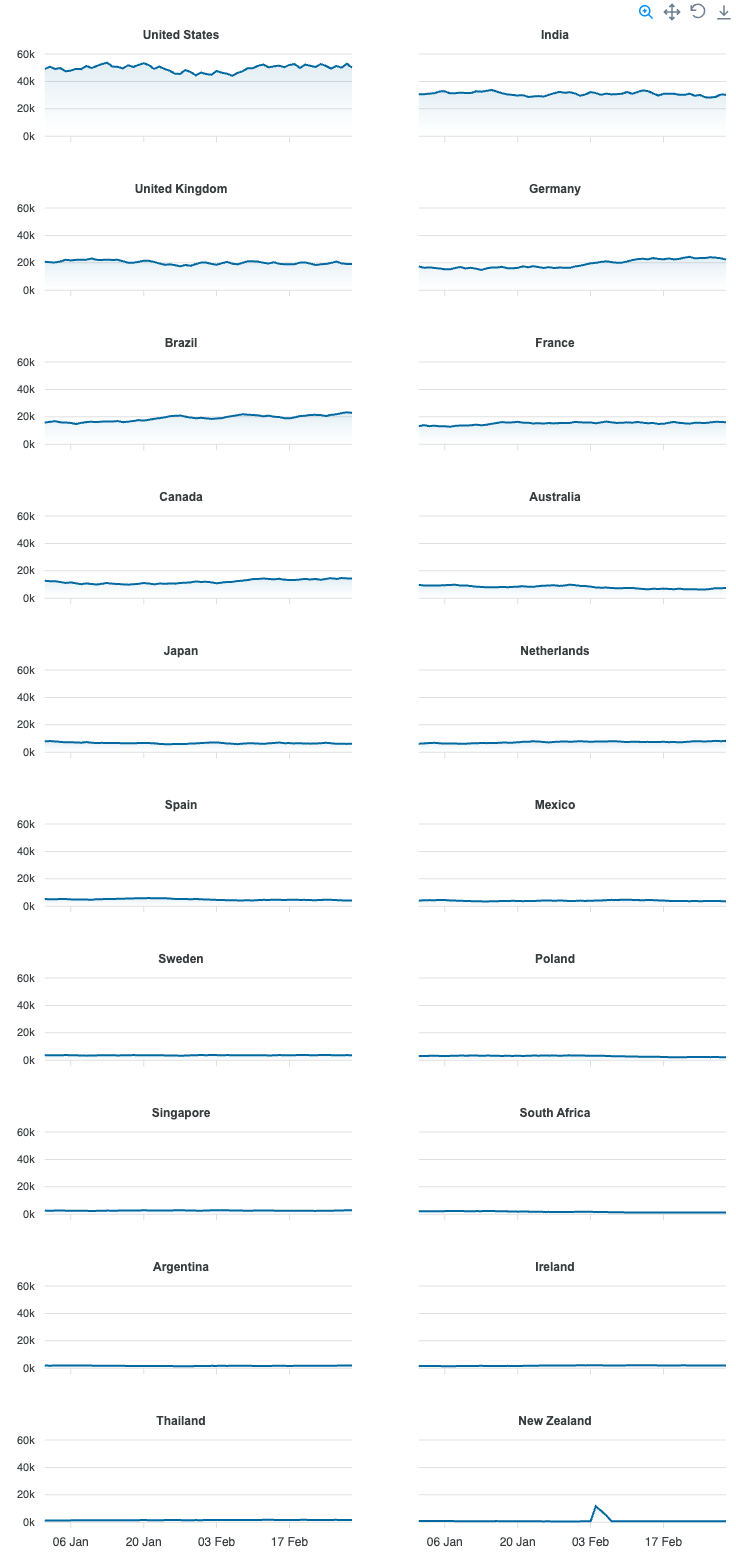
View all →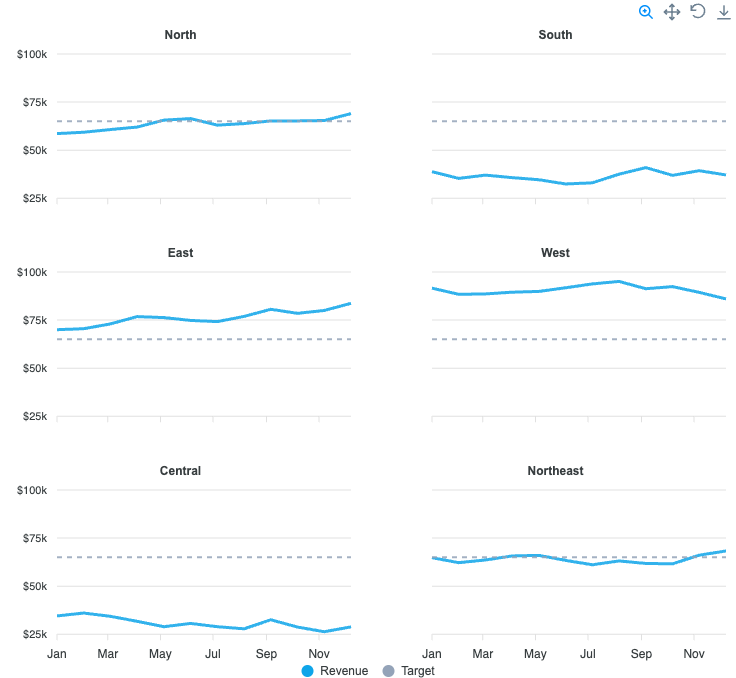

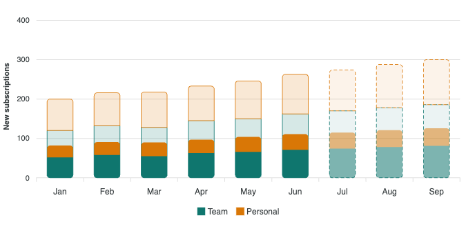
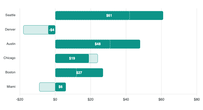
Highlight Filter
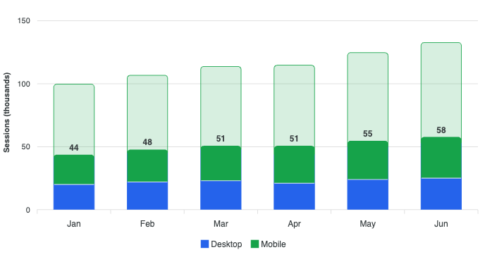
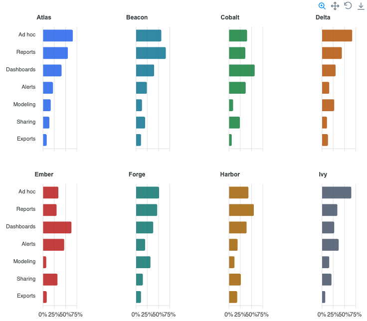
View all →Keep every total on the chart, faded, and draw the part a filter or segment accounts for solid in front of it, on bars, lines, pies, gauges and treemaps. Read the docs →